PSP Universal First Hour Trading SystemPSP Universal First Hour Trading System
Type: Indicator (Pine v5)
Works on: Any symbol & intraday timeframe
Idea: Trade the breakout of the first-hour range with auto Targets/SL, clean signals, and a full P&L dashboard.
What it does
Automatically detects the first-hour session (fully configurable start time & timezone) and draws:
First Hour High / Low
Projected Target and Stop-Loss for both directions
Triggers one signal per day on breakout:
🟢 BUY when price breaks above the First Hour High
🔴 SELL when price breaks below the First Hour Low
Lets you choose Signal timing:
Close = confirms at candle close (more reliable)
Touch = triggers intra-bar (more responsive)
Tracks and displays a comprehensive P&L table: trades, win rates, avg P/L, R:R, today’s stats, and ₹ results based on your lot-size.
P&L Dashboard (auto-updating)
Totals: Trades, Win Rate, Target Hits vs Misses
Breakdown: Buy vs Sell counts & win%
Averages: Avg Profit, Avg Loss, R:R
Today’s Section: Trades, Win%, Targets, Misses, Today P&L (Pts & ₹)
Overall: Total Profit/Loss (Pts & ₹), Net P&L, est. ROI (base ₹1L)
Context: Timeframe, Session time, Target mode/values, Candles, Status
How to use
Add the indicator to your chart.
Set your session start time, timezone, and first-hour length to match the market.
Choose Points or Percentage for Target/SL and set values.
Decide whether signals should confirm on Close (recommended) or on Touch.
(Optional) Set From Date and Lot Size to compute accurate ₹ stats.
Enable alerts for automation or notifications.
Good to know
Designed to avoid multiple trades per day—first valid breakout only.
Lines and labels are non-repainting when using Signal on Close.
Works across indices, stocks, futures, and crypto; adjust Target/SL to instrument volatility.
Best-practice presets (suggestions)
Indices (5-min): Target 40–80 pts, SL 25–40 pts
Large-cap stocks (5–10 min): Target 0.5–1.0%, SL 0.3–0.6%
Crypto (5–15 min): Start with % mode (e.g., TGT 0.5–1.0%, SL 0.3–0.7%)
Sentiment

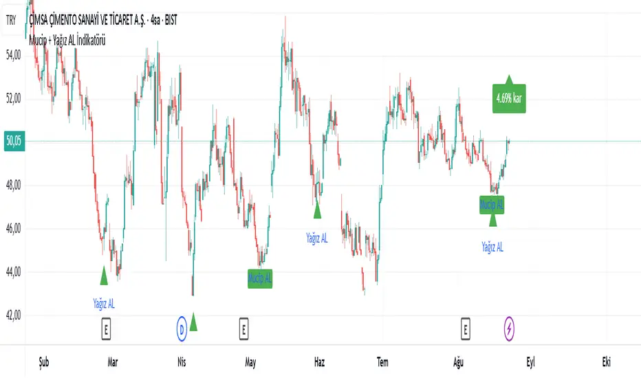
Mucip + Yağız AL BUY İndikatörü v3This is the strengthened version of version 2 with an additional condition. It does not provide definitive results. It is the indicator version of the strategy I use to detect potential reversal points. It will continue to be developed. It should be used in different timeframes and with additional confirmations.
Армс Индекс (TRIN)
Arms Indicator (TRIN)
General description
This indicator is designed to visualize the overbought and oversold levels of the stock market. The Arms Index (TRIN) evaluates the ratio of the number of rising and falling stocks to the corresponding ratio of the trading volume of rising and falling stocks. The lower the TRIN indicator, the more overbought the market is, and vice versa — a high TRIN indicates oversold conditions.
How to interpret the signal?
- Zone below 0.8: The market is overbought, and a downward correction is likely to follow soon.
- Zone above 1.2: The market is oversold, an upward reversal is possible.
These zones help to identify entry and exit points in a timely manner, optimizing trading decisions.
Implementation features
1. Calculation method: The classic TRIN formula is based on the ratio of volume indicators of rising and falling assets.
2. Averaging interval: A moving average (MA) is used with a configurable default period of five days. The user can change this value manually.
3. Level display: The chart shows two key levels: the oversold (1.2) and overbought (0.8) lines. These lines are guidelines for decision-making.
Instructions for use
1. Upload the indicator to the chart of your financial instrument.
2. Keep an eye on the TRIN value: does it cross the critical levels (1.2 and 0.8)?
3. Use the TRIN readings as an additional filter to confirm the signal of your main strategies.
Remember that the Arms index is best used in conjunction with other technical analysis indicators to achieve maximum signal accuracy.
---
I hope this implementation will help you to trade more efficiently and find the best opportunities in the market!
© The authorship belongs to Eva-S-Apple.
Volume-Weighted Money Flow [sgbpulse]Overview
The VWMF indicator is an advanced technical analysis tool that combines and summarizes five leading momentum and volume indicators (OBV, PVT, A/D, CMF, MFI) into one clear oscillator. The indicator helps to provide a clear picture of market sentiment by measuring the pressure from buyers and sellers. Unlike single indicators, VWMF provides a comprehensive view of market money flow by weighting existing indicators and presenting them in a uniform and understandable format.
Indicator Components
VWMF combines the following indicators, each normalized to a range of 0 to 100 before being weighted:
On-Balance Volume (OBV): A cumulative indicator that measures positive and negative volume flow.
Price-Volume Trend (PVT): Similar to OBV, but incorporates relative price change for a more precise measure.
Accumulation/Distribution Line (A/D): Used to identify whether an asset is being bought (accumulated) or sold (distributed).
Chaikin Money Flow (CMF): Measures the money flow over a period based on the close price's position relative to the candle's range.
Money Flow Index (MFI): A momentum oscillator that combines price and volume to measure buying and selling pressure.
Understanding the Normalized Oscillators
The indicator combines the five different momentum indicators by normalizing each one to a uniform range of 0 to 100 .
Why is Normalization Important?
Indicators like OBV, PVT, and the A/D Line are cumulative indicators whose values can become very large. To assess their trend, we use a Moving Average as a dynamic reference line . The Moving Average allows us to understand whether the indicator is currently trending up or down relative to its average behavior over time.
How Does Normalization Work?
Our normalization fully preserves the original trend of each indicator.
For Cumulative Indicators (OBV, PVT, A/D): We calculate the difference between the current indicator value and its Moving Average. This difference is then passed to the normalization process.
- If the indicator is above its Moving Average, the difference will be positive, and the normalized value will be above 50.
- If the indicator is below its Moving Average, the difference will be negative, and the normalized value will be below 50.
Handling Extreme Values: To overcome the issue of extreme values in indicators like OBV, PVT, and the A/D Line , the function calculates the highest absolute value over the selected period. This value is used to prevent sharp spikes or drops in a single indicator from compromising the accuracy of the normalization over time. It's a sophisticated method that ensures the oscillators remain relevant and accurate.
For Bounded Indicators (CMF, MFI): These indicators already operate within a known range (for example, CMF is between -1 and 1, and MFI is between 0 and 100), so they are normalized directly without an additional reference line.
Reference Line Settings:
Moving Average Type: Allows the user to choose between a Simple Moving Average (SMA) and an Exponential Moving Average (EMA).
Volume Flow MA Length: Allows the user to set the lookback period for the Moving Average, which affects the indicator's sensitivity.
The 50 line serves as the new "center line." This ensures that, even after normalization, the determination of whether a specific indicator supports a bullish or bearish trend remains clear.
Settings and Visual Tools
The indicator offers several customization options to provide a rich analysis experience:
VWMF Oscillator (Blue Line): Represents the weighted average of all five indicators. Values above 50 indicate bullish momentum, and values below 50 indicate bearish momentum.
Strength Metrics (Bullish/Bearish Strength %): Two metrics that appear on the status line, showing the percentage of indicators supporting the current trend. They range from 0% to 100%, providing a quick view of the strength of the consensus.
Dynamic Background Colors: The background color of the chart automatically changes to bullish (a blue shade by default) or bearish (a default brown-gray shade) based on the trend. The transparency of the color shows the consensus strength—the more opaque the background, the more indicators support the trend.
Advanced Settings:
- Background Color Logic: Allows the user to choose the trigger for the background color: Weighted Value (based on the combined oscillator) or Strength (based on the majority of individual indicators).
- Weights: Provides full control over the weight of each of the five indicators in the final oscillator.
Using the Data Window
TradingView provides a useful Data Window that allows you to see the exact numerical values of each normalized oscillator separately, in addition to the trend strength data.
You can use this window to:
Get more detailed information on each indicator: Viewing the precise numerical data of each of the five indicators can help in making trading decisions.
Calibrate weights: If you want to manually adjust the indicator weights (in the settings menu), you can do so while tracking the impact of each indicator on the weighted oscillator in the Data Window.
The indicator's default setting is an equal weight of 20% for each of the five indicators.
Alert Conditions
The indicator comes with a variety of built-in alerts that can be configured through the TradingView alerts menu:
VWMF Cross Above 50: An alert when the VWMF oscillator crosses above the 50 line, indicating a potential bullish momentum shift.
VWMF Cross Below 50: An alert when the VWMF oscillator crosses below the 50 line, indicating a potential bearish momentum shift.
Bullish Strength: High But Not Absolute Consensus: An alert when the bullish trend strength reaches 60% or more but is less than 100%, indicating a high but not absolute consensus.
Bullish Strength at 100%: An alert when all five indicators (MFI, OBV, PVT, A/D, CMF) show bullish strength, indicating a full and absolute consensus.
Bearish Strength: High But Not Absolute Consensus: An alert when the bearish trend strength reaches 60% or more but is less than 100%, indicating a high but not absolute consensus.
Bearish Strength at 100%: An alert when all five indicators (MFI, OBV, PVT, A/D, CMF) show bearish strength, indicating a full and absolute consensus.
Summary
The VWMF indicator is a powerful, all-in-one tool for analyzing market momentum, money flow, and sentiment. By combining and normalizing five different indicators into a single oscillator, it offers a holistic and accurate view of the market's underlying trend. Its dynamic visual features and customizable settings, including the ability to adjust indicator weights, provide a flexible experience for both novice and experienced traders. The built-in alerts for momentum shifts and trend consensus make it an effective tool for spotting trading opportunities with confidence. In essence, VWMF distills complex market data into clear, actionable signals.
Important Note: Trading Risk
This indicator is intended for educational and informational purposes only and does not constitute investment advice or a recommendation for trading in any form whatsoever.
Trading in financial markets involves significant risk of capital loss. It is important to remember that past performance is not indicative of future results. All trading decisions are your sole responsibility. Never trade with money you cannot afford to lose.

Армс Индекс (TRIN)Arms Indicator (TRIN)
General description
This indicator is designed to visualize the overbought and oversold levels of the stock market. The Arms Index (TRIN) evaluates the ratio of the number of rising and falling stocks to the corresponding ratio of the trading volume of rising and falling stocks. The lower the TRIN indicator, the more overbought the market is, and vice versa — a high TRIN indicates oversold conditions.
How to interpret the signal?
- Zone below 0.8: The market is overbought, and a downward correction is likely to follow soon.
- Zone above 1.2: The market is oversold, an upward reversal is possible.
These zones help to identify entry and exit points in a timely manner, optimizing trading decisions.
Implementation features
1. Calculation method: The classic TRIN formula is based on the ratio of volume indicators of rising and falling assets.
2. Averaging interval: A moving average (MA) is used with a configurable default period of five days. The user can change this value manually.
3. Level display: The chart shows two key levels: the oversold (1.2) and overbought (0.8) lines. These lines are guidelines for decision-making.
Instructions for use
1. Upload the indicator to the chart of your financial instrument.
2. Keep an eye on the TRIN value: does it cross the critical levels (1.2 and 0.8)?
3. Use the TRIN readings as an additional filter to confirm the signal of your main strategies.
Remember that the Arms index is best used in conjunction with other technical analysis indicators to achieve maximum signal accuracy.
---
I hope this implementation will help you to trade more efficiently and find the best opportunities in the market!
© The authorship belongs to Eva-S-Apple.
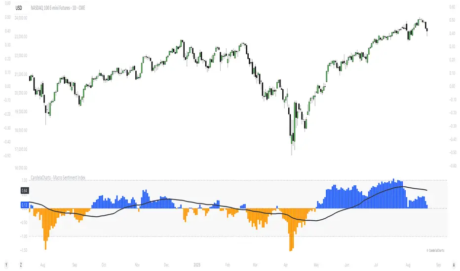
CandelaCharts - Macro Sentiment Index 📝 Overview
The Macro Sentiment Index (MSI) is a multi-asset, rules-based indicator designed to quantify global market risk appetite by aggregating signals from a diversified basket of financial instruments across equities, fixed income, commodities, currencies, volatility, and macroeconomic data.
Developed under the CandelaCharts framework, MSI transforms complex intermarket dynamics into a single, interpretable sentiment score. It reflects the collective behavior of institutional and retail investors, central bank policies, liquidity conditions, and macroeconomic trends.
Rather than relying on a single data source, the index combines over 30 components grouped into five core categories:
Risk-On Assets
Risk-Off / Defensive Assets
Macro & Interest Rate Indicators
Central Bank & Policy Proxies
Sentiment Ratios & Cross-Asset Signals
Each component is standardized using z-score normalization over a user-defined lookback period, weighted based on empirical significance, and aggregated into a composite sentiment score.
The final output oscillates around a neutral baseline (0), with positive values indicating risk-on conditions and negative values signaling risk-off sentiment.
📦 Features
Multi-Dimensional Inputs: Integrates equities, bonds, commodities, volatility, FX, yield curves, policy, macro, sector rotations, and sentiment ratios for holistic market breadth.
Adaptive Scoring System: Converts inputs into z-scores over a lookback window, normalizes directionality, and highlights relative strength/weakness in real time.
Weighted Aggregation: Users assign custom weights (0.1–3.0) to inputs, enabling fine-tuning for regimes or strategies. The index is a weighted average of component scores.
Smoothing & Visualization Modes: Apply SMA, EMA, RMA, or VWMA with custom length. Display as line, histogram, area, or columns with neutral, overbought, and oversold zones.
Correlation Monitoring: On-chart table tracks rolling correlations (default 20 periods) between asset prices and MSI, detecting divergences and regime changes.
Customizable UI: Personalize fonts, text size, branding, and color schemes for bullish/bearish phases and MA line visualization.
⚙️ Settings
Lookback: Define how far back the indicator evaluates data
MA (Moving Average): When enabled, overlays a moving default disabled
MA Smoothing: Applies a secondary smoothing layer
Correlation: Defines the period over which correlation is measured
Mode: Determines the visual layout style
Equity Benchmarks: SPY, QQQ, IWM, EEM
Fixed Income: TLT, HYG, LQD, SHY
Commodities: Gold (GC), Copper (HG), Oil (CL), BCOM
Volatility: VIX, VVIX, MOVE, SKEW
FX Pairs: USD/JPY, USD/CHF, AUD/JPY, DXY
Yield Curves: 10Y-2Y Spread (TYX), 10Y-5Y (TNX-FEDFUNDS)
Monetary Policy: SOFR, ED, FF futures
Global Macro: BDIY, M2, TED Spread, Put/Call Ratio
Sector Rotation: XLU/XLY, XLY/XLP
Sentiment Ratios: SPY/TLT, HYG/LQD, BTC/Gold, Copper/Gold, etc
⚡️ Showcase
Default Mode
Area Mode
Smoothing Moving Average
📒 Usage
Interpreting the Index
Above 0: Net risk-on sentiment - (Markets favor growth, liquidity, and speculative assets)
Below 0: Net risk-off sentiment - (Flight to safety, rising volatility, defensive positioning)
Above +1: Extreme risk-on / complacency - (Potential overheating or topping pattern)
Below −1: Extreme risk-off / fear - (Stress, capitulation, or strong defensive rotation)
🚨 Alerts
The indicator does not provide any alerts!
⚠️ Disclaimer
These tools are exclusively available on the TradingView platform.
Our charting tools are intended solely for informational and educational purposes and should not be regarded as financial, investment, or trading advice. They are not designed to predict market movements or offer specific recommendations. Users should be aware that past performance is not indicative of future results and should not rely on these tools for financial decisions. By using these charting tools, the purchaser agrees that the seller and creator hold no responsibility for any decisions made based on information provided by the tools. The purchaser assumes full responsibility and liability for any actions taken and their consequences, including potential financial losses or investment outcomes that may result from the use of these products.
By purchasing, the customer acknowledges and accepts that neither the seller nor the creator is liable for any undesired outcomes stemming from the development, sale, or use of these products. Additionally, the purchaser agrees to indemnify the seller from any liability. If invited through the Friends and Family Program, the purchaser understands that any provided discount code applies only to the initial purchase of Candela's subscription. The purchaser is responsible for canceling or requesting cancellation of their subscription if they choose not to continue at the full retail price. In the event the purchaser no longer wishes to use the products, they must unsubscribe from the membership service, if applicable.
We do not offer reimbursements, refunds, or chargebacks. Once these Terms are accepted at the time of purchase, no reimbursements, refunds, or chargebacks will be issued under any circumstances.
By continuing to use these charting tools, the user confirms their understanding and acceptance of these Terms as outlined in this disclaimer.
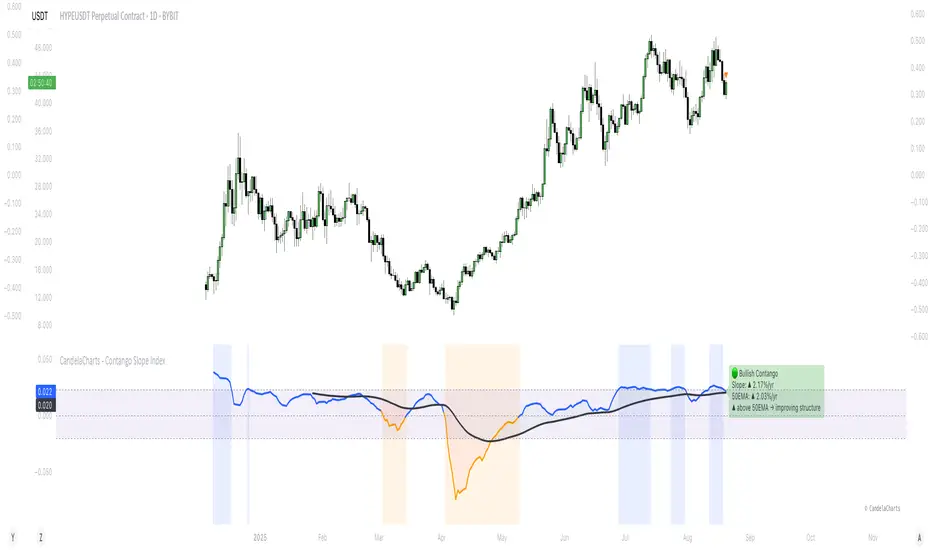
CandelaCharts - Contango Slope Index 📝 Overview
The Contango Slope Index (CSI) is a volatility term structure analysis tool designed to quantify the slope of the VIX futures curve over time.
By measuring the rate of change in implied volatility across multiple tenors—such as VIX1D, VIX (1M), VIX3M, VIX6M, and VIX1Y—the CSI provides traders and analysts with real-time insights into market sentiment, risk appetite, and potential turning points in equity markets.
Developed by CandelaCharts, the CSI draws from established financial research on volatility term structures, particularly focusing on how contango (upward-sloping curve) and backwardation (downward-sloping curve) regimes correlate with future market behavior.
The index computes a normalized slope using linear regression across available VIX futures, offering a dynamic view of evolving market expectations. The core output a slope value expressed in annualized percentage points per year (%/yr)—represents the steepness of the volatility curve:
Positive slope: Contango regime, typically associated with market stability and complacency.
Negative slope: Backwardation, historically linked to fear, near-term uncertainty, and often preceding market rallies.
Slope crossing zero or key thresholds: Generates regime shifts and alert conditions.
📦 Features
The Contango Slope Index offers a comprehensive set of features for analyzing volatility dynamics:
Multi-Tenor Volatility Input: Users can select which VIX futures contracts to include in the slope calculation: VIX, VIX1D, etc
Dynamic Slope Calculation: The indicator calculates the slope of the VIX term structure using linear regression on time-to-maturity (TTM) vs. volatility levels.
Moving Average Overlay: A configurable moving average (SMA, EMA, RMA, WMA, VWMA) is applied to the smoothed slope to identify trend direction and momentum shifts.
Regime Classification: Based on the slope value and its relationship to the moving average, the CSI classifies current market conditions into distinct regimes.
Visual Enhancements: Color-coded slope line, background shading, etc
Real-Time Label & Tooltip: On the last bar, a dynamic label displays: Current regime, Slope value and direction, etc
⚙️ Settings
VIX: Toggles use of spot VIX index (CBOE_DLY:VIX).
VIX1D: Toggles use of 1-day VIX futures (CBOE_DLY:VIX1D).
VIX3M: Toggles use of 3-month VIX futures (CBOE_DLY:VIX3M).
VIX6M: Toggles use of 6-month VIX futures (CBOE_DLY:VIX6M).
VIX1Y: Toggles use of 1-year VIX futures (CBOE_DLY:VIX1Y).
MA: Enables moving average filter; options include type (SMA, etc.) and period length.
Slope: Defines slope calculation line thickness and colors.
Bg: Enables background shading with customizable colors.
⚡️ Showcase
Slope Line
Customizable Moving Average
Regime Shift Zones
📒 Usage
The CSI is plotted as a standalone oscillator beneath the price chart (non-overlay mode). Key interpretation guidelines:
Slope Direction
Slope < 0 - Backwardation: Indicates near-term volatility is higher than long-term expectations. Historically, this has preceded equity market rallies, as panic subsides and fear peaks.
Slope > 0 - Contango: Reflects normal market conditions where longer-dated volatility is priced higher. Persistent high contango may signal complacency.
Magnitude of Slope
Slope > 0.0232 (%/yr) - Elevated complacency: The term structure is steeper than historical average—caution advised ahead of potential corrections.
Slope near 0 - Neutral or transitioning regime: Markets may be at inflection points.
Slope vs. MA Crossover
Slope crosses above MA: Improving confidence, potential upside acceleration
Slope crosses below MA: Deteriorating structure, rising stress
🚨 Alerts
Six pre-configured alerts are available for integration into trading systems:
🚨 Backwardation Detected – Slope turns negative
🔚 Exit Backwardation – Slope crosses above zero
⚠️ Elevated Complacency – Slope exceeds 2.32%/yr
📈 Potential Bullish Setup – Slope crosses below zero
✅ Slope Crosses Above MA – Momentum improves
⚠️ Slope Crosses Below MA – Momentum deteriorates
⚠️ Disclaimer
These tools are exclusively available on the TradingView platform.
Our charting tools are intended solely for informational and educational purposes and should not be regarded as financial, investment, or trading advice. They are not designed to predict market movements or offer specific recommendations. Users should be aware that past performance is not indicative of future results and should not rely on these tools for financial decisions. By using these charting tools, the purchaser agrees that the seller and creator hold no responsibility for any decisions made based on information provided by the tools. The purchaser assumes full responsibility and liability for any actions taken and their consequences, including potential financial losses or investment outcomes that may result from the use of these products.
By purchasing, the customer acknowledges and accepts that neither the seller nor the creator is liable for any undesired outcomes stemming from the development, sale, or use of these products. Additionally, the purchaser agrees to indemnify the seller from any liability. If invited through the Friends and Family Program, the purchaser understands that any provided discount code applies only to the initial purchase of Candela's subscription. The purchaser is responsible for canceling or requesting cancellation of their subscription if they choose not to continue at the full retail price. In the event the purchaser no longer wishes to use the products, they must unsubscribe from the membership service, if applicable.
We do not offer reimbursements, refunds, or chargebacks. Once these Terms are accepted at the time of purchase, no reimbursements, refunds, or chargebacks will be issued under any circumstances.
By continuing to use these charting tools, the user confirms their understanding and acceptance of these Terms as outlined in this disclaimer.
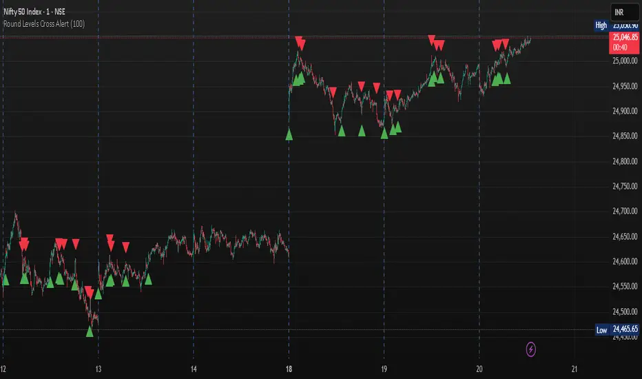
Round Levels Cross AlertRound Levels Cross Alert
Overview
The Round Levels Cross Alert is a Pine Script v6 indicator for TradingView that detects when the price crosses user-defined round price levels (e.g., 100, 200, 500). It is designed for traders focusing on psychological or key support/resistance levels, providing clear visual markers and real-time alerts with detailed messages.
Features
Custom Round Levels: Set your preferred price interval (e.g., 100 points) using the Round Level Interval input.
Visual Cues: Green triangle-up shapes appear below bars for upward crosses; red triangle-down shapes appear above for downward crosses.
Detailed Alerts: Alerts include the ticker, crossed level, and time in HH:mm AM/PM format, triggered only on confirmed bars for accuracy.
Multi-Level Detection: Captures multiple round-level crosses in a single bar, sending individual alerts for each.
User-Friendly: Easy to set up and integrates with TradingView's alert system for notifications via email, SMS, or other platforms.
How It Works
The script calculates the nearest round level by flooring the closing price divided by the user-defined interval. It detects changes in this level to identify crosses, then:
Plots a shape to visually mark the cross.
Generates an alert with the ticker, crossed level, and current time.
Handles multiple level crosses in one bar, ensuring all are reported.
Ideal For
Swing Traders: Identify key levels for entries/exits.
Day Traders: Monitor real-time price action at round numbers.
Automated Alerts: Stay informed with timely notifications.
Customization
Adjust the Round Level Interval to match your asset or strategy (e.g., 50, 100, 1000).
Configure TradingView alerts to suit your notification preferences.
This indicator is a simple, effective tool for tracking price movements at significant round levels with clear visuals and actionable alerts.
[AlbaTherium] Wabi-Sabi Wyckoff Flow Structure Map MTF[1.0.42] Wabi-Sabi Wyckoff Flow Structure Map
Master the Hidden Geometry of Market Campaigns – Accumulation, Distribution, and the Laws That Govern Them
Introduction
The Wabi-Sabi Wyckoff Flow Structure Map is a software-engineered analytical framework that visualizes the flow of institutional market behavior through the lens of the Wyckoff Method. This tool automates the detection of trading ranges, maps the phases of accumulation/distribution, and extrapolates price objectives .
The Wabi-Sabi Wyckoff Flow Structure Map is a meticulous implementation of the principles of Richard D. Wyckoff , interpreted through the lens of market structure and volume dynamics. This tool aims to identify, contextualize, and map out accumulation and distribution zones by interpreting the composite operator's intended path in financial markets.
It is not merely an indicator-it is a structural compass, guiding you through the architecture of smart money campaigns.
Chapter 1: The Architecture of Market Campaigns
1.1 From Noise to Narrative
Markets do not move randomly. They are orchestrated campaigns-methodically executed by informed operators. The identifies these campaigns as they unfold across:
Accumulation
Markup
Distribution
Markdown
Each is grounded in Wyckoff’s structural logic and revealed in real time.
1.2 Who Is the Composite Operator, Composite Man?
The Composite Operator (CO), Composite Man (CM) represents dominant market participants-institutions with the capacity to engineer price movement. By dissecting trading ranges, the script deciphers their behavior through:
Event-based mapping (SC, ST, Spring, AR, UTAD, etc.)
Phase progression (Phase A to E)
PnF-based directional forecasting
The CO leaves footprints. This script reads them.
Chapter 2: Wyckoff’s Core Laws, Brought to Life
2.1 The Law of Supply and Demand
Every price bar reflects this law. The tool highlights where supply is absorbed and demand emerges, revealing the true balance of power behind the chart.
2.2 The Law of Cause and Effect
Accumulation and distribution ranges are not noise-they are preparation. By measuring their width, the script calculates PnF-based targets for the post-breakout phase, offering traders quantified projections rooted in structure.
2.3 The Law of Effort vs. Result
Effort = volume.
Result = price movement.
Discrepancies between the two-expose market turning points.
This script captures those moments within Wyckoff's structural context, not isolated volume spikes.
Chapter 3: Real-Time Interpretation of Trading Ranges
3.1 Automatic Schematic Mapping
The tool auto-generates Wyckoff structures:
Detects and maps Trading Ranges dynamically
Labels Wyckoff events (SC, ST, AR, Spring, UT, LPS, etc.)
Identifies current phase (Phase B, C, D, E) via real-time bias detection
3.1.1.Core Components
a. Structural Framing
The script autonomously detects the boundaries of a trading range (TR), guided by pivot highs and lows derived from Volume Spread Analysis (VSA) dynamics and price behavior.
b. Automatic Rally (AR) & Selling Climax (SC)
These foundational events are systematically computed and highlighted using volume-weighted price interaction. The Selling Climax defines the lower bound of the TR, while the Automatic Rally sets the resistance zone.
c. Secondary Tests (ST)
The algorithm traces the STs to validate demand/supply balance and the structural integrity of the TR. These are tagged with precision to avoid false positives.
d. Spring / Upthrust Actions
Wyckoffian springs and upthrusts are flagged using deviations below support (spring) or above resistance (upthrust) coupled with volume exhaustion or climax events.
e. Creek & Ice Visualization
Inspired by Wyckoff’s narrative metaphor, the script maps the 'Creek' (High of the Range flow) and 'Ice' (Low of the Range flow), guiding the observer through breakout or breakdown conditions.
f. Sign of Strength (SOS) / Sign of Weakness (SOW)
These turning points are confirmed via expansion in spread and volume. SOS is a bullish confirmation of accumulation resolution, while SOW indicates bearish continuation.
g. LPS & LPSY
The Last Point of Support (LPS) and Last Point of Supply (LPSY) are precisely mapped post-confirmation of breakout or breakdown. Their presence strengthens the bias of the ongoing structural phase.
h. Phase Annotation
Each zone within the TR is annotated based on Wyckoff’s five-phase logic (A to E). This includes climactic action in Phase A, testing in Phase B, spring/UTAD in Phase C, confirmation in Phase D, and exit in Phase E.
3.2 Multi-Timeframe Tracking
Observe the interplay of nested structures across several timeframes. Whether you’re tracking a micro accumulation on 1-min or macro distribution on the 1H, the script integrates both for a full-spectrum view.
3.3 Point-and-Figure Price Targeting
Using Wyckoff’s Law of Cause and Effect, the tool projects price targets based on the range width. Outputs are displayed directly on the chart, aiding in:
Profit-taking zones
Invalidations
R/R planning with structure-based confidence
Chapter 4: Applying Like a Wyckoffian
4.1 Configuration Best Practices
Timeframes: 1–5min for tactical intraday, 15min–4H for swing campaigns
Detection Radius: Control how deep the script searches for structural pivots
Modes: Choose between Delta (volume shifts) and Normal (price formations)
4.2 Dashboard & Event Tracker
The Bias Dashboard displays:
The current dominant phase (e.g. “Phase C Test” or “Late Phase D”)
Key events (AR, ST, Spring, LPS)
Whether current price action supports a continuation or Climax
4.3 Alerts and Customization
Configure alerts to monitor:
New TR detection across up to 6 timeframes
Key structural events like Spring, UTAD, or SOS
Completion of cause zones with target projection triggered
Chapter 5: Use Cases and Strategic Implementation
5.1 Spotting Reversals Before the Breakout
Use the script to:
Enter near Springs (accumulation) or UTADs (distribution)
Identify retests as Last Points of Support/Resistance
Confirm or invalidate breakout attempts using the schematic context
5.2 Confirming Institutional Engagement
Recognize institutional footprints through:
Multiple STs (Testing for supply)
Strong SOS, SOW / LPS combinations
Absence of follow-through = Absorption
The Flow Map helps distinguish retail chase from professional intent.
Conclusion
The Wabi-Sabi Wyckoff Flow Structure Map is an elite market structure decoder for traders who operate on logic, not emotion. Grounded in Wyckoff’s time-tested methodology and enhanced with modern automation, it transforms the invisible structure of price action into a readable, tradeable roadmap.
“Structure precedes movement. Those who read structure, anticipate motion. Those who chase motion, miss the meaning .
”
- A Wyckoffian Principle
This tool is for traders who understand that preparation is where profits are born-not during the move, but before it."

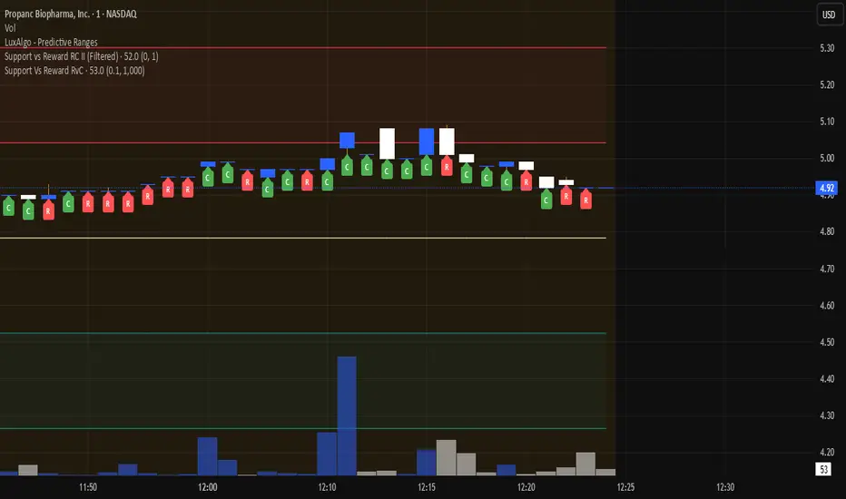
Support Vs Reward RvCSupport Vs Reward RvC
The Support Vs Reward RvC indicator is a simple yet effective tool that analyzes candle strength relative to both price movement and trading volume. Highlights candles where both body size and volume expand or contract, helping traders spot momentum shifts and weakening moves.
📌 How it works:
- “C” expect a Continuation of Trend in the next one or two candles;
- “R” expect a Reverse of Trend in the next one or two candles.
Works well on bigger time candles like 10-15 minutes but also gives important info in day-trading or scalping.
Marks candles where both body size and volume increase or decrease, making momentum shifts easy to spot. This smart candle analyzer reveals momentum surges and fading moves through body size and volume dynamics.
It compares each candle’s body size (open-to-close range) and its volume against the previous candle.
If both the body and volume are greater than the previous candle, a green “C” from Continuation of Trend is displayed under the bar.
If both the body and volume are smaller than the previous candle, a red “R” from Reverse of Trend is displayed under the bar.
Custom filters allow users to ignore insignificant moves by setting a minimum body size (as % of price) and a minimum volume threshold.
📌 Use cases:
Spot momentum shifts when price and volume expand together.
Identify weakening moves when both price action and volume contract.
Can be combined with other strategies for confirmation of entries or exits.
⚙️ Inputs:
Minimum Body Size % (of price): Filters out small candles.
Minimum Volume: Ensures only significant moves are marked.
This indicator is best used as a confirmation tool within a larger trading strategy, rather than as a standalone buy/sell signal.
Market Outlook Score (MOS)Overview
The "Market Outlook Score (MOS)" is a custom technical indicator designed for TradingView, written in Pine Script version 6. It provides a quantitative assessment of market conditions by aggregating multiple factors, including trend strength across different timeframes, directional movement (via ADX), momentum (via RSI changes), volume dynamics, and volatility stability (via ATR). The MOS is calculated as a weighted score that ranges typically between -1 and +1 (though it can exceed these bounds in extreme conditions), where positive values suggest bullish (long) opportunities, negative values indicate bearish (short) setups, and values near zero imply neutral or indecisive markets.
This indicator is particularly useful for traders seeking a holistic "outlook" score to gauge potential entry points or market bias. It overlays on a separate pane (non-overlay mode) and visualizes the score through horizontal threshold lines and dynamic labels showing the numeric MOS value along with a simple trading decision ("Long", "Short", or "Neutral"). The script avoids using the plot function for compatibility reasons (e.g., potential TradingView bugs) and instead relies on hline for static lines and label.new for per-bar annotations.
Key features:
Multi-Timeframe Analysis: Incorporates slope data from 5-minute, 15-minute, and 30-minute charts to capture short-term trends.
Trend and Strength Integration: Uses ADX to weight trend bias, ensuring stronger signals in trending markets.
Momentum and Volume: Includes RSI momentum impulses and volume deviations for added confirmation.
Volatility Adjustment: Factors in ATR changes to assess market stability.
Customizable Inputs: Allows users to tweak periods for lookback, ADX, and ATR.
Decision Labels: Automatically classifies the MOS into actionable categories with visual labels.
This indicator is best suited for intraday or swing trading on volatile assets like stocks, forex, or cryptocurrencies. It does not generate buy/sell signals directly but can be combined with other tools (e.g., moving averages or oscillators) for comprehensive strategies.
Inputs
The script provides three user-configurable inputs via TradingView's input panel:
Lookback Period (lookback):
Type: Integer
Default: 20
Range: Minimum 10, Maximum 50
Purpose: Defines the number of bars used in slope calculations for trend analysis. A shorter lookback makes the indicator more sensitive to recent price action, while a longer one smooths out noise for longer-term trends.
ADX Period (adxPeriod):
Type: Integer
Default: 14
Range: Minimum 5, Maximum 30
Purpose: Sets the smoothing period for the Average Directional Index (ADX) and its components (DI+ and DI-). Standard value is 14, but shorter periods increase responsiveness, and longer ones reduce false signals.
ATR Period (atrPeriod):
Type: Integer
Default: 14
Range: Minimum 5, Maximum 30
Purpose: Determines the period for the Average True Range (ATR) calculation, which measures volatility. Adjust this to match your trading timeframe—shorter for scalping, longer for positional trading.
These inputs allow customization without editing the code, making the indicator adaptable to different market conditions or user preferences.
Core Calculations
The MOS is computed through a series of steps, blending trend, momentum, volume, and volatility metrics. Here's a breakdown:
Multi-Timeframe Slopes:
The script fetches data from higher timeframes (5m, 15m, 30m) using request.security.
Slope calculation: For each timeframe, it computes the linear regression slope of price over the lookback period using the formula:
textslope = correlation(close, bar_index, lookback) * stdev(close, lookback) / stdev(bar_index, lookback)
This measures the rate of price change, where positive slopes indicate uptrends and negative slopes indicate downtrends.
Variables: slope5m, slope15m, slope30m.
ATR (Average True Range):
Calculated using ta.atr(atrPeriod).
Represents average volatility over the specified period. Used later to derive volatility stability.
ADX (Average Directional Index):
A detailed, manual implementation (not using built-in ta.adx for customization):
Computes upward movement (upMove = high - high ) and downward movement (downMove = low - low).
Derives +DM (Plus Directional Movement) and -DM (Minus Directional Movement) by filtering non-relevant moves.
Smooths true range (trur = ta.rma(ta.tr(true), adxPeriod)).
Calculates +DI and -DI: plusDI = 100 * ta.rma(plusDM, adxPeriod) / trur, similarly for minusDI.
DX: dx = 100 * abs(plusDI - minusDI) / max(plusDI + minusDI, 0.0001).
ADX: adx = ta.rma(dx, adxPeriod).
ADX values above 25 typically indicate strong trends; here, it's normalized (divided by 50) to influence the trend bias.
Volume Delta (5m Timeframe):
Fetches 5m volume: volume_5m = request.security(syminfo.tickerid, "5", volume, lookahead=barmerge.lookahead_on).
Computes a 12-period SMA of volume: avgVolume = ta.sma(volume_5m, 12).
Delta: (volume_5m - avgVolume) / avgVolume (or 0 if avgVolume is zero).
This measures relative volume spikes, where positive deltas suggest increased interest (bullish) and negative suggest waning activity (bearish).
MOS Components and Final Calculation:
Trend Bias: Average of the three slopes, normalized by close price and scaled by 100, then weighted by ADX influence: (slope5m + slope15m + slope30m) / 3 / close * 100 * (adx / 50).
Emphasizes trends in strong ADX conditions.
Momentum Impulse: Change in 5m RSI(14) over 1 bar, divided by 50: ta.change(request.security(syminfo.tickerid, "5", ta.rsi(close, 14), lookahead=barmerge.lookahead_on), 1) / 50.
Captures short-term momentum shifts.
Volatility Clarity: 1 - ta.change(atr, 1) / max(atr, 0.0001).
Measures ATR stability; values near 1 indicate low volatility changes (clearer trends), while lower values suggest erratic markets.
MOS Formula: Weighted average:
textmos = (0.35 * trendBias + 0.25 * momentumImpulse + 0.2 * volumeDelta + 0.2 * volatilityClarity)
Weights prioritize trend (35%) and momentum (25%), with volume and volatility at 20% each. These can be adjusted in code for experimentation.
Trading Decision:
A variable mosDecision starts as "Neutral".
If mos > 0.15, set to "Long".
If mos < -0.15, set to "Short".
Thresholds (0.15 and -0.15) are hardcoded but can be modified.
Visualization and Outputs
Threshold Lines (using hline):
Long Threshold: Horizontal dashed green line at +0.15.
Short Threshold: Horizontal dashed red line at -0.15.
Neutral Line: Horizontal dashed gray line at 0.
These provide visual reference points for MOS interpretation.
Dynamic Labels (using label.new):
Placed at each bar's index and MOS value.
Text: Formatted MOS value (e.g., "0.2345") followed by a newline and the decision (e.g., "Long").
Style: Downward-pointing label with gray background and white text for readability.
This replaces a traditional plot line, showing exact values and decisions per bar without cluttering the chart.
The indicator appears in a separate pane below the main price chart, making it easy to monitor alongside price action.
Usage Instructions
Adding to TradingView:
Copy the script into TradingView's Pine Script editor.
Save and add to your chart via the "Indicators" menu.
Select a symbol and timeframe (e.g., 1-minute for intraday).
Interpretation:
Long Signal: MOS > 0.15 – Consider bullish positions if supported by other indicators.
Short Signal: MOS < -0.15 – Potential bearish setups.
Neutral: Between -0.15 and 0.15 – Avoid trades or wait for confirmation.
Watch for MOS crossings of thresholds for momentum shifts.
Combine with price patterns, support/resistance, or volume for better accuracy.
Limitations and Considerations:
Lookahead Bias: Uses barmerge.lookahead_on for multi-timeframe data, which may introduce minor forward-looking bias in backtesting (use with caution).
No Alerts Built-In: Add custom alerts via TradingView's alert system based on MOS conditions.
Performance: Tested for compatibility; may require adjustments for illiquid assets or extreme volatility.
Backtesting: Use TradingView's strategy tester to evaluate historical performance, but remember past results don't guarantee future outcomes.
Customization: Edit weights in the MOS formula or thresholds to fit your strategy.
This indicator distills complex market data into a single score, aiding decision-making while encouraging users to verify signals with additional analysis. If you need modifications, such as restoring plot functionality or adding features, provide details for further refinement.

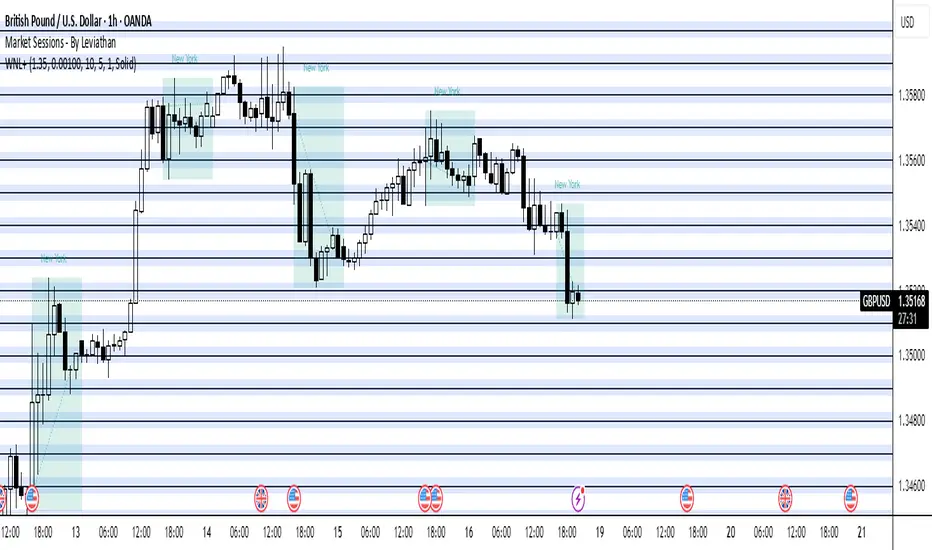
Whole Number Levels & ZonesWhole Number Levels & Zones Indicator
This indicator is designed to automatically plot key psychological price levels on your chart. These are typically round numbers (e.g., 1.35000 on GBP/USD) where trading activity often clusters, creating potential support and resistance.
How It's Used:
Traders use these lines and zones to identify areas where the price might pause, reverse, or break out.
Support: If the price is falling, it may find support and bounce off one of these levels.
Resistance: If the price is rising, it may face resistance and stall at one of these levels.
Confirmation: It can be used alongside other indicators and analysis techniques to confirm trade entries or exits.
Key Features:
Automatic or Manual Levels: You can either let the indicator automatically adjust the lines based on the current price or anchor them to a specific starting price you choose.
Customizable Intervals: You can set the distance between each line (e.g., every 50 or 100 pips).
Shaded Zones: You can enable a shaded box around each line to better visualize the price zones. The height of this box is adjustable.
Full Styling Control: You have complete control over the color, style (dashed, solid, dotted), and thickness of the lines and zones to match your chart's theme.
Order Blocks + Order-Flow ProxiesOrder Blocks + Order-Flow Proxies
This indicator combines structural analysis of order blocks with lightweight order-flow style proxies, providing a tool for chart annotation and contextual study. It is designed to help users visualize where significant structural shifts occur and how simple volume-based signals behave around those areas. The script does not guarantee profitable outcomes, nor does it issue financial advice. It is intended purely for research, learning, and discretionary use.
Conceptual Background
Order Blocks
An “order block” is a term often used to describe a zone on the chart where price left behind a significant reversal or imbalance before continuing strongly in the opposite direction. In practice, this can mean the last bullish or bearish candle before a strong breakout. Traders sometimes study these regions because they believe that unfilled resting orders may exist there, or simply because they mark important pivots in price structure. This indicator detects such moments by scanning for breaks of structure (BOS). When price pushes above or below recent swing levels with sufficient displacement, the script identifies the prior opposite candle as the potential order block.
Break of Structure
A break of structure in this context is defined when the closing price moves beyond the highest high or lowest low of a short lookback window. The script compares the magnitude of this break to an ATR-based displacement filter. This helps ensure that only meaningful moves are marked rather than small, random fluctuations.
Order-Flow Proxies
Traditional order flow analysis may use bid/ask data, footprint charts, or volume profiles. Because TradingView scripts cannot access true order-book data, this indicator instead uses proxy signals derived from standard chart data:
Delta (proxy): Estimated imbalance of buying vs. selling pressure, approximated using bar direction and volume.
Imbalance ratio: Normalizes delta by total volume, ranging between -1 and +1 in theory.
Cumulative Delta (CVD): Running sum of delta over time.
Effort vs. Result (EvR): A comparison between volume and actual bar movement, highlighting cases where large effort produced little result (or vice versa).
These are not real order-flow measurements, but rather simple mathematical constructs that mimic some of its logic.
How the Script Works
Detecting Break of Structure
The user specifies a swing length. When price closes above the recent high (for bullish BOS) or below the recent low (for bearish BOS), a potential shift is recorded.
To qualify, the breakout must exceed a displacement filter proportional to the ATR. This helps filter out weak moves.
Locating the Order Block Candle
Once a BOS is confirmed, the script looks back within a short window to find the last opposite-colored candle.
The high/low or open/close of that candle (depending on user settings) is marked as the potential order block zone.
Drawing and Maintaining Zones
Each order block is represented as a colored rectangle extending forward in time.
Bullish zones are teal by default, bearish zones are red.
Zones extend until invalidated (price closing or wicking beyond them, depending on user preference) or until a user-defined lifespan expires.
A pruning mechanism ensures that only the most recent set number of zones remain, preventing chart overload.
Monitoring Touches
The script checks whether the current bar’s range overlaps any existing order block.
If so, the “closest” zone is considered touched, and a label may appear on the chart.
Confirmation Filters
Touches can optionally be confirmed by order-flow proxies.
For a bullish confirmation, the following must align:
Imbalance ratio above threshold,
Delta EMA positive,
Effort vs. Result positive.
For a bearish confirmation, the opposite holds true.
Optionally, a higher-timeframe EMA slope filter can gate these confirmations. For example, a bullish confirmation may only be accepted if the higher-timeframe EMA is sloping upward.
Alerts
Users may create alerts based on conditions such as “bullish touch confirmed” or “bearish touch confirmed.”
Alerts can be gated to only fire after bar close, reducing intrabar noise.
Standard alertcondition calls are provided, and optional inline alert() calls can be enabled.
Inputs and Customization
Structure & OB
Swing length: Defines how many bars back to check for BOS.
ATR length & displacement factor: Adjust sensitivity for structural breaks.
Body vs. wick reference: Choose whether zones are based on candle bodies or full ranges.
Invalidation rule: Pick between wick breach or close beyond the level.
Lifespan (bars): Limit how long a zone remains active.
Max keep: Cap the number of zones stored to reduce clutter.
Order-Flow Proxies
Delta mode: Choose between “Close vs Previous Close” or “Body” for delta calculation.
EMA length: Smooths the delta/imbalance series.
Z-score lookback: Defines the averaging window for EvR.
Confirmation thresholds: Adjust the imbalance levels required for long/short confirmation.
Higher Timeframe Filter
Enable HTF gate: Optional filter requiring higher-timeframe EMA slope alignment.
HTF timeframe & EMA length: Configurable for context alignment.
Style
Colors and transparency for bullish and bearish zones.
Border color customization.
Alerts
Enable inline alerts: Optional direct calls to alert().
Alerts on bar close only: Helps avoid multiple firings during bar formation.
Practical Use
This tool is best seen as a way to annotate charts and to study how simple volume-derived signals behave near important structural levels. Some users may:
Observe whether order blocks line up with later price reactions.
Study how imbalance or cumulative delta conditions align with these zones.
Use it in a discretionary workflow to highlight areas of interest for deeper analysis.
Because the proxies are based only on candle OHLCV data, they are approximations. They cannot replace true depth-of-market analysis. Similarly, order block detection here is one specific algorithmic interpretation; other traders may define order blocks differently.
Limitations and Disclaimers
This indicator does not predict future price movement.
It does not access real order book or tick-by-tick data. All signals are derived from bar OHLCV.
Past performance of signals or zones does not guarantee future results.
The script is for educational and informational purposes only. It is not financial advice.
Users should test thoroughly, adjust parameters to their own instruments and timeframes, and use it in combination with broader analysis.
Summary
The Order Blocks + Order-Flow Proxies script is an experimental study tool that:
Detects potential order blocks using a displacement-filtered break of structure.
Marks these zones as boxes that persist until invalidation or expiry.
Provides lightweight order-flow-style proxies such as delta, imbalance, CVD, and effort vs. result.
Allows confirmation of zone touches through these proxies and optional higher-timeframe context.
Offers flexible customization, alerting, and chart-style options.
It is not a trading system by itself but rather a framework for studying price/volume behavior around structurally significant areas. With careful exploration, it can give users new ways to visualize market structure and to understand how simple flow-like measures behave in those contexts.

Nasdaq Sentiment DashboardBuilds a composite sentiment state — RISK-ON / NEUTRAL / RISK-OFF — using three legs:
Volatility: CBOE VXN vs its moving average and absolute thresholds (risk-on when low & below MA; risk-off when high & above MA).
Breadth (quality of participation): QQEW/QQQ ratio vs its MA (equal-weight beating cap-weight = healthier breadth).
Advance/Decline (intraday breadth): advdec.nq vs its MA, with a magnitude filter (ignores tiny A/D days).
How it works
Pulls each series on your chosen signal timeframe (default Daily).
Creates binary signals per leg:
Vol: volOn if VXN < MA and < vxnLower; volOff if VXN > MA and > vxnUpper.
Breadth: brOn if QQEW/QQQ is above its MA by a deadband; brOff if below.
A/D: adOn if A/D > MA and above adMin; adOff if below MA and < -adMin.
Scores each leg (+1 on, −1 off, 0 neutral) → sums to −3…+3.
State rule (default): RISK-ON if score ≥ +2, RISK-OFF if ≤ −2, else NEUTRAL (i.e., need 2 of 3 to agree).
Detects flips (changes in state) and provides alert conditions that fire only on the flip bar.
What you see
Lines for VXN & MA, QQEW/QQQ & MA, A/D & MA.
Background color shows current composite state.
Triangle markers on the flip bar (up for ON, down for OFF).
A top-right table summarizing state, each leg vs its MA, and the composite score.
How to tune
Vol thresholds: vxnLower / vxnUpper.
Breadth whipsaw control: deadbandBps around the ratio’s MA.
A/D sensitivity: adMin and adMaLen.
Stricter regime: require all 3 to agree by changing the state line to score == 3 / -3.

Simple NASDAQ TrackerNasdaq Tracker, is an indicator to use while trading nasdaq stocks.
It uses the chart as a market tracker too know what the overall blue chip market is doing, if it trades above the moving average, it indicates the the overall market is going upp or down.

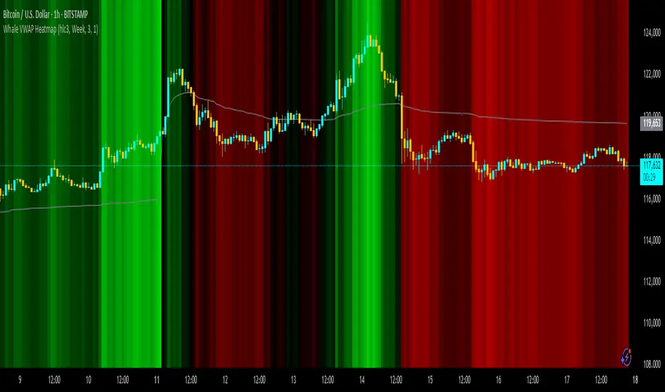
Whale VWAP HeatmapWhat it does
This indicator paints a heatmap around an anchored VWAP to make market context obvious at a glance.
Above VWAP → cyan background
Below VWAP → amber background
The farther price is from VWAP (in %), the stronger the color intensity.
How it works
Uses an anchored VWAP that resets on the period you choose (Session / Week / Month / Quarter / Year / Decade / Century / Earnings / Dividends / Splits).
Computes the percentage distance between price and VWAP, then maps that distance to background opacity.
Optional VWAP line can be shown/hidden.
Inputs (Settings)
Anchor Period — choose when VWAP resets (Session→Year, plus E/D/S options).
Source — price source (default hlc3).
Hide on D/W/M (Session only) — hides the script on Daily/Weekly/Monthly when anchor=Session (avoids NA behavior).
Enable Heatmap — turn background coloring on/off.
Max distance for full color (%) — at/above this % from VWAP, color hits full intensity (typical 0.5–2% depending on volatility).
Show VWAP Line / Line Color/Width — visual preference.
How to read it (quick playbook)
Context first: color tells you if price is trading above/below “fair value” (VWAP).
Intensity = how stretched price is from VWAP.
Use it to frame bias (above/below VWAP) and to avoid chasing extended moves.
Notes & limitations
Requires volume (VWAP is volume-weighted). If the data vendor doesn’t provide volume for the symbol, the script will stop.
For intraday, Session anchor is common. For swing/context, try Week or Month.
Volume with Buying/Selling PowerUnlock deeper market insights with this volume indicator that goes beyond basic volume analysis:
- Buying & Selling Volume Breakdown: Distinguishes between buying and selling pressure so you can spot real shifts in market sentiment.
- Adaptive Volume Coloring: Bars colored by previous close or buy/sell balance for instant clarity.
- Volume Power Signals: Visualizes buying and selling volume power using both raw and normalized calculations.
- Buy/Sell Ratio Coloring: Optionally color bars based on relative buy/sell strength for quick visual cues.

Volumes (with MA indicator)This indicator provides a comprehensive volume analysis packed with features to enhance your trading decisions:
- Volume Bars Colored by Price Action: Volume bars are colored green or red based on the relationship between current and previous closes for intuitive trend awareness.
- Moving Average on Volume: Displays dynamic moving averages of volume on daily or weekly timeframes helping gauge volume trends.
- Low Relative Volume Highlighting: Spot volume bars with the lowest relative volume for deeper insight.
- Volume Peaks and Labels: Marks highest volumes and volume spikes using customizable labels, including volume change percentages and shares counts.
- Volume Buzz Indicator: Visual indication of volume momentum with colored buzz plots.
- Volume Statistics Table: Displays average volume, average dollar volume, volume up/down ratio, and real-time volume stats in a convenient table on the chart.
- High Customizability: Multiple input options to tailor colors, sizes, labels, and data to your preferences.
Dual Custom Index with SpreadDual Custom Index with Spread
Create powerful custom indices from any instruments and analyze their relative strength dynamics
Overview
This advanced indicator allows you to build two completely customizable indices from your choice of instruments and analyze their spread relationship. Perfect for inter-market analysis, sector rotation strategies, currency strength comparisons, and sophisticated relative performance studies.
Key Features
🔧 Fully Customizable Index Construction
Build each index from up to 6 instruments with individual weightings
Enable/disable instruments on the fly without losing settings
Automatic weight validation ensures mathematically accurate calculations
Invert functionality for instruments that move opposite to index strength
📊 Advanced ADX-Based Methodology
Uses sophisticated ADX +DI/-DI directional bias calculations
Normalized bias calculation for consistent scaling across different instruments
Optimized default settings for intraday trading with full customization options
Professional-grade smoothing and filtering options
📈 Dual Analysis Modes
Difference Mode: Shows absolute strength difference (Index1 - Index2)
Ratio Mode: Shows relative performance ratio (Index1 / Index2)
Additional spread smoothing for cleaner signals
🎨 Professional Display Options
Custom labels with full color, size, and positioning control
Dynamic "Follow Line" labels that move with your data
Static corner positioning for reference displays
Clean error messaging and validation feedback
Use Cases
Gold Trading: Create gold strength vs USD strength indices for precise market timing
Sector Analysis: Compare technology vs financial sector strength for rotation strategies
Currency Strength: Build custom currency baskets for advanced forex analysis
Commodity Spreads: Analyze relative strength between different commodity groups
Regional Markets: Compare strength between different geographical market indices
Crypto Analysis: Track relative performance between different cryptocurrency sectors
Technical Specifications
Instruments per Index: Up to 6 with individual enable/disable
Weight Validation: Automatic 100% total weight enforcement
Calculation Method: ADX-based directional bias with trend strength weighting
Smoothing Options: Multiple levels of customizable smoothing
Error Handling: Professional validation with clear user feedback
Optimization Tips
Intraday Trading: Use DI Length 3-7 for faster response
Daily Analysis: Use DI Length 10-14 for smoother signals
Noisy Markets: Increase Final Smoothing for cleaner signals
Trending Markets: Lower smoothing values for faster reaction
Perfect for traders who need sophisticated inter-market analysis tools beyond standard indicators. Whether you're analyzing gold vs dollar dynamics, sector rotation opportunities, or custom currency strength relationships, this indicator provides institutional-grade analysis capabilities with complete customization flexibility.

VIX > 20/25 HighlightThis indicator tracks the CBOE Volatility Index (VIX) and highlights when volatility exceeds critical thresholds.
Plots the VIX with dashed reference lines at 20 and 25.
Background turns orange when the VIX is above 20.
Background turns bright red when the VIX is above 25.
Includes alert conditions to notify you when the VIX crosses above 20 or 25.
Use this tool to quickly visualize periods of elevated market stress and manage risk accordingly.
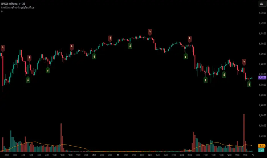
Market Structure Trend Change by TenAMTraderMarket Structure Trend Change Indicator
Description:
This indicator detects changes in market trend by analyzing swing highs and lows to identify Higher Highs (HH), Higher Lows (HL), Lower Highs (LH), and Lower Lows (LL). It helps traders quickly see potential reversals and trend continuation points.
Features:
Automatically identifies pivots based on configurable left and right bars.
Labels pivot points (HH, HL, LH, LL) directly on the chart (text-only for clarity).
Generates buy and sell signals when a trend change is detected:
Buy Signal: HL after repeated LLs.
Sell Signal: LH after repeated HHs.
Fully customizable signal appearance: arrow type, circle, label, color, and size.
Adjustable minimum number of repeated highs or lows before a trend change triggers a signal.
Alerts built in for automated notifications when buy/sell signals occur.
Default Settings:
Optimized for a 10-minute chart.
Default “Min repeats before trend change” and pivot left/right bars are set for typical 10-min price swings.
User Customization:
Adjust the “Pivot Left Bars,” “Pivot Right Bars,” and “Min repeats before trend change” to match your trading style, chart timeframe, and volatility.
Enable pivot labels for visual clarity if desired.
Set alerts to receive notifications of trend changes in real time.
How to Use:
Apply the indicator to any chart and timeframe. It works best on swing-trading or trend-following strategies.
Watch for Buy/Sell signals in conjunction with your other analysis, such as volume, support/resistance, or other indicators.
Legal Disclaimer:
This indicator is provided for educational and informational purposes only. It is not financial advice. Trading involves substantial risk, and past performance is not indicative of future results. Users should trade at their own risk and are solely responsible for any gains or losses incurred.
Traders Reality Rate Spike Monitor 0.1 betaTraders Reality Rate Spike Monitor
## **Early Warning System for Interest Rate-Driven Market Crashes**
Based on critical market analysis revealing the dangerous correlation between interest rate spikes and major market selloffs, this indicator provides **three-tier alerts** for US 10-Year Treasury yield acceleration.
### **📊 Key Market Intelligence:**
**Historical Precedent:** The 2018 market crash occurred when unrealized bank losses hit $256 billion with interest rates at just 2.5%. **Current unrealized losses have reached $560 billion** - more than double the 2018 levels - while rates sit at 4.5%.
**Critical Vulnerabilities:**
- **$559 billion in tech sector debt** maturing through 2025
- **65% of investment-grade debt** rated BBB (vulnerable to adverse conditions)
- **$9.5 trillion in total debt** requiring refinancing
- Every 1% rate increase costs the economy **$360 billion annually**
### **🚨 Alert System:**
**📊 WATCH (20+ basis points/3 days):** Early positioning signal
**⚠️ WARNING (30+ basis points/3 days):** Prepare for volatility
**🚨 CRITICAL (40+ basis points/3 days):** Historical crash threshold
### **💡 Why This Matters:**
Interest rate spikes historically trigger major market corrections:
- **2018:** 70 basis points spike → 20% S&P 500 crash
- **2025:** Similar pattern led to massive selloffs
- **Current risk:** 2x higher unrealized losses than 2018
### **⚡ Features:**
✅ **Zero chart clutter** - invisible until alerts trigger
✅ **Dynamic calculation** - automatically adjusts to current yield levels
✅ **Multi-timeframe compatibility** - works on any chart timeframe
✅ **Professional alerts** - with actual basis point calculations
### **🎯 Use Case:**
Perfect for traders and investors who understand that **debt refinancing pressure** and **unrealized bank losses** create systemic risks that manifest through interest rate volatility. When rates spike rapidly, leveraged positions unwind and markets crash.
**"Every point costs us $360 billion a year. Think of that."** - This indicator helps you see those critical rate movements before the market does.
---
**Disclaimer:** This indicator is for educational purposes. Past performance does not guarantee future results. Always manage risk appropriately.
---
This description positions your indicator as a **serious professional tool** based on real market analysis rather than just another technical indicator! 🚀

Correlation Heatmap Matrix [TradingFinder] 20 Assets Variable🔵 Introduction
Correlation is one of the most important statistical and analytical metrics in financial markets, data mining, and data science. It measures the strength and direction of the relationship between two variables.
The correlation coefficient always ranges between +1 and -1 : a perfect positive correlation (+1) means that two assets or currency pairs move together in the same direction and at a constant ratio, a correlation of zero (0) indicates no clear linear relationship, and a perfect negative correlation (-1) means they move in exactly opposite directions.
While the Pearson Correlation Coefficient is the most common method for calculation, other statistical methods like Spearman and Kendall are also used depending on the context.
In financial market analysis, correlation is a key tool for Forex, the Stock Market, and the Cryptocurrency Market because it allows traders to assess the price relationship between currency pairs, stocks, or coins. For example, in Forex, EUR/USD and GBP/USD often have a high positive correlation; in stocks, companies from the same sector such as Apple and Microsoft tend to move similarly; and in crypto, most altcoins show a strong positive correlation with Bitcoin.
Using a Correlation Heatmap in these markets visually displays the strength and direction of these relationships, helping traders make more accurate decisions for risk management and strategy optimization.
🟣 Correlation in Financial Markets
In finance, correlation refers to measuring how closely two assets move together over time. These assets can be stocks, currency pairs, commodities, indices, or cryptocurrencies. The main goal of correlation analysis in trading is to understand these movement patterns and use them for risk management, trend forecasting, and developing trading strategies.
🟣 Correlation Heatmap
A correlation heatmap is a visual tool that presents the correlation between multiple assets in a color-coded table. Each cell shows the correlation coefficient between two assets, with colors indicating its strength and direction. Warm colors (such as red or orange) represent strong negative correlation, cool colors (such as blue or cyan) represent strong positive correlation, and mid-range tones (such as yellow or green) indicate correlations that are close to neutral.
🟣 Practical Applications in Markets
Forex : Identify currency pairs that move together or in opposite directions, avoid overexposure to similar trades, and spot unusual divergences.
Crypto : Examine the dependency of altcoins on Bitcoin and find independent movers for portfolio diversification.
Stocks : Detect relationships between stocks in the same industry or find outliers that move differently from their sector.
🟣 Key Uses of Correlation in Trading
Risk management and diversification: Select assets with low or negative correlation to reduce portfolio volatility.
Avoiding overexposure: Prevent opening multiple positions on highly correlated assets.
Pairs trading: Exploit temporary deviations between historically correlated assets for arbitrage opportunities.
Intermarket analysis: Study the relationships between different markets like stocks, currencies, commodities, and bonds.
Divergence detection: Spot when two typically correlated assets move apart as a possible trend change signal.
Market forecasting: Use correlated asset movements to anticipate others’ behavior.
Event reaction analysis: Evaluate how groups of assets respond to economic or political events.
❗ Important Note
It’s important to note that correlation does not imply causation — it only reflects co-movement between assets. Correlation is also dynamic and can change over time, which is why analyzing it across multiple timeframes provides a more accurate picture. Combining correlation heatmaps with other analytical tools can significantly improve the precision of trading decisions.
🔵 How to Use
The Correlation Heatmap Matrix indicator is designed to analyze and manage the relationships between multiple assets at once. After adding the tool to your chart, start by selecting the assets you want to compare (up to 20).
Then, choose the Correlation Period that fits your trading strategy. Shorter periods (e.g., 20 bars) are more sensitive to recent price movements, making them suitable for short-term trading, while longer periods (e.g., 100 or 200 bars) provide a broader view of correlation trends over time.
The indicator outputs a color-coded matrix where each cell represents the correlation between two assets. Warm colors like red and orange signal strong negative correlation, while cool colors like blue and cyan indicate strong positive correlation. Mid-range tones such as yellow or green suggest correlations that are close to neutral. This visual representation makes it easy to spot market patterns at a glance.
One of the most valuable uses of this tool is in portfolio risk management. Portfolios with highly correlated assets are more vulnerable to market swings. By using the heatmap, traders can find assets with low or negative correlation to reduce overall risk.
Another key benefit is preventing overexposure. For example, if EUR/USD and GBP/USD have a high positive correlation, opening trades on both is almost like doubling the position size on one asset, increasing risk unnecessarily. The heatmap makes such relationships clear, helping you avoid them.
The indicator is also useful for pairs trading, where a trader identifies assets that are usually correlated but have temporarily diverged — a potential arbitrage or mean-reversion opportunity.
Additionally, the tool supports intermarket analysis, allowing traders to see how movements in one market (e.g., crude oil) may impact others (e.g., the Canadian dollar). Divergence detection is another advantage: if two typically aligned assets suddenly move in opposite directions, it could signal a major trend shift or a news-driven move.
Overall, the Correlation Heatmap Matrix is not just an analytical indicator but also a fast, visual alert system for monitoring multiple markets at once. This is particularly valuable for traders in fast-moving environments like Forex and crypto.
🔵 Settings
🟣 Logic
Correlation Period : Number of bars used to calculate correlation between assets.
🟣 Display
Table on Chart : Enable/disable displaying the heatmap directly on the chart.
Table Size : Choose the table size (from very small to very large).
Table Position : Set the table location on the chart (top, middle, or bottom in various alignments).
🟣 Symbol Custom
Select Market : Choose the market type (Forex, Stocks, Crypto, or Custom).
Symbol 1 to Symbol 20: In custom mode, you can define up to 20 assets for correlation calculation.
🔵 Conclusion
The Correlation Heatmap Matrix is a powerful tool for analyzing correlations across multiple assets in Forex, crypto, and stock markets. By displaying a color-coded table, it visually conveys both the strength and direction of correlations — warm colors for strong negative correlation, cool colors for strong positive correlation, and mid-range tones such as yellow or green for near-zero or neutral correlation.
This helps traders select assets with low or negative correlation for diversification, avoid overexposure to similar trades, identify arbitrage and pairs trading opportunities, and detect unusual divergences between typically aligned assets. With support for custom mode and up to 20 symbols, it offers high flexibility for different trading strategies, making it a valuable complement to technical analysis and risk management.
