The Composite Predictive Index-(CPI-IG v5)**The Composite Predictive Index (CPI-IG v5) is a comprehensive Market Institutional Indicator created by Alcides Davila and is an overlay indicator designed for institutional-grade market analysis and trading signals. Nevertheless, Daily-Short-Term Traders may also take advantage of this robust and efficient indicator. Still, they must make the necessary adjustments for scalping and for short-, medium-, and long-term trading. It synthesizes multiple technical factors (e.g., RSI, MACD, Bollinger Bands, VWAP, EMAs/SMAs, volume pressure, delta volume, manual sentiment/news inputs) into a weighted Z-score-based probability model (probUp) for forecasting price direction—generating buy/sell gates, strong/ultra signals, and short-term projections. It supports multi-timeframe alignment (HTF/LTF), breakout/breakdown detection with retests, internal backtesting, and alerts, while displaying dashboards for probabilities, stats, oscillators (bull/bear/neutral), major indexes (S&P, DJIA, Nasdaq), and ETFs (SPY, QQQ, etc.).
In terms of structure, it's highly reliable and productive: modular code with error-handling (safe divisions, approximations for tanh/erf), customizable modes (scalp to long-term), efficient resource use (max_bars_back=500), and cooldowns to prevent alert spam. Quality is strong, with transparent math, visual flexibility, and no apparent logic bugs—though real-world performance depends on market conditions and user tuning.
Investors can benefit significantly by using it for data-driven decisions, reducing bias through probability scores (e.g., >68% for buys), timing entries/exits with cross-confirmations, and monitoring broader market context via indexes/ETFs. It's especially useful for trend-following or reversal strategies, potentially improving win rates in volatile markets, but, like all indicators, it's not foolproof—use it in combination with risk management.
Strongest feature: The probability engine, which normalizes diverse signals into a robust, Z-scaled probUp metric (via the normal CDF or a logistic), enabling a quantifiable edge over traditional oscillators. Cheers...!!!
Pesquisar nos scripts por "spy"

The Composite Predictive Index-(CPI-IG v5)*The Composite Predictive Index (CPI-IG v5) is the creation of Alcides Davila (Alcides0265), Daily Trader. This indicator, which I call "The Predictor Index" and is also known as "The Composite Predictive Index (CPI-IG v5)", is an overlay indicator designed for institutional-grade market analysis and trading signals. Daily traders could also take advantage of this indicator by making the necessary adjustments for each trading session, whether for short-term (scalping), medium-term, or long-term investments. It synthesizes multiple technical factors (e.g., RSI, MACD, Bollinger Bands, VWAP, EMAs/SMAs, volume pressure, delta volume, manual sentiment/news inputs) into a weighted Z-score-based probability model (probUp) for forecasting price direction—generating buy/sell gates, strong/ultra signals, and short-term projections. It supports multi-timeframe alignment (HTF/LTF), breakout/breakdown detection with retests, internal backtesting, and alerts, while displaying dashboards for probabilities, stats, oscillators (bull/bear/neutral), major indexes (S&P, DJIA, Nasdaq), and ETFs (SPY, QQQ, etc.).
In terms of structure, it's highly reliable and productive: modular code with error-handling (safe divisions, approximations for tanh/erf), customizable modes (scalp to long-term), efficient resource use (max_bars_back=500), and cooldowns to prevent alert spam. Quality is strong, with transparent math, visual flexibility, and no apparent logic bugs—though real-world performance depends on market conditions and user tuning.
Investors can benefit significantly by using it for data-driven decisions, reducing bias through probability scores (e.g., >68% for buys), timing entries/exits with cross-confirmations, and monitoring broader market context via indexes/ETFs. It's especially useful for trend-following or reversal strategies, potentially improving win rates in volatile markets, but, like all indicators, it's not foolproof—use it in combination with risk management.
Strongest feature: The probability engine, which normalizes diverse signals into a robust, Z-scaled probUp metric (via the normal CDF or a logistic), enabling a quantifiable edge over traditional oscillators.

The Composite Predictive Index (CPI-IG v5)The Composite Predictive Index (CPI-IG v5) is the creation of Alcides Davila (Alcides0265), Daily Trader. This indicator, which I call "The Predictor Index" and is also known as "The Composite Predictive Index (CPI-IG v5)", is an overlay indicator designed for institutional-grade market analysis and trading signals. Daily traders could also take advantage of this indicator by making the necessary adjustments for the trading sessions, whether for short (scalping), medium, or long-term investments. It synthesizes multiple technical factors (e.g., RSI, MACD, Bollinger Bands, VWAP, EMAs/SMAs, volume pressure, delta volume, manual sentiment/news inputs) into a weighted Z-score-based probability model (probUp) for forecasting price direction—generating buy/sell gates, strong/ultra signals, and short-term projections. It supports multi-timeframe alignment (HTF/LTF), breakout/breakdown detection with retests, internal backtesting, and alerts, while displaying dashboards for probabilities, stats, oscillators (bull/bear/neutral), major indexes (S&P, DJIA, Nasdaq), and ETFs (SPY, QQQ, etc.).
In terms of structure, it's highly reliable and productive: modular code with error-handling (safe divisions, approximations for tanh/erf), customizable modes (scalp to long-term), efficient resource use (max_bars_back=500), and cooldowns to prevent alert spam. Quality is strong, with transparent math, visual flexibility, and no apparent logic bugs—though real-world performance depends on market conditions and user tuning.
Investors can benefit significantly by using it for data-driven decisions, reducing bias through probability scores (e.g., >68% for buys), timing entries/exits with cross-confirmations, and monitoring broader market context via indexes/ETFs. It's especially useful for trend-following or reversal strategies, potentially improving win rates in volatile markets, but, like all indicators, it's not foolproof—use it in combination with risk management.
Strongest feature: The probability engine, which normalizes diverse signals into a robust, Z-scaled probUp metric (via the normal CDF or a logistic), enabling a quantifiable edge over traditional oscillators.

Absorption RatioThe Hidden Connections Between Markets
Financial markets are not isolated islands. When panic spreads, seemingly unrelated assets suddenly begin moving in lockstep. Stocks, bonds, commodities, and currencies that normally provide diversification benefits start falling together. This phenomenon, where correlations spike during crises, has devastated portfolios throughout history. The Absorption Ratio provides a quantitative measure of this hidden fragility.
The concept emerged from research at State Street Associates, where Mark Kritzman, Yuanzhen Li, Sebastien Page, and Roberto Rigobon developed a novel application of principal component analysis to measure systemic risk. Their 2011 paper in the Journal of Portfolio Management demonstrated that when markets become tightly coupled, the variance explained by the first few principal components increases dramatically. This concentration of variance signals elevated systemic risk.
What the Absorption Ratio Measures
Principal component analysis, or PCA, is a statistical technique that identifies the underlying factors driving a set of variables. When applied to asset returns, the first principal component typically captures broad market movements. The second might capture sector rotations or risk-on/risk-off dynamics. Additional components capture increasingly idiosyncratic patterns.
The Absorption Ratio measures the fraction of total variance absorbed or explained by a fixed number of principal components. In the original research, Kritzman and colleagues used the first fifth of the eigenvectors. When this fraction is high, it means a small number of factors are driving most of the market movements. Assets are moving together, and diversification provides less protection than usual.
Consider an analogy: imagine a room full of people having independent conversations. Each person speaks at different times about different topics. The total "variance" of sound in the room comes from many independent sources. Now imagine a fire alarm goes off. Suddenly everyone is talking about the same thing, moving in the same direction. The variance is now dominated by a single factor. The Absorption Ratio captures this transition from diverse, independent behavior to unified, correlated movement.
The Implementation Approach
TradingView does not support matrix algebra required for true principal component analysis. This implementation uses a closely related proxy: the average absolute correlation across a universe of major asset classes. This approach captures the same underlying phenomenon because when assets are highly correlated, the first principal component explains more variance by mathematical necessity.
The asset universe includes eight ETFs representing major investable categories: SPY and QQQ for large cap US equities, IWM for small caps, EFA for developed international markets, EEM for emerging markets, TLT for long-term treasuries, GLD for gold, and USO for oil. This selection provides exposure to equities across geographies and market caps, plus traditional diversifying assets.
From eight assets, there are twenty-eight unique pairwise correlations. The indicator calculates each using a rolling window, takes the absolute value to measure coupling strength regardless of direction, and averages across all pairs. This average correlation is then transformed to match the typical range of published Absorption Ratio values.
The transformation maps zero average correlation to an AR of 0.50 and perfect correlation to an AR of 1.00. This scaling aligns with empirical observations that the AR typically fluctuates between 0.60 and 0.95 in practice.
Interpreting the Regimes
The indicator classifies systemic risk into four regimes based on AR levels.
The Extreme regime occurs when the AR exceeds 0.90. At this level, nearly all asset classes are moving together. Diversification has largely failed. Historically, this regime has coincided with major market dislocations: the 2008 financial crisis, the 2020 COVID crash, and significant correction periods. Portfolios constructed under normal correlation assumptions will experience larger drawdowns than expected.
The High regime, between 0.80 and 0.90, indicates elevated systemic risk. Correlations across asset classes are above normal. This often occurs during the build-up to stress events or during volatile periods where fear is spreading but has not reached panic levels. Risk management should be more conservative.
The Normal regime covers AR values between 0.60 and 0.80. This represents typical market conditions where some correlation exists between assets but diversification still provides meaningful benefits. Standard portfolio construction assumptions are reasonable.
The Low regime, below 0.60, indicates that assets are behaving relatively independently. Diversification is working well. Idiosyncratic factors dominate returns rather than systematic risk. This environment is favorable for active management and security selection strategies.
The Relationship to Portfolio Construction
The implications for portfolio management are significant. Modern portfolio theory assumes correlations are stable and uses historical estimates to construct efficient portfolios. The Absorption Ratio reveals that this assumption is violated precisely when it matters most.
When AR is elevated, the effective number of independent bets in a diversified portfolio shrinks. A portfolio holding stocks, bonds, commodities, and real estate might behave as if it holds only one or two positions during high AR periods. Position sizing based on normal correlation estimates will underestimate portfolio risk.
Conversely, when AR is low, true diversification opportunities expand. The same nominal portfolio provides more independent return streams. Risk can be deployed more aggressively while maintaining the same effective exposure.
Component Analysis
The indicator separately tracks equity correlations and cross-asset correlations. These components tell different stories about market structure.
Equity correlations measure coupling within the stock market. High equity correlation indicates broad risk-on or risk-off behavior where all stocks move together. This is common during both rallies and selloffs driven by macroeconomic factors. Stock pickers face headwinds when equity correlations are elevated because individual company fundamentals matter less than market beta.
Cross-asset correlations measure coupling between different asset classes. When stocks, bonds, and commodities start moving together, traditional hedges fail. The classic 60/40 stock/bond portfolio, for example, assumes negative or low correlation between equities and treasuries. When cross-asset correlation spikes, this assumption breaks down.
During the 2022 market environment, for instance, both stocks and bonds fell significantly as inflation and rate hikes affected all assets simultaneously. High cross-asset correlation warned that the usual defensive allocations would not provide their expected protection.
Mean Reversion Characteristics
Like most risk metrics, the Absorption Ratio tends to mean-revert over time. Extremely high AR readings eventually normalize as panic subsides and assets return to more independent behavior. Extremely low readings tend to rise as some level of systematic risk always reasserts itself.
The indicator tracks AR in statistical terms by calculating its Z-score relative to the trailing distribution. When AR reaches extreme Z-scores, the probability of normalization increases. This creates potential opportunities for strategies that bet on mean reversion in systemic risk.
A buy signal triggers when AR recovers from extremely elevated levels, suggesting the worst of the correlation spike may be over. A sell signal triggers when AR rises from unusually low levels, warning that complacency about diversification benefits may be excessive.
Momentum and Trend
The rate of change in AR carries information beyond the absolute level. Rapidly rising AR suggests correlations are increasing and systemic risk is building. Even if AR has not yet reached the high regime, acceleration in coupling should prompt increased vigilance.
Falling AR momentum indicates normalizing conditions. Correlations are decreasing and assets are returning to more independent behavior. This often occurs in the recovery phase following stress events.
Practical Application
For asset allocators, the AR provides guidance on how much diversification benefit to expect from a given allocation. During high AR periods, reducing overall portfolio risk makes sense because the usual diversifiers provide less protection. During low AR periods, standard or even aggressive allocations are more appropriate.
For risk managers, the AR serves as an early warning indicator. Rising AR often precedes large market moves and volatility spikes. Tightening risk limits before correlations reach extreme levels can protect capital.
For systematic traders, the AR provides a regime filter. Mean reversion strategies may work better during high AR periods when panics create overshooting. Momentum strategies may work better during low AR periods when trends can develop independently across assets.
Limitations and Considerations
The proxy methodology introduces some approximation error relative to true PCA-based AR calculations. The asset universe, while representative, does not include all possible diversifiers. Correlation estimates are inherently backward-looking and can change rapidly.
The transformation from average correlation to AR scale is calibrated to match typical published ranges but is not mathematically equivalent to the eigenvalue ratio. Users should interpret levels directionally rather than as precise measurements.
Correlation regimes can persist longer than expected. Mean reversion signals indicate elevated probability of normalization but do not guarantee timing. High AR can remain elevated throughout extended crisis periods.
References
Kritzman, M., Li, Y., Page, S., and Rigobon, R. (2011). Principal Components as a Measure of Systemic Risk. Journal of Portfolio Management, 37(4), 112-126.
Kritzman, M., and Li, Y. (2010). Skulls, Financial Turbulence, and Risk Management. Financial Analysts Journal, 66(5), 30-41.
Billio, M., Getmansky, M., Lo, A., and Pelizzon, L. (2012). Econometric Measures of Connectedness and Systemic Risk in the Finance and Insurance Sectors. Journal of Financial Economics, 104(3), 535-559.

Gamma Conviction Oscillator LiteGamma Conviction Oscillator Lite
A volume-weighted momentum oscillator designed to help traders visualize conviction in gamma-heavy instruments (SPY, TSLA, NVDA, MSTR, COIN, HOOD, etc.). This LITE edition is fully functional and educational, focusing on reading market momentum without offering trading signals.
Core Features (LITE Version):
Dynamic oscillator panel with volatility-adjusted overbought/oversold levels
Long-term trend filter: 200-period moving average selectable as SMA, EMA, or HMA
Conviction-based coloring system:
Bright Lime → high-conviction oversold (price above long-term MA)
Bright Red → high-conviction overbought (price below long-term MA)
Teal / Maroon → low-conviction extremes (counter-trend)
User Inputs:
Base Oscillator Length, Volatility Smoothing Length, and Sensitivity Factor are adjustable in Settings → Inputs
Long-Term Trend Length and MA Type are selectable for trend confirmation
How to Read Signals (Educational Use Only):
Oscillator Level: Observe the main VWPS line relative to overbought/oversold levels:
Above the red overbought line → price may be stretched
Below the green oversold line → price may be compressed
Trend Context: Compare the oscillator reading to the long-term MA:
Oscillator above oversold + price above MA → potential bullish conviction
Oscillator below overbought + price below MA → potential bearish conviction
Color Coding: The line color communicates conviction strength and trend alignment:
Bright Lime / Bright Red indicate strong alignment with trend extremes
Teal / Maroon indicate weaker, counter-trend extremes
Use the oscillator in conjunction with your own analysis; consider confirming with price action, volume, or other indicators.
LITE Version:
Oscillator panel only
No divergence detection
No multi-ticker gamma table
Important Notice:
This script is educational and informational only. Not trading, financial, or investment advice.
All calculations are proprietary and protected to preserve intellectual property.
No repainting: results reflect real-time calculations.
Source Code:
This script is published as protected/closed-source to safeguard GammaBulldog intellectual property.

EMA Pullback Pro V8.5Introduction to High-Probability Trend Trading
The EMA PBN Pro 8.5 is a specialized trading suite designed to assist scalpers and day traders in identifying high-probability trend continuation setups.
In professional trading, one of the most difficult challenges is distinguishing between a genuine "dip" in an uptrend and the beginning of a reversal. Many traders lose capital by entering pullbacks too early (catching a falling knife) or too late (chasing the move). This script addresses that issue by combining multiple layers of trend analysis into a single, objective visual interface.
The Philosophy Behind the Script
This tool is built on the core principle that price action in strong trends tends to respect dynamic support and resistance zones derived from institutional moving averages and relative strength flows.
Trend Alignment: Markets are fractal. A 5-minute pullback is often a 1-minute downtrend. This system uses multi-factor analysis to ensure you are trading in the direction of the dominant momentum, filtering out low-quality "chop" environments where moving averages lose their efficacy.
Relative Strength (RS/RW): Asset selection is key. Trading an asset that is showing relative strength compared to the broader market index (like SPY or QQQ) significantly increases the probability of a successful bounce. This script incorporates logic to highlight assets that are outperforming their peers.
Objective Entries: By visually plotting "Value Zones," the script removes the guesswork. It waits for specific confluence criteria—momentum exhaustion, trend alignment, and relative strength—before suggesting an area of interest.
Features Overview
Dynamic Trend Filtering: Color-coded zones indicate when the market is in a "safe" buy/sell zone versus a neutral zone where cash is the best position.
Pullback Detection: Automatically identifies optimal zones for re-entry into established trends, helping traders enter on weakness in strong stocks.
Noise Reduction: The algorithm smoothes out insignificant price fluctuations, allowing the trader to focus on the structural moves of the session.
Access and Permissions
This is a proprietary, Invite-Only script. It is protected to prevent unauthorized distribution and to maintain the integrity of the strategy for current users.
The source code is hidden.
Access is granted on a per-user basis.
Please refer to the Author's Instructions section below for details on how to request access or trial the system.
(Note: This tool is for educational purposes only. Past performance is not indicative of future results. Always manage your risk.)

Nexural Flow Pro
NEXURAL FLOW PRO
Pure Order Flow Visualization for TradingView
WHAT THIS INDICATOR ACTUALLY IS
Nexural Flow Pro is a buy and sell volume separation tool that visualizes the ongoing battle between buyers and sellers on every bar. It uses TradingViews most accurate native function for approximating order flow by pulling tick direction data from lower timeframes and aggregating it into clean visual columns.
This indicator shows you who is in control right now. Not who was in control yesterday. Not what some lagging moving average thinks. It answers the most fundamental question in trading which is are buyers or sellers more aggressive at this moment.
The core premise is simple. When buyers are hitting the ask aggressively the price tends to go up. When sellers are hitting the bid aggressively the price tends to go down. This indicator attempts to measure that aggression using the best data TradingView provides.
WHAT THIS INDICATOR IS NOT
I need to be completely transparent with you because I believe education matters more than anything else
This is not true order flow. Real order flow requires access to the raw tape which shows every single trade as it happens along with whether it hit the bid or ask. It requires Level 2 depth of market data showing resting limit orders. It requires footprint charts that break down volume at each price level within a candle.
TradingView does not provide any of this data.
What TradingView does provide is tick direction data from lower timeframes which can be aggregated to approximate buy versus sell volume. This approximation is useful but it is not the same as reading the actual tape.
If you are a professional scalper or a futures day trader who needs precision order flow you should be using Sierra Chart or a similar platform with real market depth access. I use Sierra Chart myself for serious order flow work. This indicator exists for traders who either cannot access those platforms or who want supplementary confluence on TradingView.
HOW THE DATA WORKS
The indicator uses a Pine Script function called requestUpAndDownVolume which pulls volume data from a lower timeframe and categorizes it based on tick direction. When price ticks up on that lower timeframe the volume is counted as buying. When price ticks down the volume is counted as selling.
You have four timeframe modes to choose from.
Auto mode selects a sensible lower timeframe based on your current chart. On intraday charts it pulls from the one minute. On daily charts it pulls from the five minute.
Aggressive mode uses the smallest possible timeframe for maximum granularity. On intraday charts this means one second data when available.
Conservative mode uses slightly larger lower timeframes which can reduce noise but also reduces precision.
Custom mode lets you specify exactly which timeframe to pull data from.
When real tick data is not available such as on some symbols or during certain conditions the indicator falls back to a synthetic calculation based on where price closed within the candle range. This fallback is clearly labeled in the info panel so you always know what type of data you are seeing.
THE VISUAL SYSTEM
You have two display modes.
Stacked mode shows buy volume sitting on top of sell volume in a single column. This makes it easy to see total volume at a glance while still understanding the composition. The dividing line between green and red tells you instantly who dominated that bar.
Side by Side mode shows buy volume as an upward histogram and sell volume as a downward histogram. This creates a cleaner separation and makes it easier to compare the raw sizes of each.
Column colors shift based on context. High volume bars get more saturated colors. Low volume bars fade toward gray because they carry less significance. Strong imbalances get even more vivid coloring to draw your attention.
The imbalance glow feature adds a white border around columns where the buy to sell ratio exceeds three to one or vice versa. These moments represent potential exhaustion or continuation signals depending on context.
THE INFO PANEL
The panel in the corner gives you a real time dashboard of the current bar.
Bias tells you whether buyers or sellers are dominant and whether that dominance is mild or strong.
Delta shows the net difference between buy and sell volume. Positive delta means more buying. Negative delta means more selling.
Imbalance displays the ratio between the dominant and passive side. A three to one ratio means the dominant side has three times the volume of the other.
Buy and Sell rows show the actual volume numbers along with their percentage of total volume.
Volume Status tells you whether current volume is high normal or low compared to the fifty bar average. This matters because a strong imbalance on low volume means much less than the same imbalance on high volume.
Session Delta tracks the cumulative delta for the entire trading day. This helps you understand the overall flow bias since the session opened.
The data type indicator in the header shows REAL when you have actual tick data and SYNTH when the indicator is using the fallback calculation.
HOW TO ACTUALLY USE THIS
Here is my honest guidance on extracting value from this tool.
Use it for confluence not as a primary signal. If you see a support level on your chart and Flow Pro shows aggressive buying with a strong imbalance that is meaningful confluence. If you are about to short a resistance level and Flow Pro shows zero selling interest you might reconsider.
Pay attention to volume context. A ninety percent buy bar means nothing if total volume is a fraction of average. Always check the volume status before getting excited about an imbalance.
Watch for divergences between price and delta. If price is making new highs but delta is getting weaker that suggests buying pressure is fading. The opposite is also true. Price making new lows with weakening negative delta can signal seller exhaustion.
Use session delta for intraday bias. If session delta is deeply positive all day and you are looking to short you are fighting the flow. That does not mean you cannot short but you should demand a better setup.
The imbalance glow is a flag not a signal. When you see that white border it means something notable is happening. Whether that something leads to continuation or reversal depends on the context around it. Learn to read what happens after these moments.
Do not use this on low liquidity symbols. The tick direction approximation works best on liquid markets like ES SPY QQQ NQ and major forex pairs. On illiquid small caps the data becomes much less reliable.
STRENGTHS OF THIS APPROACH
This uses the absolute best data source TradingView offers for order flow approximation. There is no secret function or hidden data that would make this more accurate on this platform.
The visualization is clean and immediately readable. You do not need to interpret complex footprints or read raw tape. The information is distilled into an intuitive format.
Session tracking gives you cumulative context that single bar analysis cannot provide.
The honest data labeling tells you exactly what you are looking at. No pretending synthetic data is real.
It works on any symbol and any timeframe with appropriate data source adjustment.
LIMITATIONS YOU NEED TO UNDERSTAND
The tick direction method is an approximation. A large institutional order might execute across multiple price levels and get miscategorized. The indicator cannot know the true intent behind the volume.
There is no price level breakdown. Real footprint charts show you exactly how much volume traded at each price within a bar. This indicator aggregates everything into a single bar level summary.
You cannot see resting orders. The depth of market showing limit orders waiting to be filled is invisible on TradingView. You only see what already traded not what is waiting to trade.
Absorption detection is heuristic based. The indicator can flag high volume bars with small price movement but it cannot confirm whether that volume was actually absorbed by passive limit orders or simply mixed aggressive flow.
The one second data has gaps. Not all symbols support one second resolution and even when they do the data can be incomplete during fast markets.
WHO THIS IS FOR
Swing traders who want to add volume flow context to their technical analysis without switching platforms.
TradingView users who cannot access or afford professional order flow software but want something better than basic volume bars.
Traders learning about order flow concepts who want a visual introduction before moving to more complex tools.
Anyone who uses TradingView as their primary platform and wants the best possible volume analysis within that ecosystem.
WHO THIS IS NOT FOR
Professional scalpers who need millisecond precision and true tape reading. You need Sierra Chart Bookmap or a similar platform.
Traders who expect this to generate automatic buy and sell signals. This is an analysis tool not a signal generator.
Anyone trading illiquid instruments where volume data is sparse or unreliable.
FINAL THOUGHTS
I built this indicator because I wanted the best possible order flow visualization within TradingViews constraints. That meant being honest about what those constraints are rather than pretending they do not exist.
Order flow analysis is genuinely valuable. Understanding whether buyers or sellers are in control gives you an edge that pure price action analysis does not provide. But the quality of that understanding depends entirely on the quality of the underlying data.
On TradingView this indicator represents the ceiling of what is possible. It is not perfect but it is honest and it is useful when applied correctly with realistic expectations.
If this helps you make better trading decisions even occasionally it has done its job.
Trade well.
Nexural Trading

Pulse by RoseTreePulse by RoseTree is a dynamic stock/cash allocation indicator that answers the essential question: "How much should I have in stocks right now?"
It outputs a percentage from 0-100% representing suggested equity exposure—a reading of 75% means 75% stocks and 25% cash/bonds. The indicator synthesizes five key market dimensions: Regime (trend strength and market structure), Risk (volatility and drawdown management), Valuation (P/E, equity risk premium, shareholder yield), Sentiment (VIX term structure and fear/greed dynamics), and Macro (yield curves, credit spreads, financial stability). Each factor is weighted and blended into a single actionable signal. A built-in Crisis Detection System automatically reduces exposure when multiple stress indicators trigger—including VIX spikes, rapid drawdowns, credit spread blowouts, and correlated stock/bond selloffs. The indicator classifies markets into six regimes: Strong Bull, Bull Market, Neutral, Correction, Bear Market, and Crisis. Four approach modes (Conservative, Balanced, Aggressive, Adaptive) let you match the signal to your risk personality. The on-chart dashboard displays real-time metrics including VIX, market drawdown, P/E ratio, equity risk premium, ROE, and individual component scores. Built-in alerts notify you of allocation threshold crossings, regime changes, and crisis events. Data is pulled automatically from SPY, VIX, Treasury yields, credit ETFs (HYG/LQD), TLT, gold, and dollar index. Eight color themes are included with dark/light mode support. Best used on daily timeframe for strategic allocation decisions.

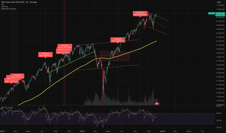
DANGER SP500This indicator is designed to identify severe correlation anomalies between the Volatility Index (VIX) and the S&P 500 (SPX). It operates on the premise that a simultaneous rise in both assets often precedes market corrections or significant local tops.
The underlying concept is "fear in the rally": investors are buying equities (driving price up), but at the same time, they are aggressively buying protection (Puts), causing the VIX to spike.
⚠️ Strict Usage Rules
To guarantee the mathematical reliability of the VIX data, this indicator includes strict security restrictions:
EXCLUSIVE ASSET: Designed solely for the S&P 500 (SPX, SPY, US500, ES1!). It should not be used on Crypto or Forex, as the VIX correlation does not apply in the same way.
LOCKED TIMEFRAME: It only functions on the Daily Chart (1D).
Note: The script includes a runtime.error block that will prevent execution if you attempt to load it on intraday charts (H1, H4, etc.) to avoid false signals caused by market noise.
Visualization
Red Background: Visually highlights the exact moment the alert is triggered.
"DANGER" Label: Prints clearly above the signaled bar.
Max Price Display: Unlike other indicators that mark the close, this tool specifically labels the HIGH of the candle, allowing you to identify the exact point of price extension.
🔔 Alerts
The script is ready for TradingView Alerts. The alert message is dynamic and will include the exact High price reached during the signal candle.
Disclaimer: This script is for technical analysis purposes only and does not constitute financial advice. Trading involves risk.
Universe Breadth Engine & Trend Scorecard [StockBee Style]Description
Concept & Methodology Traders are often misled by market-cap weighted indices (like SPY or QQQ). When a handful of mega-cap stocks rally, the index may look healthy even if the majority of stocks are selling off. This is called a "Hollow Rally."
This script is designed to look "under the hood" of the US Stock Market. It aggregates data from the entire investable universe (combining both NASDAQ and NYSE internals) to determine the true strength of market participation. It draws heavy inspiration from the StockBee Market Monitor methodology, using breadth and moving average geometry to define "Safe" vs. "Unsafe" trading environments.
How It Works (The Math)
This indicator combines three distinct layers of market analysis into a single pane:
1. The "Universe" McClellan Oscillator Most breadth indicators only look at one exchange. This script aggregates data to create a "Total US Market" view:
Data aggregation: We sum Advancing Issues (USI:ADVN.NQ + USI:ADVN.NY) and subtract Declining Issues (USI:DECL.NQ + USI:DECL.NY).
The Calculation: We apply the standard McClellan Oscillator formula to this aggregated net number: (19-period EMA of Net Issues) - (39-period EMA of Net Issues).
The Signal Line: A 5-period Simple Moving Average (SMA) of the Oscillator.
Green Line: Breadth momentum is rising (5SMA > Previous 5SMA).
Red Line: Breadth momentum is falling.
2. The Market Monitor Filter (Background Color) To determine the long-term "Health" of the market, the script queries the Wilshire 5000 index breadth (INDEX:MMTH), which represents the total US stock universe.
Logic: It measures the percentage of stocks currently above their 50-Day Moving Average.
Green Background: The percentage is rising (Current % > 10-Day SMA of %). This indicates an expanding environment.
Red Background: The percentage is falling. This indicates a contracting environment.
3. The "Traffic Light" Ribbon (Bottom Line) A thick ribbon at the bottom of the pane visualizes the trend of the QQQ (Nasdaq 100 Equal Weighted).
Green Ribbon: Price is above both the 10-day and 20-day SMAs.
Gray Ribbon: Price has lost the short-term moving average structure.
4. The Breadth Scorecard (Table) The table on the right provides a statistical summary of "Winning Days" (Positive Breadth) vs "Losing Days" (Negative Breadth) over multiple timeframes:
7 Days & 30 Days: For short-term momentum checks.
3 Month, 6 Month, 1 Year: For secular trend analysis.
YTD: Year-to-Date performance.
How to Use This Tool
The "All Clear" Signal: When the Background is Green (Market Monitor rising), the Ribbon is Green (Price Trend), and the Oscillator Bars cross above the Signal Line. This suggests high-probability conditions for long swing trades.
Divergence Warning: If the QQQ is making new highs, but the Oscillator is making lower highs (or staying red), it indicates that the rally is not supported by the broader market.
The Turnaround: A crossover of the Oscillator above the Signal Line while deep in negative territory often marks a short-term sold-out low.
Settings & Customization
Fully Configurable Table: You can change the position, size, and colors of the Scorecard table to fit your chart layout.
Data Sources: The script uses USI and INDEX tickers by default. These can be adjusted in the settings if you use different data providers.
Disclaimer: This tool is for educational market analysis only and does not constitute financial advice.

Powell's Brain Mk.4.4 [Scalper Edition]Title: Powell's Brain Mk.4.4
Description
Powell's Brain is a mechanical scalping system designed for volatile assets (like SPY, QQQ, NVDA, and TSLA) on 1-minute and 5-minute timeframes.
Unlike standard indicators that spam signals at every crossover, this script uses a "Subtractive" Philosophy. It starts with a trend crossover signal and then runs it through a squad of 6 distinct filters. If any filter detects low probability (chop, low volume, weak momentum), the trade is blocked.
This is the Scalper Edition, tuned to catch V-Shape reversals while still protecting capital during sideways chop.
🧠 How It Works
The system relies on the confluence of four market forces: Momentum, Energy, Trend Strength, and AI Confirmation.
1. The Core Strategy (The Engine)
Dual EMA Crossover: Uses a Fast (9) and Slow (50) EMA to identify immediate trend changes.
Slope Detection: A trade is only considered if the EMAs are separating with sufficient velocity (0.04% slope threshold). This prevents trading when lines are flat/tangled.
2. The "No" Squad (Filters)
A signal is rejected unless it passes these checks:
Volume Gate: Volume must be at least 80% (0.8x) of the 20-period average. This filters out pre-market noise or lunch-hour apathy.
ADX Shield: The Average Directional Index must be > 20. If ADX is lower, the market is chopping, and the script forces you to sit on your hands.
Time-of-Day: By default, it targets "Prime Hours" (09:30–11:00 & 14:00–16:00 EST) to avoid the "lunchtime trap."
Cooldown: Enforces a 3-bar wait period between signals to prevent signal flickering in high-volatility zones.
3. The AI Engine (k-NN Machine Learning)
Included is a k-Nearest Neighbors (k-NN) implementation that analyzes historical RSI and Relative Volume patterns.
It compares the current market state to the last ~1,000 bars.
It calculates a "Confidence %" based on how often similar past setups resulted in a bullish or bearish move.
AI Gating: You can enable a "Strict Mode" in settings where the script will block any trade that the AI does not agree with (Confidence < 55%).
4. The Squeeze Filter (TTM Logic)
An optional filter allows you to trade only on volatility expansion (Bollinger Bands exiting Keltner Channels). This is disabled by default to allow for standard trend scalping but can be enabled for breakout hunting.
🚦 How to Use
The Signals:
Green "CALL" Label: Bullish Momentum + Volume + Trend Strength.
Red "PUT" Label: Bearish Momentum + Volume + Breakdown.
The HUD (Heads-Up Display):
Monitor the top-right panel for Market Flow, Squeeze Status, and AI Confidence.
If the AI text is Orange ("INITIALIZING"), wait for more data to load.
The Debugger:
If you see a crossover but NO signal, turn on "Show Debug Labels" in settings.
The chart will print exactly why the trade was skipped (e.g., Vol❌ means volume was too low, Slope❌ means the trend was too flat).
⚙️ Settings Guide
Strategy Core: Adjust Min EMA Separation to tune sensitivity. Higher = Fewer, safer trades. Lower = Faster entries.
Filters:
Trade with 200 EMA Trend: Keep OFF for scalping reversals. Turn ON for strict trend following.
Gate Entries with AI: Turn ON if you want the Machine Learning engine to veto low-confidence setups.
Visuals: Toggle Dark/Light themes to match your chart.
Disclaimer
This script is a tool for identifying high-probability setups based on historical data and technical analysis. It does not guarantee future performance. Always use proper risk management (Stop Losses are included in the logic visuals). In less words DON'T BE AN IDIOT.
By FallenAngel666

VOID/DOM Tier4 Options CoreExecution Windows
Professional Description (Publish-Ready)
VOID/DOM Tier4 Options Core is an institutional-grade microstructure engine designed to map premium flow, volatility skew, contract drift, and IV-pressure zones during the highest-value trading windows of the day.
This module is optimized for OPTIONS decision-making, not price-only signals. It extracts Tier-4 DOM + Options Chain influence and converts it into clean flow-intent guidance, ideal for directional confirmation, momentum continuation, or early-warning reversal detection.
Core Capabilities
• Tier-4 Options DOM Mapping
Captures hidden liquidity pockets, premium migrations, and microstructure imbalances that standard technical indicators can’t see.
• Flow Premium Pressure (0630–1300 Core Session)
Tracks how premium shifts through the morning auction → trend establishment → mid-day compression.
Helps determine when momentum is real vs fading.
• Volatility & Contract Drift Sync (1200–1300 Reset Window)
Reads IV cooling, gamma realignment, and exhaustion signatures leading into mid-day resets.
• Reversal + Continuation Bias Engine
Filters noise and reveals true intent—ideal for options traders needing direction + timing.
• Multi-Asset Compatibility
Futures, indices, SPX/SPY derivatives, and high-beta assets.
What This Module Is For
✔ Confirming options entries with real flow
✔ Avoiding false moves during chop
✔ Reading premium pressure during the most lucrative sessions
✔ Identifying when liquidity is forcing price vs when price is bluffing
✔ Syncing with the rest of your VOID/DOM Tier4 ecosystem (Chain Scanner, Purge Loop, Apex Fusion, etc.)
Recommended Use
Runs best as a confirmation and environment-grading module, not a standalone signal generator.
Pairs extremely well with Apex Fusion, RAI, SS++ God filters, and all Tier4 chain-based indicators.
GexView📈 OVERVIEW
GexView indicator plots the Historical Gamma Exposure (GEX) profile, directly on the chart. It enables traders and analysts to observe how GEX profile evolve across multiple days/sessions.
🧲 CONCEPT
Today everybody uses Gamma Exposure. Gamma is the ROC (Rate of Change) for an option’s delta. GEX is crucial for all traders, not just intraday traders, because it helps assess market stability and potential volatility shifts driven by options positioning.
High positive GEX generally implies a mean-reverting market, where big price swings are dampened, while negative GEX signals increased volatility and potential large moves.
Understanding GEX allows traders to anticipate liquidity-driven price action, identify key support and resistance levels, and adjust strategies accordingly. In today’s market, where options flow heavily influences underlying assets, ignoring GEX can mean missing critical market dynamics that impact both short-term and long-term positions.
💡 UNIQUENESS
This indicator is a unique tool and offers a groundbreaking way to visualize market dynamics by plotting Historical Gamma Exposure (GEX), like a Volume Profile across multiple days or sessions. For the first time, traders can clearly see how GEX levels evolve over time, revealing how certain price zones gain or lose importance as market conditions change. This multi-session GEX profile allows users to identify persistent areas of dealer positioning and potential support or resistance that develop and shift over days. Unlike traditional GEX tools designed primarily for intraday use, this indicator provides valuable insight for both short-term traders and medium-term investors seeking to understand how option market flows influence price behaviour over extended periods.
⚙️ FEATURES
• Historical Gamma Exposure
The GexView indicator by default plots the last 6 days of the GEX profile, providing a framework for understanding the bigger picture.
• GEX profile
Displays the 10 largest GEX levels across all expirations (thick lines), as well as the 10 largest GEX levels for the next expiration (thin lines, 0DTE or upcoming).
• Update
Daily, after market close, based on new open interest. No more manual level imports.
Just one-click update.
• Settings
Option to plot total sum GEX for all expirations, or only net GEX for next expiration.
• Watchlist
SPX, NDX, DIA, SPY, QQQ, VIX, VXX, IBIT
(Additional tickers coming soon)
• Mapping
The indicator automatically detects and maps the underlying ticker on your chart, or lets you plot any symbol from the available watchlist.
🔍 HOW TO USE
• Identify intraday support and resistance levels shaped by option market dynamics
• Quickly spot significant GEX levels and compare how they relate to other key levels.
• Compare current vs. past GEX distributions for contextual trend analysis
• Observe structural GEX shifts that may align with volatility or mean-reversion setups
• Easily understanding if an asset trading on positive gamma (around green lines), or negative gamma (around red lines)
Examples:
1. DIA ETF
2. QQQ and VIX
📚 NOTES
• Calculation
GEX for All Expirations: This is the total sum (Call+Put) of gamma exposure of all expirations.
GEX for Nearest Expirations: This is the net sum (Call-Put) of gamma exposure of next expirations (0DTE if available).
• Trading Session - RTH & ETH
The indicator can include the extended trading hours when activated on the chart.
✅ VISUALIZATION
• Vertical implementation of gamma exposure profile.
• Thick lines represent the total gamma exposure across all expiration contracts.
• Thin lines represent the gamma exposure of next expiration only.
• All Expirations: Green colour if Calls > Puts, Red colour if Calls < Puts
• Next Expiration: Lime colour if Calls > Puts, Maroon colour if Calls < Puts
⚠️ DISCLAIMER
This indicator is provided for informational and educational purposes only.
It does not constitute financial advice or a recommendation to buy or sell any financial instrument.
Historical Gamma patterns and analytical interpretations do not guarantee future performance.
All analysis should be combined with independent research and risk management.

Relative Measured Extension (RME)The Relative Measured Extension (RME) indicator is a powerful oscillator that helps traders identify extreme price extensions from a moving average by normalizing historical data on a scale of -100 to +100.
This indicator is inspired by the Deepvue RME indicator and brings its powerful methodology to TradingView with full customization options and additional features.
What Makes RME Unique?
Unlike traditional oscillators, RME dynamically calculates how extended the current price is compared to ALL previous extensions over your chosen lookback period. A reading of +100 means the stock is as far above the moving average as it has EVER been in the lookback window, while -100 indicates the maximum historical extension below the MA.
Key Features
✅ Adaptive Scaling - Automatically normalizes to historical extremes
✅ Multiple MA Types - Choose between SMA, EMA, WMA, or VWMA
✅ Visual Zones - Color-coded overbought (70-100) and oversold (-70 to -100) regions
✅ Info Dashboard - Real-time display of RME value, extension %, MA value, and status
✅ Built-in Alerts - Get notified when entering overbought/oversold zones or crossing zero
✅ Fully Customizable - Adjust all parameters to match your trading style
Recommended Settings
Position Traders:
Lookback Period: 250
MA Length: 50
Use for spotting significant trend changes and correction bottoms
Swing Traders (Option 1):
Lookback Period: 100
MA Length: 20
Faster signals for medium-term swings
Swing Traders (Option 2):
Lookback Period: 50
MA Length: 10
Most responsive for quick trades on strong momentum stocks
How to Interpret
+70 to +100 (Red Zone) - Overbought, potential pullback area
-70 to -100 (Green Zone) - Oversold, potential reversal area
Zero Line Cross - Momentum shift signal
RME at 0 in uptrends - Excellent entry points during pullbacks
Trading Application
Early in Trends: High RME readings can signal strength, though a consolidation may be needed
Late in Trends: Extreme readings may indicate exhaustion
During Corrections: Use on index ETFs (QQQ, SPY) to identify potential bottoms
Pro Tips
Compare current extremes to historical extremes in context
Strong stocks may hold near overbought zones longer
Pullbacks to zero in strong uptrends often provide low-risk entries
Works on all timeframes and instruments (stocks, crypto, forex, commodities)
Credit: Inspired by the Deepvue Relative Measured Extension indicator

Premarket LevelsThis indicator tracks premarket high and low levels for day trading, providing statistical analysis on how often these levels get touched during regular trading hours (9:30 AM-4:00 PM EST). It combines real-time level tracking with historical probability analysis and precise timing statistics to help traders make data-driven decisions. I use 4:00 - 9:30 AM on SPY/QQQ etc and 18:00 - 9:30 on Futures ES/NQ etc
Core Features
1. Premarket Level Tracking
Automatically identifies and plots premarket high and low levels
Displays levels with customizable colors and line styles
Shows optional midpoint and percentage/fibonacci retracement levels
Tracks when levels are set during premarket session
2. Historical Touch Analysis
Calculates probability of PM high/low being touched during regular hours
Tracks "Both Levels" touched rate (how often both get hit same day)
Tracks "Either Level" touched rate (how often at least one gets hit)
Adjustable lookback period (1-250 days) for statistical analysis
3. Timing Intelligence
Average time when levels get touched
Earliest and latest touch times in historical data
Four customizable time buckets showing touch distribution throughout the day
First touch time displayed for current session
4. Range Analysis
Current PM range vs historical average (adjustable period)
Range percentile ranking (where today ranks in historical distribution)
Min/Max historical ranges for context
Large/small range detection with customizable thresholds
Background highlighting for unusual range days
5. Smart Signals & Alerts
Buy/Sell signals on level breakouts (adjustable sensitivity)
Level rejection detection (failed breakout patterns)
Proximity alerts when approaching levels
Touch markers (diamond shapes) when levels are tested
Multiple alert conditions for various scenarios
6. Risk Management Tools
Automatic stop loss suggestions (ATR-based, percentage-based, or fixed points)
Target projections based on range extension
Position tracking relative to PM range
Distance calculations to both levels
How To Use
For Day Traders:
Check the "Either Level" percentage - if 90%+, at least one level will likely be touched
Review time bucket statistics - most touches happen 9:30-10:00 AM
Monitor "Both Levels" rate - typically only 20-30%, meaning round trips are rare
Use range percentile to gauge if expansion or mean reversion is likely
For Scalpers:
Enable touch markers to see exact level tests
Use proximity alerts to prepare for potential bounces
Monitor first touch times - early touches often lead to continuations
Check rejection signals for quick reversal trades
For Swing Position Sizing:
Use historical touch rates to assess probability of level tests
Review range size vs average for stop placement guidance
Check timing analysis to avoid holding through low-probability windows
Use target projections for realistic profit targets
Settings Overview
Basic Settings:
Premarket session time (default 4:00-7:30 AM EST)
Signal sensitivity for breakout detection
Timezone selection for accurate time labels
Historical Analysis:
Lookback period for statistics (default 20 days, max 250)
Toggle touch tracking and markers
Enable/disable daily statistics display
Range Analysis:
Adjustable average period (default 20 days)
Large/small range threshold customization
Range percentile display toggle
Timing Analysis:
Three customizable time buckets (default: 10:00, 11:00, 12:00)
Fourth bucket automatically covers afternoon (12:00-4:00 PM)
Toggle time bucket statistics display
Visual Features:
Midpoint line display
Percentage (25%, 75%) or Fibonacci (23.6%, 38.2%, 61.8%, 78.6%) levels
Table position and size customization
Comprehensive color scheme customization (background, text, headers)
Smart Alerts:
Proximity alerts with adjustable threshold
Level rejection detection
Failed breakout detector
Time-of-day filter to avoid lunch chop
Risk Management:
Stop loss method selection (ATR, PM Range %, Fixed Points)
Adjustable ATR multiplier
Target projection display
Statistics Explained
Touch Rates:
Percentage of days where level was touched during RTH
Based only on FIRST touch per day (not multiple re-tests)
Binary metric: Yes/No for each day
Timing Stats:
All based on timestamp of FIRST touch each day
Average, Earliest, Latest provide distribution context
Time buckets show concentration of first touches
Range Metrics:
Current range compared to historical average
Percentile shows where today ranks (0-100%)
Min/Max provide extreme boundaries from history
Important Notes
First Touch Only: All statistics track only the first time a level is touched each day, not subsequent re-tests
RTH Focus: Touch tracking occurs only during regular trading hours (9:30 AM-4:00 PM EST)
Data Accumulation: Historical statistics build over time as indicator runs; requires specified lookback period to populate
Chart Timeframe: Works on any timeframe but recommended 3-5 minute charts for best premarket level precision
Memory Reset: Each new premarket session resets tracking for fresh daily analysis
Best Practices
Use 60-100 day lookback for statistical significance
Combine high touch rates (80%+) with time bucket data for highest probability setups
Small ranges (< 50% of average) often lead to expansion moves
Large ranges (> 150% of average) often consolidate or mean-revert
First 30 minutes typically contains 50%+ of all level touches
After 12:00 PM, probability of untouched levels being hit drops significantly
Performance Considerations
Optimized for real-time calculation with minimal lag
Uses efficient array management for historical data
Table updates only on bar close for performance
Maximum lookback of 250 days to prevent memory issues
This indicator is for educational and informational purposes only. It is NOT financial advice.
The buy/sell signals are algorithmic suggestions based on historical patterns and should NOT be followed blindly
Past performance and historical statistics do NOT guarantee future results
All trading involves substantial risk of loss
You are solely responsible for your own trading decisions
Always perform your own analysis and risk assessment before entering any trade
The creator of this indicator is not responsible for any trading losses incurred from its use
No representation is being made that any account will or is likely to achieve profits or losses similar to those discussed in the indicator statistics
By using this indicator, you acknowledge that you understand these risks and accept full responsibility for your trading decisions.

VMDM - Volume, Momentum & Divergence Master [BullByte]VMDM - Volume, Momentum and Divergence Master
Educational Multi-Layer Market Structure Analysis System
Multi-factor divergence engine that scores RSI momentum, volume pressure, and institutional footprints into one non-repainting confluence rating (0-100).
WHAT THIS INDICATOR IS
VMDM is an educational indicator designed to teach traders how to recognize high-probability reversal and continuation patterns by analyzing four independent market dimensions simultaneously. Instead of relying on a single indicator that may produce frequent false signals, VMDM creates a confluence-based scoring system that weights multiple confirmation factors, helping you understand which setups have stronger technical backing and which are lower quality.
This is NOT a trading system or signal generator. It is a learning tool that visualizes complex market structure concepts in an accessible format for both coders and non-coders.
THE PROBLEM IT SOLVES
Most traders face these common challenges:
Challenge 1 - Indicator Overload: Running RSI, volume analysis, and divergence detection separately creates chart clutter and conflicting signals. You waste time cross-referencing multiple windows trying to determine if all factors align.
Challenge 2 - False Divergences: Standard divergence indicators trigger on every minor pivot, creating noise. Many divergences fail because they lack supporting evidence from volume or market structure.
Challenge 3 - Missed Context: A bullish RSI divergence means nothing if it occurs during weak volume or in the middle of strong distribution. Context determines quality.
Challenge 4 - Repainting Confusion: Many divergence scripts repaint, showing perfect historical signals that never actually triggered in real-time, leading to false confidence.
Challenge 5 - Institutional Pattern Recognition: Absorption zones, stop hunts, and exhaustion patterns are taught in trading education but difficult to identify systematically without manual analysis.
VMDM addresses all five challenges by combining complementary analytical layers into one transparent, non-repainting, confluence-weighted system with visual clarity.
WHY THIS SPECIFIC COMBINATION - MASHUP JUSTIFICATION
This indicator is NOT a random mashup of popular indicators. Each of the four layers serves a specific analytical purpose and together they create a complete market structure assessment framework.
THE FOUR ANALYTICAL LAYERS
LAYER 1 - RSI MOMENTUM DIVERGENCE (Trend Exhaustion Detection)
Purpose: Identifies when price momentum is weakening before price itself reverses.
Why RSI: The Relative Strength Index measures momentum on a bounded 0-100 scale, making divergence detection mathematically consistent across all assets and timeframes. Unlike raw price oscillators, RSI normalizes momentum regardless of volatility regime.
How It Contributes: Divergence between price pivots and RSI pivots reveals early momentum exhaustion. A lower price low with a higher RSI low (bullish regular divergence) signals sellers are losing strength even as price makes new lows. This is the PRIMARY signal generator in VMDM.
Limitation If Used Alone: RSI divergence by itself produces many false signals because momentum can remain weak during continued trends. It needs confirmation from volume and structural evidence.
LAYER 2 - VOLUME PRESSURE ANALYSIS (Buying vs Selling Intensity)
Purpose: Quantifies whether the current bar's volume reflects buying pressure or selling pressure based on where price closed within the bar's range.
Methodology: Instead of just measuring volume size, VMDM calculates WHERE in the bar range the close occurred. A close near the high on high volume indicates strong buying absorption. A close near the low indicates selling pressure. The calculation accounts for wick size (wicks reduce pressure quality) and uses percentile ranking over a lookback period to normalize pressure strength on a 0-100 scale.
Formula Concept:
Buy Pressure = Volume × (Close - Low) / (High - Low) × Wick Quality Factor
Sell Pressure = Volume × (High - Close) / (High - Low) × Wick Quality Factor
Net Pressure = Buy Pressure - Sell Pressure
Pressure Strength = Percentile Rank of Net Pressure over lookback period
Why Percentile Ranking: Absolute volume varies by asset and session. Percentile ranking makes 85th percentile pressure on low-volume crypto comparable to 85th percentile pressure on high-volume forex.
How It Contributes: When a bullish divergence occurs at a pivot low AND pressure strength is above 60 (strong buying), this adds 25 confluence points. It confirms that the divergence is occurring during actual accumulation, not just weak selling.
Limitation If Used Alone: Pressure analysis shows current bar intensity but cannot identify trend exhaustion or reversal timing. High buying pressure can exist during a strong uptrend with no reversal imminent.
LAYER 3 - BEHAVIORAL FOOTPRINT PATTERNS (Volume Anomaly Detection)
CRITICAL DISCLAIMER: The terms "institutional footprint," "absorption," "stop hunt," and "exhaustion" used in this indicator are EDUCATIONAL LABELS for specific price and volume behavioral patterns. These patterns are detected through technical analysis of publicly available price, volume, and bar structure data. This indicator does NOT have access to actual institutional order flow, market maker data, broker stop-loss locations, or any non-public data source. These pattern names are used because they are common terminology in trading education to describe these technical behaviors. The analysis is interpretive and based on observable price action, not privileged information.
Purpose: Detect volume anomalies and price patterns that historically correlate with potential reversal zones or trend continuation failure.
Pattern Type 1 - Absorption (Labeled as "ACCUMULATION" or "DISTRIBUTION")
Detection Criteria: Volume is more than 2x the moving average AND bar range is less than 50 percent of the average bar range.
Interpretation: High volume compressed into a tight range suggests large participants are absorbing supply (accumulation) or distribution (distribution) without allowing price to move significantly. This often precedes directional moves once absorption completes.
Visual: Colored box zone highlighting the absorption area.
Pattern Type 2 - Stop Hunt (Labeled as "BULL HUNT" or "BEAR HUNT")
Detection Criteria: Price penetrates a recent 10-bar high or low by a small margin (0.2 percent), then closes back inside the range on above-average volume (1.5x+).
Interpretation: Price briefly spikes beyond recent structure (likely triggering stop losses placed just beyond obvious levels) then reverses. This is a classic false breakout pattern often seen before reversals.
Visual: Label at the wick extreme showing hunt direction.
Pattern Type 3 - Exhaustion (Labeled as "SELL EXHAUST" or "BUY EXHAUST")
Detection Criteria: Lower wick is more than 2.5x the body size with volume above 1.8x average and RSI below 35 (sell exhaustion), OR upper wick more than 2.5x body size with volume above 1.8x average and RSI above 65 (buy exhaustion).
Interpretation: Large wicks with high volume and extreme RSI suggest aggressive buying or selling was met with equally aggressive rejection. This exhaustion often marks short-term extremes.
Visual: Label showing exhaustion type.
How These Contribute: When a divergence forms at a pivot AND one of these behavioral patterns is active, the confluence score increases by 20 points. This confirms the divergence is occurring during structural anomaly activity, not just normal price flow.
Limitation If Used Alone: These patterns can occur mid-trend and do not indicate direction without momentum context. Absorption in a strong uptrend may just be continuation accumulation.
LAYER 4 - CONFLUENCE SCORING MATRIX (Quality Weighting System)
Purpose: Translate all detected conditions into a single 0-100 quality score so you can objectively compare setups.
Scoring Breakdown:
Divergence Present: +30 points (primary signal)
Pressure Confirmation: +25 points (volume supports direction)
Behavioral Footprint Active: +20 points (structural anomaly present)
RSI Extreme: +15 points (RSI below 30 or above 70 at pivot)
Volume Spike: +10 points (current volume above 1.5x average)
Maximum Possible Score: 100 points
Why These Weights: The weights reflect reliability hierarchy based on backtesting observation. Divergence is the core signal (30 points), but without volume confirmation (25 points) many fail. Behavioral patterns add meaningful context (20 points). RSI extremes and volume spikes are secondary confirmations (15 and 10 points).
Quality Tiers:
90-100: TEXTBOOK (all factors aligned)
75-89: HIGH QUALITY (strong confluence)
60-74: VALID (meets minimum threshold)
Below 60: DEVELOPING (not displayed unless threshold lowered)
How It Contributes: The confluence score allows you to filter noise. You can set your minimum quality threshold in settings. Higher thresholds (75+) show fewer but higher-quality patterns. Lower thresholds (50-60) show more patterns but include lower-confidence setups. This teaches you to distinguish strong setups from weak ones.
Limitation: Confluence scoring is historical observation-based, not predictive guarantee. A 95-point setup can still fail. The score represents technical alignment, not future certainty.
WHY THIS COMBINATION WORKS TOGETHER
Each layer addresses a limitation in the others:
RSI Divergence identifies WHEN momentum is exhausting (timing)
Volume Pressure confirms WHETHER the exhaustion is accompanied by opposite-side accumulation (confirmation)
Behavioral Footprint shows IF structural anomalies support the reversal hypothesis (context)
Confluence Scoring weights ALL factors into an objective quality metric (filtering)
Using only RSI divergence gives you timing without confirmation. Using only volume pressure gives you intensity without directional context. Using only pattern detection gives you anomalies without trend exhaustion context. Using all four together creates a complete analytical framework where each layer compensates for the others' weaknesses.
This is not a mashup for the sake of combining indicators. It is a structured analytical system where each component has a defined role in a multi-dimensional market assessment process.
HOW TO READ THE INDICATOR - VISUAL ELEMENTS GUIDE
VMDM displays up to five visual layer types. You can enable or disable each layer independently in settings under "Visual Layers."
VISUAL LAYER 1 - MARKET STRUCTURE (Pivot Points and Lines)
What You See:
Small labels at swing highs and lows marked "PH" (Pivot High) and "PL" (Pivot Low) with horizontal dashed lines extending right from each pivot.
What It Means:
These are CONFIRMED pivots, not real-time. A pivot low appears AFTER the required right-side confirmation bars pass (default 3 bars). This creates a delay but prevents repainting. The pivot only appears once it is mathematically confirmed.
The horizontal lines represent support (from pivot lows) and resistance (from pivot highs) levels where price previously found significant rejection.
Color Coding:
Green label and line: Pivot Low (potential support)
Red label and line: Pivot High (potential resistance)
How To Use:
These pivots are the foundation for divergence detection. Divergence is only calculated between confirmed pivots, ensuring all signals are non-repainting. The lines help you see historical structure levels.
VISUAL LAYER 2 - PRESSURE ZONES (Background Color)
What You See:
Subtle background color shading on bars - light green or light red tint.
What It Means:
This visualizes volume pressure strength in real-time.
Color Coding:
Light Green Background: Pressure Strength above 70 (strong buying pressure - price closing near highs on volume)
Light Red Background: Pressure Strength below 30 (strong selling pressure - price closing near lows on volume)
No Color: Neutral pressure (pressure between 30-70)
How To Use:
When a bullish divergence pattern appears during green pressure zones, it suggests the divergence is forming during accumulation. When a bearish divergence appears during red zones, distribution is occurring. Pressure zones help you filter divergences - those forming in supportive pressure environments have higher probability.
VISUAL LAYER 3 - DIVERGENCE LINES (Dotted Connectors)
What You See:
Dotted lines connecting two pivot points (either two pivot lows or two pivot highs).
What It Means:
A divergence has been detected between those two pivots. The line connects the price pivots where RSI showed opposite behavior.
Color Coding:
Bright Green Line: Bullish divergence (regular or hidden)
Bright Red Line: Bearish divergence (regular or hidden)
How To Use:
The divergence line appears ONLY after the second pivot is confirmed (delayed by right-side confirmation bars). This is intentional to prevent repainting. When you see the line appear, it means:
For Bullish Regular Divergence:
Price made a lower low (second pivot lower than first)
RSI made a higher low (RSI at second pivot higher than first)
Interpretation: Downtrend losing momentum
For Bullish Hidden Divergence:
Price made a higher low (second pivot higher than first)
RSI made a lower low (RSI at second pivot lower than first)
Interpretation: Uptrend continuation likely (pullback within uptrend)
For Bearish Regular Divergence:
Price made a higher high (second pivot higher than first)
RSI made a lower high (RSI at second pivot lower than first)
Interpretation: Uptrend losing momentum
For Bearish Hidden Divergence:
Price made a lower high (second pivot lower than first)
RSI made a higher high (RSI at second pivot higher than first)
Interpretation: Downtrend continuation likely (bounce within downtrend)
If "Show Consolidated Analysis Label" is disabled, a small label will appear on the divergence line showing the divergence type abbreviation.
VISUAL LAYER 4 - BEHAVIORAL FOOTPRINT MARKERS
What You See:
Boxes, labels, and markers at specific bars showing pattern detection.
ABSORPTION ZONES (Boxes):
Colored rectangular boxes spanning one or more bars.
Purple Box: Accumulation absorption zone (high volume, tight range, bullish close)
Red Box: Distribution absorption zone (high volume, tight range, bearish close)
If absorption continues for multiple consecutive bars, the box extends and a counter appears in the label showing how many bars the absorption lasted.
What It Means: Large volume is being absorbed without significant price movement. This often precedes directional breakouts once the absorption phase completes.
STOP HUNT MARKERS (Labels):
Small labels below or above wicks labeled "BULL HUNT" or "BEAR HUNT" (may show bar count if consecutive).
What It Means:
BULL HUNT : Price spiked below recent lows then reversed back up on volume - likely triggered sell stops before reversing
BEAR HUNT : Price spiked above recent highs then reversed back down on volume - likely triggered buy stops before reversing
EXHAUSTION MARKERS (Labels):
Labels showing "SELL EXHAUST" or "BUY EXHAUST."
What It Means:
SELL EXHAUST : Large lower wick with high volume and low RSI - aggressive selling met with strong rejection
BUY EXHAUST : Large upper wick with high volume and high RSI - aggressive buying met with strong rejection
How To Use:
These markers help you identify WHERE structural anomalies occurred. When a divergence signal appears AT THE SAME TIME as one of these patterns, the confluence score increases. You are looking for alignment - divergence + behavioral pattern + pressure confirmation = high-quality setup.
VISUAL LAYER 5 - CONSOLIDATED ANALYSIS LABEL (Main Pattern Signal)
What You See:
A large label appearing at pivot points (or in real-time mode, at current bar) containing full pattern analysis.
Label Appearance:
Depending on your "Use Compact Label Format" setting:
COMPACT MODE (Single Line):
Example: "BULLISH REGULAR | Q:HIGH QUALITY C:82"
Breakdown:
BULLISH REGULAR: Divergence type detected
Q:HIGH QUALITY: Pattern quality tier
C:82: Confluence score (82 out of 100)
FULL MODE (Multi-Line Detailed):
Example:
PATTERN DETECTED
-------------------
BULLISH REGULAR
Quality: HIGH QUALITY
Price: Lower Low
Momentum: Higher Low
Signal: Weakening Downtrend
CONFLUENCE: 82/100
-------------------
Divergence: 30
Pressure: 25
Institutional: 20
RSI Extreme: 0
Volume: 10
Breakdown:
Top section: Pattern type and quality
Middle section: Divergence explanation (what price did vs what RSI did)
Bottom section: Confluence score with itemized breakdown showing which factors contributed
Label Position:
In Confirmed modes: Label appears AT the pivot point (delayed by confirmation bars)
In Real-time mode: Label appears at current bar as conditions develop
Label Color:
Gold: Textbook quality (90+ confluence)
Green: High quality (75-89 confluence)
Blue: Valid quality (60-74 confluence)
How To Use:
This is your primary decision-making label. When it appears:
Check the divergence type (regular divergences are reversal signals, hidden divergences are continuation signals)
Review the quality tier (textbook and high quality have better historical win rates)
Examine the confluence breakdown to see which factors are present and which are missing
Look at the chart context (trend, support/resistance, timeframe)
Use this information to assess whether the setup aligns with your strategy
The label does NOT tell you to buy or sell. It tells you a technical pattern has formed and provides the quality assessment. Your trading decision must incorporate risk management, market context, and your strategy rules.
UNDERSTANDING THE THREE DETECTION MODES
VMDM offers three signal detection modes in settings to accommodate different trading styles and learning objectives.
MODE 1: "Confluence Only (Real-Time)"
How It Works: Displays signals AS THEY DEVELOP on the current bar without waiting for pivot confirmation. The system calculates confluence score from pressure, volume, RSI extremes, and behavioral patterns. Divergence signals are NOT required in this mode.
Delay: ZERO - signals appear immediately.
Use Case: Real-time scanning for high-confluence zones without divergence requirement. Useful for intraday traders who want immediate alerts when multiple factors align.
Tradeoff: More frequent signals but includes setups without confirmed divergence. Higher false signal rate. Signals can change as the bar develops (not repainting in historical bars, but current bar updates).
Visual Behavior: Labels appear at the current bar. No divergence lines unless divergence happens to be present.
MODE 2: "Divergence + Confluence (Confirmed)" - DEFAULT RECOMMENDED
How It Works: Full system engagement. Signals appear ONLY when:
A pivot is confirmed (requires right-side confirmation bars to pass)
Divergence is detected between current pivot and previous pivot
Total confluence score meets or exceeds your minimum threshold
Delay: Equal to your "Pivot Right Bars" setting (default 3 bars). This means signals appear 3 bars AFTER the actual pivot formed.
Use Case: Highest-quality, non-repainting signals for swing traders and learners who want to study confirmed pattern completion.
Tradeoff: Delayed signals. You will not receive the signal until confirmation occurs. In fast-moving markets, price may have already moved significantly by the time the signal appears.
Visual Behavior: Labels appear at the historical pivot location (in the past). Divergence lines connect the two pivots. This is the most educational mode because it shows completed, confirmed patterns.
Non-Repainting Guarantee: Yes. Once a signal appears, it never disappears or changes.
MODE 3: "Divergence + Confluence (Relaxed)"
How It Works: Same as Confirmed mode but with adaptive thresholds. If confluence is very high (10 points above threshold), the signal may appear even if some factors are weak. If divergence is present but confluence is slightly below threshold (within 10 points), it may still appear.
Delay: Same as Confirmed mode (right-side confirmation bars).
Use Case: Slightly more signals than Confirmed mode for traders willing to accept near-threshold setups.
Tradeoff: More signals but lower average quality than Confirmed mode.
Visual Behavior: Same as Confirmed mode.
DASHBOARD GUIDE - READING THE METRICS
The dashboard appears in the corner of your chart (position selectable in settings) and provides real-time market state analysis.
You can choose between four dashboard detail levels in settings: Off, Compact, Optimized (default), Full.
DASHBOARD ROW EXPLANATIONS
ROW 1 - Header Information
Left: Current symbol and timeframe
Center: "VMDM "
Right: Version number
ROW 2 - Mode and Delay
Shows which detection mode you are using and the signal delay.
Example: "CONFIRMED | Delay: 3 bars"
This reminds you that signals in confirmed mode appear 3 bars after the pivot forms.
ROW 3 - Market Regime
Format: "TREND UP HV" or "RANGING NV"
First Part - Trend State:
TREND UP: 20 EMA above 50 EMA with strong separation
TREND DOWN: 20 EMA below 50 EMA with strong separation
RANGING: EMAs close together, low trend strength
TRANSITION: Between trending and ranging states
Second Part - Volatility State:
HV: High Volatility (current ATR more than 1.3x the 50-bar average ATR)
NV: Normal Volatility (current ATR between 0.7x and 1.3x average)
LV: Low Volatility (current ATR less than 0.7x average)
Third Column: Volatility ratio (example: "1.45x" means current ATR is 1.45 times normal)
How To Use: Regime context helps you interpret signals. Reversal divergences are more reliable in ranging or transitional regimes. Continuation divergences (hidden) are more reliable in trending regimes. High volatility means wider stops may be needed.
ROW 4 - Pressure
Shows current volume pressure state.
Format: "BUYING | ██████████░░░░░░░░░"
States:
BUYING : Pressure strength above 60 (closes near highs)
SELLING : Pressure strength below 40 (closes near lows)
NEUTRAL : Pressure strength between 40-60
Bar Visualization: Each block represents 10 percentile points. A full bar (10 filled blocks) = 100th percentile pressure.
Color: Green for buying, red for selling, gray for neutral.
How To Use: When pressure aligns with divergence direction (bullish divergence during buying pressure), confluence is stronger.
ROW 5 - Volume and RSI
Format: "1.8x | RSI 68 | OB"
First Value: Current volume ratio (1.8x = volume is 1.8 times the moving average)
Second Value: Current RSI reading
Third Value: RSI state
OB: Overbought (RSI above 70)
OS: Oversold (RSI below 30)
Blank: Neutral RSI
How To Use: Volume spikes (above 1.5x) during divergence formation add confluence. RSI extremes at pivots add confluence.
ROW 6 - Behavioral Footprint
Format: "BULL HUNT | 2 bars"
Shows the most recent behavioral pattern detected and how long ago.
States:
ACCUMULATION / DISTRIBUTION: Absorption detected
BULL HUNT / BEAR HUNT: Stop hunt detected
SELL EXHAUST / BUY EXHAUST: Exhaustion detected
SCANNING: No recent pattern
NOW: Pattern is active on current bar
How To Use: When footprint activity is recent (within 50 bars) or active now, it adds context to divergence signals forming in that area.
ROW 7 - Current Pattern
Shows the divergence type currently detected (if any).
Examples: "BULLISH REGULAR", "BEARISH HIDDEN", "Scanning..."
Quality: Shows pattern quality (TEXTBOOK, HIGH QUALITY, VALID)
How To Use: This tells you what type of signal is active. Regular divergences are reversal setups. Hidden divergences are continuation setups.
ROW 8 - Session Summary
Format: "14 events | A3 H8 E3"
First Value: Total institutional events this session
Breakdown:
A: Absorption events
H: Stop hunt events
E: Exhaustion events
How To Use: High event counts suggest an active, volatile session with frequent structural anomalies. Low counts suggest quiet, orderly price action.
ROW 9 - Confluence Score (Optimized/Full mode only)
Format: "78/100 | ████████░░"
Shows current real-time confluence score even if no pattern is confirmed yet.
How To Use: Watch this in real-time to see how close you are to pattern formation. When it exceeds your threshold and divergence forms, a signal will appear (after confirmation delay).
ROW 10 - Patterns Studied (Optimized/Full mode only)
Format: "47 patterns | 12 bars ago"
First Value: Total confirmed patterns detected since chart loaded
Second Value: How many bars since the last confirmed pattern appeared
How To Use: Helps you understand pattern frequency on your selected symbol and timeframe. If many bars have passed since last pattern, market may be trending without reversal opportunities.
ROW 11 - Bull/Bear Ratio (Optimized/Full mode only)
Format: "28:19 | BULL"
Shows count of bullish vs bearish patterns detected.
Balance:
BULL: More bullish patterns detected (suggests market has had more bullish reversals/continuations)
BEAR: More bearish patterns detected
BAL: Equal counts
How To Use: Extreme imbalances can indicate directional bias in the studied period. A heavily bullish ratio in a downtrend might suggest frequent failed rallies (bearish continuation). Context matters.
ROW 12 - Volume Ratio Detail (Optimized/Full mode only)
Shows current volume vs average volume in absolute terms.
Example: "1.4x | 45230 / 32300"
How To Use: Confirms whether current activity is above or below normal.
ROW 13 - Last Institutional Event (Full mode only)
Shows the most recent institutional pattern type and how many bars ago it occurred.
Example: "DISTRIBUTION | 23 bars"
How To Use: Tracks recency of last anomaly for context.
SETTINGS GUIDE - EVERY PARAMETER EXPLAINED
PERFORMANCE SECTION
Enable All Visuals (Master Toggle)
Default: ON
What It Does: Master kill switch for ALL visual elements (labels, lines, boxes, background colors, dashboard). When OFF, only plot outputs remain (invisible unless you open data window).
When To Change: Turn OFF on mobile devices, 1-second charts, or slow computers to improve performance. You can still receive alerts even with visuals disabled.
Impact: Dramatic performance improvement when OFF, but you lose all visual feedback.
Maximum Object History
Default: 50 | Range: 10-100
What It Does: Limits how many of each object type (labels, lines, boxes) are kept in memory. Older objects beyond this limit are deleted.
When To Change: Lower to 20-30 on fast timeframes (1-minute charts) to prevent slowdown. Increase to 100 on daily charts if you want more historical pattern visibility.
Impact: Lower values = better performance but less historical visibility. Higher values = more history visible but potential slowdown on fast timeframes.
Alert Cooldown (Bars)
Default: 5 | Range: 1-50
What It Does: Minimum number of bars that must pass before another alert of the same type can fire. Prevents alert spam when multiple patterns form in quick succession.
When To Change: Increase to 20+ on 1-minute charts to reduce noise. Decrease to 1-2 on daily charts if you want every pattern alerted.
Impact: Higher cooldown = fewer alerts. Lower cooldown = more alerts.
USER EXPERIENCE SECTION
Show Enhanced Tooltips
Default: ON
What It Does: Enables detailed hover-over tooltips on labels and visual elements.
When To Change: Turn OFF if you encounter Pine Script compilation errors related to tooltip arguments (rare, platform-specific issue).
Impact: Minimal. Just adds helpful hover text.
MARKET STRUCTURE DETECTION SECTION
Pivot Left Bars
Default: 3 | Range: 2-10
What It Does: Number of bars to the LEFT of the center bar that must be higher (for pivot low) or lower (for pivot high) than the center bar for a pivot to be valid.
Example: With value 3, a pivot low requires the center bar's low to be lower than the 3 bars to its left.
When To Change:
Increase to 5-7 on noisy timeframes (1-minute charts) to filter insignificant pivots
Decrease to 2 on slow timeframes (daily charts) to catch more pivots
Impact: Higher values = fewer, more significant pivots = fewer signals. Lower values = more frequent pivots = more signals but more noise.
Pivot Right Bars
Default: 3 | Range: 2-10
What It Does: Number of bars to the RIGHT of the center bar that must pass for confirmation. This creates the non-repainting delay.
Example: With value 3, a pivot is confirmed 3 bars AFTER it forms.
When To Change:
Increase to 5-7 for slower, more confirmed signals (better for swing trading)
Decrease to 2 for faster signals (better for intraday, but still non-repainting)
Impact: Higher values = longer delay but more reliable confirmation. Lower values = faster signals but less confirmation. This setting directly controls your signal delay in Confirmed and Relaxed modes.
Minimum Confluence Score
Default: 60 | Range: 40-95
What It Does: The threshold score required for a pattern to be displayed. Patterns with confluence scores below this threshold are not shown.
When To Change:
Increase to 75+ if you only want high-quality textbook setups (fewer signals)
Decrease to 50-55 if you want to see more developing patterns (more signals, lower average quality)
Impact: This is your primary signal filter. Higher threshold = fewer, higher-quality signals. Lower threshold = more signals but includes weaker setups. Recommended starting point is 60-65.
TECHNICAL PERIODS SECTION
RSI Period
Default: 14 | Range: 5-50
What It Does: Lookback period for RSI calculation.
When To Change:
Decrease to 9-10 for faster, more sensitive RSI that detects shorter-term momentum changes
Increase to 21-28 for slower, smoother RSI that filters noise
Impact: Lower values make RSI more volatile (more frequent extremes and divergences). Higher values make RSI smoother (fewer but more significant divergences). 14 is industry standard.
Volume Moving Average Period
Default: 20 | Range: 10-200
What It Does: Lookback period for calculating average volume. Current volume is compared to this average to determine volume ratio.
When To Change:
Decrease to 10-14 for shorter-term volume comparison (more sensitive to recent volume changes)
Increase to 50-100 for longer-term volume comparison (smoother, less sensitive)
Impact: Lower values make volume ratio more volatile. Higher values make it more stable. 20 is standard.
ATR Period
Default: 14 | Range: 5-100
What It Does: Lookback period for Average True Range calculation used for volatility measurement and label positioning.
When To Change: Rarely needs adjustment. Use 7-10 for faster volatility response, 21-28 for slower.
Impact: Affects volatility ratio calculation and visual label spacing. Minimal impact on signals.
Pressure Percentile Lookback
Default: 50 | Range: 10-300
What It Does: Lookback period for calculating volume pressure percentile ranking. Your current pressure is ranked against the pressure of the last X bars.
When To Change:
Decrease to 20-30 for shorter-term pressure context (more responsive to recent changes)
Increase to 100-200 for longer-term pressure context (smoother rankings)
Impact: Lower values make pressure strength more sensitive to recent bars. Higher values provide more stable, long-term pressure assessment. Capped at 300 for performance reasons.
SIGNAL DETECTION SECTION
Signal Detection Mode
Default: "Divergence + Confluence (Confirmed)"
Options:
Confluence Only (Real-time)
Divergence + Confluence (Confirmed)
Divergence + Confluence (Relaxed)
What It Does: Selects which detection logic mode to use (see "Understanding The Three Detection Modes" section above).
When To Change: Use Confirmed for learning and non-repainting signals. Use Real-time for live scanning without divergence requirement. Use Relaxed for slightly more signals than Confirmed.
Impact: Fundamentally changes when and how signals appear.
VISUAL LAYERS SECTION
All toggles default to ON. Each controls visibility of one visual layer:
Show Market Structure: Pivot markers and support/resistance lines
Show Pressure Zones: Background color shading
Show Divergence Lines: Dotted lines connecting pivots
Show Institutional Footprint Markers: Absorption boxes, hunt labels, exhaustion labels
Show Consolidated Analysis Label: Main pattern detection label
Use Compact Label Format
Default: OFF
What It Does: Switches consolidated label between single-line compact format and multi-line detailed format.
When To Change: Turn ON if you find full labels too large or distracting.
Impact: Visual clarity vs. information density tradeoff.
DASHBOARD SECTION
Dashboard Mode
Default: "Optimized"
Options: Off, Compact, Optimized, Full
What It Does: Controls how much information the dashboard displays.
Off: No dashboard
Compact: 8 rows (essential metrics only)
Optimized: 12 rows (recommended balance)
Full: 13 rows (every available metric)
Dashboard Position
Default: "Top Right"
Options: Top Right, Top Left, Bottom Right, Bottom Left
What It Does: Screen corner where dashboard appears.
HOW TO USE VMDM - PRACTICAL WORKFLOW
STEP 1 - INITIAL SETUP
Add VMDM to your chart
Select your detection mode (Confirmed recommended for learning)
Set your minimum confluence score (start with 60-65)
Adjust pivot parameters if needed (default 3/3 is good for most timeframes)
Enable the visual layers you want to see
STEP 2 - CHART ANALYSIS
Let the indicator load and analyze historical data
Review the patterns that appear historically
Examine the confluence scores - notice which patterns had higher scores
Observe which patterns occurred during supportive pressure zones
Notice the divergence line connections - understand what price vs RSI did
STEP 3 - PATTERN RECOGNITION LEARNING
When a consolidated analysis label appears:
Read the divergence type (regular or hidden, bullish or bearish)
Check the quality tier (textbook, high quality, or valid)
Review the confluence breakdown - which factors contributed
Look at the chart context - where is price relative to structure, trend, etc.
Observe the behavioral footprint markers nearby - do they support the pattern
STEP 4 - REAL-TIME MONITORING
Watch the dashboard for real-time regime and pressure state
Monitor the current confluence score in the dashboard
When it approaches your threshold, be alert for potential pattern formation
When a new pattern appears (after confirmation delay), evaluate it using the workflow above
Use your trading strategy rules to decide if the setup aligns with your criteria
STEP 5 - POST-PATTERN OBSERVATION
After a pattern appears:
Mark the level on your chart
Observe what price does after the pattern completes
Did price respect the reversal/continuation signal
What was the confluence score of patterns that worked vs. those that failed
Learn which quality tiers and confluence levels produce better results on your specific symbol and timeframe
RECOMMENDED TIMEFRAMES AND ASSET CLASSES
VMDM is timeframe-agnostic and works on any asset with volume data. However, optimal performance varies:
BEST TIMEFRAMES
15-Minute to 1-Hour: Ideal balance of signal frequency and reliability. Pivot confirmation delay is acceptable. Sufficient volume data for pressure analysis.
4-Hour to Daily: Excellent for swing trading. Very high-quality signals. Lower frequency but higher significance. Recommended for learning because patterns are clearer.
1-Minute to 5-Minute: Works but requires adjustment. Increase pivot bars to 5-7 for filtering. Decrease max object history to 30 for performance. Expect more noise.
Weekly/Monthly: Works but very infrequent signals. Increase confluence threshold to 70+ to ensure only major patterns appear.
BEST ASSET CLASSES
Forex Majors: Excellent volume data and clear trends. Pressure analysis works well.
Crypto (Major Pairs): Good volume data. High volatility makes divergences more pronounced. Works very well.
Stock Indices (SPY, QQQ, etc.): Excellent. Clean price action and reliable volume.
Individual Stocks: Works well on high-volume stocks. Low-volume stocks may produce unreliable pressure readings.
Commodities (Gold, Oil, etc.): Works well. Clear trends and reactions.
WHAT THIS INDICATOR CANNOT DO - LIMITATIONS
LIMITATION 1 - It Does Not Predict The Future
VMDM identifies when technical conditions align historically associated with potential reversals or continuations. It does not predict what will happen next. A textbook 95-confluence pattern can still fail if fundamental events, news, or larger timeframe structure override the setup.
LIMITATION 2 - Confirmation Delay Means You Miss Early Entry
In Confirmed and Relaxed modes, the non-repainting design means you receive signals AFTER the pivot is confirmed. Price may have already moved significantly by the time you receive the signal. This is the tradeoff for non-repainting reliability. You can use Real-time mode for faster signals but sacrifice divergence confirmation.
LIMITATION 3 - It Does Not Tell You Position Sizing or Risk Management
VMDM provides technical pattern analysis. It does not calculate stop loss levels, take profit targets, or position sizing. You must apply your own risk management rules. Never risk more than you can afford to lose based on a technical signal.
LIMITATION 4 - Volume Pressure Analysis Requires Reliable Volume Data
On assets with thin volume or unreliable volume reporting, pressure analysis may be inaccurate. Stick to major liquid assets with consistent volume data.
LIMITATION 5 - It Cannot Detect Fundamental Events
VMDM is purely technical. It cannot predict earnings reports, central bank decisions, geopolitical events, or other fundamental catalysts that can override technical patterns.
LIMITATION 6 - Divergence Requires Two Pivots
The indicator cannot detect divergence until at least two pivots of the same type have formed. In strong trends without pullbacks, you may go long periods without signals.
LIMITATION 7 - Institutional Pattern Names Are Interpretive
The behavioral footprint patterns are named using common trading education terminology, but they are detected through technical analysis, not actual institutional data access. The patterns are interpretations based on price and volume behavior.
CONCEPT FOUNDATION - WHY THIS APPROACH WORKS
MARKET PRINCIPLE 1 - Momentum Divergence Precedes Price Reversal
Price is the final output of market forces, but momentum (the rate of change in those forces) shifts first. When price makes a new low but the momentum behind that move is weaker (higher RSI low), it signals that sellers are losing strength even though they temporarily pushed price lower. This precedes reversal. This is a fundamental principle in technical analysis taught by Charles Dow, widely observed in market behavior.
MARKET PRINCIPLE 2 - Volume Reveals Conviction
Price can move on low volume (low conviction) or high volume (high conviction). When price makes a new low on declining volume while RSI shows improving momentum, it suggests the new low is not confirmed by participant conviction. Adding volume pressure analysis to momentum divergence adds a confirmation layer that filters false divergences.
MARKET PRINCIPLE 3 - Anomalies Mark Structural Extremes
When volume spikes significantly but range contracts (absorption), or when price spikes beyond structure then reverses (stop hunt), or when aggressive moves are met with large-wick rejection (exhaustion), these anomalies often mark short-term extremes. Combining these structural observations with momentum analysis creates context.
MARKET PRINCIPLE 4 - Confluence Improves Probability
No single technical factor is reliable in isolation. RSI divergence alone fails frequently. Volume analysis alone cannot time entries. Combining multiple independent factors into a weighted system increases the probability that observed patterns have structural significance rather than random noise.
THE EDUCATIONAL VALUE
By visualizing all four layers simultaneously and breaking down the confluence scoring transparently, VMDM teaches you to think in terms of multi-dimensional analysis rather than single-indicator reliance. Over time, you will learn to recognize these patterns manually and understand which combinations produce better results on your traded assets.
INSTITUTIONAL TERMINOLOGY - IMPORTANT CLARIFICATION
This indicator uses the following terms that are common in trading education:
Institutional Footprint
Absorption (Accumulation / Distribution)
Stop Hunt
Exhaustion
CRITICAL DISCLAIMER:
These terms are EDUCATIONAL LABELS for specific price action and volume behavior patterns detected through technical analysis of publicly available chart data (open, high, low, close, volume). This indicator does NOT have access to:
Actual institutional order flow or order book data
Market maker positions or intentions
Broker stop-loss databases
Non-public trading data
Proprietary institutional information
The patterns labeled as "institutional footprint" are interpretations based on observable price and volume behavior that educational trading literature often associates with potential large-participant activity. The detection is algorithmic pattern recognition, not privileged data access.
When this indicator identifies "absorption," it means it detected high volume within a small range - a condition that MAY indicate large orders being filled but is not confirmation of actual institutional participation.
When it identifies a "stop hunt," it means price briefly penetrated a structural level then reversed - a pattern that MAY have triggered stop losses but is not confirmation that stops were specifically targeted.
When it identifies "exhaustion," it means high volume with large rejection wicks - a pattern that MAY indicate aggressive participation meeting strong opposition but is not confirmation of institutional involvement.
These are technical analysis interpretations, not factual statements about market participant identity or intent.
DISCLAIMER AND RISK WARNING
EDUCATIONAL PURPOSE ONLY
This indicator is designed as an educational tool to help traders learn to recognize technical patterns, understand multi-factor analysis, and practice systematic market observation. It is NOT a trading system, signal service, or financial advice.
NO PERFORMANCE GUARANTEE
Past pattern behavior does not guarantee future results. A pattern that historically preceded price movement in one direction may fail in the future due to changing market conditions, fundamental events, or random variance. Confluence scores reflect historical technical alignment, not future certainty.
TRADING INVOLVES SUBSTANTIAL RISK
Trading financial instruments involves substantial risk of loss. You can lose more than your initial investment. Never trade with money you cannot afford to lose. Always use proper risk management including stop losses, position sizing, and portfolio diversification.
NO PREDICTIVE CLAIMS
This indicator does NOT predict future price movement. It identifies when technical conditions align in patterns that historically have been associated with potential reversals or continuations. Market behavior is probabilistic, not deterministic.
BACKTESTING LIMITATIONS
If you backtest trading strategies using this indicator, ensure you account for:
Realistic commission costs
Realistic slippage (difference between signal price and actual fill price)
Sufficient sample size (minimum 100 trades for statistical relevance)
Reasonable position sizing (risking no more than 1-2 percent of account per trade)
The confirmation delay inherent in the indicator (you cannot enter at the exact pivot in Confirmed mode)
Backtests that do not account for these factors will produce unrealistic results.
AUTHOR LIABILITY
The author (BullByte) is not responsible for any trading losses incurred using this indicator. By using this indicator, you acknowledge that all trading decisions are your sole responsibility and that you understand the risks involved.
NOT FINANCIAL ADVICE
Nothing in this indicator, its code, its description, or its visual outputs constitutes financial, investment, or trading advice. Consult a licensed financial advisor before making investment decisions.
FREQUENTLY ASKED QUESTIONS
Q: Why do signals appear in the past, not at the current bar
A: In Confirmed and Relaxed modes, signals appear at confirmed pivots, which requires waiting for right-side confirmation bars (default 3). This creates a delay but prevents repainting. Use Real-time mode if you want current-bar signals without pivot confirmation.
Q: Can I use this for automated trading
A: You can create alert-based automation, but understand that Confirmed mode signals appear AFTER the pivot with delay, so your entry will not be at the pivot price. Real-time mode signals can change as the current bar develops. Automation requires careful consideration of these factors.
Q: How do I know which confluence score to use
A: Start with 60. Observe which patterns work on your symbol/timeframe. If too many false signals, increase to 70-75. If too few signals, decrease to 55. Quality vs. quantity tradeoff.
Q: Do regular divergences mean I should enter a reversal trade immediately
A: No. Regular divergences indicate momentum exhaustion, which is a WARNING sign that trend may reverse, not a confirmation that it will. Use confluence score, market context, support/resistance, and your strategy rules to make entry decisions. Many divergences fail.
Q: What's the difference between regular and hidden divergence
A: Regular divergence = price and momentum move in opposite directions at extremes = potential reversal signal. Hidden divergence = price and momentum move in opposite directions during pullbacks = potential continuation signal. Hidden divergence suggests the pullback is just a correction within the larger trend.
Q: Why does the pressure zone color sometimes conflict with the divergence direction
A: Pressure is real-time current bar analysis. Divergence is confirmed pivot analysis from the past. They measure different things at different times. A bullish divergence confirmed 3 bars ago might appear during current selling pressure. This is normal.
Q: Can I use this on stocks without volume data
A: No. Volume is required for pressure analysis and behavioral pattern detection. Use only on assets with reliable volume reporting.
Q: How often should I expect signals
A: Depends on timeframe and settings. Daily charts might produce 5-10 signals per month. 1-hour charts might produce 20-30. 15-minute charts might produce 50-100. Adjust confluence threshold to control frequency.
Q: Can I modify the code
A: Yes, this is open source. You can modify for personal use. If you publish a modified version, please credit the original and ensure your publication meets TradingView guidelines.
Q: What if I disagree with a pattern's confluence score
A: The scoring weights are based on general observations and may not suit your specific strategy or asset. You can modify the code to adjust weights if you have data-driven reasons to do so.
Final Notes
VMDM - Volume, Momentum and Divergence Master is an educational multi-layer market analysis system designed to teach systematic pattern recognition through transparent, confluence-weighted signal detection. By combining RSI momentum divergence, volume pressure quantification, behavioral footprint pattern recognition, and quality scoring into a unified framework, it provides a comprehensive learning environment for understanding market structure.
Use this tool to develop your analytical skills, understand how multiple technical factors interact, and learn to distinguish high-quality setups from noise. Remember that technical analysis is probabilistic, not predictive. No indicator replaces proper education, risk management, and trading discipline.
Trade responsibly. Learn continuously. Risk only what you can afford to lose.
-BullByte

OBV + WaveTrend Volume Scalper [GratefulFutures]This script is a combination script of three different strategies that provides buy and sell signals based on the change of volume with momentum confirmations.
Sources used:
This script relies on the outstanding scripts of the great script writer LazyBear: LazyBear
The following scripts were used in this publication:
1. A modified "On-Balance Volume Oscillator" modified from LazyBear's original script:
2. Wavetrend Oscillator with crosses, Author: LazyBear
3. Squeeze Momentum Oscillator, Author: LazyBear
This script functions based on the following criteria being true:
1. On balance volume oscillator turning from negative to positive (buy) or positive to negative (sell)
2. Squeeze Momentum value is increasing (buy) or decreasing (sell)
3. Wavetrend 1 (wt1) is greater than wavetrend 2 (wt2) (buy)/ Wavetrend 1 (wt1) is less than wavetrend 2 (wt2) (sell)
By combining these factors the indicator is able to signal exactly when net buying turns to net selling (OBV) and when this change is most advantageous to continue based on the momentum and price action of the underlying asset (SQMOMO and Wavetrend).
This allows you to pair volume and price action for a powerful tool to identify where price will reverse or continue providing exceptional entries for short term trades, especially when combined with other aspects such as support and resistance, or volume profile.
How to use:
Simply adjust the settings to your preference and read the given signals as generated.
Settings
There are multiple ways to tune the signals generated. It is set standard for my preferred use on a 1 minute chart.
OBV Oscillator Settings
The first 4 dropdowns in the Inputs section tune the On Balance Volume Oscillator (OBVO) portion of the indicator. You can choose if you want it to calculate based on close, open, high, low, or other value.
The most impactful in the entire settings is going to be the length and smoothing of the OBVO EMA. Making this number lower increasing the sensitivity to changes in volume, making the signals come quicker but is more susceptible to quick fluctuations. A value of between (5-20) is reasonable for the OBVO EMA length. There is a separate smoothing factor titled OBV Smoothing Length and below that, OBV Smoothing Type , a value of (2) is standard with "SMA" for smoothing type with a value of between 2-10 being reasonable. You may also play with these values to see what you like for your trading style.
Wavetrend Settings
The next 3 options are to modify the wavetrend portion of the indicator. I do not modify these from standard, and feel that they work appropriately on all time frames at the following values: n1 length (10), n2 length (20), Wavetrend Signal SMA length (4)
Squeeze Momentum Settings
The following 5 options through the end modify the Squeeze momentum portion of the indicator. The only one that modifies the signals generated is the KC Length , Making this number lower increasing the sensitivity to changes in price action, making the signals come quicker but is more susceptible to quick fluctuations. A value of between (18-25) is reasonable for KC Length .
Style Setting
You may select if you want to see the buy and sell signals. The following 5 options Raw OBV Osc through Squeeze Momentum allow you to see where each specific requirement was met, posted as a vertical line, but for live use it is recommended to turn all of these vertical lines off and only use the buy and sell signals.
Time Frames:
While this script is most effective on shorter time frames (1 minute for scalping and daytrading) it is also viable to use it on longer timeframes, due to the nature of its components being independent of time frame.
Examples of use - (Green and red vertical lines are for visualization purpose and are not part of the script)
SPY 1 Minute (Factory Settings):
SPX 15 minutes (Factory Settings):
Considerations
This script is meant primarily for short term trading, trades on the basis of seconds to minutes primarily. While they can be a good indication of volume lining up with momentum, it is always wise to use them in combination with other factors such as support, resistance, market structure, volume levels, or the many other techniques out there...
As Always... Happy Trading.
-Not_A_Mad_Scientist (GreatfulFutures Trade University)

RGainzAlgo Mk.11Only use this if you hate losing money more than you like making it since it will only give the thing, not the gamble/lotto ticket that will burn your account. inspired by all the scammers on TikTok and Instagram but actually working to help you. Anyway without further ado, I give you:
🚀 RGainzAlgo Mk.11—Institutional Trend System
RGainzAlgo Mk.11 is a precision trend-trading suite designed to filter out market noise using advanced volume analysis and volatility logic. Unlike standard indicators that lag and get "chopped up," Mk.11 utilizes a proprietary Signal Strength Engine and Auto-Throttle Logic to adapt to changing market conditions in real time.
🧠 The Core Intelligence: "Signal Strength Engine"
At the bottom-right of your screen, the Heads-Up Display (HUD) gives you a real-time health check of the market (0–100 score). It analyzes 4 distinct dimensions on every candle:
1. Trend Velocity: (EMA Spread)
2. Volume Flow: (Institutional participation)
3. Momentum Integrity: (Candle body & slope analysis)
4. Volatility Stability: (ATR consistency)
🛡️ Feature: Auto-Throttle Logic
The algorithm automatically shifts "gears" based on the market condition to protect your capital:
🔴 STRICT Mode (Score 0–40): Detected in choppy/weak markets. The algo engages safety filters and requires 1.4x volume to trigger a trade.
🟡 NORMAL Mode (Score 40–70): Standard trend-following rules apply (1.1x Volume).
🔵 AGGRESSIVE Mode (Score 70+): Engaged during high-velocity breakouts. Filters are relaxed (0.8x volume) to ensure you catch fast-moving entries.
📊 Professional Visual Tools
Liquidity Heatmap: A dynamic volume profile on the right side of the chart highlights "brick wall" resistance and "vacuum" zones where price moves fast.
Option Strike Labels: Automatically calculates suggested Call/Put Strikes (e.g., "Buy CALL 450").
Momentum Bursts: Visual triangles indicate sudden volume spikes—perfect for scaling into winning positions.
Dynamic Background: The chart background changes color (green/red) to indicate the dominant macro trend.
---
⚡ How to Trade with Mk.11
1. Wait for the Signal: Look for a BUY (green) or SELL (red) label.
2. Check the HUD:
Is the Score high (green/blue)?
Is the mode "Normal" or "Aggressive"? (Avoid "Strict" if possible).
3. Check the Heatmap: Ensure you aren't buying directly into a massive yellow wall of resistance.
4. Execute: Use the suggested strike price for options or enter the perp contract.
---
⚙️ Best Settings
Assets: SPY, QQQ, NVDA, TSLA, AAPL, GOOGL, MSFT, AMZN, BTCUSD, ETHUSD.
Timeframes: 5m, 15m, 1H.
Recommended: Enable "Limit to RTH" if you are day trading stocks to avoid pre-market noise.
---
Risk Disclaimer: Trading involves risk. This algorithm is a tool to assist decision-making, not financial advice. Past performance is not indicative of future results.
By FallenAngel666

RED-E Institutional Flow Tracker ProRED-E Institutional Flow Tracker Pro
A histogram-based institutional activity detector for swing traders and options traders. Identifies institutional buying/selling pressure through volume analysis, money flow calculations, and manipulation detection algorithms.
═══════════════════════════════════════════════════════════════════════════════
OVERVIEW
═══════════════════════════════════════════════════════════════════════════════
This indicator addresses two critical challenges in swing trading:
1. Exiting profitable positions prematurely due to normal market volatility
2. Holding positions during periods of market manipulation
The histogram display provides clear visual signals (BUY/HOLD/SELL) with educational tooltips explaining why each signal appeared and how to trade it.
═══════════════════════════════════════════════════════════════════════════════
ORIGINALITY & METHODOLOGY
═══════════════════════════════════════════════════════════════════════════════
Built from scratch using Pine Script v6, this indicator combines multiple analytical methods into a unified histogram system:
**Core Detection Methods:**
- **Dollar Volume Analysis** - Multiplies price by volume to identify institutional-sized trades. Default threshold: 3x average dollar volume over 20 periods.
- **Smart Money Flow Detection** - Combines three simultaneous conditions: unusual volume (1.5x+ average), large order size (3x+ average dollar volume), and directional price movement. All three must occur on the same bar for confirmation.
- **Money Flow Index Integration** - 14-period volume-weighted momentum indicator. Calculated as: typical price (HLC3) × volume, separated into positive flow (up bars) and negative flow (down bars), converted to 0-100 scale.
- **Manipulation Detection Algorithm** - Identifies suspicious patterns where volume spikes dramatically (>1.5x threshold) but price moves minimally (<0.5% volatility). This pattern is characteristic of spoofing, layering, and wash trading.
- **Market Regime Classification** - Uses Money Flow Index combined with flow strength to classify market state as Bullish (MFI >50 and positive flow), Bearish (MFI <50 and negative flow), or Neutral.
**Histogram Calculation:**
Formula: (Price Change % × Volume Ratio) × (1.5x multiplier if large order detected)
Smoothed with 3-period EMA for clean visualization
Values automatically scaled for optimal display
**21-Period Moving Average:**
Simple moving average of histogram values provides trend direction confirmation. Crossovers signal momentum shifts.
═══════════════════════════════════════════════════════════════════════════════
HOW IT WORKS - TECHNICAL DETAILS
═══════════════════════════════════════════════════════════════════════════════
**1. Volume Analysis Foundation**
- 50-period SMA of volume establishes baseline
- Current volume compared to baseline creates Volume Ratio
- Unusual volume threshold (default 1.5x) flags institutional interest
**2. Money Flow Index (14-period default)**
- Typical price = (High + Low + Close) / 3
- Raw Money Flow = Typical Price × Volume
- Positive Flow = Raw Money Flow when price up
- Negative Flow = Raw Money Flow when price down
- MFI = 100 -
**3. Large Order Detection**
- Dollar Volume = Close Price × Volume
- 20-period average establishes baseline
- Orders exceeding 3x baseline flagged as institutional
**4. Smart Money Logic**
- Buying Signal: Positive price change AND large order AND volume >1.5x average (all simultaneous)
- Selling Signal: Negative price change AND large order AND volume >1.5x average (all simultaneous)
- Must occur on same bar for confirmation
**5. Flow Magnitude Tracking**
- Dollar volume tracked cumulatively
- Automatically resets daily at market open
- Formatted in readable units: K (thousands), M (millions), B (billions), T (trillions)
- Displayed in dashboard for easy monitoring
**6. Signal Classification**
- Strong Buy: Histogram >0.3 AND bullish regime AND unusual volume
- Buy: Histogram >0.15 AND bullish regime
- Hold: Histogram between ±0.15 OR neutral regime
- Sell: Histogram <-0.15 AND bearish regime
- Strong Sell: Histogram <-0.3 AND bearish regime AND unusual volume
**7. Manipulation Detection**
- Triggers when: Volume Ratio > threshold AND price volatility < 0.5%
- This pattern suggests large volume without corresponding price impact
- Common in spoofing (fake orders), layering (multiple false orders), and wash trading
═══════════════════════════════════════════════════════════════════════════════
HISTOGRAM DISPLAY & INTERPRETATION
═══════════════════════════════════════════════════════════════════════════════
**Color-Coded Bars:**
- **Bright Green** - Strong institutional buying (>0.3 momentum + bullish regime + unusual volume)
- **Light Green** - Institutional buying (>0.15 momentum + bullish regime)
- **Gray** - Neutral/Hold zone (±0.15 momentum or neutral regime)
- **Light Red** - Institutional selling (<-0.15 momentum + bearish regime)
- **Bright Red** - Strong institutional selling (<-0.3 momentum + bearish regime + unusual volume)
**Visual Signals:**
- **BUY labels** - Appear above bright green bars with detailed tooltip
- **SELL labels** - Appear below bright red bars with detailed tooltip
- **HOLD labels** - Appear on most recent bar during consolidation with educational tooltip
- **Yellow warning dots (⚠)** - Mark manipulation periods at zero line with explanation tooltip
- **Blue 21-period MA** - Shows overall trend direction
**Interactive Tooltips:**
Hover over any signal to see:
- Why the signal appeared (exact metrics)
- What the data shows (momentum, MFI, volume values)
- How to trade it (entry, exit, position sizing)
- Risk management recommendations
**Plot Style Options:**
Users can choose from 5 display styles:
- Columns (default) - Traditional histogram bars
- Area - Filled area chart
- Line - Simple line chart
- Step Line - Step-style line
- Histogram - Alternative histogram style
═══════════════════════════════════════════════════════════════════════════════
DASHBOARD METRICS EXPLAINED
═══════════════════════════════════════════════════════════════════════════════
12-row real-time dashboard displays:
**Current Flow** - Institutional money flow for current bar (M/B/T units)
**Daily Flow** - Cumulative activity since market open (resets daily)
**Flow Strength** - Intensity percentage (0-100%)
- >70% = Extreme pressure
- 40-70% = Moderate activity
- <40% = Weak/absent activity
**Money Flow Index** - Volume-weighted momentum (0-100 scale)
- >60 = Strong buying pressure
- 40-60 = Neutral/mixed
- <40 = Strong selling pressure
**Volume Ratio** - Current vs 50-day average
- >2.0x = Highly unusual
- 1.5-2.0x = Unusual
- <1.5x = Normal
**Market Regime** - Current classification
- Bullish: MFI >50 AND histogram >0
- Bearish: MFI <50 AND histogram <0
- Neutral: All other conditions
**Activity Status** - Real-time assessment
- HEAVY BUYING: Unusual volume + buying + MFI >60
- BUYING: Large orders + positive movement
- HEAVY SELLING: Unusual volume + selling + MFI <40
- SELLING: Large orders + negative movement
- NEUTRAL: No significant activity
**Unusual Volume** - Binary alert when exceeds threshold
**Large Orders** - Binary alert when dollar volume >3x average
**Manipulation Warning** - Binary alert for suspicious patterns
**Swing Signal** - Primary recommendation
- HOLD LONG: Bullish regime + Flow Strength >60%
- HOLD SHORT: Bearish regime + Flow Strength >60%
- CAUTION: Manipulation detected
- MONITOR: All other conditions
═══════════════════════════════════════════════════════════════════════════════
HOW TO USE FOR SWING TRADING
═══════════════════════════════════════════════════════════════════════════════
**ENTRY CONFIRMATION (Long Positions):**
Wait for multiple confirmations:
1. Histogram shows bright green bars
2. Histogram crosses above 21-period MA
3. Flow Strength >60%
4. Dashboard shows "BUYING" or "HEAVY BUYING"
5. Volume Ratio >1.5x
6. No yellow manipulation warnings
7. Regime shows "BULLISH"
**HOLDING POSITIONS (Primary Use Case):**
The indicator's strength is helping traders stay in winning trades. Continue holding when:
- Dashboard displays "HOLD LONG" or "HOLD SHORT"
- Histogram bars remain same color as position direction
- Histogram stays on correct side of 21-period MA
- Daily Flow continues trending in your direction
- Market regime supports position
- No "CAUTION" signals appear
This prevents premature exits during normal volatility when institutions are still supporting the move.
**EXIT SIGNALS:**
Consider closing positions when:
- Histogram crosses 21-period MA against position
- Histogram color changes from green to red (or vice versa)
- Dashboard changes to "CAUTION"
- Yellow manipulation warnings appear
- Market regime flips
- Flow Strength drops below 40%
**ENTRY CONFIRMATION (Short Positions):**
Wait for multiple confirmations:
1. Histogram shows bright red bars
2. Histogram crosses below 21-period MA
3. Flow Strength >60%
4. Dashboard shows "SELLING" or "HEAVY SELLING"
5. Volume Ratio >1.5x
6. No manipulation warnings
7. Regime shows "BEARISH"
═══════════════════════════════════════════════════════════════════════════════
CUSTOMIZATION OPTIONS
═══════════════════════════════════════════════════════════════════════════════
**Flow Detection Settings:**
- Unusual Volume Threshold (1.0-5.0x, default 1.5x)
- Large Order Multiplier (2.0-10.0x, default 3.0x)
- Flow Analysis Period (5-50 bars, default 14)
**Histogram Display:**
- Histogram Style (5 options: Columns/Area/Line/Step/Histogram)
- Histogram Width (1-10, default 4)
**Moving Average:**
- Show 21-Period MA (toggle)
- MA Line Color (customizable)
- MA Line Width (1-5, default 2)
**Visual Settings:**
- Show Buy/Hold/Sell Labels (toggle)
- Label Size (Tiny/Small/Normal/Large/Huge)
- Label Distance from Bars (0.1-2.0x, prevents overlap)
- Show Manipulation Warnings (toggle)
- Show Watermark (toggle)
**Dashboard:**
- Position (4 corners)
- Size (Small/Normal/Large)
- Background Color (fully customizable)
- Border Color (fully customizable)
**Alerts:**
- Toggle institutional activity alerts
- Three types: Strong Buy, Strong Sell, Manipulation Detection
═══════════════════════════════════════════════════════════════════════════════
RECOMMENDED SETTINGS BY TRADING STYLE
═══════════════════════════════════════════════════════════════════════════════
**Day Trading (15min-1H):**
- Volume Threshold: 1.3x
- Large Order Multiplier: 2.5x
- Flow Period: 7-10
- Label Distance: 0.3-0.4x
**Swing Trading (4H-Daily) - DEFAULT:**
- Volume Threshold: 1.5x
- Large Order Multiplier: 3.0x
- Flow Period: 14
- Label Distance: 0.5x
**Position Trading (Daily-Weekly):**
- Volume Threshold: 2.0x
- Large Order Multiplier: 5.0x
- Flow Period: 21
- Label Distance: 0.7-1.0x
═══════════════════════════════════════════════════════════════════════════════
BEST MARKETS & TIMEFRAMES
═══════════════════════════════════════════════════════════════════════════════
**Optimal Performance:**
- Timeframes: 1-hour, 4-hour, Daily
- Markets: Liquid stocks and ETFs (avg volume >1M shares/day)
- Market Cap: >$500M (ensures institutional participation)
- Examples: SPY, QQQ, AAPL, MSFT, NVDA, TSLA, major sector ETFs
**Less Effective:**
- Penny stocks (<$500M market cap)
- Low-volume securities
- Cryptocurrency (different volume dynamics)
- Timeframes below 15 minutes (excessive noise)
═══════════════════════════════════════════════════════════════════════════════
EDUCATIONAL FEATURES
═══════════════════════════════════════════════════════════════════════════════
**Interactive Learning:**
Every signal includes a hover tooltip that explains:
- **Why** - The specific conditions that triggered the signal
- **What** - The exact metric values (momentum, MFI, volume)
- **How** - Specific trading actions to take
- **When** - Exit conditions to monitor
- **Risk** - Management recommendations
**Example Tooltips:**
**BUY Signal:** "Institutions actively accumulating. Momentum: X.XX | MFI: XX | Volume: X.Xx avg. Large orders detected. Consider LONG positions or CALL options. Place stops below support."
**HOLD Signal:** "Consolidation phase. No clear direction. HOLD profitable positions. DO NOT enter new trades. Many traders exit too early during consolidation - institutions accumulate before next move."
**Manipulation Warning:** "High volume with minimal price movement. Possible spoofing, layering, or wash trading. STAY OUT. Tighten stops. Expect whipsaw. Wait for warning to clear."
═══════════════════════════════════════════════════════════════════════════════
LIMITATIONS & DISCLOSURES
═══════════════════════════════════════════════════════════════════════════════
**What This Indicator DOES:**
✓ Analyzes publicly available price and volume data
✓ Identifies patterns consistent with institutional activity
✓ Detects suspicious volume/price relationships
✓ Provides statistical money flow analysis
✓ Helps traders hold through normal volatility
**What This Indicator DOES NOT DO:**
✗ Access external APIs or institutional order flow data
✗ Track actual institutional orders (infers from patterns)
✗ Guarantee profitable trades
✗ Replace risk management
✗ Work reliably on illiquid securities
✗ Provide financial advice
**Technical Limitations:**
- Uses confirmed bar data only (no repainting)
- Requires minimum 50 bars for volume baseline
- Daily Flow resets at market open
- Manipulation detection can have false positives during low liquidity
- Label positioning may overlap on extreme values
**Trading Disclaimers:**
- Infers institutional activity through statistical analysis
- Should complement, not replace, fundamental analysis
- Past performance does not guarantee future results
- Always use proper position sizing and stop losses
- Not a registered investment advisor
**Risk Warning:**
Options trading carries substantial risk. This indicator is provided for educational purposes. Users should conduct due diligence and consult licensed professionals before trading.
═══════════════════════════════════════════════════════════════════════════════
ALERT CONDITIONS
═══════════════════════════════════════════════════════════════════════════════
Three built-in alert types:
1. **Strong Buy Signal** - Bright green bars appear (>0.3 momentum + bullish regime + unusual volume)
2. **Strong Sell Signal** - Bright red bars appear (<-0.3 momentum + bearish regime + unusual volume)
3. **Manipulation Detected** - Suspicious volume/price patterns occur
To enable:
- Click three dots next to indicator name
- Select "Create Alert"
- Choose alert condition
- Configure notifications
- Set frequency to "Once Per Bar Close"
═══════════════════════════════════════════════════════════════════════════════
TECHNICAL SPECIFICATIONS
═══════════════════════════════════════════════════════════════════════════════
- **Pine Script Version:** v6
- **Type:** Oscillator (separate pane)
- **Repainting:** None - uses confirmed bar data only
- **Lookahead Bias:** None
- **Max Bars Back:** 500
- **Computational Load:** Low to moderate
- **Bar Replay Compatible:** Yes
═══════════════════════════════════════════════════════════════════════════════
VERSION HISTORY
═══════════════════════════════════════════════════════════════════════════════
**v1.0** (Initial Release)
- Histogram-based institutional momentum display
- 5 customizable plot styles
- 12-metric comprehensive dashboard
- Flow magnitude tracking (M/B/T units)
- 21-period moving average overlay
- Manipulation detection algorithm
- Educational tooltip system on all signals
- BUY/HOLD/SELL label system with positioning
- Market regime classification
- Three alert conditions
- Fully customizable dashboard (size, colors, position)
═══════════════════════════════════════════════════════════════════════════════
CREDITS
═══════════════════════════════════════════════════════════════════════════════
Developed from scratch using Pine Script v6 and standard TradingView built-in functions. No code copied from other scripts. Methodology combines classical volume analysis with modern institutional flow detection.
═══════════════════════════════════════════════════════════════════════════════
This indicator helps swing traders answer: "Should I hold or exit?" By analyzing institutional activity and warning of manipulation, it provides the framework to stay in winning trades while protecting against adverse conditions.
Published open-source to contribute to the TradingView community.
Questions or feedback? Leave a comment below.
═══════════════════════════════════════════════════════════════════════════════
Disclaimer: Provided "as-is" without warranty. Use at your own risk. Past performance does not guarantee future results.

VB Finviz-style MTF Screener📊 VB Multi-Timeframe Stock Screener (Daily + 4H + 1H)
A structured, high-signal stock screener that blends Daily fundamentals, 4H trend confirmation, and 1H entry timing to surface strong trading opportunities with institutional discipline.
🟦 1. Daily Screener — Core Stock Selection
All fundamental and structural filters run strictly on Daily data for maximum stability and signal quality.
Daily filters include:
📈 Average Volume & Relative Volume
💲 Minimum Price Threshold
📊 Beta vs SPY
🏢 Market Cap (Billions)
🔥 ATR Liquidity Filter
🧱 Float Requirements
📘 Price Above Daily SMA50
🚀 Minimum Gap-Up Condition
This layer acts like a Finviz-style engine, identifying stocks worth trading before momentum or timing is considered.
🟩 2. 4H Trend Confirmation — Momentum Check
Once a stock passes the Daily screen, the 4-hour timeframe validates trend strength:
🔼 Price above 4H MA
📈 MA pointing upward
This removes structurally good stocks that are not in a healthy trend.
🟧 3. 1H Entry Alignment — Timing Layer
The Hourly timeframe refines near-term timing:
🔼 Price above 1H MA
📉 Short-term upward movement detected
This step ensures the stock isn’t just good on paper—it’s moving now.
🧪 MTF Debug Table (Your Transparency Engine)
A live diagnostic table shows:
All Daily values
All 4H checks
All 1H checks
Exact PASS/FAIL per condition
Perfect for tuning thresholds or understanding why a ticker qualifies or fails.
🎯 Who This Screener Is For
Swing traders
Momentum/trend traders
Systematic and rules-based traders
Traders who want clean, multi-timeframe alignment
By combining Daily fundamentals, 4H trend structure, and 1H momentum, this screener filters the market down to the stocks that are strong, aligned, and ready.

Sector Rotation - Risk Preference Indicator# Sector Rotation - Risk Preference Indicator
## Overview
This indicator measures market risk appetite by comparing the relative strength between **Aggressive** and **Defensive** sectors. It provides a clean, single-line visualization to help traders identify market sentiment shifts and potential trend reversals.
## How It Works
The indicator calculates a **Bullish/Bearish Ratio** by dividing the average price of aggressive sector ETFs by defensive sector ETFs, then normalizing to a baseline of 100.
**Formula:**
- Ratio = (Aggressive Sectors Average / Defensive Sectors Average) × 100
**Interpretation:**
- **Ratio > 100**: Risk-on sentiment (Aggressive sectors outperforming Defensive)
- **Ratio < 100**: Risk-off sentiment (Defensive sectors outperforming Aggressive)
- **Ratio ≈ 100**: Neutral (Both sector groups performing equally)
## Default Sectors
**Defensive Sectors** (Safe havens during uncertainty):
- XLP - Consumer Staples Select Sector SPDR Fund
- XLU - Utilities Select Sector SPDR Fund
- XLV - Health Care Select Sector SPDR Fund
**Aggressive Sectors** (Growth-oriented, higher risk):
- XLK - Technology Select Sector SPDR Fund
- XBI - SPDR S&P Biotech ETF
- XRT - SPDR S&P Retail ETF
## Features
✅ **Fully Customizable Sectors** - Choose any ETFs/tickers for each sector group
✅ **Smoothing Control** - Adjustable SMA period to reduce noise (default: 2)
✅ **Clean Visualization** - Single blue line for easy interpretation
✅ **Multi-timeframe Support** - Works on any timeframe
✅ **Lightweight** - Minimal calculations for fast performance
## Settings
### Defensive Sectors Group
- **Defensive Sector 1**: First defensive ETF ticker (default: XLP)
- **Defensive Sector 2**: Second defensive ETF ticker (default: XLU)
- **Defensive Sector 3**: Third defensive ETF ticker (default: XLV)
### Aggressive Sectors Group
- **Aggressive Sector 1**: First aggressive ETF ticker (default: XLK)
- **Aggressive Sector 2**: Second aggressive ETF ticker (default: XBI)
- **Aggressive Sector 3**: Third aggressive ETF ticker (default: XRT)
### Display Settings
- **Smoothing Length**: SMA period for ratio smoothing (default: 2, range: 1-50)
- Lower values = More responsive but noisier
- Higher values = Smoother but more lagging
## Use Cases
### 1. Market Regime Identification
- **Rising Ratio (trending up)** → Bull market / Risk-on environment
- Aggressive sectors leading, investors chasing growth
- Favorable for long positions in tech, growth stocks
- **Falling Ratio (trending down)** → Bear market / Risk-off environment
- Defensive sectors leading, investors seeking safety
- Consider defensive positioning or short opportunities
### 2. Divergence Analysis
- **Bullish Divergence**: Price makes new lows but ratio rises
- Suggests underlying strength returning
- Potential market bottom forming
- **Bearish Divergence**: Price makes new highs but ratio falls
- Suggests weakening momentum
- Potential market top forming
### 3. Trend Confirmation
- **Strong uptrend + Rising ratio** → Confirmed bullish trend
- **Strong downtrend + Falling ratio** → Confirmed bearish trend
- **Uptrend + Falling ratio** → Weakening trend, watch for reversal
- **Downtrend + Rising ratio** → Potential trend exhaustion
## Best Practices
⚠️ **Timeframe Selection**
- Recommended: Daily, 4H, 1H for cleaner signals
- Lower timeframes (15m, 5m) may produce noisy signals
⚠️ **Complementary Analysis**
- Use alongside price action and volume analysis
- Combine with support/resistance levels
- Not designed as a standalone trading system
⚠️ **Market Conditions**
- Most effective in trending markets
- Less reliable during ranging/consolidation periods
- Works best in liquid, well-traded sectors
⚠️ **Customization Tips**
- Can substitute with international sectors (EWU, EWZ, etc.)
- Can use crypto sectors (DeFi vs Layer1, etc.)
- Adjust smoothing based on trading style (day trading = 2-5, swing = 10-20)
## Display Options
### Default View (overlay=false)
- Shows in separate pane below chart
- Dedicated scale for ratio values
### Alternative View
- Can be moved to main chart pane (drag indicator)
I typically overlay this indicator on the SPY daily chart to observe divergences. I don’t focus on specific values but rather on the direction of the trend.
The author is not responsible for any trading losses incurred using this indicator.
## Support & Feedback
For questions, feature requests, or bug reports:
- Comment below
- Send a private message
- Check for updates regularly
If you find this indicator useful, please:
- ⭐ Leave a like/favorite
- 💬 Share your experience in comments
- 📊 Share charts showing interesting patterns

MA200 Deviation Percentile200-Day MA Deviation with Dynamic Thresholds
OVERVIEW
This indicator measures price deviation from the 200-day moving average as a percentage, with dynamically calculated overbought/oversold thresholds based on historical percentiles.
Best suited for broad market indices (SPY, QQQ, IWM, etc.) where the 200-day MA serves as a reliable long-term trend indicator. Individual stocks may exhibit more erratic behavior around this level.
CALCULATION
Deviation (%) = (Close - 200MA) / 200MA x 100
Dynamic thresholds are derived from actual historical distribution rather than assuming normal distribution:
- Overbought threshold = 97.5th percentile of historical deviations
- Oversold threshold = 2.5th percentile of historical deviations
SETTINGS
MA Length (default: 200)
Moving average period.
Lookback Period (default: 1260)
Historical window for threshold calculation. 1260 bars approximates 5 years of daily data.
Threshold Percentile (default: 5%)
Two-tailed threshold. 5% places overbought/oversold boundaries at the 97.5th and 2.5th percentiles respectively.
INTERPRETATION
Deviation Value
- Positive: Price trading above 200MA
- Negative: Price trading below 200MA
- Magnitude indicates extent of deviation
Percentile Ranking (0-100%)
- Shows where current deviation ranks historically
- Above 90%: Historically elevated
- Below 10%: Historically depressed
Dynamic Threshold Lines
- Red line: Upper boundary based on historical distribution
- Green line: Lower boundary based on historical distribution
- These adapt automatically to each asset's volatility characteristics
APPLICATION
Mean Reversion
Extreme deviations tend to normalize over time. When deviation exceeds dynamic thresholds, probability of mean reversion increases.
Trend Assessment
Sustained positive/negative deviation confirms trend direction. Zero-line crossovers may signal trend changes.
NOTES
- Optimized for daily timeframe on market indices
- Requires sufficient historical data (minimum equal to lookback period)
- Extreme readings do not guarantee immediate reversals
- Use in conjunction with other analysis methods

Mebane Faber GTAA 5In 2007, Mebane Faber published research that challenged the conventional wisdom of buy-and-hold investing. His paper, titled "A Quantitative Approach to Tactical Asset Allocation" and published in the Journal of Wealth Management, demonstrated that a simple timing mechanism could reduce portfolio volatility and drawdowns while maintaining competitive returns (Faber, 2007). This indicator implements his Global Tactical Asset Allocation strategy, known as GTAA5, following the original methodology.
The core insight of Faber's research stems from a century of market data. By analyzing asset class performance from 1901 onwards, Faber found that a ten-month simple moving average served as an effective trend filter across major asset classes. When an asset trades above its ten-month moving average, it tends to continue its upward trajectory; when it falls below, significant drawdowns often follow (Faber, 2007, pp. 12-16). This observation aligns with momentum research by Jegadeesh and Titman (1993), who documented that intermediate-term momentum persists across equity markets.
The GTAA5 strategy allocates capital equally across five diversified asset classes: domestic equities (SPY), international developed markets (EFA), aggregate bonds (AGG), commodities (DBC), and real estate investment trusts (VNQ). Each asset receives a twenty percent allocation when trading above its ten-month moving average. When an asset falls below this threshold, its allocation moves to short-term treasury bills (SHY), creating a dynamic cash position that scales with market risk (Cambria Investment Management, 2013).
The strategy's historical performance during market crises illustrates its function. During the 2008 financial crisis, traditional sixty-forty portfolios experienced drawdowns exceeding forty percent. The GTAA5 strategy limited losses to approximately twelve percent by reducing equity exposure as prices declined below their moving averages (Faber, 2013). This asymmetric return profile represents the strategy's primary characteristic.
This implementation uses monthly closing prices retrieved via request.security() to calculate the ten-month simple moving average. This distinction matters, as approximations using daily data (such as a 200-day moving average) can generate different signals during volatile periods. Monthly data ensures the indicator produces signals consistent with published academic research.
The indicator provides position monitoring, automatic rebalancing detection on either the first or last trading day of each month, and share calculations based on user-defined capital. A dashboard displays current trend status for each asset class, target versus actual weightings, and trade instructions for rebalancing. Performance metrics including annualized volatility and Sharpe ratio provide ongoing risk assessment.
Several limitations warrant acknowledgment. First, the strategy rebalances monthly, meaning it cannot respond to intra-month market crashes. Second, transaction costs and taxes from monthly rebalancing may reduce net returns for taxable accounts. Third, the ten-month lookback period, while historically robust, offers no guarantee of future effectiveness. As Ilmanen (2011) notes in "Expected Returns", all timing strategies face the risk of regime change, where historical relationships break down.
This indicator serves educational purposes and portfolio monitoring. It does not constitute financial advice.
References:
Cambria Investment Management (2013). Global Tactical Asset Allocation: An Introduction to the Approach. Research Report, Los Angeles.
Faber, M.T. (2007). A Quantitative Approach to Tactical Asset Allocation. Journal of Wealth Management, Spring 2007, pp. 9-79.
Faber, M.T. (2013). Global Asset Allocation: A Survey of the World's Top Asset Allocation Strategies. Cambria Investment Management, Los Angeles.
Ilmanen, A. (2011). Expected Returns: An Investor's Guide to Harvesting Market Rewards. John Wiley and Sons, Chichester.
Jegadeesh, N. and Titman, S. (1993). Returns to Buying Winners and Selling Losers: Implications for Stock Market Efficiency. Journal of Finance, 48(1), pp. 65-91.