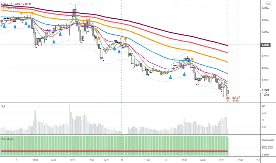
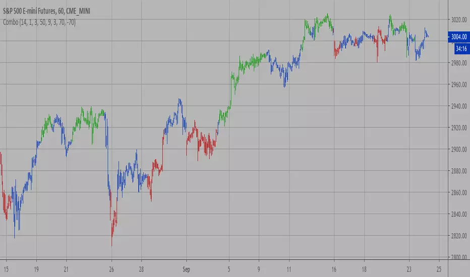
ETS Trend Early Cross ArrowsThis indicator is an updated version and alternative to the ETS Trending Arrows indicator that contains the results of years of trial and error to create an indicator aiming to mimic market entry points that a professional trader would take.
It has arrows to clearly show potential market entry points, and suggested stop-loss levels. This particular updated version of the Trending Arrows indicator responds faster to market direction changes, even before the main trend starts to change.
To use this indicator in the best way, with the best entry point, wait for the market to return close to, or touch, one of the moving averages. The larger the moving average, the better, and then enter in the direction indicated by the arrow. The arrow will not repaint once the bar closes, so use the initial arrow's appearance to prepare yourself to enter a trade, and then wait for your perfect entry that is close to a moving average or support/resistance level.
What Makes It So Powerful?
- Give you a signal as early as possible and does not "repaint" once the bar completes
- Reacts to fast market direction changes like a master trader
- Is super easy to understand and implement in your trading
- Can be used for Forex, Stocks and Crypto
- Works on all timeframes
How To Use The ETS Trend Early Cross Arrows (ETS TrendEX Arrows) Indicator
1. Add the indicator to any chart you wish to trade, Crypto, Forex or Stocks and set it to the timeframe you prefer. For instance, I use it on 1 minute and 5 minute charts for daytrading Stocks. For Forex I generally use a 15 minute chart, and longer timeframes for Crypto.
2. Open the Settings. Generally you should not need to change anything:
2.1. "Show 20, 50, 200 Moving Averages" - This is just a convenience, and is provided to help you identify where the market is trading in relation to the trend.
2.2. "Show Small Expo Moving Average" - Also provided for convenience, and goes with "SMAX" - Simple Moving Average - and the "EMAX" - Exponential Moving Average settings
2.3. "Show Potential Reversal Points" - You will notice small X indicators that appear when it's detected that the market might soon be reversing or at least halting and going sideways. A small red X at the bottom of a candle indicates that the market might not be moving further down much, warning you against taking a short position. While a small green X above a candle indicates that the market may be exhausted and soon reverse or at least stall. When the market eventually goes past the highs and lows indicated by these levels, the market often continues on its previous trend.
2.4. "Delength" - The length setting for the DeMarker indicator that's used internally.
2.5. "KC Length" - the Keltner Channel length setting.
2.6. "KC Multiplier" - the Keltner Channel multiplier setting.
2.7. "KC Source" - the Keltner Channel source setting.
2.8. "KC Exponential" - the Keltner Channel exponential or simple setting.
3. Now that you've set things up, all you need to do is to wait for a signal. Pay attention to where the market currently is in relation to the closest moving average, like the 10 SMA or 12 EMA . Keep in mind that price will often signal a new move, but then first move back to the average, before continuing in the new direction identified by the trading arrow.
4. Larger arrows are signals that go with the shorter term trend, and smaller arrows indicate a potential change in the market direction that is not yet in line with the shorter term trend. Typically it should be best to enter using the larger arrows, and be cautious, or exit a trade, that is counter to the smaller arrows.
5. These signals are intended to identify new trending moves, and for that reason, if the market moves against the signal, you should not hold on to your position hoping that it will turn in your favor.
6. When the market is moving in your favor, resist the urge to exit quickly, and use the smaller moving averages or support/resistance levels to exit your trades.
This is an "invite only" script, which means that you will need to let me know that you're interested in it before you can get access to it. This is a paid script, please follow the link in my profile to get the details or ask me directly. It may take up to 48 hours for me to respond, but I do my best to respond as quickly as possible. You will get 7 days to test it for yourself on all your charts with no restrictions.
Pesquisar nos scripts por "reversal"
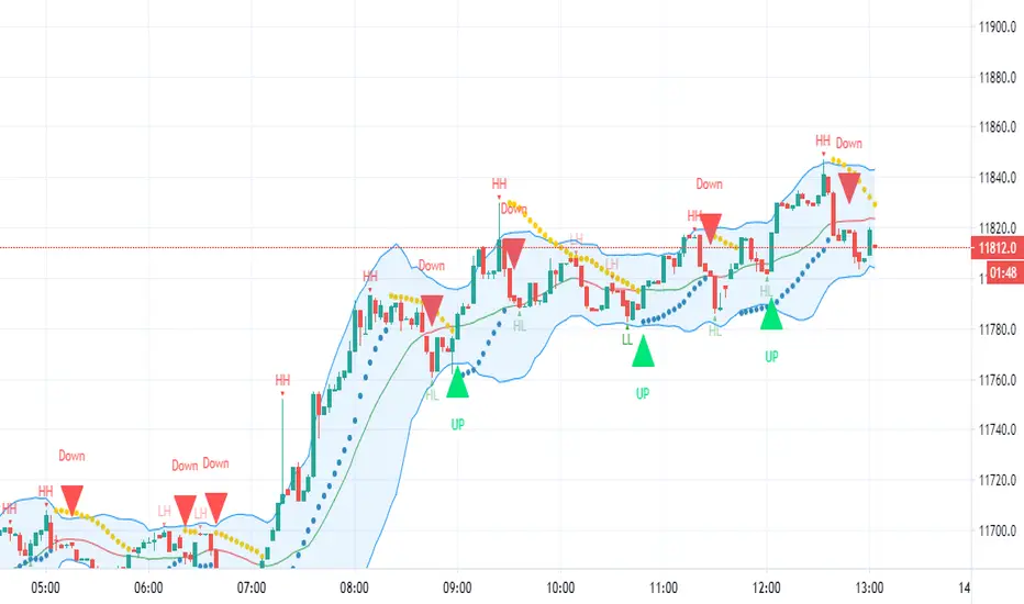
HFX543This indicator will provide the possibility of when trend reversals may happen on any time frame. It can work on any time frame and the use of Heiken Ashi candles can enhance it further.
When used with other indicators such as the MACD it can increase the possibility of a trend reversal being identified. On shorter time frames the alerts are much more frequent therefore can be less accurate so other indicators can be used.
It will show an alert Arrow for the First Flat BOTTOM Candle that has flipped on the PSAR and when the MACD has a crossover to the upside within one bar either side of the candle and those that are directly below the candle.
It will show an alert Arrow for the First Flat TOP HA Candle that has flipped on the PSAR + when the MACD has a crossover to the downside within one bar either side of the candle and those that are directly below the candle.
The Bollinger Bands have been added to enhance the possibility of a trend reversal occurring when the price reaches the Bollinger Band extremities and these should be paid attention to along with the Higher Highs (HH) and Lower Lows (LL).
The Colour changes on the Bollinger Band Moving Average from Red to Green to support a trend change possibility.
This has been designed to provide a visual confirmation that selected indicators have met certain criteria and that the trend has the possibility of reversing in the near future.
It is NOT meant to be a trading system or offer trading advice. The indicator offers only possibilities of trend reversals when the above criteria is met.
This is designed for Trend analysis ONLY.
To gain access to this invite only script, please send me a private message on Trading View so I can assist you further.
Thanks Les Gallagher
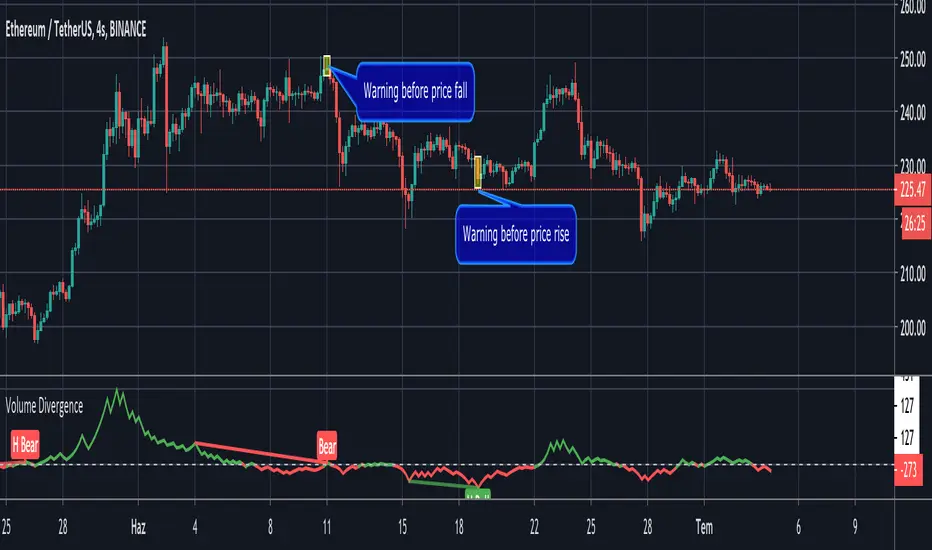
Volume Divergence by MMIt's a simply volume indicator. You should watch for breaks on both volume uptrend and volume downtrend. It uses fibonacci numbers to build smoothed moving average of volume.
Also you can check divergences for trend reversal and momentum loss.
GreedZone indicator - Contrarian Indicator"Be fearful when others are greedy, and greedy when others are fearful" - Warren Buffett. Greedzone is a contrarian indicator that gives us an indication when greed begins to take over in the market. Traders should be prepared for increased volatility and good trading opportunities.
The Greedzone is visualized with green candlesticks above the price.
HOW TO USE
1. Use the indicator to identify when investors are greedy.
2. Use the indicator to identify potential reversal points.
INDICATOR IN ACTION
1 hour chart
5 min chart
I hope you find this indicator useful , and please comment or contact me if you like the script or have any questions/suggestions for future improvements. Thanks!
I will continually work on this indicator, so please share your experience and feedback as it will enable me to make even better improvements. Thanks to everyone that has already contacted me regarding my scripts. Your feedback is valuable for future developments!
-----------------
Disclaimer
Copyright by Zeiierman.
The information contained in my scripts/indicators/ideas does not constitute financial advice or a solicitation to buy or sell any securities of any type. I will not accept liability for any loss or damage, including without limitation any loss of profit, which may arise directly or indirectly from the use of or reliance on such information.
All investments involve risk, and the past performance of a security, industry, sector, market, financial product, trading strategy, or individual’s trading does not guarantee future results or returns. Investors are fully responsible for any investment decisions they make. Such decisions should be based solely on an evaluation of their financial circumstances, investment objectives, risk tolerance, and liquidity needs.
My scripts/indicators/ideas are only for educational purposes!

Fearzone (Expo) - Contrarian Indicator"Be fearful when others are greedy, and greedy when others are fearful" - Warren Buffett. Fearzone is a contrarian indicator that gives us an indication when fear begins to take over in the market. Traders should be prepared for increased volatility and good trading opportunities.
The Fearzone is visualized with red candlesticks below the price.
This version of the FearZone indicator is slightly different from the one ©kruskakli has published.
HOW TO USE
1. Use the indicator to identify when investors are fearful.
2. Use the indicator to identify potential reversal points.
INDICATOR IN ACTION
1 hour chart
5 min chart
I hope you find this indicator useful , and please comment or contact me if you like the script or have any questions/suggestions for future improvements. Thanks!
I will continually work on this indicator, so please share your experience and feedback as it will enable me to make even better improvements. Thanks to everyone that has already contacted me regarding my scripts. Your feedback is valuable for future developments!
-----------------
Disclaimer
Copyright by Zeiierman.
The information contained in my scripts/indicators/ideas does not constitute financial advice or a solicitation to buy or sell any securities of any type. I will not accept liability for any loss or damage, including without limitation any loss of profit, which may arise directly or indirectly from the use of or reliance on such information.
All investments involve risk, and the past performance of a security, industry, sector, market, financial product, trading strategy, or individual’s trading does not guarantee future results or returns. Investors are fully responsible for any investment decisions they make. Such decisions should be based solely on an evaluation of their financial circumstances, investment objectives, risk tolerance, and liquidity needs.
My scripts/indicators/ideas are only for educational purposes!

Candlestick Reversal SystemHello Traders,
In the book "Secrets of a Pivot Boss: Revealing Proven Methods for Profiting in the Market" by Franklin Ochoa, Four different types of reversal systems were introduced and candlestick patterns are used to find reversals. I will not write a lot about the book, you should get/read it for yourself. There are many great ideas in the book, Candlesetick Reversal System, Following Trend, Time Price Opportunity, Advanced Camarilla Concepts and much more.
Reversal systems mentioned in the book are :
- Wick Reversal System
- Exteme Reversal System
- Outside Reversal System
- Doji Reversal System
I tried to add these four reversal systems to the script. If you need detailed info you better read the book ;)
Enjoy!
Combo Strategy 123 Reversal & CMOfilt This is combo strategies for get a cumulative signal.
First strategy
This System was created from the Book "How I Tripled My Money In The
Futures Market" by Ulf Jensen, Page 183. This is reverse type of strategies.
The strategy buys at market, if close price is higher than the previous close
during 2 days and the meaning of 9-days Stochastic Slow Oscillator is lower than 50.
The strategy sells at market, if close price is lower than the previous close price
during 2 days and the meaning of 9-days Stochastic Fast Oscillator is higher than 50.
Second strategy
This indicator plots a CMO which ignores price changes which are less
than a threshold value. CMO was developed by Tushar Chande. A scientist,
an inventor, and a respected trading system developer, Mr. Chande developed
the CMO to capture what he calls "pure momentum". For more definitive
information on the CMO and other indicators we recommend the book The New
Technical Trader by Tushar Chande and Stanley Kroll.
The CMO is closely related to, yet unique from, other momentum oriented
indicators such as Relative Strength Index, Stochastic, Rate-of-Change, etc.
It is most closely related to Welles Wilder`s RSI, yet it differs in several ways:
- It uses data for both up days and down days in the numerator, thereby directly
measuring momentum;
- The calculations are applied on unsmoothed data. Therefore, short-term extreme
movements in price are not hidden. Once calculated, smoothing can be applied to the
CMO, if desired;
- The scale is bounded between +100 and -100, thereby allowing you to clearly see
changes in net momentum using the 0 level. The bounded scale also allows you to
conveniently compare values across different securities.
WARNING:
- For purpose educate only
- This script to change bars colors.
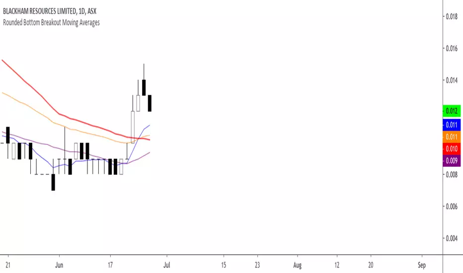
Rounded Bottom Breakout Strategy Moving Averages20-day SMA , 34-day EMA , 50-day SMA and 200-day SMA moving average indicator based on Rick Saddler's Rounded Bottom Reversal Breakout Strategy
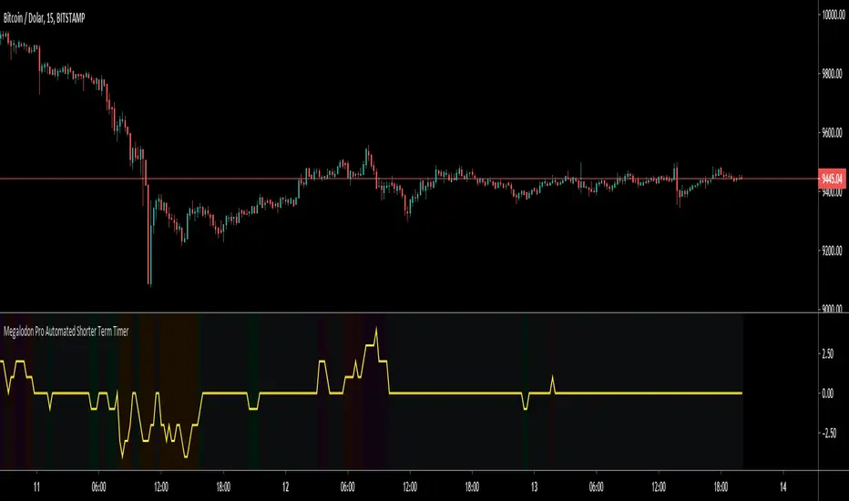
Megalodon Pro Automated Shorter Term TimerHow to use?
It should be used on 1 minute time frame for finding potential market reversal points.
It shows reversal signals by printing Green for Buy - Orange for Strong Buy - Red for Sell - Purple for Strong Sell signals.
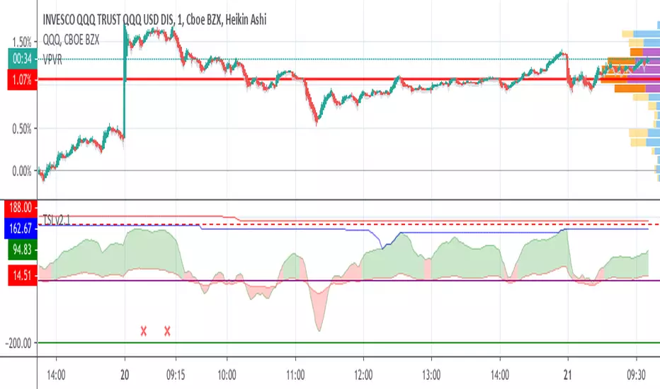
Trend Shift Indicator v2.0 [Bradford Fournier]TSI v2.0-- Early Trend Shift Indicator Version 2.0
PURPOSE: This indicator detects early changes in trends and provides confirmation
TSI aims to do the following simultaneously:
detect trend changes early
provide a means of trend confirmation -- while still being early in the cycle change
provide an early indication of trend changing away from positive.
SIGNALS
EARLY SELL: Green peaked and decreasing
SELL: GREEN TO RED
(STRONG SELL: TSI peaked and crossunder "overbought input(180)")
BUY: RED TO GREEN
NOTE: Version 1 is still operative and updated. This is simply an alternative version for those who prefer it. SEE CHANGES BELOW
-----------------
VERSION 2 CHANGES:
Earlier reversal indications.
Dynamic risk range. (yellow filler)
[*}Overlay for signal confirmation
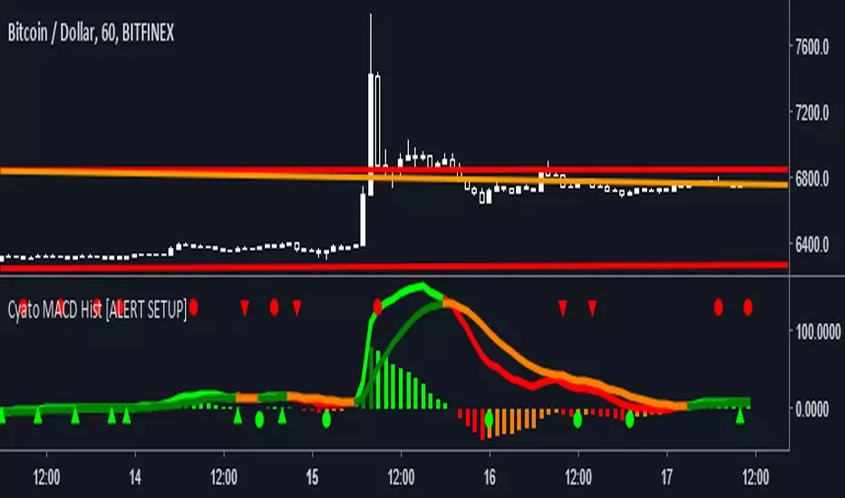
Cyatophilum MACD Hist [ALERT SETUP]Hello, I made a classic MACD Histogram indicator, with custom alerts and parameters though.
Shapes
Green circles : The MACD histogram is reversing, this is a buy (or Long) signal.
Red circles : The MACD histogram is reversing, this is a sell (or Short) signal.
Green Arrow up : The MACD histogram is enduring a bear fakeout. This is a buy signal.
Red Arrow up : The MACD histogram is enduring a bullfakeout. This is a sell signal.
Parameters ( INPUTS )
Classic MACD parameters.
Sensitivity : (1 = really sensitive to reverals and fakeouts - 5 = much less sensitive)
Activate Fakeouts : default is true. Uncheck to deactivate fakeout on chart /!\ will also deactivate fakeout alerts
Alerts (Automated trading alerts : SMS, email, etc.) that you can create :
Buy : a buy signal that will trigger on a bull reversal or a bear fakeout. No more than one buy/sell signal in a row (You will not get multiple buy signals or multiple sell signals in a row)
Sell : a sell signal that will trigger on a bearreversal or a bullfakeout. No more than one buy/sell signal in a row (You will not get multiple buy signals or multiple sell signals in a row)
Buy (Bull Reversal) : a buy signal that will trigger on each bull reversal.
Buy (Bear Fakeout) : a buy signal that will trigger on each bear fakeout.
Sell (Bear Reversal) : a sell signal that will trigger on each bear reversal.
Sell (Bull Fakeout) : a sell signal that will trigger on each bull fakeout.
If you like, leave a comment, thanks! If you find any bug, thanks for telling me!
-----------------------------------------------------------------------------------------------------------------
I am selling access to private scripts and backtests that can be found on my website .
I am also open to commissions : TradingView's PineScript development, reverse engineering.
Thanks.
PRPI - Potential Reversal Points IndicatorThis indicator signals potential exhaustion of current trend.
Green background means we are in up-trend.
Spike in the opposite direction on histogram signals a waning of trend exhaustion.
Comment on this to get an access.

CCI AnalysesThis script analyses the CCI indicator values, showing when a fall in price or a rise in price may happen, or when the CCI is confirming the trend.
The user can personalize:
The period to be used and the range of the CCI bands ( by default)
The slow SMA period to be used and the price percentage variation to react for bullish/bearish
Consecutive number of bullish/bearish in order to consider the CCI as a trend confirmation rather than a price reversal

3-Candle Reversal & Retest (Severin-style) v63-Candle Reversal & Retest (Severin-style)
What it does
Detects a three-candle reversal with a retest entry, then plots compact buy/sell markers anchored to the exact bar and price. Designed for fast execution timeframes (1–5m) but works on any TF.
Pattern logic (longs)
Approach candle: bearish candle closing above a chosen reference level.
Reversal candle: bullish candle with a minimum body size (filters out dojis). Optional requirement that it sweeps the prior low.
Retest/entry candle: dips back into a configurable fraction of candle #2’s body and closes bullish (lower wick first).
Shorts use the mirror conditions.
Reference level (choose one)
Manual level – type a price or drag the built-in cyan line.
Previous Day High/Low
Session VWAP
SMA (length input)
The approach candle must close on the correct side of this level (above for longs, below for shorts).
Signals & visuals
Green triangle = 3C Long. Plotted at low − pad ticks.
Red triangle = 3C Short. Plotted at high + pad ticks.
All markers are price-anchored (bar index + price), so they move with candles when you pan/zoom.
Option to keep markers only for the last N bars (prevents “floating” artefacts when the chart rescales).
Inputs
Reference source (Manual / PDH / PDL / VWAP / SMA)
Manual price and draggable line toggle (+ one-click reset)
Min body % for reversal candle
Require liquidity sweep on candle #2 (on/off)
Retest zone fraction of candle #2 body (e.g., 0.5 = lower/upper half)
Marker size and padding (in ticks)
Retain markers for last N bars
Alerts
“3C Long Entry” and “3C Short Entry” fire on bar close when the full three-candle pattern is confirmed.
How to use
Pick your reference. For manual levels, enable the draggable line and place it at your area (PD value area edge, key level, etc.).
Trade the first clean signal that forms around that reference, ideally confluencing with structure/flow (VWAP, prior day levels, liquidity pools).
Manage risk below/above the retest candle or the reversal candle, not the approach candle.
Tips
Works best after impulsive moves into a level, not in the middle of chop.
Tighten the min body % to avoid weak reversals on slow sessions.
On highly volatile alts, increase the retest fraction (e.g., 0.6–0.7) to demand a deeper retest.
Notes
This is an execution pattern, not a complete system. Add your own higher-timeframe bias and risk rules.
Nothing here is financial advice. Use position sizing and stops.
Run Reversal Run Reversal is a multi-timeframe precision reversal tool designed to detect momentum shifts after a clean run of candles in one direction. The indicator identifies when price completes a directional run on the lower timeframe and confirms alignment with a matching run on a higher timeframe. Once both conditions are met, it marks the first reversal candle and plots a customizable entry and stop-loss setup.
Features include:
• Multi-combo structure (1m→5m, 2m→10m, 3m→15m, etc.)
• Separate settings for bullish and bearish entries & stop-loss modes
• Swing stop-loss using the most recent high/low within adjustable lookback
• Optional wick, open, and body-percentage stop-loss types
• Clean visual entry and SL lines
• Built-in alerts for buy and sell signals
Run Reversal helps traders catch early reversals with structure, clarity, and precision across multiple timeframe combinations.

Alt Trading: Tom's Reversal Strategy
The Alt Trading: Tom’s Reversal Strategy indicator is a multi-layered market-structure and regime-detection tool engineered specifically for intraday futures trading. It dynamically computes hourly directional bias using higher-timeframe OHLC data, enabling traders to visually interpret bullish or bearish regime transitions with precision. The system identifies structural turning points through pivot-based swing analysis and confirms Break-of-Structure (BOS) events with strict or non-strict validation logic. Once a valid BOS occurs inside a higher-timeframe continuation window, the indicator generates long or short signals that incorporate intelligent risk modeling, including pivot-derived stop placement and customizable fixed-risk calibration. Automated risk-to-reward boxes are drawn in real time, updating tick-by-tick until either the stop or target is hit, allowing for clear visualization of trade lifecycle and expectancy. A second-order trend-continuation filter highlights specific intra-hour windows—referred to as “blue windows”—giving traders refined timing insights for potential reversals. With optional background bias shading, customizable TP/SL lines, and fully stylized BOS labels, the interface provides a clean, highly interpretable execution framework. Designed with scalpers and algorithmic traders in mind, the indicator blends structure, regime context, and real-time visualization to produce high-probability reversal setups during the most liquid hours of the trading session.

CVD Smart ReversalCVD Smart Reversal - Indicator Description
═══════════════════════════════════════════════════════════════
🎯 OVERVIEW
Advanced reversal detection system based on Cumulative Volume Delta (CVD) analysis with intelligent quality filtering. Each signal is rated 1-5 stars based on multiple confirmation factors.
═══════════════════════════════════════════════════════════════
🌟 KEY FEATURES
1. Quality Score System (⭐1-5)
• 5 independent criteria evaluate each signal
• Filter weak setups - show only 3+ star signals
• Higher scores = higher probability setups
2. Adaptive Thresholds
• Automatically adjusts to market volatility
• High volatility = stricter criteria
• Works across all market conditions
3. Volume Context Analysis
• Compares current vs historical volume
• Calculates buy/sell pressure (requires >60%)
• Filters reversals with weak volume
4. Multi-Timeframe Confirmation (Optional)
• Validates signals on higher timeframe
• Ensures trading with the trend
• Reduces counter-trend entries
5. Smart Signal Management
• Minimum 5-bar spacing between signals
• Automatic label cleanup (max 20)
• Clean chart, no clutter
═══════════════════════════════════════════════════════════════
📊 HOW IT WORKS
CVD Calculation:
Custom volume delta calculation using intrabar polarity estimation.
Signal Detection:
Combines CVD reversal, candlestick patterns (Hammer, Shooting Star, Engulfing, Pin Bar), and divergence analysis.
Quality Scoring:
Each signal scores 0-5 points based on:
• CVD strength (statistical deviation)
• Pattern quality (professional recognition)
• Divergence presence
• Volume context (ratio + pressure)
• Trend confirmation (MTF or acceleration)
═══════════════════════════════════════════════════════════════
🎮 USAGE MODES
Sniper Mode (High Quality):
• Min Score: 4-5 stars
• MTF: ON
• Result: 2-5 signals/day, highest win-rate
Active Mode (Balanced):
• Min Score: 3 stars
• MTF: OFF
• Result: 5-15 signals/day, good balance
Scalping Mode (High Frequency):
• Min Score: 2 stars
• Divergence: Weak
• Result: Many signals, fast execution needed
═══════════════════════════════════════════════════════════════
💡 BEST PRACTICES
• Use on liquid markets with reliable volume data
• Combine with key support/resistance levels
• Pay attention to quality scores - 4-5★ have significantly higher success
• Enable MTF confirmation for intraday trading
• Use stricter settings during high-impact news events
═══════════════════════════════════════════════════════════════
⚙️ DEFAULT SETTINGS
• Quality Filter: ON
• Minimum Score: 3 stars
• MTF Confirmation: OFF
• Volume Analysis: ON
• Divergence Strength: Medium
These settings provide 5-15 quality signals per day on active instruments.
═══════════════════════════════════════════════════════════════
🔔 ALERTS
Four alert types available:
• Strong Bullish Reversal (4-5★ only)
• Strong Bearish Reversal (4-5★ only)
• Regular Bullish Reversal (all qualified)
• Regular Bearish Reversal (all qualified)
═══════════════════════════════════════════════════════════════
⚠️ LIMITATIONS
• Requires volume data (not suitable for markets without volume)
• MTF confirmation adds lag by design
• Lower timeframes may need adjusted settings
• Quality filter reduces signal frequency by design
═══════════════════════════════════════════════════════════════
🎯 ORIGINALITY
This indicator combines multiple unique elements:
• Multi-factor quality scoring (not found in other CVD tools)
• Adaptive volatility-based thresholds
• Volume pressure calculation with directional filter
• Integrated MTF confirmation within scoring system
• Smart label management with automatic cleanup
The quality scoring system transforms CVD analysis from binary signals into a ranked opportunity system, allowing traders to prioritize setups based on confluence strength.
═══════════════════════════════════════════════════════════════
📈 DISPLAY ELEMENTS
• Background highlighting on signal bars
• Triangle markers at entry points
• Labels showing CVD, Delta, Divergence, Quality Score, Volume flag
• Real-time info panel with CVD metrics
• Clean visual presentation
═══════════════════════════════════════════════════════════════
✅ SUITABLE FOR
• Crypto (BTC, ETH, etc.)
• Stocks (AAPL, TSLA, SPY, etc.)
• Futures (ES, NQ, CL, etc.)
• Forex (brokers with volume data)
• All timeframes (1m to 1D)
═══════════════════════════════════════════════════════════════

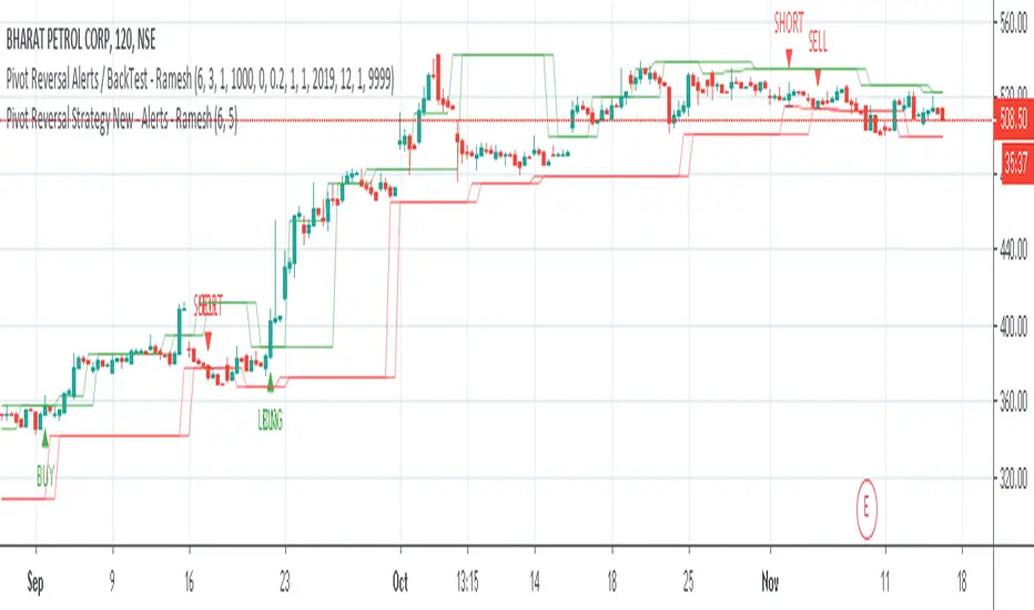
Pivot Reversal Signals - Multi ConfirmationPivot Reversal Signals - Multi-Confirmation System
Overview
A comprehensive reversal detection indicator designed for daytraders that combines six independent technical signals to identify high-probability pivot points. The indicator uses a scoring system to classify signal strength as Weak, Medium, or Strong based on the number of confirmations present.
How It Works
The indicator monitors six key reversal signals simultaneously:
1. RSI Divergence - Detects when price makes new highs/lows but RSI shows weakening momentum
2. MACD Divergence - Identifies divergence between price action and MACD histogram
3. Key Level Touch - Confirms price is at significant support/resistance (previous day high/low, premarket high/low, VWAP, 50 SMA)
4. Reversal Candlestick Patterns - Recognizes bullish/bearish engulfing, hammers, and shooting stars
5. Moving Average Confluence - Validates bounces/rejections at stacked moving averages (9/20/50)
6. Volume Spike - Confirms increased participation (default: 1.5x average volume)
Signal Strength Classification
• Weak (3/6 confirmations) - Small circles for situational awareness only
• Medium (4/6 confirmations) - Regular triangles, viable entry signals
• Strong (5-6/6 confirmations) - Large triangles with background highlight, highest probability setups
Visual Features
• Entry Signals: Green triangles (up) for long entries, red triangles (down) for short entries
• Exit Warnings: Orange X markers when opposing signals appear
• Signal Labels: Show confirmation score (e.g., "5/6") and strength level
• Key Levels Displayed:
o Previous Day High/Low - Solid green/red lines (uses actual daily data)
o Premarket High/Low - Blue/orange circles (4:00 AM - 9:30 AM EST)
o VWAP - Purple line
o Moving Averages - 9 EMA (blue), 20 EMA (orange), 50 SMA (red)
• Background Tinting: Subtle color on strongest reversal zones
Key Level Detection
The indicator uses request.security() to accurately fetch previous day's high/low from daily timeframe data, ensuring precise level placement. Premarket high/low levels are dynamically tracked during premarket sessions (4:00 AM - 9:30 AM EST) and plotted throughout the trading day, providing critical support/resistance zones that often influence price action during regular hours.
Customizable Parameters
• Signal strength thresholds (adjust required confirmations)
• RSI settings (length, overbought/oversold levels)
• MACD parameters (fast/slow/signal lengths)
• Moving average periods
• Volume spike multiplier
• Toggle individual display elements (levels, MAs, labels)
Best Practices
• Use on 5-minute charts for entries, confirm on 15-minute for direction
• Focus on Medium and Strong signals; Weak signals provide context only
• Strong signals (5-6 confirmations) have the highest win rate
• Pay special attention to reversals at premarket high/low - these levels frequently hold
• Previous day high/low often acts as major support/resistance
• Always use proper risk management and stop losses
• Works best in moderately trending markets
Alert Capabilities
Set custom alerts for:
• Strong long/short signals
• All entry signals (medium + strong)
• Exit warnings for open positions
Ideal For
• Daytraders and scalpers (especially SPY, QQQ, and liquid equities)
• Swing traders seeking precise entries
• Traders who prefer confirmation-based systems
• Anyone looking to reduce false signals with multi-factor validation
• Traders who utilize premarket levels in their strategy
Technical Notes
• Uses Pine Script v6
• Premarket hours: 4:00 AM - 9:30 AM EST
• Previous day levels pulled from daily timeframe for accuracy
• Maximum 500 labels to maintain chart performance
• All key levels update dynamically in real-time
________________________________________
Note: This indicator provides signal analysis only and should be used as part of a complete trading strategy. Past performance does not guarantee future results. Always practice proper risk management.

3-DMA Panic Reversal [Diodato/SMI]This indicator is a market breadth tool designed to identify panic selling climaxes and potential bullish reversals. It combines Diodato's 3-DMA % Decliners with the Stochastic Momentum Index (SMI) to filter for high-probability setups.
How It Works The indicator tracks the 3-Day Moving Average of Declining Issues. When this metric spikes above 65%, it signals extreme market panic.
Signals
🟢 Green Dot (Bullish Reversal): Appears when a panic phase ends. It triggers when the 3-DMA Decliners crosses back under the 65% panic threshold, but only if the market was Oversold (SMI < 0) at some point during the panic. This "latch" logic ensures you catch the reversal even if momentum shifts slightly before the panic fully subsides.
🔴 Red Dot (Bearish/Overbought): Appears if the 3-DMA Decliners is high (> 65%) while the market is simultaneously Overbought (SMI > 40). This is a rare but powerful signal of extreme volatility or a "crash up" exhaustion.
Settings
Panic Threshold: Default 65% (Adjustable).
SMI Settings: 10, 3, 3 (Fast/Standard).
Credits Original concept by Diodato. Enhanced with SMI context for precision.

Trend-Adaptive 3-Band Reversal CloudThis indicator plots a trend-adaptive, volatility-based 3-band cloud on your chart to visually contextualize potential high-probability reversal, balance, and exhaustion price zones — all in strict alignment with TradingView’s house rules and best compliance practices.
How It Works
Trend Detection:
The script determines short-term trend direction using two adjustable EMAs (fast and slow). When the fast EMA is above the slow, the environment is classified as an uptrend; when below, as a downtrend.
Adaptive Bands and Clouds:
Around the dynamic trend baseline, three cloud “bands” are drawn using multiples of an ATR (Average True Range) volatility filter, automatically adjusting for evolving market conditions:
Middle Band (Fair Value Zone): Area around the baseline, where price is statistically balanced.
Upper Outer Band: In an uptrend, this shows a potential 'exhaustion/overextension' area; in a downtrend, it can act as a deep pullback or reversal area.
Lower Outer Band: In an uptrend, this highlights a possible 'deep pullback/reversal' area; in a downtrend, it becomes the potential exhaustion zone.
Contextual RSI Markers:
When price is in one of the outer bands and RSI is overbought (upper) or oversold (lower), a tiny diamond marker appears on that band as extra context — offering a visual cue for a possible high-momentum exhaustion or deep reversal zone, but never a trade signal or advice.
Visuals and Compliance:
All cloud regions use three different, semi-transparent colors for easy reading, and never block price action.
Labels indicate only “Possible Exhaustion,” “Deep Pullback Zone,” and “Balanced/Fair Value”—the language is strictly neutral and descriptive.
All calculations run only on confirmed, historical bars with zero repainting, no future bar lookahead, and no predictive overlays.
How to Use
Add to Chart:
Simply add the indicator to any chart and timeframe.
Configure:
Adjust the EMA, ATR, and RSI settings via the input panel to best fit your instrument and preferred sensitivity.
Choose band multipliers to widen or contract the cloud according to volatility or your system.
Toggle RSI marker/context highlighting as desired.
Interpretation:
Middle Cloud (“Balanced/Fair Value”): Price in this zone suggests mean reversion, equilibrium, or fair pricing for the session’s volatility/trend conditions.
Outer Clouds: If price reaches an outer cloud, pay attention for potential mean-reversion (if trend persists) or exhaustion zones (especially if a diamond appears).
Uptrend: Lower cloud is where larger pullbacks/reversals are often initiated; upper cloud indicates potential trend exhaustion.
Downtrend: Upper and lower clouds are reversed in interpretation.
Diamond Markers: A red diamond atop the upper band signifies RSI overbought; a lime diamond below the lower band shows RSI oversold. These do not recommend trading—only highlight increased likelihood that buyers/sellers may be overextended.
Best Practices:
Do not use the indicator in isolation or as a signal generator. Combine its context with price action confirmation, volume, or other non-repainting tools.
Use labels only for navigation/context, never as actionable advice.
Technical Details
Inputs/Customization: Fully adjustable (EMAs, ATR period, band multipliers, RSI thresholds, label/marker toggles).
Logic: All code processes only historical closed bars and overlays information in real time.
No repaint, strategy, or alerts: No signals, no script-driven trading, and no claims of prediction or guaranteed probability.
House-rule Clean: The script and its visuals are compliant with TradingView’s publishing requirements, both visually and textually.
Summary:
This tool is designed for traders who want to visually frame high-probability reversal, equilibrium, and exhaustion zones adaptively—while keeping price action primary and avoiding visual or conceptual clutter. Use it to better understand where price may statistically find resistance/support or revert, not to automate signals or guarantee outcomes

Trendy Bands + Reversal SignalsTrendy Bands + Reversal Signals
This is a versatile and powerful TradingView indicator that combines a dual Bollinger Bands system with momentum-based reversal signals. It's designed to help traders identify the prevailing trend, potential volatility expansions/contractions, and key reversal points in the market.
Core Concept: The indicator uses two sets of Bollinger Bands with different standard deviation settings to create a "band within a band" structure. This visual setup makes it easier to gauge trend strength and spot potential breakouts or breakdowns. Additionally, it calculates a custom momentum oscillator to generate early warnings for potential trend reversals.

Ultimate RSI Suite [BigBeluga]🔵 OVERVIEW
The Ultimate RSI Suite elevates the classic RSI into a full professional trading system.
It combines momentum analysis, advanced divergence detection, volatility-based RSI channels, multi-timeframe signals, deviation tracking, and reversal alerts into one powerful tool.
This is no ordinary RSI — it’s a complete momentum intelligence engine designed to identify trend strength, exhaustion, breakout conditions, and reliable reversal points with high precision.
⚠️ Note:
This suite enhances RSI with MTF dashboards, dynamic channels, deviation logic, and smart alerting — ideal for scalpers, swing traders, and institutional-style trend followers.
🔵 CONCEPTS
Measures market momentum to detect overbought/oversold zones and trend health
Tracks RSI behavior relative to dynamic channels (BB/Keltner/Donchian)
Identifies regular bullish & bearish divergences
Detects deviation moves after divergence to confirm trend continuation or exhaustion
Multi-timeframe RSI conditions reveal higher-timeframe confluence
Reversal triggers confirm early momentum shifts
Overbought/oversold gradients visually highlight exhaustion zones
🔵 FEATURES
Classic + Enhanced RSI with configurable lookback & price source
RSI-Channel System (Bollinger, Keltner, Donchian) for volatility-adaptive trend structure
RSI-Smoothing MA for trend direction filters
RSI Reversal Signals for early trend inflection detection
RSI Reversal Signals Deviation Levels +1 / +2 for advanced continuation confirmation
Overbought/Oversold Gradient Zones at 35/65 or user-defined levels
Divergence Engine for bullish & bearish momentum exhaustion signals
On-Chart Divergence & Signals (full overlay capability)
Divergence Engine Deviation Levels +1 / +2 for advanced continuation confirmation
Multi-Timeframe Dashboard (RSI OB/OS, signals, divergences, channel breaks)
• Hover your mouse over any signal cell to see how many bars ago it was triggered
• Signals automatically expire after 50 bars
Smart Alerts for divergence, reversals, channel breaks, and deviation triggers
🔵 HOW TO USE
Enter long when RSI reverses from oversold & prints bullish divergence or a ▲ signal
Enter short when RSI reverses from overbought & prints bearish divergence or ▼
Use channel breaks to confirm momentum expansions or trend shifts
Look for deviation crosses (+1 / +2) for strong confirmation after divergence
Track MTF table — more timeframe agreement = stronger conviction
Avoid trading against MTF RSI extremes (OB/OS stacked zones)
Combine with market structure or volume-based tools for maximum precision
🔵 ALERTS
Includes full automation suite:
Bullish / Bearish divergence
Reversal signals (▲ / ▼)
Channel breakouts (Up/Down)
Deviation +1 / +2 confirmation triggers
Extra RSI signal deviation alerts for precision continuation reads
Great for automated systems, confirmation models, and high-probability intraday/swing entries.
🔵 CONCLUSION
The Ultimate RSI Suite transforms RSI into a smart momentum-analysis system.
With multi-timeframe logic, dynamic channels, advanced divergence/deviation systems, and powerful visual cues, it offers institutional-grade trend, exhaustion, and reversal detection.
If you rely on RSI, this toolkit provides superior clarity, deeper context, and stronger execution timing — making it an elite upgrade for professional traders.
Script pago
