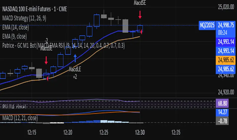
Patrice - GC M1 Bot (MACD EMA RSI)//@version=6
indicator("Patrice - GC M1 Bot (MACD EMA RSI)", overlay = true)
//----------------------
// Inputs (optimisés GC)
//----------------------
emaLenFast = input.int(9, "EMA rapide")
emaLenSlow = input.int(14, "EMA lente")
rsiLen = input.int(14, "RSI length")
atrLen = input.int(14, "ATR length")
volLen = input.int(20, "Volume moyenne")
slMult = input.float(0.4, "SL = ATR x", step = 0.1)
tpMult = input.float(0.7, "TP = ATR x", step = 0.1)
minAtr = input.float(0.7, "ATR minimum pour trader", step = 0.1)
maxDistEmaPct = input.float(0.3, "Distance max EMA9 (%)", step = 0.1)
//----------------------
// Indicateurs
//----------------------
ema9 = ta.ema(close, emaLenFast)
ema14 = ta.ema(close, emaLenSlow)
= ta.macd(close, 12, 26, 9)
hist = macdLine - signalLine
rsi = ta.rsi(close, rsiLen)
atr = ta.atr(atrLen)
volMa = ta.sma(volume, volLen)
//----------------------
// Session 9:30 - 11:00 (NY)
//----------------------
hourSession = hour(time, "America/New_York")
minuteSession = minute(time, "America/New_York")
inSession = (hourSession == 9 and minuteSession >= 30) or
(hourSession > 9 and hourSession < 11) or
(hourSession == 11 and minuteSession == 0)
//----------------------
// Filtres vol / ATR / distance EMA
//----------------------
volFilter = volume > volMa
atrFilter = atr > minAtr
distEmaPct = math.abs(close - ema9) / close * 100.0
distFilter = distEmaPct < maxDistEmaPct
//----------------------
// Tendance
//----------------------
bullTrend = close > ema9 and close > ema14 and ema9 > ema14
bearTrend = close < ema9 and close < ema14 and ema9 < ema14
//----------------------
// MACD : 2e barre
//----------------------
bullSecondBar = hist > 0 and hist > 0 and hist <= 0
bearSecondBar = hist < 0 and hist < 0 and hist >= 0
//----------------------
// Filtres RSI
//----------------------
rsiLongOk = rsi < 70 and rsi >= 45 and rsi <= 65
rsiShortOk = rsi > 30 and rsi >= 35 and rsi <= 55
//----------------------
// Gestion du risque (simple pour l'instant)
//----------------------
canTradeRisk = true
//----------------------
// Conditions d'entrée
//----------------------
longCond = bullTrend and bullSecondBar and rsiLongOk and inSession and volFilter and atrFilter and distFilter and canTradeRisk
shortCond = bearTrend and bearSecondBar and rsiShortOk and inSession and volFilter and atrFilter and distFilter and canTradeRisk
//----------------------
// SL / TP (info seulement, pas d'ordres)
//----------------------
slPoints = atr * slMult
tpPoints = atr * tpMult
longSL = close - slPoints
longTP = close + tpPoints
shortSL = close + slPoints
shortTP = close - tpPoints
//----------------------
// Visuels
//----------------------
plot(ema9, title = "EMA 9")
plot(ema14, title = "EMA 14")
plotshape(longCond, title = "Signal Long", style = shape.triangleup, location = location.belowbar, size = size.tiny, text = "L")
plotshape(shortCond, title = "Signal Short", style = shape.triangledown, location = location.abovebar, size = size.tiny, text = "S")
//----------------------
// Conditions d'ALERTE
//----------------------
alertcondition(longCond, title = "ALERTE LONG", message = "Signal LONG Patrice GC bot")
alertcondition(shortCond, title = "ALERTE SHORT", message = "Signal SHORT Patrice GC bot")
Pesquisar nos scripts por "bear"
Super momentum DBSISuper momentum DBSI: The Ultimate Guide
1. What is this Indicator?
The Super momentum DBSI is a "Consensus Engine." Instead of relying on a single line (like an RSI) to tell you where the market is going, this tool calculates 33 distinct technical indicators simultaneously for every single candle.
It treats the market like a democracy. It asks 33 mathematical "voters" (Momentum, Trend, Volume, Volatility) if they are Bullish or Bearish.
If 30 out of 33 say "Buy," the score is high (Yellow), and the trend is extremely strong.
If only 15 say "Buy," the score is low (Teal), and the trend is weak or choppy.
2. Visual Guide: How to Read the Numbers
The Scores
Top Number (Bears): Represents Selling Pressure.
Bottom Number (Bulls): Represents Buying Pressure.
The Colors (The Traffic Lights)
The colors are your primary signal. They tell you who is currently winning the war.
🟡 YELLOW (Dominance):
This indicates the Winning Side.
If the Bottom Number is Yellow, Bulls are in control.
If the Top Number is Yellow, Bears are in control.
🔴 RED (Weakness):
This appears on the Top. It means Bears are present but losing.
🔵 TEAL (Weakness):
This appears on the Bottom. It means Bulls are present but losing.
3. Trading Strategy
Scenario A: The "Strong Buy" (Long Entry)
The Setup: You are looking for a shift in momentum where Buyers overwhelm Sellers.
Watch the Bottom Number: Wait for it to turn Yellow.
Confirm Strength: Ensure the score is above 15 and rising (e.g., 12 → 18 → 22).
Check the Top: The Top Number should be Red and low (below 10).
Trigger: Enter on the candle close.
Scenario B: The "Strong Sell" (Short Entry)
The Setup: You are looking for Sellers to crush the Buyers.
Watch the Top Number: Wait for it to turn Yellow.
Confirm Strength: Ensure the score is above 15 and rising.
Check the Bottom: The Bottom Number should be Teal and low.
Trigger: Enter on the candle close.
Scenario C: The "No Trade Zone" (Choppy Market)
The Setup: The market is confused.
Visual: Top is Red, Bottom is Teal.
Meaning: NOBODY IS WINNING. There is no Yellow number.
Action: Do not trade. This usually happens during lunch hours, weekends, or right before big news. This filter alone will save you from many false breakouts.
4. What is Inside? (The 33 Indicators)
To give you confidence in the signals, here is exactly what the script is checking:
Group 1: Momentum (Oscillators)
Detects if price is moving fast.
RSI (Relative Strength Index)
CCI (Commodity Channel Index)
Stochastic
Williams %R
Momentum
Rate of Change (ROC)
Ultimate Oscillator
Awesome Oscillator
True Strength Index (TSI)
Stoch RSI
TRIX
Chande Momentum Oscillator
Group 2: Trend Direction
Detects the general path of the market.
13. MACD
14. Parabolic SAR
15. SuperTrend
16. ALMA (Moving Average)
17. Aroon
18. ADX (Directional Movement)
19. Coppock Curve
20. Ichimoku Conversion Line
21. Hull Moving Average
Group 3: Price Action
Detects where price is relative to averages.
22. Price vs EMA 20
23. Price vs EMA 50
24. Price vs EMA 200
Group 4: Volume & Force
Detects if there is money behind the move.
25. Money Flow Index (MFI)
26. On Balance Volume (OBV)
27. Chaikin Money Flow (CMF)
28. VWAP (Intraday)
29. Elder Force Index
30. Ease of Movement
Group 5: Volatility
Detects if price is pushing the outer limits.
31. Bollinger Bands
32. Keltner Channels
33. Donchian Channels
5. Pro Tips for Success
Don't Catch Knives: If the Bear score (Top) is Yellow and 25+, do not try to buy the dip. Wait for the Yellow score to break.
Exit Early: If you are Long and the Yellow Bull score drops from 28 to 15 in one candle, TAKE PROFIT. The momentum has died.
Use Higher Timeframes: This indicator works best on 15m, 1H, and 4H charts. On the 1m chart, it may be too volatile.

Directional Imbalance Index [BigBeluga]🔵 OVERVIEW
The Directional Imbalance Index is designed to track market strength by counting how often price sets new highs or lows over a defined lookback period. Every time a bar forms a new extreme, the indicator records a +1 count for either bullish (highs) or bearish (lows). These counts are aggregated into a rolling calculation, allowing traders to see which side dominates and how directional imbalance evolves.
🔵 CONCEPTS
Each new highest high → adds a bullish count (+1).
Each new lowest low → adds a bearish count (+1).
Counts are stored inside arrays over a user-defined Calculation Period .
for i = 0 to period-1
h = high
l = low
if h == upper
countUp.push(1)
if l == lower
countDn.push(1)
The balance between bullish and bearish counts highlights dominance and imbalance.
Normalized percentages help compare both sides (e.g., 65% bullish vs 35% bearish).
🔵 FEATURES
Counts new highs/lows over a chosen Highest/Lowest Length .
Aggregates values over a rolling Calculation Period .
Plots cumulative bullish vs bearish totals in the subchart.
Displays % share of bulls vs bears from total counts.
On-chart labels mark bars where a count was added.
Plots reference lines of the current upper (high) and lower (low) ranges.
Dynamic fill between bullish/bearish plots to visualize which side dominates.
🔵 HOW TO USE
Look for persistent bullish imbalance (bull % > bear %) as confirmation of upward momentum.
Look for persistent bearish imbalance (bear % > bull %) as confirmation of downward momentum.
Watch for shifts in % dominance — often early signs of trend reversal or weakening strength.
Use labels on the chart to visually confirm which bars contributed to directional bias.
Combine with trend or volume tools to confirm whether imbalance aligns with market direction.
🔵 CONCLUSION
The Directional Imbalance Index offers a systematic way to measure directional pressure. By counting how often price pushes into new territory, the indicator reveals whether bulls or bears are taking control. This makes it a valuable tool for detecting early signs of trend continuation or exhaustion, helping traders align with the side most likely to dominate.

DTC - 1.3.6 DTC Trading ClubDTC – 1.3.6 | Advanced Multi-Timeframe Trend & Algo Trading System
Version: 1.3.6
Platform: TradingView
Category: Trend Following | Algo Automation | EMA-Based System
⚙️ 1. Algo Trading Integration (NEW FEATURE)
The DTC 1.3.6 system bridges TradingView charts and MT4/MT5 execution through PineConnector for full trade automation.
This allows signals generated by the indicator to instantly execute trades on your broker account using your unique Trading UID.
Purpose & Justification:
Many traders rely on chart-based strategies but struggle with delayed manual execution. The Algo module removes this limitation by automating execution directly from the chart while retaining full user control. This makes it particularly useful for systematic traders who want precision, consistency, and hands-off operation.
Key Features:
🔑 Trading UID Input: Enter your PineConnector UID (e.g., 88888999) for authenticated trade routing.
📊 Auto-Formatted Trade Message: All signals are converted into PineConnector-ready format:
88888999, buy, EURUSD, risk=0.01, comment=DTCAlgoMT4/MT5
⚙️ Full Customization: Users decide every aspect of execution — direction, position risk, TP/SL handling, signal triggers, comments, and automation level.
Practical Example:
If a Bullish EMA alignment occurs on EURUSD while the ATR filter confirms valid volatility, the Algo instantly sends a buy order to MT4/MT5 with all trade parameters defined in TradingView — enabling disciplined, automated execution without delay.
Requirements:
TradingView paid plan (for webhook automation)
PineConnector account (free tier supported)
Once connected, the DTC system becomes a fully autonomous trading solution, handling entries, exits, and TP/SL management in real-time.
📈 2. Multi-Timeframe Trend Dashboard
This feature provides an at-a-glance overview of market bias across key timeframes (1H–Monthly), powered by the EMA 30 vs EMA 60 trend structure.
Purpose & Justification:
Instead of switching between multiple charts, traders can instantly see the dominant market direction across all major timeframes. This prevents counter-trend trades and encourages entries that align with broader market momentum.
Dashboard Highlights:
Customizable position (top/bottom left/right)
Adjustable text size for clarity
Displays active trend for 1H, 4H, Daily, Weekly, and Monthly
Shows Unrealized PnL of the current open position
Displays ATR Filter Status (Active/Inactive with color coding)
Practical Example:
A trader sees a Bullish signal on the 1H chart, but the dashboard shows Bearish trends on higher timeframes — indicating possible short-term pullback rather than a trend reversal. This cross-timeframe awareness improves decision quality.
💹 3. EMA Trend System
At the core of DTC lies a 6-layer EMA engine (30–60) designed to identify strong, sustained market trends with minimal lag.
Logic:
Bullish: EMA 30 > 35 > 40 > 45 > 50 > 60
Bearish: EMA 30 < 35 < 40 < 45 < 50 < 60
Purpose & Justification:
Unlike simple two-EMA systems, this multi-layer method filters out temporary volatility and confirms trend stability before triggering signals. It forms the foundation upon which all other modules (signals, dashboard, algo, and volatility filter) operate.
🚦 4. Buy/Sell Signal Engine
Signals are automatically generated when EMA layers achieve full alignment — a clear confirmation of market direction change.
Conditions:
🟢 Buy Signal: Bearish/Neutral → Bullish alignment
🔴 Sell Signal: Bullish/Neutral → Bearish alignment
Signals appear as chart markers and can trigger PineConnector automation.
Purpose & Justification:
This systematic approach removes emotional decision-making and allows traders to execute only when objective technical conditions are met. It ensures that trades align with verified EMA-based momentum, not short-term price noise.
🎯 5. Dynamic TP/SL and Entry Visualization
Every trade signal comes with a structured plan:
Entry, Stop-Loss, and seven Take-Profit levels
Accurate price labels and color-coded zones
Customizable SL modes: Tiny, Small, Mid, or Large
Purpose & Justification:
Visual clarity is vital for risk control. The indicator presents all levels directly on the chart, so traders instantly see potential reward-to-risk scenarios and manage trades with confidence. These levels also integrate seamlessly with PineConnector automation for direct execution.
📊 6. ATR Volatility Filter
The ATR (Average True Range) module filters low-quality setups during flat or choppy markets.
Mechanics:
Adjustable ATR period and multiplier
Filters weak signals when volatility drops below threshold
Purpose & Justification:
ATR adds a volatility-based confirmation layer to the EMA logic. For instance, if EMAs align but ATR volatility is below the active threshold, no trade is executed — reducing false signals during quiet sessions. When ATR exceeds the threshold, trades are allowed, improving accuracy and overall system efficiency.
Example:
During a ranging session on GBPUSD, EMAs may align briefly, but low ATR prevents a false breakout entry. Once volatility returns, the same logic allows a valid trade — demonstrating how ATR integrates into the system to maintain trade quality.
🎨 7. EMA Cloud Visualization
The EMA Cloud fills the area between EMA 30 and EMA 60 to visualize momentum strength and transitions.
🟩 Green cloud → Bullish bias
🟥 Red cloud → Bearish bias
Purpose & Justification:
This feature provides immediate visual cues for traders to identify trend continuation or potential reversal zones. It reinforces the EMA Trend System, ensuring that market structure and momentum remain visually synchronized.
🧭 8. Full Customization Control
DTC 1.3.6 allows traders to tailor every aspect of their experience:
Enable/disable components such as Algo, Dashboard, TP/SL, and Cloud
Modify color themes, layouts, and text sizes
Adjust to suit manual or automated trading preferences
Purpose & Justification:
Different traders have different workflows. By allowing total flexibility, DTC can adapt to short-term scalping, swing trading, or long-term automation setups without performance compromise.
✅ Summary
DTC 1.3.6 is a professional-grade, multi-layer trading system that integrates EMA-based trend detection, volatility filtering, dashboard visualization, and algo automation into one cohesive tool.
Each module contributes to a unified goal — identifying high-probability market conditions, confirming them through volatility, and executing with precision.
This system is Invite-Only because it represents a complete, ready-to-deploy professional framework — not a single indicator — and requires responsible use of automation features that directly impact live trading accounts.
DTC = Smart Visuals + Total Control + True Automation.
⚠️ Disclaimer
This indicator is for educational and research purposes only.
The DTC Team, developers, and affiliates do not provide financial advice and assume no responsibility for profits or losses from its use.
Trading involves substantial risk.
Past performance is not indicative of future results.
Users should test thoroughly on demo accounts, perform independent analysis, and consult a licensed financial advisor before live trading.
By using this tool, you acknowledge that all actions are taken at your own risk and that the DTC Team bears no liability for any outcomes.

ICS🏛️ Institutional Confluence Suite (ICS) Indicator
The Institutional Confluence Suite is a powerful and highly customizable TradingView indicator built to help traders identify key institutional trading concepts across multiple timeframes. It visualizes essential market components like Market Structures (MS), Order Blocks (OB)/Breaker Blocks (BB), Liquidity Zones, and Volume Profile, providing a confluence of institutional price action data.
📈 Key Features & Components
1. Market Structures (MS)
Purpose: Automatically identifies and labels shifts in market trends (Market Structure Shift, MSS) and continuations (Break of Structure, BOS).
Timeframe Detection: You can select detection across Short Term, Intermediate Term, or Long Term swings to match your trading horizon.
Visualization: Plots colored lines (Bullish: Teal, Bearish: Red) to mark the structures and optional text labels (BOS/MSS) for clear identification.
2. Order & Breaker Blocks (OB/BB)
Purpose: Detects and projects potential Supply and Demand zones based on recent price action that led to a swing high or low.
Block Types: Distinguishes between standard Order Blocks and Breaker Blocks (OBs that fail to hold and are traded through, often serving as support/resistance in the opposite direction).
Customization:
Detection Term: Adjusts sensitivity (Short, Intermediate, Long Term).
Display Limit: Sets the maximum number of recent Bullish and Bearish blocks to display.
Price Reference: Option to use the Candle Body (Open/Close) or Candle Wicks (High/Low) to define the block boundaries.
Visualization: Displays blocks as colored boxes (Bullish: Green, Bearish: Red) extending into the future, with a dotted line marking the 50% equilibrium level. Breaker Blocks are indicated by a change in color/line style upon being broken.
3. Buyside & Sellside Liquidity (BSL/SSL)
Purpose: Highlights areas where retail stops/limit orders are likely clustered, often represented by a series of relatively equal highs (Buyside Liquidity) or lows (Sellside Liquidity).
Detection Term: Adjustable sensitivity (Short, Intermediate, Long Term).
Margin: Uses a margin (derived from ATR) to group similar swing points into a single liquidity zone.
Visualization: Plots a line and text label marking the swing point, and a box indicating the clustered liquidity zone.
4. Liquidity Voids (LV) / Fair Value Gaps (FVG)
Purpose: Identifies areas where price moved sharply and inefficiency was created, often referred to as Fair Value Gaps or Imbalances. These are price ranges where minimal trading volume occurred.
Threshold: Uses a multiplier applied to the 200-period ATR to filter for significant gaps.
Mode: Can be set to Present (only show voids near the current price) or Historical (show all detected voids).
Visualization: Fills the price gap with colored boxes (Bullish/Bearish zones), often segmented to represent the price delivery across the gap.
5. Enhanced Liquidity Detection
Purpose: A complementary feature that uses volume and price action to highlight areas of high liquidity turnover, potentially indicating stronger Support and Resistance zones.
Calculation: Utilizes a volume-weighted approach to color-grade liquidity zones based on their significance.
Visualization: Plots shaded boxes (gradient-colored) around swing highs/lows, with text displaying the normalized volume strength.
6. Swing Highs/Lows
Purpose: Directly marks the price points identified as Swing Highs and Swing Lows based on the lookback periods.
Timeframe Detection: Can be enabled for Short Term, Intermediate Term, or Long Term swings.
Visualization: Plots a small colored dot/label (e.g., "⦁") at the swing point.
This indicator is an invaluable tool for traders employing ICT (Inner Circle Trader), Smart Money Concepts (SMC), or general price action strategies, as it automatically aggregates and displays these critical structural and liquidity elements.

LE ScannerGENERAL OVERVIEW:
The LE Scanner is a multi-ticker dashboard that scans up to 20 tickers in real time and displays their current trend, price, volume, and key level conditions directly on your chart. It tracks how each ticker interacts with both the Previous Day’s High/Low (PDH/PDL) and Pre-Market High/Low (PMH/PML) to determine whether price is breaking above, below, or remaining inside those levels. The indicator automatically classifies each ticker as Bullish, Bearish, or Neutral based on these break conditions.
This indicator was developed by Flux Charts in collaboration with Ellis Dillinger (Ellydtrades).
What is the purpose of the indicator?:
The LE Scanner helps traders keep track of up to 20 tickers at once without switching between charts. It puts all the key information in one place, including price, daily percentage change, volume, and how each ticker is reacting around the previous day’s and pre-market highs and lows. The layout is simple and easy to read, with progress bars that show where price is relative to those levels. The goal is to save time and make it easier to understand market strength and weakness across your watchlist.
What’s the theory behind the indicator?:
The LE Scanner is built around the idea that key levels define bias. The previous day’s high and low show where the market traded most actively during the prior session, and the pre-market range reveals how price behaved before the open. When a ticker breaks both the previous day’s high and the pre-market high, it shows that buyers are in control. When it breaks both the previous day’s low and the pre-market low, sellers are in control. If neither side has full control, the bias is seen as neutral.
LE SCANNER FEATURES:
Multi-Ticker Dashboard
Key Level Tracking
Trend Classification
Sorting
Customization
Multi-Ticker Dashboard:
The LE Scanner can monitor up to 20 tickers at the same time. Each ticker has its own row in the dashboard showing:
Ticker Name
Current Price
Volume
Daily % Change
PDH Break
PDL Break
PMH Break
PML Break
Trend (bullish, bearish, or neutral)
You can enable or disable each ticker individually, so if you only want to track 5 or 10 tickers, you can simply toggle the rest off. Each ticker input lets you type in any valid ticker that’s available on TradingView.
Ticker Name:
Shows the ticker you selected in your input settings
Current Price:
Displays the latest price of that ticker based on your chart’s selected timeframe.
Volume:
Tracks the total trading volume for the current session.
Daily % Change:
Measures how much price has moved since the previous session’s close.
The remaining elements of the dashboard are explained in full detail throughout the remaining sections of this write-up.
Key Level Tracking:
The core of the LE Scanner is its ability to track and visualize how price interacts with four key levels for every ticker:
Previous Day High (PDH)
Previous Day Low (PDL)
Pre-Market High (PMH)
Pre-Market Low (PML)
These levels are updated automatically and compared to the current market price for each ticker inputted into the indicator. They show you whether the market is staying inside yesterday’s range or expanding beyond it.
🔹Previous Day High (PDH) & Previous Day Low (PDL)
The Previous Day High (PDH) marks where price reached its highest point during the last full trading session, while the Previous Day Low (PDL) marks the lowest point. Together, they define the previous day’s range and help traders understand where price is trading relative to that prior structure.
When the current price of a user-selected ticker moves above the PDH, it signals that buyers are taking control and that the ticker is now trading above yesterday’s range. In the dashboard, this change triggers a 🟢 icon under the “PDH Break” column. Once the PDH Break is confirmed, the opposite PDL Break column for that same ticker becomes blank.
When the current price of the user-selected ticker moves below the PDL, it shows that sellers are taking control and that the ticker is trading below yesterday’s range. In the dashboard, this change triggers a 🔴 icon under the “PDL Break” column. Once the PDL Break is confirmed, the opposite PDH Break column for that same ticker becomes blank.
🔹 Pre-Market High (PMH) & Pre-Market Low (PML)
The Pre-Market High (PMH) and Pre-Market Low (PML) show where price reached its highest and lowest points before the main trading session begins. On most U.S. exchanges, the pre-market session is from 4:00 AM to 9:29 AM Eastern Standard Time (EST), just before the New York session opens at 9:30 AM EST. These levels are important because they reflect how traders positioned themselves during the early morning hours. Many traders use the pre-market session to react to overnight news. The PMH and PML outline that entire pre-market range, showing where buyers and sellers fought for control and where the early balance between the two sides was established before the market opens.
When the current price of a ticker moves above the Pre-Market High, it means buyers are in control and that price has pushed through the top of the pre-market range. In the dashboard, this triggers a 🟢 icon under the “PMH Break” column. Once this break is confirmed, the opposite PML Break column for that ticker becomes blank.
When the current price moves below the Pre-Market Low, it means sellers are in control and that price has fallen beneath the pre-market range. In the dashboard, this triggers a 🔴 icon under the “PML Break” column. Once a PML Break is confirmed, the opposite PMH Break column for that ticker becomes blank.
🔹Progress Bars
The LE Scanner indicator includes progress bars that show how far the current price is from key levels.
When price is between the Previous Day High (PDH) and Previous Day Low (PDL), the progress bar measures price’s distance relative to those two points.
When price is between the Pre-Market High (PMH) and Pre-Market Low (PML), the bar tracks how far price is from those pre-market boundaries.
The closer price gets to either side, the more the bar fills, giving you a quick visual sense of how close a breakout or breakdown might be. A bar that’s nearly full means price is approaching one of the levels, while a shorter bar means it’s still far away from it. By seeing this relationship directly in the dashboard, you can see which tickers are getting ready to test key levels without flipping through multiple charts.
🔹PDH Progress Bar
The PDH progress bar measures how close price is to breaking above the previous day’s high.
When the bar is nearly full, it means the current price is trading just below yesterday’s high.
When the bar is low or mostly empty, it means price is far from the PDH and trading near the middle or lower end of the previous day’s range.
Once price breaks above the PDH, the progress bar is replaced with a green confirmation icon in the PDH Break column.
🔹Previous Day Low (PDL) Progress Bar
The PDL progress bar measures how close price is to breaking below the previous day’s low.
When the bar is nearly full, it means the current price is trading just above yesterday’s low.
When the bar is low or mostly empty, it means price is far from the PDL and trading near the middle or upper end of the previous day’s range.
Once price breaks below the PDL, the progress bar is replaced with a red confirmation icon in the PDL Break column.
🔹Pre-Market High (PMH) Progress Bar
The PMH progress bar shows how close price is to breaking above the pre-market high.
When the bar is nearly full, it means the current price is trading just below the pre-market high.
When the bar is low or mostly empty, it means price is far from the PMH and trading near the middle or lower end of the pre-market range.
Once price breaks above the PMH, the progress bar is replaced with a green confirmation icon in the PMH Break column.
🔹Pre-Market Low (PML) Progress Bar
The PML progress bar shows how close price is to breaking below the pre-market low.
When the bar is nearly full, it means the current price is trading just above the pre-market low.
When the bar is low or mostly empty, it means price is far from the PML and trading near the middle or upper end of the pre-market range.
Once price breaks below the PML, the progress bar is replaced with a red confirmation icon in the PML Break column.
Trend Classification:
The LE Scanner automatically classifies each user-inputted ticker as bullish, bearish, or neutral based on how price is interacting with its key levels.
Each trend type follows a specific set of conditions and is displayed in its own column under Trend on the dashboard.
🔹 Bullish Trend
A bullish trend occurs when price has broken above both the Previous Day High (PDH) and the Pre-Market High (PMH). This shows that buyers are in full control and that the ticker is trading firmly above the prior session’s and pre-market range.
When this condition is met, the Trend column displays a green background with an upward-facing triangle icon (▲).
🔹 Bearish Trend
A bearish trend occurs when price has broken below both the Previous Day Low (PDL) and the Pre-Market Low (PML). This indicates that sellers are in control and that the ticker is trading firmly below the prior session’s and pre-market range.
When this happens, the Trend column switches to a red background with a downward-facing triangle icon (▼).
🔹 Neutral Trend
A neutral trend occurs when price is trading inside the range, meaning it hasn’t broken above the PDH/PMH or below the PDL/PML. This indicates that neither bulls nor bears has clear control, and the ticker is consolidating between the prior session’s and pre-market range.
When this condition is active, the Trend column appears with a warning sign icon (⚠️). This helps distinguish tickers that are still forming setups from those that have already shown decisive strength or weakness.
Sorting:
The LE Scanner includes a built-in sorting feature that lets you reorder the dashboard in either descending or ascending order based on one of four metrics:
% Change
Volume
Price
Trend
Sorting is handled directly in the indicator settings, where you can toggle “Sort By” and then select your preferred Sort By criteria and Order (Ascending or Descending). When enabled, the dashboard automatically repositions every ticker to match the selected sorting method.
🔹 % Change Sorting
When you sort by % Change, the dashboard ranks tickers based on their daily percentage movement relative to the previous session’s close.
If you choose descending order, the biggest gainers appear at the top.
If you choose ascending order, the biggest decliners appear at the top.
🔹 Volume Sorting
When you sort by Volume, the dashboard arranges tickers based on their total traded volume for the current session.
If you choose descending order, the highest-volume tickers appear at the top.
If you choose ascending order, the lowest-volume tickers appear at the top.
🔹 Price Sorting
When you sort by Price, the dashboard arranges tickers by their current market price.
If you choose descending order, the highest-priced tickers appear at the top.
If you choose ascending order, the lowest-priced tickers appear at the top.
🔹 Trend Sorting
When you sort by Trend, the dashboard organizes tickers based on their directional classification.
If you choose descending order, bullish tickers appear first, followed by neutral and bearish.
If you choose ascending order, bearish tickers appear first, followed by neutral and bullish.
Customization:
The LE Scanner includes several settings that let you customize how the dashboard appears on your chart. All visual and positional elements can be adjusted to fit your personal layout preferences.
🔹 Dashboard Position
You can move the dashboard anywhere on your chart using the “Table Position” setting. Options include:
Bottom-Center
Bottom-Left
Bottom-Right
Middle-Center
Middle-Left
Middle-Right
Top-Center
Top-Left
Top-Right
🔹 Dashboard Size
The dashboard size can be adjusted to be larger or smaller. Users can choose between the following options:
Tiny
Small
Normal
Large
Huge
🔹 Color Customization
All color elements in the dashboard are customizable. You can change the following:
Background Color
Border Color
Frame Color
Text Color
Bullish Trend Color
Bearish Trend Color
Important Notes:
Because the LE Scanner tracks multiple tickers and updates all data in real time, it performs several background calculations at once. On rare occasions, this can cause the following issue:
Computation Error:
Scanning up to 20 tickers at the same time requires multiple request.security() calls. This process is resource-intensive and can sometimes trigger a calculation timeout message in TradingView. If this occurs, simply force the indicator to refresh by changing one of its settings (for example, toggling a ticker off and back on) or by removing and re-adding the indicator to your chart.
Uniqueness:
The LE Scanner is unique because it combines real-time multi-ticker tracking, sortable data, and visual feedback into one tool. It can track up to 20 tickers simultaneously, automatically sort them by % change, volume, price, or trend. The built-in progress bars provide a clear visual of how close price is to breaking key levels, while the trend classification instantly shows whether each ticker is bullish, bearish, or neutral.

Algorithm Predator - ProAlgorithm Predator - Pro: Advanced Multi-Agent Reinforcement Learning Trading System
Algorithm Predator - Pro combines four specialized market microstructure agents with a state-of-the-art reinforcement learning framework . Unlike traditional indicator mashups, this system implements genuine machine learning to automatically discover which detection strategies work best in current market conditions and adapts continuously without manual intervention.
Core Innovation: Rather than forcing traders to interpret conflicting signals, this system uses 15 different multi-armed bandit algorithms and a full reinforcement learning stack (Q-Learning, TD(λ) with eligibility traces, and Policy Gradient with REINFORCE) to learn optimal agent selection policies. The result is a self-improving system that gets smarter with every trade.
Target Users: Swing traders, day traders, and algorithmic traders seeking systematic signal generation with mathematical rigor. Suitable for stocks, forex, crypto, and futures on liquid instruments (>100k daily volume).
Why These Components Are Combined
The Fundamental Problem
No single indicator works consistently across all market regimes. What works in trending markets fails in ranging conditions. Traditional solutions force traders to manually switch indicators (slow, error-prone) or interpret all signals simultaneously (cognitive overload).
This system solves the problem through automated meta-learning: Deploy multiple specialized agents designed for specific market microstructure conditions, then use reinforcement learning to discover which agent (or combination) performs best in real-time.
Why These Specific Four Agents?
The four agents provide orthogonal failure mode coverage —each agent's weakness is another's strength:
Spoofing Detector - Optimal in consolidation/manipulation; fails in trending markets (hedged by Exhaustion Detector)
Exhaustion Detector - Optimal at trend climax; fails in range-bound markets (hedged by Liquidity Void)
Liquidity Void - Optimal pre-breakout compression; fails in established trends (hedged by Mean Reversion)
Mean Reversion - Optimal in low volatility; fails in strong trends (hedged by Spoofing Detector)
This creates complete market state coverage where at least one agent should perform well in any condition. The bandit system identifies which one without human intervention.
Why Reinforcement Learning vs. Simple Voting?
Traditional consensus systems have fatal flaws: equal weighting assumes all agents are equally reliable (false), static thresholds don't adapt, and no learning means past mistakes repeat indefinitely.
Reinforcement learning solves this through the exploration-exploitation tradeoff: Continuously test underused agents (exploration) while primarily relying on proven winners (exploitation). Over time, the system builds a probability distribution over agent quality reflecting actual market performance.
Mathematical Foundation: Multi-armed bandit problem from probability theory, where each agent is an "arm" with unknown reward distribution. The goal is to maximize cumulative reward while efficiently learning each arm's true quality.
The Four Trading Agents: Technical Explanation
Agent 1: 🎭 Spoofing Detector (Institutional Manipulation Detection)
Theoretical Basis: Market microstructure theory on order flow toxicity and information asymmetry. Based on research by Easley, López de Prado, and O'Hara on high-frequency trading manipulation.
What It Detects:
1. Iceberg Orders (Hidden Liquidity Absorption)
Method: Monitors volume spikes (>2.5× 20-period average) with minimal price movement (<0.3× ATR)
Formula: score += (close > open ? -2.5 : 2.5) when volume > vol_avg × 2.5 AND abs(close - open) / ATR < 0.3
Interpretation: Large volume without price movement indicates institutional absorption (buying) or distribution (selling) using hidden orders
Signal Logic: Contrarian—fade false breakouts caused by institutional manipulation
2. Spoofing Patterns (Fake Liquidity via Layering)
Method: Analyzes candlestick wick-to-body ratios during volume spikes
Formula: if upper_wick > body × 2 AND volume_spike: score += 2.0
Mechanism: Spoofing creates large wicks (orders pulled before execution) with volume evidence
Signal Logic: Wick direction indicates trapped participants; trade against the failed move
3. Post-Manipulation Reversals
Method: Tracks volume decay after manipulation events
Formula: if volume > vol_avg × 3 AND volume / volume < 0.3: score += (close > open ? -1.5 : 1.5)
Interpretation: Sharp volume drop after manipulation indicates exhaustion of manipulative orders
Why It Works: Institutional manipulation creates detectable microstructure anomalies. While retail traders see "mysterious reversals," this agent quantifies the order flow patterns causing them.
Parameter: i_spoof (sensitivity 0.5-2.0) - Controls detection threshold
Best Markets: Consolidations before breakouts, London/NY overlap windows, stocks with institutional ownership >70%
Agent 2: ⚡ Exhaustion Detector (Momentum Failure Analysis)
Theoretical Basis: Technical analysis divergence theory combined with VPIN reversals from market microstructure literature.
What It Detects:
1. Price-RSI Divergence (Momentum Deceleration)
Method: Compares 5-bar price ROC against RSI change
Formula: if price_roc > 5% AND rsi_current < rsi : score += 1.8
Mathematics: Second derivative detecting inflection points
Signal Logic: When price makes higher highs but momentum makes lower highs, expect mean reversion
2. Volume Exhaustion (Buying/Selling Climax)
Method: Identifies strong price moves (>5% ROC) with declining volume (<-20% volume ROC)
Formula: if price_roc > 5 AND vol_roc < -20: score += 2.5
Interpretation: Price extension without volume support indicates retail chasing while institutions exit
3. Momentum Deceleration (Acceleration Analysis)
Method: Compares recent 3-bar momentum to prior 3-bar momentum
Formula: deceleration = abs(mom1) < abs(mom2) × 0.5 where momentum significant (> ATR)
Signal Logic: When rate of price change decelerates significantly, anticipate directional shift
Why It Works: Momentum is lagging, but momentum divergence is leading. By comparing momentum's rate of change to price, this agent detects "weakening conviction" before reversals become obvious.
Parameter: i_momentum (sensitivity 0.5-2.0)
Best Markets: Strong trends reaching climax, parabolic moves, instruments with high retail participation
Agent 3: 💧 Liquidity Void Detector (Breakout Anticipation)
Theoretical Basis: Market liquidity theory and order book dynamics. Based on research into "liquidity holes" and volatility compression preceding expansion.
What It Detects:
1. Bollinger Band Squeeze (Volatility Compression)
Method: Monitors Bollinger Band width relative to 50-period average
Formula: bb_width = (upper_band - lower_band) / middle_band; triggers when < 0.6× average
Mathematical Foundation: Regression to the mean—low volatility precedes high volatility
Signal Logic: When volatility compresses AND cumulative delta shows directional bias, anticipate breakout
2. Volume Profile Gaps (Thin Liquidity Zones)
Method: Identifies sharp volume transitions indicating few limit orders
Formula: if volume < vol_avg × 0.5 AND volume < vol_avg × 0.5 AND volume > vol_avg × 1.5
Interpretation: Sudden volume drop after spike indicates price moved through order book to low-opposition area
Signal Logic: Price accelerates through low-liquidity zones
3. Stop Hunts (Liquidity Grabs Before Reversals)
Method: Detects new 20-bar highs/lows with immediate reversal and rejection wick
Formula: if new_high AND close < high - (high - low) × 0.6: score += 3.0
Mechanism: Market makers push price to trigger stop-loss clusters, then reverse
Signal Logic: Enter reversal after stop-hunt completes
Why It Works: Order book theory shows price moves fastest through zones with minimal liquidity. By identifying these zones before major moves, this agent provides early entry for high-reward breakouts.
Parameter: i_liquidity (sensitivity 0.5-2.0)
Best Markets: Range-bound pre-breakout setups, volatility compression zones, instruments prone to gap moves
Agent 4: 📊 Mean Reversion (Statistical Arbitrage Engine)
Theoretical Basis: Statistical arbitrage theory, Ornstein-Uhlenbeck mean-reverting processes, and pairs trading methodology applied to single instruments.
What It Detects:
1. Z-Score Extremes (Standard Deviation Analysis)
Method: Calculates price distance from 20-period and 50-period SMAs in standard deviation units
Formula: zscore_20 = (close - SMA20) / StdDev(50)
Statistical Interpretation: Z-score >2.0 means price is 2 standard deviations above mean (97.5th percentile)
Trigger Logic: if abs(zscore_20) > 2.0: score += zscore_20 > 0 ? -1.5 : 1.5 (fade extremes)
2. Ornstein-Uhlenbeck Process (Mean-Reverting Stochastic Model)
Method: Models price as mean-reverting stochastic process: dx = θ(μ - x)dt + σdW
Implementation: Calculates spread = close - SMA20, then z-score of spread vs. spread distribution
Formula: ou_signal = (spread - spread_mean) / spread_std
Interpretation: Measures "tension" pulling price back to equilibrium
3. Correlation Breakdown (Regime Change Detection)
Method: Compares 50-period price-volume correlation to 10-period correlation
Formula: corr_breakdown = abs(typical_corr - recent_corr) > 0.5
Enhancement: if corr_breakdown AND abs(zscore_20) > 1.0: score += zscore_20 > 0 ? -1.2 : 1.2
Why It Works: Mean reversion is the oldest quantitative strategy (1970s pairs trading at Morgan Stanley). While simple, it remains effective because markets exhibit periodic equilibrium-seeking behavior. This agent applies rigorous statistical testing to identify when mean reversion probability is highest.
Parameter: i_statarb (sensitivity 0.5-2.0)
Best Markets: Range-bound instruments, low-volatility periods (VIX <15), algo-dominated markets (forex majors, index futures)
Multi-Armed Bandit System: 15 Algorithms Explained
What Is a Multi-Armed Bandit Problem?
Origin: Named after slot machines ("one-armed bandits"). Imagine facing multiple slot machines, each with unknown payout rates. How do you maximize winnings?
Formal Definition: K arms (agents), each with unknown reward distribution with mean μᵢ. Goal: Maximize cumulative reward over T trials. Challenge: Balance exploration (trying uncertain arms to learn quality) vs. exploitation (using known-best arm for immediate reward).
Trading Application: Each agent is an "arm." After each trade, receive reward (P&L). Must decide which agent to trust for next signal.
Algorithm Categories
Bayesian Approaches (probabilistic, optimal for stationary environments):
Thompson Sampling
Bootstrapped Thompson Sampling
Discounted Thompson Sampling
Frequentist Approaches (confidence intervals, deterministic):
UCB1
UCB1-Tuned
KL-UCB
SW-UCB (Sliding Window)
D-UCB (Discounted)
Adversarial Approaches (robust to non-stationary environments):
EXP3-IX
Hedge
FPL-Gumbel
Reinforcement Learning Approaches (leverage learned state-action values):
Q-Values (from Q-Learning)
Policy Network (from Policy Gradient)
Simple Baseline:
Epsilon-Greedy
Softmax
Key Algorithm Details
Thompson Sampling (DEFAULT - RECOMMENDED)
Theoretical Foundation: Bayesian decision theory with conjugate priors. Published by Thompson (1933), rediscovered for bandits by Chapelle & Li (2011).
How It Works:
Model each agent's reward distribution as Beta(α, β) where α = wins, β = losses
Each step, sample from each agent's beta distribution: θᵢ ~ Beta(αᵢ, βᵢ)
Select agent with highest sample: argmaxᵢ θᵢ
Update winner's distribution after observing outcome
Mathematical Properties:
Optimality: Achieves logarithmic regret O(K log T) (proven optimal)
Bayesian: Maintains probability distribution over true arm means
Automatic Balance: High uncertainty → more exploration; high certainty → exploitation
⚠️ CRITICAL APPROXIMATION: This is a pseudo-random approximation of true Thompson Sampling. True implementation requires random number generation from beta distributions, which Pine Script doesn't provide. This version uses Box-Muller transform with market data (price/volume decimal digits) as entropy source. While not mathematically pure, it maintains core exploration-exploitation balance and learns agent preferences effectively.
When To Use: Best all-around choice. Handles non-stationary markets reasonably well, balances exploration naturally, highly sample-efficient.
UCB1 (Upper Confidence Bound)
Formula: UCB_i = reward_mean_i + sqrt(2 × ln(total_pulls) / pulls_i)
Interpretation: First term (exploitation) + second term (exploration bonus for less-tested arms)
Mathematical Properties:
Deterministic : Always selects same arm given same state
Regret Bound: O(K log T) — same optimality as Thompson Sampling
Interpretable: Can visualize confidence intervals
When To Use: Prefer deterministic behavior, want to visualize uncertainty, stable markets
EXP3-IX (Exponential Weights - Adversarial)
Theoretical Foundation: Adversarial bandit algorithm. Assumes environment may be actively hostile (worst-case analysis).
How It Works:
Maintain exponential weights: w_i = exp(η × cumulative_reward_i)
Select agent with probability proportional to weights: p_i = (1-γ)w_i/Σw_j + γ/K
After outcome, update with importance weighting: estimated_reward = observed_reward / p_i
Mathematical Properties:
Adversarial Regret: O(sqrt(TK log K)) even if environment is adversarial
No Assumptions: Doesn't assume stationary or stochastic reward distributions
Robust: Works even when optimal arm changes continuously
When To Use: Extreme non-stationarity, don't trust reward distribution assumptions, want robustness over efficiency
KL-UCB (Kullback-Leibler Upper Confidence Bound)
Theoretical Foundation: Uses KL-divergence instead of Hoeffding bounds. Tighter confidence intervals.
Formula (conceptual): Find largest q such that: n × KL(p||q) ≤ ln(t) + 3×ln(ln(t))
Mathematical Properties:
Tighter Bounds: KL-divergence adapts to reward distribution shape
Asymptotically Optimal: Better constant factors than UCB1
Computationally Intensive: Requires iterative binary search (15 iterations)
When To Use: Maximum sample efficiency needed, willing to pay computational cost, long-term trading (>500 bars)
Q-Values & Policy Network (RL-Based Selection)
Unique Feature: Instead of treating agents as black boxes with scalar rewards, these algorithms leverage the full RL state representation .
Q-Values Selection:
Uses learned Q-values: Q(state, agent_i) from Q-Learning
Selects agent via softmax over Q-values for current market state
Advantage: Selects based on state-conditional quality (which agent works best in THIS market state)
Policy Network Selection:
Uses neural network policy: π(agent | state, θ) from Policy Gradient
Direct policy over agents given market features
Advantage: Can learn non-linear relationships between market features and agent quality
When To Use: After 200+ RL updates (Q-Values) or 500+ updates (Policy Network) when models converged
Machine Learning & Reinforcement Learning Stack
Why Both Bandits AND Reinforcement Learning?
Critical Distinction:
Bandits treat agents as contextless black boxes: "Agent 2 has 60% win rate"
Reinforcement Learning adds state context: "Agent 2 has 60% win rate WHEN trend_score > 2 and RSI < 40"
Power of Combination: Bandits provide fast initial learning with minimal assumptions. RL provides state-dependent policies for superior long-term performance.
Component 1: Q-Learning (Value-Based RL)
Algorithm: Temporal Difference Learning with Bellman equation.
State Space: 54 discrete states formed from:
trend_state = {0: bearish, 1: neutral, 2: bullish} (3 values)
volatility_state = {0: low, 1: normal, 2: high} (3 values)
RSI_state = {0: oversold, 1: neutral, 2: overbought} (3 values)
volume_state = {0: low, 1: high} (2 values)
Total states: 3 × 3 × 3 × 2 = 54 states
Action Space: 5 actions (No trade, Agent 1, Agent 2, Agent 3, Agent 4)
Total state-action pairs: 54 × 5 = 270 Q-values
Bellman Equation:
Q(s,a) ← Q(s,a) + α ×
Parameters:
α (learning rate): 0.01-0.50, default 0.10 - Controls step size for updates
γ (discount factor): 0.80-0.99, default 0.95 - Values future rewards
ε (exploration): 0.01-0.30, default 0.10 - Probability of random action
Update Mechanism:
Position opens with state s, action a (selected agent)
Every bar position is open: Calculate floating P&L → scale to reward
Perform online TD update
When position closes: Perform terminal update with final reward
Gradient Clipping: TD errors clipped to ; Q-values clipped to for stability.
Why It Works: Q-Learning learns "quality" of each agent in each market state through trial and error. Over time, builds complete state-action value function enabling optimal state-dependent agent selection.
Component 2: TD(λ) Learning (Temporal Difference with Eligibility Traces)
Enhancement Over Basic Q-Learning: Credit assignment across multiple time steps.
The Problem TD(λ) Solves:
Position opens at t=0
Market moves favorably at t=3
Position closes at t=8
Question: Which earlier decisions contributed to success?
Basic Q-Learning: Only updates Q(s₈, a₈) ← reward
TD(λ): Updates ALL visited state-action pairs with decayed credit
Eligibility Trace Formula:
e(s,a) ← γ × λ × e(s,a) for all s,a (decay all traces)
e(s_current, a_current) ← 1 (reset current trace)
Q(s,a) ← Q(s,a) + α × TD_error × e(s,a) (update all with trace weight)
Lambda Parameter (λ): 0.5-0.99, default 0.90
λ=0: Pure 1-step TD (only immediate next state)
λ=1: Full Monte Carlo (entire episode)
λ=0.9: Balance (recommended)
Why Superior: Dramatically faster learning for multi-step tasks. Q-Learning requires many episodes to propagate rewards backwards; TD(λ) does it in one.
Component 3: Policy Gradient (REINFORCE with Baseline)
Paradigm Shift: Instead of learning value function Q(s,a), directly learn policy π(a|s).
Policy Network Architecture:
Input: 12 market features
Hidden: None (linear policy)
Output: 5 actions (softmax distribution)
Total parameters: 12 features × 5 actions + 5 biases = 65 parameters
Feature Set (12 Features):
Price Z-score (close - SMA20) / ATR
Volume ratio (volume / vol_avg - 1)
RSI deviation (RSI - 50) / 50
Bollinger width ratio
Trend score / 4 (normalized)
VWAP deviation
5-bar price ROC
5-bar volume ROC
Range/ATR ratio - 1
Price-volume correlation (20-period)
Volatility ratio (ATR / ATR_avg - 1)
EMA50 deviation
REINFORCE Update Rule:
θ ← θ + α × ∇log π(a|s) × advantage
where advantage = reward - baseline (variance reduction)
Why Baseline? Raw rewards have high variance. Subtracting baseline (running average) centers rewards around zero, reducing gradient variance by 50-70%.
Learning Rate: 0.001-0.100, default 0.010 (much lower than Q-Learning because policy gradients have high variance)
Why Policy Gradient?
Handles 12 continuous features directly (Q-Learning requires discretization)
Naturally maintains exploration through probability distribution
Can converge to stochastic optimal policy
Component 4: Ensemble Meta-Learner (Stacking)
Architecture: Level-1 meta-learner combines Level-0 base learners (Q-Learning, TD(λ), Policy Gradient).
Three Meta-Learning Algorithms:
1. Simple Average (Baseline)
Final_prediction = (Q_prediction + TD_prediction + Policy_prediction) / 3
2. Weighted Vote (Reward-Based)
weight_i ← 0.95 × weight_i + 0.05 × (reward_i + 1)
3. Adaptive Weighting (Gradient-Based) — RECOMMENDED
Loss Function: L = (y_true - ŷ_ensemble)²
Gradient: ∂L/∂weight_i = -2 × (y_true - ŷ_ensemble) × agent_contribution_i
Updates weights via gradient descent with clipping and normalization
Why It Works: Unlike simple averaging, meta-learner discovers which base learner is most reliable in current regime. If Policy Gradient excels in trending markets while Q-Learning excels in ranging, meta-learner learns these patterns and weights accordingly.
Feature Importance Tracking
Purpose: Identify which of 12 features contribute most to successful predictions.
Update Rule: importance_i ← 0.95 × importance_i + 0.05 × |feature_i × reward|
Use Cases:
Feature selection: Drop low-importance features
Market regime detection: Importance shifts reveal regime changes
Agent tuning: If VWAP deviation has high importance, consider boosting agents using VWAP
RL Position Tracking System
Critical Innovation: Proper reinforcement learning requires tracking which decisions led to outcomes.
State Tracking (When Signal Validates):
active_rl_state ← current_market_state (0-53)
active_rl_action ← selected_agent (1-4)
active_rl_entry ← entry_price
active_rl_direction ← 1 (long) or -1 (short)
active_rl_bar ← current_bar_index
Online Updates (Every Bar Position Open):
floating_pnl = (close - entry) / entry × direction
reward = floating_pnl × 10 (scale to meaningful range)
reward = clip(reward, -5.0, 5.0)
Update Q-Learning, TD(λ), and Policy Gradient
Terminal Update (Position Close):
Final Q-Learning update (no next Q-value, terminal state)
Update meta-learner with final result
Update agent memory
Clear position tracking
Exit Conditions:
Time-based: ≥3 bars held (minimum hold period)
Stop-loss: 1.5% adverse move
Take-profit: 2.0% favorable move
Market Microstructure Filters
Why Microstructure Matters
Traditional technical analysis assumes fair, efficient markets. Reality: Markets have friction, manipulation, and information asymmetry. Microstructure filters detect when market structure indicates adverse conditions.
Filter 1: VPIN (Volume-Synchronized Probability of Informed Trading)
Theoretical Foundation: Easley, López de Prado, & O'Hara (2012). "Flow Toxicity and Liquidity in a High-Frequency World."
What It Measures: Probability that current order flow is "toxic" (informed traders with private information).
Calculation:
Classify volume as buy or sell (close > close = buy volume)
Calculate imbalance over 20 bars: VPIN = |Σ buy_volume - Σ sell_volume| / Σ total_volume
Compare to moving average: toxic = VPIN > VPIN_MA(20) × sensitivity
Interpretation:
VPIN < 0.3: Normal flow (uninformed retail)
VPIN 0.3-0.4: Elevated (smart money active)
VPIN > 0.4: Toxic flow (informed institutions dominant)
Filter Logic:
Block LONG when: VPIN toxic AND price rising (don't buy into institutional distribution)
Block SHORT when: VPIN toxic AND price falling (don't sell into institutional accumulation)
Adaptive Threshold: If VPIN toxic frequently, relax threshold; if rarely toxic, tighten threshold. Bounded .
Filter 2: Toxicity (Kyle's Lambda Approximation)
Theoretical Foundation: Kyle (1985). "Continuous Auctions and Insider Trading."
What It Measures: Price impact per unit volume — market depth and informed trading.
Calculation:
price_impact = (close - close ) / sqrt(Σ volume over 10 bars)
impact_zscore = (price_impact - impact_mean) / impact_std
toxicity = abs(impact_zscore)
Interpretation:
Low toxicity (<1.0): Deep liquid market, large orders absorbed easily
High toxicity (>2.0): Thin market or informed trading
Filter Logic: Block ALL SIGNALS when toxicity > threshold. Most dangerous when price breaks from VWAP with high toxicity.
Filter 3: Regime Filter (Counter-Trend Protection)
Purpose: Prevent counter-trend trades during strong trends.
Trend Scoring:
trend_score = 0
trend_score += close > EMA8 ? +1 : -1
trend_score += EMA8 > EMA21 ? +1 : -1
trend_score += EMA21 > EMA50 ? +1 : -1
trend_score += close > EMA200 ? +1 : -1
Range:
Regime Classification:
Strong Bull: trend_score ≥ +3 → Block all SHORT signals
Strong Bear: trend_score ≤ -3 → Block all LONG signals
Neutral: -2 ≤ trend_score ≤ +2 → Allow both directions
Filter 4: Liquidity Boost (Signal Enhancer)
Unique: Unlike other filters (which block), this amplifies signals during low liquidity.
Logic: if volume < vol_avg × 0.7: agent_scores × 1.2
Why It Works: Low liquidity often precedes explosive moves (breakouts). By increasing agent sensitivity during compression, system catches pre-breakout signals earlier.
Technical Implementation & Approximations
⚠️ Critical Approximations Required by Pine Script
1. Thompson Sampling: Pseudo-Random Beta Distribution
Academic Standard: True random sampling from beta distributions using cryptographic RNG
This Implementation: Box-Muller transform for normal distribution using market data (price/volume decimal digits) as entropy source, then scale to beta distribution mean/variance
Impact: Not cryptographically random, may have subtle biases in specific price ranges, but maintains correct mean and approximate variance. Sufficient for bandit agent selection.
2. VPIN: Simplified Volume Classification
Academic Standard: Lee-Ready algorithm or exchange-provided aggressor flags with tick-by-tick data
This Implementation: Bar-based classification: if close > close : buy_volume += volume
Impact: 10-15% precision loss. Works well in directional markets, misclassifies in choppy conditions. Still captures order flow imbalance signal.
3. Policy Gradient: Simplified Per-Action Updates
Academic Standard: Full softmax gradient updating all actions (selected action UP, others DOWN proportionally)
This Implementation: Only updates selected action's weights
Impact: Valid approximation for small action spaces (5 actions). Slower convergence than full softmax but still learns optimal policy.
4. Kyle's Lambda: Simplified Price Impact
Academic Standard: Regression over multiple time scales with signed order flow
This Implementation: price_impact = Δprice_10 / sqrt(Σvolume_10); z_score calculation
Impact: 15-20% precision loss. No proper signed order flow. Still detects informed trading signals at extremes (>2σ).
5. Other Simplifications:
Hawkes Process: Fixed exponential decay (0.9) not MLE-optimized
Entropy: Ratio approximation not true Shannon entropy H(X) = -Σ p(x)·log₂(p(x))
Feature Engineering: 12 features vs. potential 100+ with polynomial interactions
RL Hybrid Updates: Both online and terminal (non-standard but empirically effective)
Overall Precision Loss Estimate: 10-15% compared to academic implementations with institutional data feeds.
Practical Trade-off: For retail trading with OHLCV data, these approximations provide 90%+ of the edge while maintaining full transparency, zero latency, no external dependencies, and runs on any TradingView plan.
How to Use: Practical Guide
Initial Setup (5 Minutes)
Select Trading Mode: Start with "Balanced" for most users
Enable ML/RL System: Toggle to TRUE, select "Full Stack" ML Mode
Bandit Configuration: Algorithm: "Thompson Sampling", Mode: "Switch" or "Blend"
Microstructure Filters: Enable all four filters, enable "Adaptive Microstructure Thresholds"
Visual Settings: Enable dashboard (Top Right), enable all chart visuals
Learning Phase (First 50-100 Signals)
What To Monitor:
Agent Performance Table: Watch win rates develop (target >55%)
Bandit Weights: Should diverge from uniform (0.25 each) after 20-30 signals
RL Core Metrics: "RL Updates" should increase when position open
Filter Status: "Blocked" count indicates filter activity
Optimization Tips:
Too few signals: Lower min_confidence to 0.25, increase agent sensitivities to 1.1-1.2
Too many signals: Raise min_confidence to 0.35-0.40, decrease agent sensitivities to 0.8-0.9
One agent dominates (>70%): Consider "Lock Agent" feature
Signal Interpretation
Dashboard Signal Status:
⚪ WAITING FOR SIGNAL: No agent signaling
⏳ ANALYZING...: Agent signaling but not confirmed
🟡 CONFIRMING 2/3: Building confirmation (2 of 3 bars)
🟢 LONG ACTIVE : Validated long entry
🔴 SHORT ACTIVE : Validated short entry
Kill Zone Boxes: Entry price (triangle marker), Take Profit (Entry + 2.5× ATR), Stop Loss (Entry - 1.5× ATR). Risk:Reward = 1:1.67
Risk Management
Position Sizing:
Risk per trade = 1-2% of capital
Position size = (Capital × Risk%) / (Entry - StopLoss)
Stop-Loss Placement:
Initial: Entry ± 1.5× ATR (shown in kill zone)
Trailing: After 1:1 R:R achieved, move stop to breakeven
Take-Profit Strategy:
TP1 (2.5× ATR): Take 50% off
TP2 (Runner): Trail stop at 1× ATR or use opposite signal as exit
Memory Persistence
Why Save Memory: Every chart reload resets the system. Saving learned parameters preserves weeks of learning.
When To Save: After 200+ signals when agent weights stabilize
What To Save: From Memory Export panel, copy all alpha/beta/weight values and adaptive thresholds
How To Restore: Enable "Restore From Saved State", input all values into corresponding fields
What Makes This Original
Innovation 1: Genuine Multi-Armed Bandit Framework
This implements 15 mathematically rigorous bandit algorithms from academic literature (Thompson Sampling from Chapelle & Li 2011, UCB family from Auer et al. 2002, EXP3 from Auer et al. 2002, KL-UCB from Garivier & Cappé 2011). Each algorithm maintains proper state, updates according to proven theory, and converges to optimal behavior. This is real learning, not superficial parameter changes.
Innovation 2: Full Reinforcement Learning Stack
Beyond bandits learning which agent works best globally, RL learns which agent works best in each market state. After 500+ positions, system builds 54-state × 5-action value function (270 learned parameters) capturing context-dependent agent quality.
Innovation 3: Market Microstructure Integration
Combines retail technical analysis with institutional-grade microstructure metrics: VPIN from Easley, López de Prado, O'Hara (2012), Kyle's Lambda from Kyle (1985), Hawkes Processes from Hawkes (1971). These detect informed trading, manipulation, and liquidity dynamics invisible to technical analysis.
Innovation 4: Adaptive Threshold System
Dynamic quantile-based thresholds: Maintains histogram of each agent's score distribution (24 bins, exponentially decayed), calculates 80th percentile threshold from histogram. Agent triggers only when score exceeds its own learned quantile. Proper non-parametric density estimation automatically adapts to instrument volatility, agent behavior shifts, and market regime changes.
Innovation 5: Episodic Memory with Transfer Learning
Dual-layer architecture: Short-term memory (last 20 trades, fast adaptation) + Long-term memory (condensed episodes, historical patterns). Transfer mechanism consolidates knowledge when STM reaches threshold. Mimics hippocampus → neocortex consolidation in human memory.
Limitations & Disclaimers
General Limitations
No Predictive Guarantee: Pattern recognition ≠ prediction. Past performance ≠ future results.
Learning Period Required: Minimum 50-100 bars for reliable statistics. Initial performance may be suboptimal.
Overfitting Risk: System learns patterns in historical data. May not generalize to unprecedented conditions.
Approximation Limitations: See technical implementation section (10-15% precision loss vs. academic standards)
Single-Instrument Limitation: No multi-asset correlation, sector context, or VIX integration.
Forward-Looking Bias Disclaimer
CRITICAL TRANSPARENCY: The RL system uses an 8-bar forward-looking window for reward calculation.
What This Means: System learns from rewards incorporating future price information (bars 101-108 relative to entry at bar 100).
Why Acceptable:
✅ Signals do NOT look ahead: Entry decisions use only data ≤ entry bar
✅ Learning only: Forward data used for optimization, not signal generation
✅ Real-time mirrors backtest: In live trading, system learns identically
⚠️ Implication: Dashboard "Agent Win%" reflects this 8-bar evaluation. Real-time performance may differ slightly if positions held longer, slippage/fees not captured, or market microstructure changes.
Risk Warnings
No Guarantee of Profit: All trading involves risk of loss
System Failures: Bugs possible despite extensive testing
Market Conditions: Optimized for liquid markets (>100k daily volume). Performance degrades in illiquid instruments, major news events, flash crashes
Broker-Specific Issues: Execution slippage, commission/fees, overnight financing costs
Appropriate Use
This Indicator Is:
✅ Entry trigger system
✅ Risk management framework (stop/target)
✅ Adaptive agent selection engine
✅ Learning system that improves over time
This Indicator Is NOT:
❌ Complete trading strategy (requires position sizing, portfolio management)
❌ Replacement for fundamental analysis
❌ Guaranteed profit generator
❌ Suitable for complete beginners without training
Recommended Complementary Analysis: Market context (support/resistance), volume profile, fundamental catalysts, correlation with related instruments, broader market regime
Recommended Settings by Instrument
Stocks (Large Cap, >$1B):
Mode: Balanced | ML/RL: Enabled, Full Stack | Bandit: Thompson Sampling, Switch
Agent Sensitivity: Spoofing 1.0-1.2, Exhaustion 0.9-1.1, Liquidity 0.8-1.0, StatArb 1.1-1.3
Microstructure: All enabled, VPIN 1.2, Toxicity 1.5 | Timeframe: 15min-1H
Forex Majors (EURUSD, GBPUSD):
Mode: Balanced to Conservative | ML/RL: Enabled, Full Stack | Bandit: Thompson Sampling, Blend
Agent Sensitivity: Spoofing 0.8-1.0, Exhaustion 0.9-1.1, Liquidity 0.7-0.9, StatArb 1.2-1.5
Microstructure: All enabled, VPIN 1.0-1.1, Toxicity 1.3-1.5 | Timeframe: 5min-30min
Crypto (BTC, ETH):
Mode: Aggressive to Balanced | ML/RL: Enabled, Full Stack | Bandit: Thompson Sampling OR EXP3-IX
Agent Sensitivity: Spoofing 1.2-1.5, Exhaustion 1.1-1.3, Liquidity 1.2-1.5, StatArb 0.7-0.9
Microstructure: All enabled, VPIN 1.4-1.6, Toxicity 1.8-2.2 | Timeframe: 15min-4H
Futures (ES, NQ, CL):
Mode: Balanced | ML/RL: Enabled, Full Stack | Bandit: UCB1 or Thompson Sampling
Agent Sensitivity: All 1.0-1.2 (balanced)
Microstructure: All enabled, VPIN 1.1-1.3, Toxicity 1.4-1.6 | Timeframe: 5min-30min
Conclusion
Algorithm Predator - Pro synthesizes academic research from market microstructure theory, reinforcement learning, and multi-armed bandit algorithms. Unlike typical indicator mashups, this system implements 15 mathematically rigorous bandit algorithms, deploys a complete RL stack (Q-Learning, TD(λ), Policy Gradient), integrates institutional microstructure metrics (VPIN, Kyle's Lambda), adapts continuously through dual-layer memory and meta-learning, and provides full transparency on approximations and limitations.
The system is designed for serious algorithmic traders who understand that no indicator is perfect, but through proper machine learning, we can build systems that improve over time and adapt to changing markets without manual intervention.
Use responsibly. Risk disclosure applies. Past performance ≠ future results.
Taking you to school. — Dskyz, Trade with insight. Trade with anticipation.

Trend Strength IndicatorThis is a Trend Strength Indicator that shows you the immediate trend and historical trend of price for up to 7 higher timeframes.
It shows the strength of each timeframe by showing a red or green dot based on where price is at compared to the previous higher timeframe candle. The brighter red or green the dot is, the stronger the trend is compared to that higher timeframe candle.
The colors and timeframes can be customized to suit your preference and you can also turn off as many timeframes as you’d like if you want less time frames to show up on the indicator.
It also includes alerts for when all timeframes are bullish or all timeframes are bearish.
Keep these timeframes set to higher time frames than your chart so you can trade in the direction of the overall higher timeframe trend.
Bullish Scoring & Colors
If the current candle close is above the midline of the higher time frame candle, it is given a score of 1 and a dark green dot. If the current candle close is above the higher timeframe candle body, then it is given a score of 2 and a medium green dot. If the current candle close is above the high of the higher time frame candle, it is given a score of 3 and a bright green dot.
The higher the score the stronger the bullish trend and the brighter green the dot will be.
Bearish Scoring & Colors
If the current candle close is below the midline of the higher timeframe candle, it is given a score of -1 and a dark red dot. If the current candle close is below the higher timeframe candle body, then it is given a score of -2 and a medium red dot. If the current candle close is below the low of the higher timeframe candle, it is given a score of -3 and a bright red dot.
The lower the score, the stronger the bearish trend and the brighter red the dot will be.
Trend Scoring Modes
We gave you the option to set the trend scoring mode to either score based on price above or below the midline for quick and easy trend identification, or using the midline, candle body and highs and lows to give you a more detailed view of the trend strength. You can switch between these modes by selecting your preferred mode in the settings panel. The default is Open, High, Low, Close + Midline.
Sending Trend Direction To External Indicators
We coded in the ability to use the trend strength score as a signal that you can use to filter other indicators. This feature is great for notifying signal generating indicators what direction the market is trending in so that the signal generating indicator only gives signals in the direction of the trend.
This feature works by providing a data output of 1, 0 or -1. 1 means the trend is bullish, 0 means the trend is neutral and -1 means the trend is bearish.
This score is calculated by using the score of each timeframe that is turned on and checking if all timeframes are in the same direction or not. So if 3 timeframes are turned on and they are all bullish, the indicator will provide a data output of 1. This tells your external indicators that the trend is bullish.
This data output can be found in the data window and is labeled Trend Direction To Send To External Indicators.
At the bottom of the settings panel, there is a setting called Trend Score Threshold For External Indicators. This setting is the score threshold that all timeframes will need to meet to allow a trend strength signal to go through. So if set to 1, then all timeframes must be scored 1 or higher for bullish or -1 or lower for bearish. If set to 2, then all timeframes must be 2 or higher for bullish or -2 or lower for bearish. If set to 3, then all timeframes must be 3 for bullish or -3 for bearish. If all timeframes have met this threshold, then a bullish or bearish signal can be sent to your external indicator as a trend filter.
Labels
There are labels to the right of each row of dots, telling you which timeframe is which so you can easily identify what timeframe each row is showing the trend for.
Alerts
You can set alerts for when all timeframes are bullish or when all timeframes are bearish. If you have some time frames turned off at the time of creating your alerts, then it will only require all timeframes that are on to be all bullish or bearish to generate an alert. Make sure to set your alerts to once per bar close to ensure you don’t get premature alerts that aren’t yet valid.
Backtesting
This indicator helps you quickly identify and backtest the trend direction, how strong that trend is on multiple timeframes and helps you spot reversals and trend continuations. Make sure you look back at a lot of historical data to see how price moves when trend changes take place and how well price continues in each direction compared to the overall trend. This will help you gain confidence in reading the indicator and using it to your advantage when trading.
Best Way To Use The Indicator
This indicator is designed to help you quickly identify the trend on various different timeframes. The brighter the green dots are, the stronger the bullish trend is. The brighter the red dots are, the stronger the bearish trend is.
Trade in the direction of the trend. If the colors are mixed green and red, then price is likely to chop back and forth, so only trade the extremes of the ranges when that happens.
When most of the lower timeframe dots are the same color, that means it is a strong trend and you should place trades in the direction of the trend to be safe. The lower timeframes will start trending before the higher timeframes, so take notice of the lower timeframe colors starting to agree with each other and then take advantage of the trend that is forming.
You can also spot reversals with this indicator by watching for the lower timeframes to start changing color after a strong trend in one direction. The lower timeframes will start to change color one by one, indicating that the trend is actually changing direction.
For best results, make sure you wait for the trend to show all bullish or all bearish at the same time before you place any trades. If you can be patient enough to do that, you will increase the probability of winning your trade because you are trading with the direction of the overall higher timeframe trend which is typically an easy way to win more trades. Of course wait for pullbacks during the trend so you can keep a tight stop loss after entering your trade.
If you are scalping, you can turn off the higher timeframes and just use the 1 hour through 1 day. This won’t be as reliable as using all timeframes and waiting for them to align, but it is suitable for scalping quick intraday movements.
Other Indicators To Pair This With
Use this in combination with our Higher Timeframe Candle Levels indicator so you can see all of these levels being used to calculate the trend strength scores and watch how price reacts to those levels. You should also use our Breakout Scanner to find other markets with strong trends so you always know which market is trending the strongest and can trade those. Trend Strength Indicator, Higher Timeframe Candle Levels and the Breakout Scanner all use the same levels and calculate the trend scores the same way so they are designed to work all together to help you quickly be able to read a chart and find what direction to trade in.
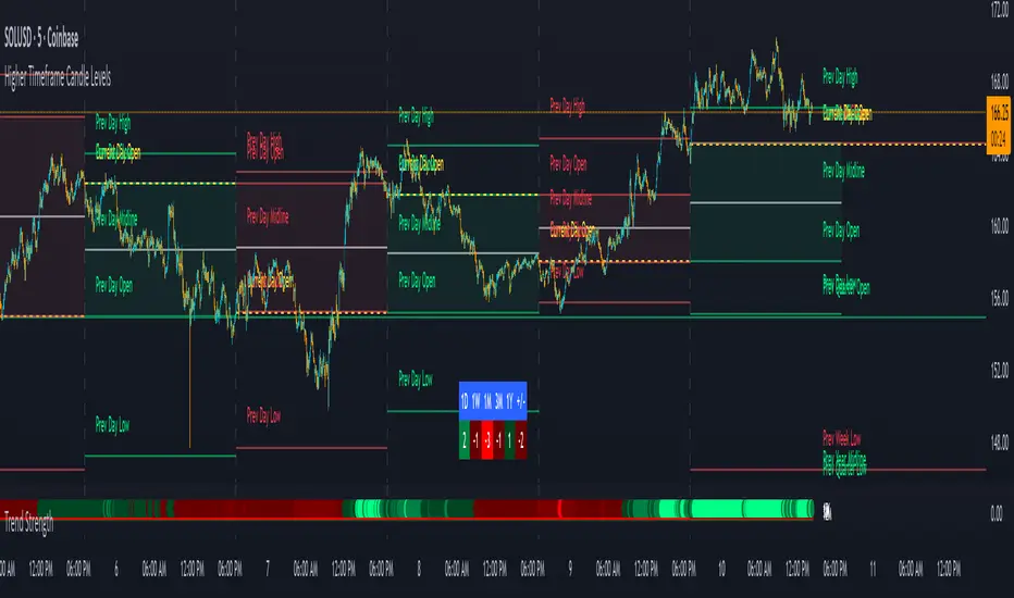
BK AK-13⚔️ BK AK-13 — The Mentor’s 13. Revealed on 11. Command the Band. Punish the Extremes. ⚔️
This is my 11th release—and that matters. 11 is a sacred number to me, so for release eleven I’m doing something I never planned to do: I’m putting my mentor’s secret 13 MA into the open.
For years, this 13-based MA framework was part of our private playbook—quietly doing work behind the scenes. Now I’m handing it to you fully armed, because I believe in karma in, karma out: I took years of wisdom from the market. I took years of wisdom from the men who taught me. This is one of the ways I give back—with structure, respect, and intent.
🎖 Full Credit — Respect the Origin
The core architecture of BK AK-13 is not mine. It stands firmly on the work of DZIV.
What comes from DZIV:
The Heikin Ashi MA engine (MA calculated on HA Open/High/Low/Close)
The multi-MA engine on the HA feed (ALMA / HMA / SMA / RMA / VWMA / WMA / ZLEMA / EMA)
The Body / Wick / Band zone classification for price
The dynamic body & wick clouds that give this structure its clean visual form
If this framework changes the way you see trend and price location, remember the name: DZIV.
On top of his backbone, I forged the BK AK-13 enhancement layer: trend-strength regimes, background modes, structured band-reversal arrows, momentum acceleration dots, extreme pivot markers, historical band-touch rails, the info panel, and a complete alert suite.
And as always, the “AK” in the name is not branding—it’s honor. It belongs to my mentor A.K. His secret 13 MA is the spine of this system, and his obsession with clarity, patience, and zero shortcuts sits behind every decision in this tool. Above that, all glory and gratitude to Gd—the real source of any wisdom, edge, or endurance we have in this game.
🧠 Why “BK AK-13”?
BK — my mark, the house I’m building.
AK — my mentor, the standard I’m still chasing.
13 — his secret moving average, the length that quietly shaped how I see trend, location, and pressure.
For years, 13 stayed off the public record—used, not discussed. Now, on indicator number 11, I’m putting that weapon in the open: 11th release. Sacred number. Secret 13 revealed, not for hype—but as karmic give-back. Karma in. Karma out.
🧱 What BK AK-13 Actually Is
BK AK-13 is a Heikin Ashi MA battle band with a brain and a conscience.
It does three big things:
Builds a smoothed HA-MA band using Heikin Ashi OHLC to create a cleaner, truer band around price.
Maps price into zones: Body, Upper Wick, Lower Wick, Above Band, Below Band—so every bar has a role.
Assigns a trend regime by computing a normalized trend-strength %, classifying the environment as Weak / Normal / Strong / Extreme.
You’re never guessing: Is this real trend or just drift? Am I in the spine, the wick, or off the rails? Is this where I press, fade, or stand down? The band, zones, and regimes answer that for you.
🎨 Visual Architecture — Band, Clouds, Regimes
Body & Wick Clouds (DZIV’s craft)
Body cloud between HA-MA Open & Close.
Wick clouds between body and HA-MA High/Low.
Color follows trend: bull, bear, or neutral.
You’re not decoding noisy candles—you’re reading the spine and skin of the move.
Background Regime Modes (BK layer)
Standard – background always on, soft trend-follow color.
Hybrid (Extreme + Breaks) – lights only on extreme trend states or reversal break events.
Hybrid (Strong/Extreme + Breaks) – shows strong & extreme regimes, darker tone on true extremes.
Breaks Only – background flashes only on reversal arrows.
When the background goes quiet, you’re in ordinary flow. When it lights up, something is strategic, not cosmetic.
🎯 Weapons Inside BK AK-13
⭐ Trend Change Stars
Stars appear when the internal band trend crosses zero: bull star when it flips negative → positive, bear star from positive → negative. They’re your pivot flags for swing shifts when aligned with your higher timeframe bias.
🔁 Band Reversal Arrows — Edge Flip Logic
Not every band tap—only structured reversals:
Reversal Down (short idea): first a break of the upper band, then later, for the first time, a break of the lower band.
Reversal Up (long idea): first a break of the lower band, then later, for the first time, a break of the upper band.
You can require a close outside the band and set a minimum break distance (% of band range) so only real punches count. These arrows mark campaign flips, not noise.
💡 Momentum Acceleration Dots
In strong trend regimes only:
Green dot = trend accelerating in its own direction (uptrend steepening, downtrend deepening).
Red dot = trend decelerating, even if direction hasn’t flipped yet.
They protect you from chasing late when the engine is dying and from staying stubborn when momentum is bleeding out.
⚠ Extreme Pivot Markers
Pivot highs/lows are found with a configurable lookback and only marked when trend strength at that pivot bar is above your threshold. You’ll see ⚠ above likely exhaustion tops in strong bulls and ⚠ below likely exhaustion lows in strong bears—perfect for final scale-outs, countertrend scouts, and knowing where campaigns commonly run out of blood.
📏 Historical Band-Touch Rails
Over your lookback window, BK AK-13 tracks the highest upper band touch and lowest lower band touch, drawing them as dashed rails. They’re dynamic SR built from real band extremes—ideal for trend targets, fade zones, and stop/scale-out context.
🧭 Info Panel — On-Chart War Room
The Info Panel compresses everything into a single strip: direction + strength codes (BULL STR, BEAR EXT, NEUT WEAK), four segments that brighten as |trend| climbs from weak → normal → strong → extreme, and a zone + deviation label (BDY/UW/LW/AB/BL × OK/AL/EX).
Hover and you get a full tactical brief: trend, momentum change, acceleration, band levels, distances to upper/lower/nearest band in ticks, outer-band streaks, strategic state, plus “Action” guidance and a “What-if” forward scenario. It doesn’t just tell you where you are—it pushes you toward a structured thought process on each bar.
🕹 How to Use BK AK-13 with Intent
1️⃣ Trend-Rider Mode
In Strong/Extreme bull with price in Body or Lower Wick: buy dips into the band (mid/lower) instead of chasing tops; target the upper band / upper rail while structure holds.
In Strong/Extreme bear with price in Body or Upper Wick: sell rallies into the band; target lower band / lower rail while acceleration stays healthy.
The band defines where you’re allowed to do business.
2️⃣ Extreme Snapback Hunter
Prime conditions: trend tagged Extreme, price pressed into the outer band in trend direction, strategic state lit + Hybrid background active. That’s where pressing fresh risk often flips from reward to punishment. Use it to stop adding, start harvesting, or launch controlled mean-reversion probes back to the midline—if your system and risk rules allow it.
3️⃣ Exhaustion & Turn Zones
Watch for confluence: red momentum dots, extreme pivot ⚠ markers, a reversal arrow, and a nearby historical rail or your own key level (Fibs, VWAP, volume structure, etc.). That’s where campaigns often end, traps are set, and new campaigns begin.
🔔 Alerts — The Chart Calls You
Included alerts: Bullish/Bearish Trend Change, Strategic Extreme at Outer Band, Reversal Up/Down, Extreme Pivot High/Low, and Body Zone Entry during Strong Trend. Use them so you respond to events, not impulses.
🔧 Tuning the Extremes — Help Me Perfect the Advanced Side
The extreme thresholds and advanced features are powerful but sensitive, and there is no single perfect universal setting. I’m still tuning them myself across instruments and timeframes: strong/extreme trend thresholds, extreme background thresholds, momentum acceleration threshold, pivot lookback + pivot trend filter, band-touch lookback, and minimum break distance for reversals.
Different markets and timeframes breathe differently.
If you find killer settings for a specific symbol + timeframe, please share:
Instrument & timeframe
Your tuned values for extremes and advanced modules
A few charts showing why they work
Experiment. Dial it in. Then share your best settings for the extremes and advanced features. Let this become a crowd-forged battle manual: I gave you the engine, you tune it to your battleground, and we all benefit from what’s discovered in live fire. Karma in. Karma out.
🤝 Pay It Forward
If BK AK-13 sharpens your read, don’t just flex screenshots—teach structure. Show newer traders body vs wick vs edge. Talk about when you didn’t take a trade because the band said “danger,” not just the wins. Share your settings, charts, and lessons—especially around the extremes and advanced modules. I’m sharing a mentor’s secret on release 11 for a reason. If it blesses you, don’t let it stop with you.
📜 King Solomon’s Lens
King Solomon said: “The prudent sees danger and hides himself, but the simple go on and suffer for it.”
BK AK-13 is built exactly around that dividing line: the simple chase candles at the outer band in extreme regimes and get punished; the prudent see danger in the structure, hide their size, hedge, or reverse with intent.
This indicator won’t make you prudent. It just removes your excuse for being simple.
⚔️ BK AK-13 — The mentor’s secret 13, revealed on 11. Let the band define the field. Let wisdom define your strike.
May Gd bless your eyes, your patience, your settings, and every decision you make at the edge. 🙏

Market Trend statusBullTrading Free Indicator Series
What is the Trend State Machine?
A “trend state machine” that fuses DMI (+DI/−DI) with ADX strength. It avoids bells and whistles and answers three things with minimal rules:
1. Whether the market is range-bound (chop) or trending;
2. If trending, whether it is bullish (long) or bearish (short);
3. The trend intensity tier (Strong / Extreme / Decaying) plus a 0–100 strength score.
1-Minute Quick Start (beginners can stop here)
1. Timeframe – pick your trading anchor first
• Crypto: 5–15m
• Gold: 5m or 15m
• FX: 15–30m
2. Mode – top of the panel: set Mode = Simple.
3. Sensitivity – set Sensitivity (1 conservative – 5 aggressive). Recommended:
• Crypto: 3 (use 4 in high volatility)
• Gold: 2–3
• FX: 2–3
• Indices: 2
4. Read the card (top-right)
• Environment: Range/Invalid, Bull Trend (Watch), Bull Trend (Confirmed) (bearish equivalents apply)
• Add-ons: | Strong, | Extreme, | Decay
• Also shows ADX, Enter/Exit thresholds, ΔDI, and Score.
5. Background & lines
• Green/Red background = in trend; deeper shade = stronger.
• Orange thick line = ADX, Green = +DI, Red = −DI; shaded band between lines is the enter/exit zone.
6. Minimal execution rules
• Trade with the trend only: consider entries only when Environment = Confirmed and direction is bull/bear.
• Prioritize strength: when Strong Trend triggers or Score > 70, prefer trend-following adds / enable trailing take-profit.
• Exit: when Exit/Flip alert fires, or after Decay if ADX falls back below the enter threshold, reduce/close.
Note: In Simple mode, built-in hysteresis (Enter > Exit) cuts whipsaws significantly—no need to hand-tune thresholds.
How to Use Alerts
• Three built-in fixed alerts:
1. Trend Confirmed (Bull/Bear) — entry/add trigger
2. Strong Trend — momentum reinforcement (chase/add or tighten trailing TP)
3. Exit or Flip — scale-out/close/observe the other side
• Want dynamic messages with numbers? Check “Enable dynamic alerts (alert())” and, when creating the alert, choose Any alert() function call.
Parameter Guidance (rules of thumb)
• Sensitivity: Higher = earlier entries but more false signals; lower = later confirmation but steadier.
• Timeframe: The smaller the timeframe, the lower the sensitivity you usually need; on higher timeframes you may nudge it up.
• Combos:
• Crypto: 5m/15m + Sens 3 (4 in heavy vol)
• Gold: 5m/15m + Sens 2–3
• FX: 15m/30m + Sens 2–3
• Indices: 15m/30m + Sens 2
Pro Mode Highlights (optional)
• Threshold Mode: switch from Fixed (default) to Percentile Adaptive for better robustness across regimes/markets.
• ΔDI / Slope / Hold / Cool-down:
• ΔDI min separation filters weak price/volume divergences.
• ADX slope > threshold on entry rejects “breakouts without growing strength”.
• Min hold bars confirms before output to reduce whipsaws.
• Cool-down bars prevent immediate re-entry after exit/flip.
• MTF Aggregation: enable MTF, default 3× current timeframe, HTF weight 0.3–0.5.
• Turn on Require HTF not opposite & HTF_ADX ≥ exit threshold to effectively filter higher-TF noise.
Reading Cheat Sheet (what you see = what it means)
• Environment: Range/Invalid → Stand down; avoid counter-trend.
• Trend (Watch) → Just entered the zone; wait for Confirmed or buy the pullback with small size.
• Trend (Confirmed) → Trend-following allowed; use Score and Strong/Decay to size/manage.
• Strong Trend → Consider chasing/relaxing TP; momentum is increasing.
• Extreme → Overheated; be cautious chasing—favor trailing to lock gains.
• Decay → Momentum bending down; prepare to trim or tighten stops.
Common Pitfalls & Fixes
• Whipsaws in ranges → Lower sensitivity or move up a timeframe; in Pro mode, enable Slope filter.
• Confirmation too late → During Trend (Watch), try a probe with smaller size; add on confirmation.
• Cross-asset differences → Use Percentile thresholds and MTF weight, or adjust via market presets (Gold/FX/Index).
• Single-signal bias → Always combine Environment + Score + Strong/Decay to avoid tunnel vision.
⸻
Disclaimer: This tool is for educational and research purposes only and does not constitute investment advice or a promise of profit. Trading involves risk; you are solely responsible for your gains and losses.
BullTrading免费指标系列
趋势状态机 是什么:
一个把 DMI(+DI/-DI) 与 ADX 强度合成的“趋势状态机”。它不追求花哨,而是用最小规则输出三件事:
1. 市场当前是 震荡还是趋势;
2. 如是趋势,是 多还是 空;
3. 趋势的 强弱等级(强趋势/极端/衰减)与一个 0–100 的强度分数。
一分钟上手(新手用这个就够)
1. 时间周期:先选你交易的主周期(例:加密 5–15m;黄金 5m 或 15m;外汇 15–30m)。
2. 模式:面板最上方“模式”= 简单。
3. 敏感度:设“敏感度(1保守–5激进)”。推荐:
• Crypto:3(波动大可 4)
• Gold:2–3
• FX:2–3
• 指数/股指:2
4. 读卡片(右上角)
• 环境:震荡/无效、多头趋势(观察)、多头趋势(已确认)(空头同理)
• 附加:|强趋势、|极端、|衰减
• 同时显示 ADX、进入/退出阈值、ΔDI、评分。
5. 底色 & 线
• 绿色/红色底色=处于趋势;颜色越实=越强。
• 橙色粗线=ADX,绿色=+DI,红色=-DI;中间阴影为进入/退出带。
6. 最小执行规则
• 只顺势:环境=已确认 且方向为多/空时才考虑进场。
• 强势优先:出现 强趋势 或评分>70 时,优先做顺势加仓/启动追踪止盈。
• 退出:出现 退出/翻转 告警,或 衰减 后 ADX 再跌回进入阈值下方时,减仓/平仓。
提醒:简单模式下,脚本已内置迟滞(进入>退出),可显著减少抖动;无需再手动校准阈值。
告警怎么用
• 已内置三条固定告警:
1. 趋势已确认(多/空) — 入场/加仓触发器
2. 强趋势 — 趋势强化(可做追击或加速移动止盈)
3. 退出或翻转 — 减仓/止盈/反向观察
• 想带数值的动态文案:勾选“启用动态告警 alert()”,创建告警时选择 Any alert() function call。
参数建议(简易法则)
• 敏感度:更激进(数字大)=更早进场但更易假信号;更保守(数字小)=更迟确认但更稳。
• 时间周期:越小周期越需要降低敏感度;越大周期可略升敏感度。
• 组合:
• Crypto:5m/15m + 敏感度 3(波动大时 4)
• Gold:5m/15m + 敏感度 2–3
• FX:15m/30m + 敏感度 2–3
• 指数:15m/30m + 敏感度 2
专业模式要点(进阶可选)
• 阈值模式:从“固定阈值(默认)”切到“百分位自适应”,在大波动/换市场时更鲁棒。
• ΔDI/斜率/驻留/冷却:
• ΔDI 最小分离度 过滤弱量价背离;
• 进入需 ADX 斜率>阈值 可拒绝“强度不增”的假突破;
• 最小驻留K数 确认后再输出,减少回撤抖动;
• 冷却K数 防止来回打脸。
• MTF 聚合:勾选“启用 MTF”,默认自动 3× 当前周期,HTF 权重 0.3–0.5。
• 要求HTF不反向且HTF_ADX≥退出阈值 打开,能有效剔除逆大级别噪音。
读图速查(你看到=代表什么)
• 环境:震荡/无效 → 暂停;不要逆势开单。
• 趋势(观察) → 刚进入阈值,等待 已确认 或回踩二次确认。
• 趋势(已确认) → 允许顺势;用评分和“强趋势/衰减”微调仓位。
• 强趋势 → 追击或放宽止盈,趋势动能在增强。
• 极端 → 过热区;谨慎追高,更多用移动止盈锁定。
• 衰减 → 动能下弯,准备减仓或收紧止盈。
常见坑 & 对策
• 在震荡箱体频繁进出:降低敏感度或升周期;专业模式勾选“斜率过滤”。
• 确认太慢错过起点:在确认前的“趋势(观察)”阶段,可用更小仓位的试探单,确认后加仓。
• 不同品种差异大:用“百分位”阈值与 MTF 权重;或按市场预设(Gold/FX/Index)微调。
• 只看一个信号:至少同时看 环境状态 + 评分 + 强/衰 三个维度,避免单指标偏差。
本指标仅供教育与研究,不构成投资建议或收益承诺;交易有风险,盈亏自负。

Gildenburg ValueGildenburg Value
Purpose: Trend-strength indicator using three moving averages (fast/mid/slow) to identify Bull/Bear/Neutral zones and generate precise crossover signals.
Default parameters: fast = 8, mid = 13, slow = 21, MA type = EMA.
Zones:
Bull: fast > mid > slow
Bear: fast < mid < slow
Neutral: any other ordering
Signals:
BUY: fast crosses above mid, the post-crossing order is fast > mid > slow, and close > slow.
SELL: fast crosses below mid, the post-crossing order is fast < mid < slow, and close < slow.
Optional filter: minimum percentage gap between fast and mid to ignore weak crosses.
Visualization: three MAs on the chart, optional cloud between fast and mid colored by zone, signal arrows/labels, and alertconditions.
Adjustable settings: MA type (SMA/EMA/WMA/VWMA), MA periods, cloud on/off, show signals, minimum distance threshold.
Use to confirm trends and filter false entries.

Opening Range Breakout with Multi-Timeframe Liquidity]═══════════════════════════════════════
OPENING RANGE BREAKOUT WITH MULTI-TIMEFRAME LIQUIDITY
═══════════════════════════════════════
A professional Opening Range Breakout (ORB) indicator enhanced with multi-timeframe liquidity detection, trading session visualization, volume analysis, and trend confirmation tools. Designed for intraday trading with comprehensive alert system.
───────────────────────────────────────
WHAT THIS INDICATOR DOES
───────────────────────────────────────
This indicator combines multiple trading concepts:
- Opening Range Breakout (ORB) - Customizable time period detection with automatic high/low identification
- Multi-Timeframe Liquidity - HTF (Higher Timeframe) and LTF (Lower Timeframe) key level detection
- Trading Sessions - Tokyo, London, New York, and Sydney session visualization
- Volume Analysis - Volume spike detection and strength measurement
- Multi-Timeframe Confirmation - Trend bias from higher timeframes
- EMA Integration - Trend filter and dynamic support/resistance
- Smart Alerts - Quality-filtered breakout notifications
───────────────────────────────────────
HOW IT WORKS
───────────────────────────────────────
OPENING RANGE BREAKOUT (ORB):
Concept:
The Opening Range is a period at the start of a trading session where price establishes an initial high and low. Breakouts beyond this range often indicate the direction of the day's trend.
Detection Method:
- Default: 15-minute opening range (configurable)
- Custom Range: Set specific session times with timezone support
- Automatically identifies ORH (Opening Range High) and ORL (Opening Range Low)
- Tracks ORB mid-point for reference
Range Establishment:
1. Session starts (or custom time begins)
2. Tracks highest high and lowest low during the period
3. Range confirmed at end of opening period
4. Levels extend throughout the session
Breakout Detection:
- Bullish Breakout: Close above ORH
- Bearish Breakout: Close below ORL
- Mid-point acts as bias indicator
Visual Display:
- Shaded box during range formation
- Horizontal lines for ORH, ORL, and mid-point
- Labels showing level values
- Color-coded fills based on selected method
Fill Color Methods:
1. Session Comparison:
- Green: Current OR mid > Previous OR mid
- Red: Current OR mid < Previous OR mid
- Gray: Equal or first session
- Shows day-over-day momentum
2. Breakout Direction (Recommended):
- Green: Price currently above ORH (bullish breakout)
- Red: Price currently below ORL (bearish breakout)
- Gray: Price inside range (no breakout)
- Real-time breakout status
MULTI-TIMEFRAME LIQUIDITY:
Two-Tier System for comprehensive level identification:
HTF (Higher Timeframe) Key Liquidity:
- Default: 4H timeframe (configurable to Daily, Weekly)
- Identifies major institutional levels
- Uses pivot detection with adjustable parameters
- Suitable for swing highs/lows where large orders rest
LTF (Lower Timeframe) Key Liquidity:
- Default: 1H timeframe (configurable)
- Provides precision entry/exit levels
- Finer granularity for intraday trading
- Captures minor swing points
Calculation Method:
- Pivot high/low detection algorithm
- Configurable left bars (lookback) and right bars (confirmation)
- Timeframe multiplier for accurate multi-timeframe detection
- Automatic level extension
Mitigation System:
- Tracks when levels are swept (broken)
- Configurable mitigation type: Wick or Close-based
- Option to remove or show mitigated levels
- Display limit prevents chart clutter
Asset-Specific Optimization:
The indicator includes quick reference settings for different assets:
- Major Forex (EUR/USD, GBP/USD): Default settings optimal
- Crypto (BTC/ETH): Left=12, Right=4, Display=7
- Gold: HTF=1D, Left=20
TRADING SESSIONS:
Four Major Sessions with Full Customization:
Tokyo Session:
- Default: 04:00-13:00 UTC+4
- Asian trading hours
- Often sets daily range
London Session:
- Default: 11:00-20:00 UTC+4
- Highest liquidity period
- Major institutional activity
New York Session:
- Default: 16:00-01:00 UTC+4
- US market hours
- High-impact news events
Sydney Session:
- Default: 01:00-10:00 UTC+4
- Earliest Asian activity
- Lower volatility
Session Features:
- Shaded background boxes
- Session name labels
- Optional open/close lines
- Session high/low tracking with colored lines
- Each session has independent color settings
- Fully customizable times and timezones
VOLUME ANALYSIS:
Volume-Based Trade Confirmation:
Volume MA:
- Configurable period (default: 20)
- Establishes average volume baseline
- Used for spike detection
Volume Spike Detection:
- Identifies when volume exceeds MA * multiplier
- Default: 1.5x average volume
- Confirms breakout strength
Volume Strength Measurement:
- Calculates current volume as percentage of average
- Shows relative volume intensity
- Used in alert quality filtering
High Volume Bars:
- Identifies bars above 50th percentile
- Additional confirmation layer
- Indicates institutional participation
MULTI-TIMEFRAME CONFIRMATION:
Trend Bias from Higher Timeframes:
HTF 1 (Trend):
- Default: 1H timeframe
- Uses EMA to determine intermediate trend
- Compares current timeframe EMA to HTF EMA
HTF 2 (Bias):
- Default: 4H timeframe
- Uses 50 EMA for longer-term bias
- Confirms overall market direction
Bias Classifications:
- Bullish Bias: HTF close > HTF 50 EMA AND Current EMA > HTF1 EMA
- Bearish Bias: HTF close < HTF 50 EMA AND Current EMA < HTF1 EMA
- Neutral Bias: Mixed signals between timeframes
EMA Stack Analysis:
- Compares EMA alignment across timeframes
- +1: Bullish stack (lower TF EMA > higher TF EMA)
- -1: Bearish stack (lower TF EMA < higher TF EMA)
- 0: Neutral/crossed
Usage:
- Filters false breakouts
- Confirms trend direction
- Improves trade quality
EMA INTEGRATION:
Dynamic EMA for Trend Reference:
Features:
- Configurable period (default: 20)
- Customizable color and width
- Acts as dynamic support/resistance
- Trend filter for ORB trades
Application:
- Above EMA: Favor long breakouts
- Below EMA: Favor short breakouts
- EMA cross: Potential trend change
- Distance from EMA: Momentum gauge
SMART ALERT SYSTEM:
Quality-Filtered Breakout Notifications:
Alert Types:
1. Standard ORB Breakout
2. High Quality ORB Breakout
Quality Criteria:
- Volume Confirmation: Volume > 1.2x average
- MTF Confirmation: Bias aligned with breakout direction
Standard Alert:
- Basic breakout detection
- Price crosses ORH or ORL
- Icon: 🚀 (bullish) or 🔻 (bearish)
High Quality Alert:
- Both volume AND MTF confirmed
- Stronger probability setup
- Icon: 🚀⭐ (bullish) or 🔻⭐ (bearish)
Alert Information Includes:
- Alert quality rating
- Breakout level and current price
- Volume strength percentage (if enabled)
- MTF bias status (if enabled)
- Recommended action
One Alert Per Bar:
- Prevents alert spam
- Uses flag system to track sent alerts
- Resets on new ORB session
───────────────────────────────────────
HOW TO USE
───────────────────────────────────────
OPENING RANGE SETUP:
Basic Configuration:
1. Select time period for opening range (default: 15 minutes)
2. Choose fill color method (Breakout Direction recommended)
3. Enable historical data display if needed
Custom Range (Advanced):
1. Enable Custom Range toggle
2. Set specific session time (e.g., 0930-0945)
3. Select appropriate timezone
4. Useful for specific market opens (NYSE, LSE, etc.)
LIQUIDITY LEVELS SETUP:
Quick Configuration by Asset:
- Forex: Use default settings (Left=15, Right=5)
- Crypto: Set Left=12, Right=4, Display=7
- Gold: Set HTF=1D, Left=20
HTF Liquidity:
- Purpose: Major support/resistance levels
- Recommended: 4H for day trading, 1D for swing trading
- Use as profit targets or reversal zones
LTF Liquidity:
- Purpose: Entry/exit refinement
- Recommended: 1H for day trading, 4H for swing trading
- Use for position management
Mitigation Settings:
- Wick-based: More sensitive (default)
- Close-based: More conservative
- Remove or Show mitigated levels based on preference
TRADING SESSIONS SETUP:
Enable/Disable Sessions:
- Master toggle for all sessions
- Individual session controls
- Show/hide session names
Session High/Low Lines:
- Enable to see session extremes
- Each session has custom colors
- Useful for range trading
Customization:
- Adjust session times for your broker
- Set timezone to match your location
- Customize colors for visibility
VOLUME ANALYSIS SETUP:
Enable Volume Analysis:
1. Toggle on Volume Analysis
2. Set MA length (20 recommended)
3. Adjust spike multiplier (1.5 typical)
Usage:
- Confirm breakouts with volume
- Identify climactic moves
- Filter false signals
MULTI-TIMEFRAME SETUP:
HTF Selection:
- HTF 1 (Trend): 1H for day trading, 4H for swing
- HTF 2 (Bias): 4H for day trading, 1D for swing
Interpretation:
- Trade only with bias alignment
- Neutral bias: Be cautious
- Bias changes: Potential reversals
EMA SETUP:
Configuration:
- Period: 20 for responsive, 50 for smoother
- Color: Choose contrasting color
- Width: 1-2 for visibility
Usage:
- Filter trades: Long above, Short below
- Dynamic support/resistance reference
- Trend confirmation
ALERT SETUP:
TradingView Alert Creation:
1. Enable alerts in indicator settings
2. Enable ORB Breakout Alerts
3. Right-click chart → Add Alert
4. Select this indicator
5. Choose "Any alert() function call"
6. Configure delivery method (mobile, email, webhook)
Alert Filtering:
- All alerts include quality rating
- High Quality alerts = Volume + MTF confirmed
- Standard alerts = Basic breakout only
───────────────────────────────────────
TRADING STRATEGIES
───────────────────────────────────────
CLASSIC ORB STRATEGY:
Setup:
1. Wait for opening range to complete
2. Price breaks and closes above ORH or below ORL
3. Volume > average (if enabled)
4. MTF bias aligned (if enabled)
Entry:
- Bullish: Buy on break above ORH
- Bearish: Sell on break below ORL
- Consider retest entries for better risk/reward
Stop Loss:
- Bullish: Below ORL or range mid-point
- Bearish: Above ORH or range mid-point
- Adjust based on volatility
Targets:
- Initial: Range width extension (ORH + range width)
- Secondary: HTF liquidity levels
- Final: Session high/low or major support/resistance
ORB + LIQUIDITY CONFLUENCE:
Enhanced Setup:
1. Opening range established
2. HTF liquidity level near or beyond ORH/ORL
3. Breakout occurs with volume
4. Price targets the liquidity level
Entry:
- Enter on ORB breakout
- Target the HTF liquidity level
- Use LTF liquidity for position management
Management:
- Partial profits at ORB + range width
- Move stop to breakeven at LTF liquidity
- Final exit at HTF liquidity sweep
ORB REJECTION STRATEGY (Counter-Trend):
Setup:
1. Price breaks above ORH or below ORL
2. Weak volume (below average)
3. MTF bias opposite to breakout
4. Price closes back inside range
Entry:
- Failed bullish break: Short below ORH
- Failed bearish break: Long above ORL
Stop Loss:
- Beyond the failed breakout level
- Or beyond session extreme
Target:
- Opposite end of opening range
- Range mid-point for partial profit
SESSION-BASED ORB TRADING:
Tokyo Session:
- Typically narrower ranges
- Good for range trading
- Wait for London open breakout
London Session:
- Highest volume and volatility
- Strong ORB setups
- Major liquidity sweeps common
New York Session:
- Strong trending moves
- News-driven volatility
- Good for momentum trades
Sydney Session:
- Quieter conditions
- Suitable for range strategies
- Sets up Tokyo session
EMA-FILTERED ORB:
Rules:
- Only take bullish breaks if price > EMA
- Only take bearish breaks if price < EMA
- Ignore counter-trend breaks
Benefits:
- Reduces false signals
- Aligns with larger trend
- Improves win rate
───────────────────────────────────────
CONFIGURATION GUIDE
───────────────────────────────────────
OPENING RANGE SETTINGS:
Time Period:
- 15 min: Standard for most markets
- 30 min: Wider range, fewer breakouts
- 60 min: For slower markets or swing trades
Custom Range:
- Use for specific market opens
- NYSE: 0930-1000 EST
- LSE: 0800-0830 GMT
- Set timezone to match exchange
Historical Display:
- Enable: See all previous session data
- Disable: Cleaner chart, current session only
LIQUIDITY SETTINGS:
Left Bars (5-30):
- Lower: More frequent, sensitive levels
- Higher: Fewer, more significant levels
- Recommended: 15 for most markets
Right Bars (1-25):
- Confirmation period
- Higher: More reliable, less frequent
- Recommended: 5 for balance
Display Limit (1-20):
- Number of active levels shown
- Higher: More context, busier chart
- Recommended: 7 for clarity
Extension Options:
- Short: Levels visible near formation
- Current: Extended to current bar (recommended)
- Max: Extended indefinitely
VOLUME SETTINGS:
MA Length (5-50):
- Shorter: More responsive to spikes
- Longer: Smoother baseline
- Recommended: 20 for balance
Spike Multiplier (1.0-3.0):
- Lower: More sensitive spike detection
- Higher: Only extreme spikes
- Recommended: 1.5 for day trading
MULTI-TIMEFRAME SETTINGS:
HTF 1 (Trend):
- 5m chart: Use 15m or 1H
- 15m chart: Use 1H or 4H
- 1H chart: Use 4H or 1D
HTF 2 (Bias):
- One level higher than HTF 1
- Provides longer-term context
- Don't use same as HTF 1
EMA SETTINGS:
Length:
- 20: Responsive, more signals
- 50: Smoother, stronger filter
- 200: Long-term trend only
Style:
- Choose contrasting color
- Width 1-2 for visibility
- Match your trading style
───────────────────────────────────────
BEST PRACTICES
───────────────────────────────────────
Chart Timeframe Selection:
- ORB Trading: Use 5m or 15m charts
- Session Review: Use 1H or 4H charts
- Swing Trading: Use 1H or 4H charts
Quality Over Quantity:
- Wait for high-quality alerts (volume + MTF)
- Avoid trading every breakout
- Focus on confluence setups
Risk Management:
- Position size based on range width
- Wider ranges = smaller positions
- Use stop losses always
- Take partial profits at targets
Market Conditions:
- Best results in trending markets
- Reduce position size in choppy conditions
- Consider session overlaps for volatility
- Avoid trading near major news if inexperienced
Continuous Improvement:
- Track win rate by session
- Note which confluence factors work best
- Adjust settings based on market volatility
- Review performance weekly
───────────────────────────────────────
PERFORMANCE OPTIMIZATION
───────────────────────────────────────
This indicator is optimized with:
- max_bars_back declarations for efficient processing
- Conditional calculations based on enabled features
- Proper memory management for drawing objects
- Minimal recalculation on each bar
Best Practices:
- Disable unused features (sessions, MTF, volume)
- Limit historical display to reduce rendering
- Use appropriate timeframe for your strategy
- Clear old drawing objects periodically
───────────────────────────────────────
EDUCATIONAL DISCLAIMER
───────────────────────────────────────
This indicator combines established trading concepts:
- Opening Range Breakout theory (price action)
- Liquidity level detection (pivot analysis)
- Session-based trading (time-of-day patterns)
- Volume analysis (confirmation technique)
- Multi-timeframe analysis (trend alignment)
All calculations use standard technical analysis methods:
- Pivot high/low detection algorithms
- Moving averages for trend and volume
- Session time filtering
- Timeframe security functions
The indicator identifies potential trading setups but does not predict future price movements. Success requires proper application within a complete trading strategy including risk management, position sizing, and market context.
───────────────────────────────────────
USAGE DISCLAIMER
───────────────────────────────────────
This tool is for educational and analytical purposes. Opening Range Breakout trading involves substantial risk. The alert system and quality filters are designed to identify potential setups but do not guarantee profitability. Always conduct independent analysis, use proper risk management, and never risk capital you cannot afford to lose. Past performance does not indicate future results. Trading intraday breakouts requires experience and discipline.
───────────────────────────────────────
CREDITS & ATTRIBUTION
───────────────────────────────────────
ORIGINAL SOURCE:
This indicator builds upon concepts from LuxAlgo's-ORB

FVG MagicFVG Magic — Fair Value Gaps with Smart Mitigation, Inversion & Auto-Clean-up
FVG Magic finds every tradable Fair Value Gap (FVG), shows who powered it, and then manages each gap intelligently as price interacts with it—so your chart stays actionable and clean.
Attribution
This tool is inspired by the idea popularized in “Volumatic Fair Value Gaps ” by BigBeluga (licensed CC BY-NC-SA 4.0). Credit to BigBeluga for advancing FVG visualization in the community.
Important: This is a from-scratch implementation—no code was copied from the original. I expanded the concept substantially with a different detection stack, a gap state machine (ACTIVE → 50% SQ → MITIGATED → INVERSED), auto-clean up rules, lookback/nearest-per-side pruning, zoom-proof volume meters, and timeframe auto-tuning for 15m/H1/H4.
What makes this version more accurate
Full-coverage detection (no “missed” gaps)
Default ICT-minimal rule (Bullish: low > high , Bearish: high < low ) catches all valid 3-candle FVGs.
Optional Strict filter (stricter structure checks) for traders who prefer only “clean” gaps.
Optional size percentile filter—off by default so nothing is hidden unless you choose to filter.
Correct handling of confirmations (wick vs close)
Mitigation Source is user-selectable: high/low (wick-based) or close (strict).
This avoids false “misses” when you expect wick confirmations (50% or full fill) but your logic required closes.
State-aware labelling to prevent misleading data
The Bull%/Bear% meter is shown only while a gap is ACTIVE.
As soon as a gap is 50% SQ, MITIGATED, or INVERSED, the meter is hidden and replaced with a clear tag—so you never read stale participation stats.
Robust zoom behaviour
The meter uses a fixed bar-width (not pixels), so it stays proportional and readable at any zoom level.
Deterministic lifecycle (no stale boxes)
Remove on 50% SQ (instant or delayed).
Inversion window after first entry: if price enters but doesn’t invert within N bars, the box auto-removes once fully filled.
Inversion clean up: after a confirmed flip, keep for N bars (context) then delete (or 0 = immediate).
Result: charts auto-maintain themselves and never “lie” about relevance.
Clarity near current price
Nearest-per-side (keep N closest bullish & bearish gaps by distance to the midpoint) focuses attention where it matters without altering detection accuracy.
Lookback (bars) ensures reproducible behaviour across accounts with different data history.
Timeframe-aware defaults
Sensible auto-tuning for 15m / H1 / H4 (right-extension length, meter width, inversion windows, clean up bars) to reduce setup friction and improve consistency.
What it does (under the hood)
Detects FVGs using ICT-minimal (default) or a stricter rule.
Samples volume from a 10× lower timeframe to split participation into Bull % / Bear % (sum = 100%).
Manages each gap through a state machine:
ACTIVE → 50% SQ (midline) → MITIGATED (full) → INVERSED (SR flip after fill).
Auto-clean up keeps only relevant levels, per your rules.
Dashboard (top-right) displays counts by side and the active state tags.
How to use it
First run (show everything)
Use Strict FVG Filter: OFF
Enable Size Filter (percentile): OFF
Mitigation Source: high/low (wick-based) or close (stricter), as you prefer.
Remove on 50% SQ: ON, Delay: 0
Read the context
While ACTIVE, use the Bull%/Bear% meter to gauge demand/supply behind the impulse that created the gap.
Confluence with your HTF structure, sessions, VWAP, OB/FVG, RSI/MACD, etc.
Trade interactions
50% SQ: often the highest-quality interaction; if removal is ON, the box clears = “job done.”
Full mitigation then rejection through the other side → tag changes to INVERSED (acts like SR). Keep for N bars, then auto-remove.
Keep the chart tidy (optional)
If too busy, enable Size Filter or set Nearest per side to 2–4.
Use Lookback (bars) to make behaviour consistent across symbols and histories.
Inputs (key ones)
Use Strict FVG Filter: OFF(default)/ON
Enable Size Filter (percentile): OFF(default)/ON + threshold
Mitigation Source: high/low or close
Remove on 50% SQ + Delay
Inversion window after entry (bars)
Remove inversed after (bars)
Lookback (bars), Nearest per side (N)
Right Extension Bars, Max FVGs, Meter width (bars)
Colours: Bullish, Bearish, Inversed fill
Suggested defaults (per TF)
15m: Extension 50, Max 12, Inversion window 8, Clean up 8, Meter width 20
H1: Extension 25, Max 10, Inversion window 6, Clean up 6, Meter width 15
H4: Extension 15, Max 8, Inversion window 5, Clean up 5, Meter width 10
Notes & edge cases
If a wick hits 50% or the far edge but state doesn’t change, you’re likely on close mode—switch to high/low for wick-based behaviour.
If a gap disappears, it likely met a clean up condition (50% removal, inversion window, inversion clean up, nearest-per-side, lookback, or max-cap).
Meters are hidden after ACTIVE to avoid stale percentages.
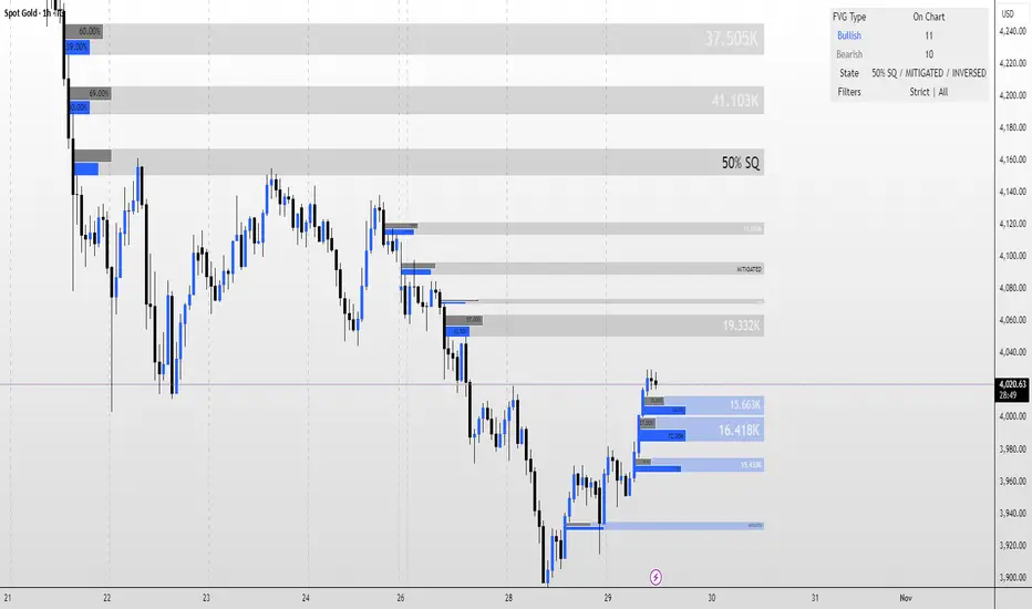
TheStrat: Failed 2 + 2 ConfirmationTheStrat: Failed-2 + 2 Confirmation (2-2 option)
This indicator spots a classic Strat “failed 2 → 2” sequence on consecutive bars, and fires alerts only when both conditions are met:
Failed-2 bar on the prior candle
Failed 2-Down (F2D): Took the prior low but closed green
Failed 2-Up (F2U): Took the prior high but closed red
By default this is strict (excludes outside bars/3’s). You can toggle to allow 3’s if you prefer a looser definition.
Current bar is a clean “2”
2U = broke prior high only; 2D = broke prior low only (excludes 3’s).
Optional: Require flip so the second bar must reverse direction (F2D→2U for longs, F2U→2D for shorts). Turn this off if you want any 2 after a Failed-2.
What gets plotted
Tiny markers on each Failed-2 as they occur (F2U/F2D).
A label when the combo confirms on the next bar:
Bullish: F2D→2U (or F2D→2 if flip is off) below the bar
Bearish: F2U→2D (or F2U→2) above the bar
Alerts (set from the “Add Alert” dialog)
Failed2 + 2 (Bull): Prior bar was F2D; current bar is a 2 (flip optional).
Failed2 + 2 (Bear): Prior bar was F2U; current bar is a 2 (flip optional).
Inputs
Colors for Failed-2 markers and combo labels
Require flip (on by default) → focuses on true 2-2 reversals
Count outside bars (3) as Failed-2? (off by default) → stricter = fewer, cleaner signals
How to trade it (typical Strat style)
Bullish combo (F2D→2U): Entry on break of the combo bar’s high; risk under its low (or under the prior bar).
Bearish combo (F2U→2D): Entry on break of the combo bar’s low; risk above its high.
First target = prior pivot (“magnitude”), then nearby pivots/BF levels. Improve odds by aligning with time-frame continuity (e.g., day/week in your direction).
Notes / Best practices
Uses barstate.isconfirmed → signals/labels are based on closed bars to avoid repaint.
If you see too many Failed-2 tags, keep outside-bar counting OFF (strict mode).

Gaussian RibbonSummary
Adaptive Gaussian ribbon with inner/outer sigma bands and soft regime colors—green trend, red pressure, gray neutral.
What it is
A clean Gaussian filter ribbon that maps trend + volatility without the jitter. It uses a Gaussian smoother, a tiny EMA basis, and two standard-deviation bands. Color fades with distance from the basis, and flips softly (no knife-edge).
How it works
Gaussian core: IIR-style smoothing on your chosen source (default hlc3).
Basis: EMA(3) of the Gaussian for a steadier slope.
Bands: Inner = Basis ± (σ × Inner Mult), Outer = Basis ± (σ × Outer Mult).
Regime: z-score → softsign → EMA(3) → bull / neutral / bear.
Faded look: opacity ramps with distance; neutral turns gray.
What “Regime” Means (Simple)
A regime is the market’s “weather.” It shifts between Bull, Neutral, and Bear. Different tactics work in each.
How this indicator detects regime
Builds a smoothed score of price vs. the basis (z-score → softsign → EMA).
Score > 0 = Bull, score < 0 = Bear. Inside the inner band = Neutral filter to cut noise.
Color changes are soft (faded) so flips don’t knife-edge.
Playbook (What to do)
Bull (Green): Buy pullbacks to the inner band; add on strength; cut fast if price falls back inside the ribbon.
Neutral (Gray): Reduce size, fade extremes, or stand down. Wait for a clean break in either direction.
Bear (Red): Sell/short rallies to the ribbon; protect capital; flip long only after a confirmed regime turn.
For Pros (Tuning & Confirmation)
Timeframe bias: Use higher TF (1W/2W) for context; trade on 1D/4H in the higher-TF direction.
Smoother vs faster: Increase Length to reduce flip-flop; decrease for earlier turns.
Vol filter: Widen Outer/Inner multipliers in choppy markets; narrow in strong trends.
Confirm: Use structure (HH/HL vs LH/LL), volume/OBV, or your MA; ribbon = context, not a standalone trigger.
How to read it
Green = trend support; pullbacks to the inner band are typical buy-the-dip zones.
Gray = inside ribbon; chop/mean reversion. Size down or wait.
Red = trend pressure; rallies into ribbon are fade zones until regime flips.
Opacity increases with distance = stronger momentum.
Good starting presets
Macro (1W–2W): Length 90–110, Outer 2.3, Inner 1.3, Source hlc3.
Swing (1D): Length 60–80, Outer 2.0, Inner 1.4.
Intraday (1–4H): Length 30–40, Outer 1.8, Inner 1.2.
Options
Opens in a separate pane (overlay=false). Set overlay=true to place on candles (consider +5 transparency on fills).
Watermark is “CAYEN” (table-based, no editor drama).
Why it’s “safe”
No repaint. No lookahead; uses only closed-bar data.
Deterministic state and divide-by-zero guards.
Limitations
It’s a context tool. It will lag at regime turns (by design). Use structure/volume to time entries.
Credits
Script by Jason Cayen. Gaussian smoothing is classic DSP math (public domain).
Release notes (v1.0)
Initial public release: faded bands, neutral zone, soft regime colors, Non-repainting; pane by default.

Dual ATR Trailing Stop with Buy/Sell SignalsThis indicator applies two ATR-based trailing stops (Fast and Slow) together with a four-state market classifier to visualize trend strength and place crossover Buy/Sell markers. It is a trend-following tool and does not predict future prices. Use it alongside independent analysis and risk management.
How it works
The Fast trail uses ATR with period 5 and multiplier 0.5 by default. The Slow trail uses ATR with period 10 and multiplier 3.0 by default. When price remains above the prior trail, the new trail equals the maximum of the previous trail and close minus the stop-loss distance derived from ATR. When price remains below the prior trail, the new trail equals the minimum of the previous trail and close plus that distance. On a side switch the trail is re-anchored from the current bar. The Fast trail reacts more quickly, while the Slow trail aims to confirm direction and filter noise.
Signals
Buy is when the Fast trail crosses above the Slow trail. Sell is when the Fast trail crosses below the Slow trail. These crossovers are continuation cues rather than standalone trade advice.
Four-state coloring
Strong Bull occurs when Fast is above Slow, the close is above Slow, and the low is above Slow. Bull with Pullback occurs when Fast is above Slow and the close is above Slow, but the low dips below Slow. Strong Bear occurs when Slow is above Fast, the close is below Slow, and the high is below Slow. Bear with Bounce occurs when Slow is above Fast and the close is below Slow, but the high pierces above Slow.
Directional bias
Bias is inferred by comparing which of Strong Bull or Strong Bear occurred more recently using a barsSince comparison. The most recent state defines the current bias and can help filter frequent flips in ranges.
Inputs
You can adjust Fast ATR period from 1 to 50 and its multiplier from 0.1 to 5.0. You can adjust Slow ATR period from 1 to 50 and its multiplier from 0.1 to 10.0. Optional toggles control candle coloring, trail visibility, fill between trails, alerts, and the information panel.
On-chart outputs
The indicator plots the Fast trail and the Slow trail, with optional fill between them. It can show Buy and Sell markers at crossovers. The optional information panel can display last signal side, entry price, current price, P&L since last signal, current market state, Fast and Slow ATR values, and inferred bias.
Alerts
Available alerts are Fast crossing above Slow, Fast crossing below Slow, entering Strong Bull, and entering Strong Bear.
Usage guidelines
For trend following, many users wait for a Buy crossover together with Strong Bull coloring and then manage risk against the Slow trail. For scalping, consider lower timeframes and a smaller Fast ATR such as period 3 and multiplier 0.3, while avoiding over-optimization. When publishing screenshots, use a clean chart with the symbol, timeframe, and the indicator’s name visible.
Limitations and realism
The tool works best in directional markets; ranging conditions may cause frequent side switches. It is designed for standard OHLC charts only and is not intended for Heikin Ashi, Renko, Kagi, Point & Figure, or Range charts. No claims are made about accuracy, profits, or future performance. Always use position sizing, stop-losses, and additional confirmation.
Compatibility and version
Pine Script v6. Default inputs in the publication match the values described above. Version 1.0 initial public release.
Notes
For questions and feedback, please use the comments section on the script page.

RSI DD – RSI Divergence DetectorRSI DD – RSI Divergence Detector (closed-source):
What it does:
Detects and plots regular and hidden RSI–price divergences using confirmed pivots on both series. Lines are drawn between the two most recent qualifying pivots; optional marks highlight OB/OS peaks at confirmation.
Detection method:
1. Compute RSI on a user-selected source and length. Optional EMA/SMA smoothing controls lag.
2. Build price and RSI pivot points with left/right lookbacks; a pivot confirms on the bar where right completes.
3. Pair the latest two pivots of the same type within a user-defined bar-distance window:
• Regular Bullish: price makes a lower low while RSI makes a higher low.
• Hidden Bullish: price makes a higher low while RSI makes a lower low.
• Regular Bearish: price makes a higher high while RSI makes a lower high.
• Hidden Bearish: price makes a lower high while RSI makes a higher high.
4. When a valid pair is found, draw a line on the RSI pane from the first RSI pivot to the second; color encodes divergence type.
5. Optional ticks mark RSI extremes when the confirming pivot is beyond OB/OS thresholds.
Inputs (key settings):
• RSI Period / Source: oscillator base.
• Pivot Lookback Left/Right: structure sensitivity; larger = fewer but stronger pivots.
• Min/Max Pairing Range: bars allowed between the two pivots; filters stale or too-tight pairs.
• Plot Toggles: enable/disable each divergence class.
• Signal Pair (visual): optional fast/slow MA pair and smoothing plotted as context; not used in detection.
• Levels: OB/OS and midline for visual regime.
Plots:
• RSI line.
• Optional RSI signal line.
• Midline (50), OB, OS levels.
• Colored divergence lines on RSI:
o Regular Bullish (aqua), Hidden Bullish (lime), Regular Bearish (yellow), Hidden Bearish (red).
• Optional OB/OS ticks at confirming pivots.
How to use:
• Works on any symbol and timeframe; higher timeframes reduce noise.
• Treat divergences as context. Combine with structure, trend, volume, and risk rules.
• Tighten stops or scale when divergence aligns with S/R and higher-TF bias.
• Increase right lookback and raise Min Range to reduce whipsaws; lower them to catch earlier turns.
Practical guidance:
• Swing trading: RSI 14, left=3/right=5, min=8/max=80, OB/OS 70/30.
• Intraday: RSI 14, left=2/right=3, min=4/max=40; consider slightly higher smoothing.
• If you see too many short lines, raise Min Range or increase right.
• If valid turns are missed, lower right or Min Range.
Limitations:
• Divergences can persist in strong trends.
• Pivot detection waits for confirmation, so signals are not predictive on the unconfirmed bar.
• OB/OS thresholds are conventional and not optimized to any asset.
Alerts (if you add alertcondition)
• Regular/Hidden Bullish/ Bearish detected on confirmation bar.
• Optional alert when RSI crosses back through midline after a divergence.
Version notes:
v2: pivot-pair range filter, optional OB/OS peak markers, object count management to prevent clutter, cosmetic controls, and visual signal pair.
Copyright © 2025 imaclone (Zen Silva). All rights reserved.
License: Private. No copying, sharing, or derivative works. Use limited to this TradingView script. Contact owner for access.

VMS Momentum Trend Matrix Indicator [09.00 to 23.30]VMS Momentum Trend Matrix Indicator - Detailed Explanation
🎯 Overview & Core Philosophy
This is a multi-dimensional trading and a multi-confirmation system that combines 4 independent analytical approaches into one unified framework. The indicator operates on the principle of "consensus trading" - where signals are only considered reliable when multiple systems confirm each other. The system is designed for 9:00 AM to 23:30 PM trading sessions (Indian Market) with dynamic support/resistance levels.
Five Pillars of Analysis:
1. Trend Matrix – Multiple indicator voting system
2. Momentum Suite – Multiple Hybrid oscillator
3. Volume Analysis - Buy/sell pressure quantification
4. Key Level Identification - Dynamic support/resistance
5. EMA Trend: Indicates the overall long-term direction.
📊 DASHBOARD INTERPRETATION - ROW BY ROW
ROW 1: Indicator Name and Cell background colour changes with Trend Matrix
ROW 2: EMA ANALYSIS (It analyses independently and does not combine this analysis with the Combined Analysis and Trading View. Background Colour on price chart is based on this)
Purpose: Long-term trend identification using Exponential Moving Averages
What to Watch:
• Major Trend: Overall market direction (Bullish/Bearish/Neutral)
• Bullish Condition: All EMAs aligned upward
• Bearish Condition: All EMAs aligned downward
• Neutral: Mixed alignment
Trading Significance:
• Trading Condition: Current bias based on EMA alignment
• Bullish Market: Focus on LONG positions only
• Bearish Market: Focus on SHORT positions only
• Neutral Market: Wait for clearer direction
ROW 3-4: KEY LEVELS
Purpose: Dynamic support and resistance identification
Levels to Monitor:
• VMS Line-1 (Support): Dynamic Support for long positions
• VMS Line-2 (Resistance): Dynamic Resistance for short positions
• Up/Down: Daily base levels from opening price calculations
• Up: Daily support level based on opening price
• Down: Daily resistance level based on opening price
How Levels Work:
• Wait for Line-1 and 2 Crossing
• In the Upward movement, Line-1 will move with the price, and Line-2 will be moved as a straight line
• In the Downward movement, Line-2 will move with the price, and Line-2 will be moved as a straight line
• Provide clear entry/exit points
• If the price is between these levels, it is mostly a sideways market. After the Upward movement, if the price crosses Line-1 and other bearish conditions are supported, a short position can be taken. And in the Downward movement, it is the reverse condition.
• If the price is above the up level, it can be considered as bullish and below as bearish
ROW 5-6: VOLUME ANALYSIS
Purpose: Measure buying vs selling pressure
Key Metrics:
• Total Buy Volume: Cumulative buying pressure
• Total Sell Volume: Cumulative selling pressure
• Bullish Candles: Number of up-candles in session
• Bearish Candles: Number of down-candles in session
Interpretation:
• Buy Volume > Sell Volume: Bullish sentiment
• Sell Volume > Buy Volume: Bearish sentiment
• Bullish Candles Dominating: Upward momentum
• Bearish Candles Dominating: Downward momentum
ROW 7-8: MOMENTUM SUITE (Background colour of Oscillator is based on this)
Purpose: Short-term momentum strength and direction
Critical Components:
• Direction: Current momentum (BULLISH/BEARISH)
• Strength: 0-100% strength measurement
• Bullish Height: Positive momentum magnitude
• Bearish Height: Negative momentum magnitude
Strength Classification:
• 80-100%: Very Strong - High conviction trades
• 60-80%: Strong - Good trading opportunities
• 40-60%: Moderate - Caution advised
• 20-40%: Weak - Avoid trading
• 0-20%: Very Weak - No trade zone
ROW 9-11: TREND MATRIX
Purpose: Consensus from Multiple technical indicators
Matrix Scoring:
• Bullish Signals: Number voting UP
• Bearish Signals: Number voting DOWN
• Neutral Signals: Non-committed indicators
• Net Score: Bullish - Bearish signals
Trend Classification:
• Strong Uptrend: Net Score ≥ +5
• Uptrend: Net Score +1 to +4
• Neutral: Net Score = 0
• Downtrend: Net Score -1 to -4
• Strong Downtrend: Net Score ≤ -5
ROW 12: COMBINED ANALYSIS
Purpose: Final integrated signal from all systems
Bias Levels:
• STRONG BULLISH: All systems aligned upward
• BULLISH: Majority systems upward
• NEUTRAL: Mixed or weak signals
• BEARISH: Majority systems downward
• STRONG BEARISH: All systems aligned downward
Confidence Score: 0-100% reliability measurement
ROW 13: TRADING VIEW
Purpose: Clear action recommendations
Possible Actions:
• STRONG LONG: High conviction buy signal
• MODERATE LONG: Medium conviction buy signal
• WAIT FOR CONFIRMATION: No clear signal
• MODERATE SHORT: Medium conviction sell signal
• STRONG SHORT: High conviction sell signal
🎯 COMPLETE TRADING RULES
BUY ENTRY CONDITIONS (All Must Be True)
Primary Conditions:
1. Combined Bias: BULLISH or STRONG BULLISH
2. Trading Action: MODERATE LONG or STRONG LONG
3. Momentum Strength: ≥ 40% (≥60% for STRONG LONG)
4. Trend Matrix: Net Score ≥ +3
5. EMA Trend: Bullish or Neutral
Confirmation Conditions:
6. Price Position: Above VMS Line-1 AND Base Up
7. Volume Confirmation: Buy Volume > Sell Volume
8. Bullish Candles: More bullish than bearish candles
Risk Management:
9. Stop Loss: Below VMS Line-1 OR Base Down (whichever is lower)
10. Position Size: Based on confidence score (higher score = larger position)
11. Take Profit: When Combined Bias turns "NEUTRAL" or momentum strength drops below 20%
12. Exit Signal: Trading Action shows "WAIT FOR CONFIRMATION"
SELL/SHORT ENTRY CONDITIONS (All Must Be True)
Primary Conditions:
1. Combined Bias: BEARISH or STRONG BEARISH
2. Trading Action: MODERATE SHORT or STRONG SHORT
3. Momentum Strength: ≥ 40% (≥60% for STRONG SHORT)
4. Bearish Signals: ≥ 12 in Trend Matrix
5. Trend Matrix: Net Score ≤ -3
6. EMA Trend: Bearish or Neutral
Confirmation Conditions:
6. Price Position: Below VMS Line-2 AND Base Down
7. Volume Confirmation: Sell Volume > Buy Volume
8. Bearish Candles: More bearish than bullish candles
Risk Management:
9. Stop Loss: Above VMS Line-2 OR Base Up (whichever is higher)
10. Position Size: Based on confidence score
11. Take Profit: When Combined Bias turns "NEUTRAL" or momentum strength drops below 20%
12. Exit Signal: Trading Action shows "WAIT FOR CONFIRMATION"
⏰ ENTRY/EXIT TIMING
Best Entry Times:
• 9:30-11:00 AM: Early session momentum established
• 12:30-16:30 AM: Mid-session confirmation
• 21:30-23:00 PM: closing session momentum shifts
Avoid Trading:
• First 15 minutes: Excessive volatility
• 12:00-18:00 PM: Low liquidity period
• After 22:00 PM: Session closing volatility
Exit Triggers:
Profit Taking:
• Target 1: 1:1 Risk-Reward (exit 50% position)
• Target 2: 1.5:1 Risk-Reward (exit remaining 50%)
• Trailing Stop: Move stop to breakeven after Target 1
Stop Loss Triggers:
• Price crosses opposite VMS line
• Combined Bias changes to NEUTRAL
• Momentum Strength drops below 20%
• Volume confirmation reverses
•
Emergency Exit:
• Trend Matrix Net Score reverses direction
• 6-EMA trend changes direction
• Key support/resistance breaks against position
📈 TRADING SCENARIOS
Scenario 1: STRONG BULLISH SETUP
- Combined Bias: STRONG BULLISH
- Trading Action: STRONG LONG
- Momentum Strength: 75%
- Trend Matrix: Net Score +8
- Price: Above VMS Line-1 and Base Up
- Volume: Strong buy volume dominance
ACTION: Enter LONG with full position size
STOP LOSS: Below VMS Line-1
TARGET: 1.5:1 Risk-Reward ratio
Scenario 2: MODERATE BEARISH SETUP
- Combined Bias: BEARISH
- Trading Action: MODERATE SHORT
- Momentum Strength: 55%
- Trend Matrix: Net Score -4
- Price: Below VMS Line-2 but above Base Down
- Volume: Moderate sell volume dominance
ACTION: Enter SHORT with half position size
STOP LOSS: Above VMS Line-2
TARGET: 1:1 Risk-Reward ratio
Scenario 3: NEUTRAL/WAIT SETUP
- Combined Bias: NEUTRAL
- Trading Action: WAIT FOR CONFIRMATION
- Momentum Strength: 35%
- Trend Matrix: Net Score 0
- Mixed volume signals
ACTION: NO TRADE - Wait for clearer signals
________________________________________
⚠️ RISK MANAGEMENT RULES
Position Sizing:
• STRONG Signals (80-100% confidence): 100% normal position
• MODERATE Signals (60-79% confidence): 50-75% position
• WEAK Signals (40-59% confidence): 25% position or avoid
• VERY WEAK (<40% confidence): NO TRADE
Daily Loss Limits:
• Maximum 2% capital loss per day
• Maximum 3 consecutive losing trades
• Stop trading after the daily limit is reached
Trade Management:
• Never move the stop loss against a position
• Take partial profits at predetermined levels
• Never average down losing positions
• Respect all exit signals immediately
________________________________________
🔄 SIGNAL CONFIRMATION PROCESS
Step 1: Trend Direction
Check EMA alignment and Combined Bias
Step 2: Momentum Strength
Verify Momentum Strength ≥ 40% and direction matches trend
Step 3: Volume Confirmation
Confirm volume supports the direction
Step 4: Matrix Consensus
Ensure Trend Matrix agrees (Net Score ≥ |3|)
Step 5: Price Position
Verify price is on the correct side of key levels
Step 6: Entry Execution
Enter on a pullback to support/resistance with a stop loss
________________________________________
This system works best when you wait for all conditions to align. Patience is key - only trade when all systems confirm the same direction with adequate strength. The multiple confirmation layers significantly increase the probability of success but reduce trading frequency.

Bull Market Support Band (20W SMA + 21W EMA)🟩 Bull Market Support Band (20W SMA + 21W EMA)
OVERVIEW
The Bull Market Support Band is a long-term trend indicator that combines the 20-week SMA and 21-week EMA.
When price is above the band → bullish trend.
When below → bearish trend.
When within → neutral or transition phase.
This v6 version adds full customization, dynamic coloring, event labels, candle coloring, and a configurable on-chart legend table with trend arrows.
HOW IT WORKS
Calculates the 20W SMA and 21W EMA from a user-selectable higher timeframe (weekly by default).
Plots both averages and shades the area between them to form the support band.
The fill and line colors change automatically based on the market phase:
🟩 Green = Bullish (price above)
🟥 Red = Bearish (price below)
⬜ Gray = Neutral (price within).
Labels appear only when the trend state changes.
Alerts trigger when price crosses the band or either moving average.
Optional candle coloring applies the same bull/bear/neutral logic to price bars.
A convenience legend table displays current 20W SMA and 21W EMA values, along with slope arrows (^, v, =).
INCLUDED FEATURES
Configurable calculation timeframe.
Automatic band fill and line coloring.
Optional candle coloring overlay.
Compact or detailed regime-change labels.
ATR-based label offset and spacing control.
Customizable legend table with background color.
Horizontal or vertical legend layout.
Custom arrow characters (ASCII or Unicode).
Built-in alerts for band and MA crosses.
Optimized for higher-timeframe accuracy using request.security().
USAGE TIPS
Keep the default weekly setting for macro trend context.
On lower chart timeframes, use the band as higher-level support/resistance.
Combine with momentum or volume indicators (RSI, MACD, OBV) for confirmation.
Adjust ATR multiplier to move labels further from price candles.
Increase “Min bars between labels” to reduce visual clutter.
Disable auto-coloring if you prefer a static color theme.
Toggle compact legend or switch between horizontal/vertical layouts for best fit.
INTERPRETATION GUIDE
🟩 Bullish: Price above the band → trend continuation likely.
⬜ Neutral: Price within the band → consolidation or potential reversal zone.
🟥 Bearish: Price below the band → downtrend continuation or distribution.
Sustained closes above or below the band typically align with major market cycle shifts.
NOTES
Uses request.security() for higher-timeframe precision — accurate even on smaller charts.
The legend table is screen-anchored and remains fixed as you pan or zoom.
Plots and labels are price-anchored and move with candles.
Lightweight and efficient for all markets and intervals.
CREDITS
Original concept: The Bull Market Support Band (popularized in crypto analysis).
Enhanced Pine Script v6 version: Ricco .
Modernized for clarity, flexibility, and multi-timeframe accuracy.
SUMMARY
A modern, customizable Bull Market Support Band indicator highlighting long-term market regimes with clean visuals, color logic, and convenience features.
Designed for traders seeking macro clarity, minimal clutter, and professional presentation.
Session-Conditioned Regime ATRWhy this exists
Classic ATR is great—until the open. The first few bars often inherit overnight gaps and 24-hour noise that have nothing to do with the intraday regime you actually trade. That inflates early ATR, scrambles thresholds, and invites hyper-recency bias (“today is crazy!”) when it’s just the open being the open.
This tool was built to:
Separate session reality from 24h noise. Measure volatility only inside your defined session (e.g., NYSE 09:30–16:00 ET).
Judge candles against the current regime, not the last 2–3 bars. A rolling statistic from the last N completed sessions defines what “typical” means right now.
Label “large” and “small” objectively. Bars are colored only when True Range meaningfully departs from the session regime—no gut feel, no open-bar distortion (gap inclusion optional).
Overview
Purpose: objectively identify unusually big or small candles within the active trading session, compared to the recent session regime.
Use cases: volatility filters, entry/exit confirmation, session bias detection, adaptive sizing.
This indicator replaces generic ATR with a session-conditioned, regime-aware measure. It colors candles only when their True Range (TR) is abnormally large/small versus the last N completed sessions of the same session window.
How it works
Session gating: Only bars inside the selected session are evaluated (presets for NYSE, CME RTH, FX NY; custom supported).
Per-bar TR: TR = max(high, prevRef) − min(low, prevRef).
prevRef is the prior close for in-session bars.
First bar of the session can include the overnight gap (optional; default off).
Regime statistic: For any bar in session k, aggregate all in-session TRs from the previous N completed sessions (k−N … k−1), then compute Median (default) or Mean.
Today’s anchor: Running statistic from today’s session start → current bar (for context and the on-chart ratio).
Color logic:
Big if TR ≥ bigMult × RegimeStat
Small if TR ≤ smallMult × RegimeStat
Colored states: big bull, big bear, small bull, small bear.
Non-triggering bars retain the chart’s native colors.
Panel (top-right by default)
Regime ATR (Nd): session-conditioned statistic over the past N completed sessions.
Today ATR (anchored): running statistic for the current session.
Ratio (Today/Regime): intraday volatility vs regime.
Sample size n: number of bars used in the regime calculation.
Inputs
Session Preset: NYSE (09:30–16:00 ET), CME RTH (08:30–15:00 CT), FX NY (08:00–17:00 ET), Custom (session + IANA timezone).
Regime Window: number of completed sessions (default 5).
Statistic: Median (robust) or Mean.
Include Open Gap: include overnight gap in the first in-session bar’s TR (default off).
Big/Small thresholds: multipliers relative to RegimeStat (defaults: Big=1.5×, Small=0.67×).
Colors: four independent colors for big/small × bull/bear.
Panel position & text size.
Hidden outputs: expose RegimeStat, TodayStat, Ratio, and Z-score to other scripts.
Alerts
RegimeATR: BIG bar — triggers when a bar meets the “Big” condition.
RegimeATR: SMALL bar — triggers when a bar meets the “Small” condition.
Hidden outputs (for strategies/screeners)
RegimeATR_stat, TodayATR_stat, Today_vs_Regime_Ratio, BarTR_Zscore.
Notes & limitations
No look-ahead: calculations only use information available up to that bar. Historical colors reflect what would have been known then.
Warm-up: colors begin once there are at least N completed sessions; before that, regime is undefined by design.
Changing inputs (session window, multipliers, median/mean, gap toggle) recomputes the full series using the same rolling regime logic per bar.
Designed for standard candles. Styling respects existing chart colors when no condition triggers.
Practical tips
For a broader or tighter notion of “unusual,” adjust Big/Small multipliers.
Prefer Median in markets prone to outliers; use Mean if you want Z-score alignment with the panel’s regime mean/std.
Use the Ratio readout to spot compression/expansion days quickly (e.g., <0.7× = compressed session, >1.3× = expanded).
Roadmap
More session presets:
24h continuous (crypto, index CFDs).
23h/Globex futures (CME ETH with a 60-minute maintenance break).
Regional equities (LSE, Xetra, TSE), Asia/Europe/NY overlaps for FX.
Half-day/holiday templates and dynamic calendars.
Multi-regime comparison: track multiple overlapping regimes (e.g., RTH vs ETH for futures) and show separate stats/ratios.
Robust stats options: trimmed mean, MAD/Huber alternatives; optional percentile thresholds instead of fixed multipliers.
Subpanel visuals: rolling TodayATR and Ratio plots; optional Z-score ribbon.
Screener/strategy hooks: export boolean series for BIG/SMALL, plus a lightweight strategy template for backtesting entries/exits conditioned on regime volatility.
Performance/QOL: per-symbol presets, smarter warm-up, and finer control over sample caps for ultra-low TF charts.
Changelog
v0.9b (Beta)
Session presets (NYSE/CME RTH/FX NY/Custom) with timezone handling.
Panel enhancements: ratio + sample size n.
Four-state bar coloring (big/small × bull/bear).
Alerts for BIG/SMALL bars.
Hidden Z-score stream for downstream use.
Gap-in-TR toggle for the first in-session bar.
Disclaimer
For educational purposes only. Not investment advice. Validate thresholds and session settings across symbols/timeframes before live use.
RSI Cloud v1.0 [PriceBlance] RSI Cloud v1.0 — Ichimoku-style Cloud on RSI(14), not on price.
Recalibrated baselines: EMA9 (Tenkan) for speed, WMA45 (Kijun) for stability.
Plus ADX-on-RSI to grade strength so you know when momentum persists or fades.
1. Introduction
RSI Cloud v1.0 applies an Ichimoku Cloud directly on RSI(14) to reveal momentum regimes earlier and cleaner than price-based views. We replaced Tenkan with EMA9 (faster, more responsive) and Kijun with WMA45 (slower, more stable) to fit a bounded oscillator (0–100). Forward spans (+26) and a lagging line (−26) provide a clear framework for trend bias and transitions.
To qualify signals, the indicator adds ADX computed on RSI—highlighting whether strength is weak, strong, or very strong, so you can decide when to follow, fade, or stand aside.
2. Core Mapping (Hook + Bullets)
At a glance: Ichimoku on RSI(14) with recalibrated baselines for a bounded oscillator.
Source: RSI(14)
Tenkan → EMA9(RSI) (fast, responsive)
Kijun → WMA45(RSI) (slow, stable)
Span A: classic Ichimoku midline, displaced +26
Span B: classic Ichimoku baseline, displaced +26
Lagging line: RSI shifted −26
3. Key Benefits (Why traders care)
Momentum regimes on RSI: position vs. Cloud = bull / bear / transition at a glance.
Cleaner confirmations: EMA9/WMA45 pairing cuts noise vs. raw 30/70 flips.
Earlier warnings: Cloud breaks on RSI often lead price-based confirmations.
4. ADX on RSI (Enhanced Strength Normalization)
Grade strength inside the RSI domain using ADX from ΔRSI:
ADX ≤ 20 → Weak (transparency = 60)
ADX ≤ 40 → Strong (transparency = 15)
ADX > 40 → Very strong (transparency = 0)
Use these tiers to decide when to trust, fade, or ignore a signal.
5. How to Read (Quick rules)
Bias / Regime
Bullish: RSI above Cloud and RSI > WMA45
Bearish: RSI below Cloud and RSI < WMA45
Neutral / Transition: all other cases
6. Settings (Copy & use)
RSI Length: 14 (default)
Tenkan: EMA9 on RSI · Kijun: WMA45 on RSI
Displacement: +26 (Span A/B) · −26 (Lagging)
Theme: PriceBlance Dark/Light
Visibility toggles: Cloud, Baselines, Lagging, labels/panel, Overbought/Oversold, Divergence, ADX-on-RSI (via transparency coloring)
7. Credits & License
Author/Brand: PriceBlance
Version: v1.0 (Free)
Watermark: PriceBlance • RSI Cloud v1.0
Disclaimer: Educational content; not financial advice.
8. CTA
If this helps, please ⭐ Star and Follow for updates & new tools.
Feedback is welcome—comment what you’d like added next (alerts, presets, visuals).
Trade PullBack - EMA Pullback System with Auto Risk-Reward# Trade Pull Back - Professional Pullback Trading System
## 📊 Overview
**Trade Pull Back** is a comprehensive pullback trading system that combines trend-following principles with precise entry timing using candlestick pattern confirmation. This indicator is designed for traders who want to enter trending markets at optimal retracement levels with pre-calculated risk-reward ratios.
---
## 🎯 Core Methodology
### Why This System Works
Most traders struggle with two key challenges:
1. **Entering too early** - jumping into trades before the pullback completes
2. **Entering too late** - missing the momentum after the pullback reverses
This system solves both problems by using a **3-Phase Confirmation Process**:
**Phase 1: Trend Identification** → **Phase 2: Pullback Detection** → **Phase 3: Reversal Confirmation**
---
## 🔧 How It Works
### 1. Triple EMA Framework (The Foundation)
Unlike traditional single EMA systems, this indicator uses **3 separate EMAs** with different purposes:
- **EMA Trend (default: 50)** - Determines the overall market direction
- Source: HL/2 for balanced trend reading
- Acts as the primary filter - we only trade in its direction
- **EMA High (default: 20)** - Dynamic resistance in uptrends
- Source: High prices for accurate resistance mapping
- Entry trigger for bullish setups when price closes above it
- **EMA Low (default: 20)** - Dynamic support in downtrends
- Source: Low prices for accurate support mapping
- Entry trigger for bearish setups when price closes below it
**Why 3 EMAs?**
- Single EMA can't distinguish between trend and pullback zones
- Two EMAs (like MACD) don't provide clear entry/exit levels
- Three EMAs create a **channel system** that identifies both trend direction AND optimal entry zones
### 2. Pattern Recognition Engine
The system detects two high-probability reversal patterns:
#### Engulfing Patterns
- **Bullish Engulfing**: Previous bearish candle completely engulfed by bullish candle
- **Bearish Engulfing**: Previous bullish candle completely engulfed by bearish candle
- Validates: Strong momentum reversal with volume confirmation
#### Pin Bar Patterns
- **Bullish Pin Bar (Hammer)**: Long lower wick (60%+ of total range) rejecting lower prices
- **Bearish Pin Bar (Inverted Hammer)**: Long upper wick (60%+ of total range) rejecting higher prices
- Validates: Institutional rejection at support/resistance levels
**Pattern Quality Filter:**
- Body-to-wick ratio must meet minimum standards
- Checks previous candle momentum
- Requires trend alignment before signaling
### 3. Pullback Confirmation System
The system includes **5 mandatory conditions** before generating a signal:
#### For Bullish Signals (BUY):
1. ✅ Close > EMA Trend (uptrend confirmed)
2. ✅ EMA High > EMA Trend AND EMA Low > EMA Trend (healthy trend structure)
3. ✅ Bullish Engulfing OR Bullish Pin Bar (pattern detected)
4. ✅ Close > EMA High (breakout confirmation)
5. ✅ Optional: Low < EMA High (pullback occurred)
#### For Bearish Signals (SELL):
1. ✅ Close < EMA Trend (downtrend confirmed)
2. ✅ EMA High < EMA Trend AND EMA Low < EMA Trend (healthy trend structure)
3. ✅ Bearish Engulfing OR Bearish Pin Bar (pattern detected)
4. ✅ Close < EMA Low (breakdown confirmation)
5. ✅ Optional: High > EMA Low (pullback occurred)
**Additional Filters:**
- **Consecutive Bars Check**: Ensures pullback had momentum (1-5 bearish/bullish bars)
- **Signal Spacing**: Minimum 4 bars between signals to avoid noise
- **Confirmation Delay**: Signal appears only AFTER bar closes (no repainting)
---
## 💰 Automatic Risk-Reward Calculator
### Smart Position Sizing
When a signal triggers, the system automatically calculates:
**For Long Positions:**
- **Entry**: High of signal candle
- **Stop Loss**: Lower of last 2 candle lows (protects against false breakouts)
- **Target 1 (1R)**: Entry + 1x Risk
- **Target 2 (2R)**: Entry + 2x Risk
- **Target 3 (3R)**: Entry + 3x Risk
**For Short Positions:**
- **Entry**: Low of signal candle
- **Stop Loss**: Higher of last 2 candle highs
- **Targets**: Calculated based on risk multiple
### Auto-Remove Feature
Lines and labels automatically disappear when:
- Price hits Stop Loss (trade invalidated)
- Price reaches 3R target (trade complete)
This keeps your chart clean and focuses only on active trades.
---
## 📈 Multi-Timeframe Trend Analysis
### Confluence Trading
The built-in MTF trend box shows trend status across 7 timeframes simultaneously:
- M1, M5, M15, M30, H1, H4, D1
**Color Coding:**
- 🟢 **Green**: Uptrend (Price > EMA Trend AND EMAs aligned bullish)
- 🔴 **Red**: Downtrend (Price < EMA Trend AND EMAs aligned bearish)
- ⚪ **Gray**: No clear trend
**Why This Matters:**
- Trade with higher timeframe trends for better win rate
- Avoid counter-trend trades when all timeframes show same direction
- Identify divergences between timeframes for reversal opportunities
---
## 🎨 Customization Options
### EMA Settings
- Adjust periods for different trading styles (scalping vs swing trading)
- Choose price sources (HL/2, Close, HLC/3) for sensitivity tuning
### Pattern Selection
- Enable/disable Engulfing patterns
- Enable/disable Pin Bar patterns
- Trade only your preferred pattern type
### Signal Filters
- **Require Pullback**: Force pullback condition (stricter entries)
- **Consecutive Bars**: Set momentum requirement (1-5 bars)
### Display Options
- Show/hide EMA lines
- Show/hide signals
- Enable/disable alerts
- Customize Risk-Reward line styles and extensions
---
## 📋 How to Use This Indicator
### Step 1: Identify the Trend
- Wait for price to establish clear direction relative to EMA Trend (50)
- Check MTF box to confirm higher timeframe alignment
### Step 2: Wait for Pullback
- In uptrend: Watch for price to pull back toward EMA High
- In downtrend: Watch for price to pull back toward EMA Low
### Step 3: Pattern Confirmation
- Look for Engulfing or Pin Bar pattern (triangle/diamond markers)
- Ensure pattern forms at or near the EMA High/Low zone
### Step 4: Entry & Risk Management
- Enter when signal appears (after bar closes)
- Use displayed Stop Loss and Take Profit levels
- Consider partial profits at 1R and 2R, let remainder run to 3R
### Step 5: Trade Management
- If price hits SL, lines disappear automatically (trade invalidated)
- If price reaches 3R, lines disappear (trade complete)
- Consider trailing stop after 1R is reached
---
## ⚙️ Recommended Settings
### For Scalping (M1-M5)
- EMA Trend: 20-30
- EMA High/Low: 10-15
- Require Pullback: OFF
- Consecutive Bars: 1
### For Day Trading (M15-H1)
- EMA Trend: 50 (default)
- EMA High/Low: 20 (default)
- Require Pullback: ON
- Consecutive Bars: 2-3
### For Swing Trading (H4-D1)
- EMA Trend: 100-200
- EMA High/Low: 50
- Require Pullback: ON
- Consecutive Bars: 3-5
---
## ✅ What Makes This Script Original
### 1. Systematic Approach
This isn't just a collection of indicators. It's a **complete trading system** with:
- Defined entry rules (5-point confirmation checklist)
- Automatic risk management (SL/TP calculation)
- Trade validation (consecutive bars, signal spacing)
### 2. Smart EMA Framework
The 3-EMA system creates a **dynamic channel** that adapts to market conditions:
- Trend EMA = Direction filter
- High/Low EMAs = Entry/Exit zones
- Together they form a "trade zone" that standard EMAs can't provide
### 3. Pattern Quality Control
Not all Engulfing or Pin Bar patterns are equal. This system:
- Validates body-to-wick ratios
- Checks previous candle momentum
- Requires trend alignment before signaling
### 4. Auto Risk-Reward Management
Most indicators just show signals. This one:
- Calculates exact entry prices
- Places stop loss at optimal location (lower of 2 lows)
- Projects 3 profit targets based on risk
- Auto-removes when trade is complete/invalidated
### 5. No Repainting
- All signals appear AFTER bar closes
- No future data leaking
- What you see in backtest = what you get in real-time
---
## 🚨 Alerts
Built-in alerts notify you when:
- Bullish signal confirmed
- Bearish signal confirmed
Alerts fire once per bar (no spam) and only after bar closes (no false alerts).
---
## 📊 Best Practices
### ✅ DO:
- Trade in direction of higher timeframe trends
- Wait for full confirmation (all 5 conditions met)
- Use proper position sizing (1-2% risk per trade)
- Let winners run to at least 2R
### ❌ DON'T:
- Trade against major trend on MTF box
- Enter before signal bar closes
- Ignore the Stop Loss level
- Overtrade - respect the 4-bar minimum spacing
---
## 🔍 Limitations
This indicator is a **tool**, not a crystal ball:
- No indicator wins 100% of the time
- False signals occur in choppy/ranging markets
- Best results in trending conditions
- Requires proper risk management
- Should be combined with fundamental analysis and market context
---
## 📚 Educational Value
This script teaches:
- How to combine trend following with mean reversion
- Pattern recognition and validation
- Risk-reward ratio calculation
- Multi-timeframe analysis
- Proper trade entry timing
---
## 🎓 Credits & Disclaimer
**Original Work**: All code written from scratch
**Methodology**: Based on classical technical analysis principles (EMA crossovers, candlestick patterns, support/resistance)
**Disclaimer**: This indicator is for educational purposes. Past performance does not guarantee future results. Always practice proper risk management.
---
## 📞 Support
If you find this indicator helpful:
- Leave a review
- Share with fellow traders
- Provide feedback for improvements
**Note**: This is a closed-source script to protect the proprietary signal logic and filtering algorithms. The description above provides comprehensive understanding of the methodology without revealing exact implementation details.
---
**Version**: 1.0
**Pine Script Version**: 5
**Type**: Indicator (Overlay)
**Category**: Trend Following + Pattern Recognition
---
*Happy Trading! 🚀*
# 🇹🇭 คู่มือภาษาไทย / Thai Guide
# Trade Pull Back - คู่มือภาษาไทย
## 📊 ภาพรวม
**Trade Pull Back** เป็นระบบเทรด Pullback ที่ผสมผสานการเทรดตามเทรนด์กับการจับจังหวะเข้าออเดอร์ด้วย Candlestick Pattern พร้อมคำนวณ Risk-Reward อัตโนมัติ
---
## 🎯 หลักการทำงาน
### ทำไมระบบนี้ได้ผล?
แก้ปัญหา 2 ข้อหลักของเทรดเดอร์:
1. **เข้าเร็วเกินไป** - เข้าก่อน Pullback เสร็จ
2. **เข้าช้าเกินไป** - พลาดโมเมนตัมหลังกลับตัว
**วิธีแก้**: ใช้กระบวนการยืนยัน 3 ขั้นตอน
- **ขั้น 1**: ระบุเทรนด์ → **ขั้น 2**: ตรวจจับ Pullback → **ขั้น 3**: ยืนยันการกลับตัว
---
## 🔧 ส่วนประกอบหลัก
### 1. ระบบ EMA 3 เส้น
ต่างจาก EMA ทั่วไป ระบบนี้ใช้ 3 เส้นที่มีหน้าที่แยกกัน:
- **EMA Trend (50)** - กำหนดทิศทางเทรนด์หลัก
- **EMA High (20)** - แนวต้านไดนามิก (สำหรับ Buy)
- **EMA Low (20)** - แนวรับไดนามิก (สำหรับ Sell)
**ทำไมต้อง 3 เส้น?**
- 1 เส้น = แยกเทรนด์กับ Pullback ไม่ได้
- 2 เส้น = ไม่มีจุด Entry/Exit ชัดเจน
- 3 เส้น = สร้าง Channel ที่บอกทั้งเทรนด์และโซนเข้าออเดอร์
### 2. ตรวจจับ Pattern
ระบบตรวจจับ 2 Pattern หลัก:
**Engulfing (แท่งกลืน)**
- Bullish: แท่งเขียวกลืนแท่งแดงทั้งหมด
- Bearish: แท่งแดงกลืนแท่งเขียวทั้งหมด
**Pin Bar (แท่งหาง)**
- Bullish: หางล่างยาว 60%+ ของช่วงทั้งหมด
- Bearish: หางบนยาว 60%+ ของช่วงทั้งหมด
### 3. เงื่อนไขยืนยันสัญญาณ (5 ข้อ)
**สัญญาณ Buy:**
1. ✅ ราคาปิด > EMA Trend (เทรนด์ขาขึ้น)
2. ✅ EMA High และ Low เหนือ EMA Trend (โครงสร้างดี)
3. ✅ เกิด Bullish Engulfing หรือ Pin Bar
4. ✅ ราคาปิด > EMA High (ยืนยัน Breakout)
5. ✅ ตัวเลือก: มี Pullback มาแตะ EMA High
**สัญญาณ Sell:**
1. ✅ ราคาปิด < EMA Trend (เทรนด์ขาลง)
2. ✅ EMA High และ Low ใต้ EMA Trend (โครงสร้างดี)
3. ✅ เกิด Bearish Engulfing หรือ Pin Bar
4. ✅ ราคาปิด < EMA Low (ยืนยัน Breakdown)
5. ✅ ตัวเลือก: มี Pullback มาแตะ EMA Low
**ตัวกรองเพิ่มเติม:**
- ต้องมีแท่งติดกัน 1-5 แท่ง (กำหนดได้)
- ห่างสัญญาณก่อนหน้าอย่างน้อย 4 แท่ง
- สัญญาณปรากฏหลังแท่งปิดเท่านั้น (ไม่ Repaint)
---
## 💰 คำนวณ Risk-Reward อัตโนมัติ
เมื่อสัญญาณเกิด ระบบคำนวณให้อัตโนมัติ:
**Long Position:**
- Entry = High ของแท่งสัญญาณ
- Stop Loss = Low ที่ต่ำกว่าของ 2 แท่งล่าสุด
- Target = 1R, 2R, 3R
**Short Position:**
- Entry = Low ของแท่งสัญญาณ
- Stop Loss = High ที่สูงกว่าของ 2 แท่งล่าสุด
- Target = 1R, 2R, 3R
**ลบอัตโนมัติ:** เส้นหายเมื่อราคาชน SL หรือถึง 3R
---
## 📈 กล่องเทรนด์หลาย Timeframe
แสดงเทรนด์พร้อมกัน 7 Timeframe:
- M1, M5, M15, M30, H1, H4, D1
**สีแสดงผล:**
- 🟢 เขียว = Uptrend
- 🔴 แดง = Downtrend
- ⚪ เทา = ไม่มีเทรนด์
**ประโยชน์:** เทรดตาม Timeframe ใหญ่เพื่อเพิ่ม Win Rate
---
## 📋 วิธีใช้งาน (5 ขั้นตอน)
1. **ระบุเทรนด์** - เช็คราคาเทียบกับ EMA Trend และกล่อง MTF
2. **รอ Pullback** - เฝ้าราคา Pullback มาที่ EMA High/Low
3. **เช็ค Pattern** - มองหาลูกศรสามเหลี่ยม (Engulfing) หรือเพชร (Pin Bar)
4. **เข้าออเดอร์** - เข้าเมื่อสัญญาณปรากฏ ใช้ SL/TP ที่แสดง
5. **จัดการเทรด** - เส้นจะหายเองเมื่อชน SL หรือถึง 3R
---
## ⚙️ การตั้งค่าแนะนำ
**Scalping (M1-M5)**
- EMA Trend: 20-30
- EMA High/Low: 10-15
- Require Pullback: ปิด
**Day Trading (M15-H1)**
- EMA Trend: 50 (ค่าเริ่มต้น)
- EMA High/Low: 20 (ค่าเริ่มต้น)
- Require Pullback: เปิด
**Swing Trading (H4-D1)**
- EMA Trend: 100-200
- EMA High/Low: 50
- Require Pullback: เปิด
---
## ✅ จุดเด่นที่แตกต่าง
1. **เป็นระบบสมบูรณ์** - ไม่ใช่แค่รวม Indicator
2. **EMA 3 เส้นสร้าง Channel** - บอกทั้งเทรนด์และโซนเข้า
3. **ตรวจสอบคุณภาพ Pattern** - ไม่ใช่ทุก Pattern ที่ให้สัญญาณ
4. **คำนวณ RR อัตโนมัติ** - วาง SL/TP ให้เลย
5. **ไม่ Repaint** - สัญญาณปรากฏหลังแท่งปิดเท่านั้น
---
## 📊 ควรทำ / ไม่ควรทำ
### ✅ ควรทำ:
- เทรดตามเทรนด์ Timeframe ใหญ่
- รอยืนยันครบ 5 เงื่อนไข
- เสี่ยง 1-2% ต่อเทรด
- ปล่อยกำไรไปอย่างน้อย 2R
### ❌ ไม่ควรทำ:
- เทรดทวนเทรนด์ในกล่อง MTF
- เข้าก่อนแท่งปิด
- ละเลย Stop Loss
- เทรดบ่อยเกินไป
---
## 🔍 ข้อจำกัด
- ไม่มี Indicator ไหนชนะ 100%
- สัญญาณผิดพลาดเกิดในตลาด Sideways
- ผลดีสุดในตลาดที่มีเทรนด์ชัด
- ต้องใช้ Money Management
- ควรดูปัจจัยพื้นฐานประกอบ
---
## 🎓 คำเตือน
**Disclaimer**: อินดิเคเตอร์นี้สำหรับการศึกษา ผลในอดีตไม่รับประกันอนาคต ใช้ Risk Management ที่เหมาะสมเสมอ
---
**เวอร์ชั่น**: 1.0
**Pine Script**: v5
**ประเภท**: Indicator (Overlay)
*Happy Trading! 🚀*
## Screenshots
**Bearish Signals with Risk-Reward:**
! (drive.google.com)
**Bullish Signal with Risk-Reward:**
! (drive.google.com)
**Multi-Timeframe Trend Box:**
! (drive.google.com)
**Settings Panel:**
! (drive.google.com)

BayesStack RSI [CHE]BayesStack RSI — Stacked RSI with Bayesian outcome stats and gradient visualization
Summary
BayesStack RSI builds a four-length RSI stack and evaluates it with a simple Bayesian success model over a rolling window. It highlights bull and bear stack regimes, colors price with magnitude-based gradients, and reports per-regime counts, wins, and estimated win rate in a compact table. Signals seek to be more robust through explicit ordering tolerance, optional midline gating, and outcome evaluation that waits for events to mature by a fixed horizon. The design focuses on readable structure, conservative confirmation, and actionable context rather than raw oscillator flips.
Motivation: Why this design?
Classical RSI signals flip frequently in volatile phases and drift in calm regimes. Pure threshold rules often misclassify shallow pullbacks and stacked momentum phases. The core idea here is ordered, spaced RSI layers combined with outcome tracking. By requiring a consistent order with a tolerance and optionally gating by the midline, regime identification becomes clearer. A horizon-based maturation check and smoothed win-rate estimate provide pragmatic feedback about how often a given stack has recently worked.
What’s different vs. standard approaches?
Reference baseline: Traditional single-length RSI with overbought and oversold rules or simple crossovers.
Architecture differences:
Four fixed RSI lengths with strict ordering and a spacing tolerance.
Optional requirement that all RSI values stay above or below the midline for bull or bear regimes.
Outcome evaluation after a fixed horizon, then rolling counts and a prior-smoothed win rate.
Dispersion measurement across the four RSIs with a percent-rank diagnostic.
Gradient coloring of candles and wicks driven by stack magnitude.
A last-bar statistics table with counts, wins, win rate, dispersion, and priors.
Practical effect: Charts emphasize sustained momentum alignment instead of single-length crosses. Users see when regimes start, how strong alignment is, and how that regime has recently performed for the chosen horizon.
How it works (technical)
The script computes RSI on four lengths and forms a “stack” when they are strictly ordered with at least the chosen tolerance between adjacent lengths. A bull stack requires a descending set from long to short with positive spacing. A bear stack requires the opposite. Optional gating further requires all RSI values to sit above or below the midline.
For evaluation, each detected stack is checked again after the horizon has fully elapsed. A bull event is a success if price is higher than it was at event time after the horizon has passed. A bear event succeeds if price is lower under the same rule. Rolling sums over the training window track counts and successes; a pair of priors stabilizes the win-rate estimate when sample sizes are small.
Dispersion across the four RSIs is measured and converted to a percent rank over a configurable window. Gradients for bars and wicks are normalized over a lookback, then shaped by gamma controls to emphasize strong regimes. A statistics table is created once and updated on the last bar to minimize overhead. Overlay markers and wick coloring are rendered to the price chart even though the indicator runs in a separate pane.
Parameter Guide
Source — Input series for RSI. Default: close. Tips: Use typical price or hlc3 for smoother behavior.
Overbought / Oversold — Guide levels for context. Defaults: seventy and thirty. Bounds: fifty to one hundred, zero to fifty. Tips: Narrow the band for faster feedback.
Stacking tolerance (epsilon) — Minimum spacing between adjacent RSIs to qualify as a stack. Default: zero point twenty-five RSI points. Trade-off: Higher values reduce false stacks but delay entries.
Horizon H — Bars ahead for outcome evaluation. Default: three. Trade-off: Longer horizons reduce noise but delay success attribution.
Rolling window — Lookback for counts and wins. Default: five hundred. Trade-off: Longer windows stabilize the win rate but adapt more slowly.
Alpha prior / Beta prior — Priors used to stabilize the win-rate estimate. Defaults: one and one. Trade-off: Larger priors reduce variance with sparse samples.
Show RSI 8/13/21/34 — Toggle raw RSI lines. Default: on.
Show consensus RSI — Weighted combination of the four RSIs. Default: on.
Show OB/OS zones — Draw overbought, oversold, and midline. Default: on.
Background regime — Pane background tint during bull or bear stacks. Default: on.
Overlay regime markers — Entry markers on price when a stack forms. Default: on.
Show statistics table — Last-bar table with counts, wins, win rate, dispersion, priors, and window. Default: on.
Bull requires all above fifty / Bear requires all below fifty — Midline gate. Defaults: both on. Trade-off: Stricter regimes, fewer but cleaner signals.
Enable gradient barcolor / wick coloring — Gradient visuals mapped to stack magnitude. Defaults: on. Trade-off: Clearer regime strength vs. extra rendering cost.
Collection period — Normalization window for gradients. Default: one hundred. Trade-off: Shorter values react faster but fluctuate more.
Gamma bars and shapes / Gamma plots — Curve shaping for gradients. Defaults: zero point seven and zero point eight. Trade-off: Higher values compress weak signals and emphasize strong ones.
Gradient and wick transparency — Visual opacity controls. Defaults: zero.
Up/Down colors (dark and neon) — Gradient endpoints. Defaults: green and red pairs.
Fallback neutral candles — Directional coloring when gradients are off. Default: off.
Show last candles — Limit for gradient squares rendering. Default: three hundred thirty-three.
Dispersion percent-rank length / High and Low thresholds — Window and cutoffs for dispersion diagnostics. Defaults: two hundred fifty, eighty, and twenty.
Table X/Y, Dark theme, Text size — Table anchor, theme, and typography. Defaults: right, top, dark, small.
Reading & Interpretation
RSI stack lines: Alignment and spacing convey regime quality. Wider spacing suggests stronger alignment.
Consensus RSI: A single line that summarizes the four lengths; use as a smoother reference.
Zones: Overbought, oversold, and midline provide context rather than standalone triggers.
Background tint: Indicates active bull or bear stack.
Markers: “Bull Stack Enter” or “Bear Stack Enter” appears when the stack first forms.
Gradients: Brighter tones suggest stronger stack magnitude; dull tones suggest weak alignment.
Table: Count and Wins show sample size and successes over the window. P(win) is a prior-stabilized estimate. Dispersion percent rank near the high threshold flags stretched alignment; near the low threshold flags tight clustering.
Practical Workflows & Combinations
Trend following: Enter only on new stack markers aligned with structure such as higher highs and higher lows for bull, or lower lows and lower highs for bear. Use the consensus RSI to avoid chasing into overbought or oversold extremes.
Exits and stops: Consider reducing exposure when dispersion percent rank reaches the high threshold or when the stack loses ordering. Use the table’s P(win) as a context check rather than a direct signal.
Multi-asset and multi-timeframe: Defaults travel well on liquid assets from intraday to daily. Combine with higher-timeframe structure or moving averages for regime confirmation. The script itself does not fetch higher-timeframe data.
Behavior, Constraints & Performance
Repaint and confirmation: Stack markers evaluate on the live bar and can flip until close. Alert behavior follows TradingView settings. Outcome evaluation uses matured events and does not look into the future.
HTF and security: Not used. Repaint paths from higher-timeframe aggregation are avoided by design.
Resources: max bars back is two thousand. The script uses rolling sums, percent rank, gradient rendering, and a last-bar table update. Shapes and colored wicks add draw overhead.
Known limits: Lag can appear after sharp turns. Very small windows can overfit recent noise. P(win) is sensitive to sample size and priors. Dispersion normalization depends on the collection period.
Sensible Defaults & Quick Tuning
Start with the shipped defaults.
Too many flips: Increase stacking tolerance, enable midline gates, or lengthen the collection period.
Too sluggish: Reduce stacking tolerance, shorten the collection period, or relax midline gates.
Sparse samples: Extend the rolling window or increase priors to stabilize P(win).
Visual overload: Disable gradient squares or wick coloring, or raise transparency.
What this indicator is—and isn’t
This is a visualization and context layer for RSI stack regimes with simple outcome statistics. It is not a complete trading system, not predictive, and not a signal generator on its own. Use it with market structure, risk controls, and position management that fit your process.
Metadata
- Pine version: v6
- Overlay: false (price overlays are drawn via forced overlay where applicable)
- Primary outputs: Four RSI lines, consensus line, OB/OS guides, background tint, entry markers, gradient bars and wicks, statistics table
- Inputs with defaults: See Parameter Guide
- Metrics and functions used: RSI, rolling sums, percent rank, dispersion across RSI set, gradient color mapping, table rendering, alerts
- Special techniques: Ordered RSI stacking with tolerance, optional midline gating, horizon-based outcome maturation, prior-stabilized win rate, gradient normalization with gamma shaping
- Performance and constraints: max bars back two thousand, rendering of shapes and table on last bar, no higher-timeframe data, no security calls
- Recommended use-cases: Regime confirmation, momentum alignment, post-entry management with dispersion and recent outcome context
- Compatibility: Works across assets and timeframes that support RSI
- Limitations and risks: Sensitive to parameter choices and market regime changes; not a standalone strategy
- Diagnostics: Statistics table, dispersion percent rank, gradient intensity
Disclaimer
The content provided, including all code and materials, is strictly for educational and informational purposes only. It is not intended as, and should not be interpreted as, financial advice, a recommendation to buy or sell any financial instrument, or an offer of any financial product or service. All strategies, tools, and examples discussed are provided for illustrative purposes to demonstrate coding techniques and the functionality of Pine Script within a trading context.
Any results from strategies or tools provided are hypothetical, and past performance is not indicative of future results. Trading and investing involve high risk, including the potential loss of principal, and may not be suitable for all individuals. Before making any trading decisions, please consult with a qualified financial professional to understand the risks involved.
By using this script, you acknowledge and agree that any trading decisions are made solely at your discretion and risk.
Best regards and happy trading
Chervolino.
Do not use this indicator on Heikin-Ashi, Renko, Kagi, Point-and-Figure, or Range charts, as these chart types can produce unrealistic results for signal markers and alerts.
