Bitcoin Power LawThis is the main body version of the script. The Oscillator version can be found here.
Understanding the Bitcoin Power Law Model
Also called the Long-Term Bitcoin Power Law Model. The Bitcoin Power Law model tries to capture and predict Bitcoin's price growth over time. It assumes that Bitcoin's price follows an exponential growth pattern, where the price increases over time according to a mathematical relationship.
By fitting a power law to historical data, the model creates a trend line that represents this growth. It then generates additional parallel lines (support and resistance lines) to show potential price boundaries, helping to visualize where Bitcoin’s price could move within certain ranges.
In simple terms, the model helps us understand Bitcoin's general growth trajectory and provides a framework to visualize how its price could behave over the long term.
The Bitcoin Power Law has the following function:
Power Law = 10^(a + b * log10(d))
Consisting of the following parameters:
a: Power Law Intercept (default: -17.668).
b: Power Law Slope (default: 5.926).
d: Number of days since a reference point(calculated by counting bars from the reference point with an offset).
Explanation of the a and b parameters:
Roughly explained, the optimal values for the a and b parameters are determined through a process of linear regression on a log-log scale (after applying a logarithmic transformation to both the x and y axes). On this log-log scale, the power law relationship becomes linear, making it possible to apply linear regression. The best fit for the regression is then evaluated using metrics like the R-squared value, residual error analysis, and visual inspection. This process can be quite complex and is beyond the scope of this post.
Applying vertical shifts to generate the other lines:
Once the initial power-law is created, additional lines are generated by applying a vertical shift. This shift is achieved by adding a specific number of days (or years in case of this script) to the d-parameter. This creates new lines perfectly parallel to the initial power law with an added vertical shift, maintaining the same slope and intercept.
In the case of this script, shifts are made by adding +365 days, +2 * 365 days, +3 * 365 days, +4 * 365 days, and +5 * 365 days, effectively introducing one to five years of shifts. This results in a total of six Power Law lines, as outlined below (From lowest to highest):
Base Power Law Line (no shift)
1-year shifted line
2-year shifted line
3-year shifted line
4-year shifted line
5-year shifted line
The six power law lines:
Bitcoin Power Law Oscillator
This publication also includes the oscillator version of the Bitcoin Power Law. This version applies a logarithmic transformation to the price, Base Power Law Line, and 5-year shifted line using the formula: log10(x) .
The log-transformed price is then normalized using min-max normalization relative to the log-transformed Base Power Law Line and 5-year shifted line with the formula:
normalized price = log(close) - log(Base Power Law Line) / log(5-year shifted line) - log(Base Power Law Line)
Finally, the normalized price was multiplied by 5 to map its value between 0 and 5, aligning with the shifted lines.
Interpretation of the Bitcoin Power Law Model:
The shifted Power Law lines provide a framework for predicting Bitcoin's future price movements based on historical trends. These lines are created by applying a vertical shift to the initial Power Law line, with each shifted line representing a future time frame (e.g., 1 year, 2 years, 3 years, etc.).
By analyzing these shifted lines, users can make predictions about minimum price levels at specific future dates. For example, the 5-year shifted line will act as the main support level for Bitcoin’s price in 5 years, meaning that Bitcoin’s price should not fall below this line, ensuring that Bitcoin will be valued at least at this level by that time. Similarly, the 2-year shifted line will serve as the support line for Bitcoin's price in 2 years, establishing that the price should not drop below this line within that time frame.
On the other hand, the 5-year shifted line also functions as an absolute resistance , meaning Bitcoin's price will not exceed this line prior to the 5-year mark. This provides a prediction that Bitcoin cannot reach certain price levels before a specific date. For example, the price of Bitcoin is unlikely to reach $100,000 before 2021, and it will not exceed this price before the 5-year shifted line becomes relevant. After 2028, however, the price is predicted to never fall below $100,000, thanks to the support established by the shifted lines.
In essence, the shifted Power Law lines offer a way to predict both the minimum price levels that Bitcoin will hit by certain dates and the earliest dates by which certain price points will be reached. These lines help frame Bitcoin's potential future price range, offering insight into long-term price behavior and providing a guide for investors and analysts. Lets examine some examples:
Example 1:
In Example 1 it can be seen that point A on the 5-year shifted line acts as major resistance . Also it can be seen that 5 years later this price level now corresponds to the Base Power Law Line and acts as a major support at point B (Note: Vertical yearly grid lines have been added for this purpose👍).
Example 2:
In Example 2, the price level at point C on the 3-year shifted line becomes a major support three years later at point D, now aligning with the Base Power Law Line.
Finally, let's explore some future price predictions, as this script provides projections on the weekly timeframe :
Example 3:
In Example 3, the Bitcoin Power Law indicates that Bitcoin's price cannot surpass approximately $808K before 2030 as can be seen at point E, while also ensuring it will be at least $224K by then (point F).
Pesquisar nos scripts por "THE SCRIPT"

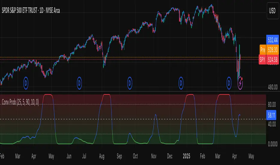
Leavitt Convolution ProbabilityTechnical Analysis of Markets with Leavitt Market Projections and Associated Convolution Probability
The aim of this study is to present an innovative approach to market analysis based on the research "Leavitt Market Projections." This technical tool combines one indicator and a probability function to enhance the accuracy and speed of market forecasts.
Key Features
Advanced Indicators : the script includes the Convolution line and a probability oscillator, designed to anticipate market changes. These indicators provide timely signals and offer a clear view of price dynamics.
Convolution Probability Function : The Convolution Probability (CP) is a key element of the script. A significant increase in this probability often precedes a market decline, while a decrease in probability can signal a bullish move. The Convolution Probability Function:
At each bar, i, the linear regression routine finds the two parameters for the straight line: y=mix+bi.
Standard deviations can be calculated from the sequence of slopes, {mi}, and intercepts, {bi}.
Each standard deviation has a corresponding probability.
Their adjusted product is the Convolution Probability, CP. The construction of the Convolution Probability is straightforward. The adjusted product is the probability of one times 1− the probability of the other.
Customizable Settings : Users can define oversold and overbought levels, as well as set an offset for the linear regression calculation. These options allow for tailoring the script to individual trading strategies and market conditions.
Statistical Analysis : Each analyzed bar generates regression parameters that allow for the calculation of standard deviations and associated probabilities, providing an in-depth view of market dynamics.
The results from applying this technical tool show increased accuracy and speed in market forecasts. The combination of Convolution indicator and the probability function enables the identification of turning points and the anticipation of market changes.
Additional information:
Leavitt, in his study, considers the SPY chart.
When the Convolution Probability (CP) is high, it indicates that the probability P1 (related to the slope) is high, and conversely, when CP is low, P1 is low and P2 is high.
For the calculation of probability, an approximate formula of the Cumulative Distribution Function (CDF) has been used, which is given by: CDF(x)=21(1+erf(σ2x−μ)) where μ is the mean and σ is the standard deviation.
For the calculation of probability, the formula used in this script is: 0.5 * (1 + (math.sign(zSlope) * math.sqrt(1 - math.exp(-0.5 * zSlope * zSlope))))
Conclusions
This study presents the approach to market analysis based on the research "Leavitt Market Projections." The script combines Convolution indicator and a Probability function to provide more precise trading signals. The results demonstrate greater accuracy and speed in market forecasts, making this technical tool a valuable asset for market participants.
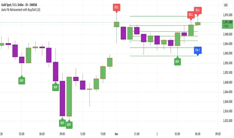
Auto Fib Retracement with Buy/SellKey Features of the Advanced Script:
Multi-Timeframe (MTF) Analysis:
We added an input for the higher timeframe (higher_tf), where the trend is checked on a higher timeframe to confirm the primary trend direction.
Complex Trend Detection:
The trend is determined not only by the current timeframe but also by the trend on the higher timeframe, giving a more comprehensive and reliable signal.
Dynamic Fibonacci Levels:
Fibonacci lines are plotted dynamically, extending them based on price movement, with the Fibonacci retracement drawn only when a trend is identified.
Background Color & Labels:
A background color is added to give a clear indication of the trend direction. Green for uptrend, red for downtrend. It makes it visually easier to understand the current market structure.
"Buy" or "Sell" labels are shown directly on the chart to mark possible entry points.
Strategy and Backtesting:
The script includes strategy commands (strategy.entry and strategy.exit), which allow for backtesting the strategy in TradingView.
Stop loss and take profit conditions are added (loss=100, profit=200), which can be adjusted according to your preferences.
Next Steps:
Test with different timeframes: Try changing the higher_tf to different timeframes (like "60" or "240") and see how it affects the trend detection.
Adjust Fibonacci settings: Modify how the Fibonacci levels are calculated or add more Fibonacci levels like 38.2%, 61.8%, etc.
Optimize Strategy Parameters: Fine-tune the entry/exit logic by adjusting stop loss, take profit, and other strategy parameters.
This should give you a robust foundation for creating advanced trend detection strategies
Cryptolabs Global Liquidity Cycle Momentum IndicatorCryptolabs Global Liquidity Cycle Momentum Indicator (LMI-BTC)
This open-source indicator combines global central bank liquidity data with Bitcoin price movements to identify medium- to long-term market cycles and momentum phases. It is designed for traders who want to incorporate macroeconomic factors into their Bitcoin analysis.
How It Works
The script calculates a Liquidity Index using balance sheet data from four central banks (USA: ECONOMICS:USCBBS, Japan: FRED:JPNASSETS, China: ECONOMICS:CNCBBS, EU: FRED:ECBASSETSW), augmented by the Dollar Index (TVC:DXY) and Chinese 10-year bond yields (TVC:CN10Y). This index is:
- Logarithmically scaled (math.log) to better represent large values like central bank balances and Bitcoin prices.
- Normalized over a 50-period range to balance fluctuations between minimum and maximum values.
- Compared to prior-year values, with the number of bars dynamically adjusted based on the timeframe (e.g., 252 for 1D, 52 for 1W), to compute percentage changes.
The liquidity change is analyzed using a Chande Momentum Oscillator (CMO) (period: 24) to measure momentum trends. A Weighted Moving Average (WMA) (period: 10) acts as a signal line. The Bitcoin price is also plotted logarithmically to highlight parallels with liquidity cycles.
Usage
Traders can use the indicator to:
- Identify global liquidity cycles influencing Bitcoin price trends, such as expansive or restrictive monetary policies.
- Detect momentum phases: Values above 50 suggest overbought conditions, below -50 indicate oversold conditions.
- Anticipate trend reversals by observing CMO crossovers with the signal line.
It performs best on higher timeframes like daily (1D) or weekly (1W) charts. The visualization includes:
- CMO line (green > 50, red < -50, blue neutral), signal line (white), Bitcoin price (gray).
- Horizontal lines at 50, 0, and -50 for improved readability.
Originality
This indicator stands out from other momentum tools like RSI or basic price analysis due to:
- Unique Data Integration: Combines four central bank datasets, DXY, and CN10Y as macroeconomic proxies for Bitcoin.
- Dynamic Prior-Year Analysis: Calculates liquidity changes relative to historical values, adjustable by timeframe.
- Logarithmic Normalization: Enhances visibility of extreme values, critical for cryptocurrencies and macro data.
This combination offers a rare perspective on the interplay between global liquidity and Bitcoin, unavailable in other open-source scripts.
Settings
- CMO Period: Default 24, adjustable for faster/slower signals.
- Signal WMA: Default 10, for smoothing the CMO line.
- Normalization Window: Default 50 periods, customizable.
Users can modify these parameters in the Pine Editor to tailor the indicator to their strategy.
Note
This script is designed for medium- to long-term analysis, not scalping. For optimal results, combine it with additional analyses (e.g., on-chain data, support/resistance levels). It does not guarantee profits but supports informed decisions based on macroeconomic trends.
Data Sources
- Bitcoin: INDEX:BTCUSD
- Liquidity: ECONOMICS:USCBBS, FRED:JPNASSETS, ECONOMICS:CNCBBS, FRED:ECBASSETSW
- Additional: TVC:DXY, TVC:CN10Y
VMA [Extreme Advanced Custom Table for BTCUSD]This indicator implements a Variable Moving Average (VMA) with a 33-period length—selected in homage to the Tesla 369 concept—to dynamically adjust to market conditions. It not only calculates the adaptive VMA but also displays a custom table of key metrics directly on the chart. Here’s how to use it:
Apply to Your Chart:
Add the indicator to your chart (optimized for BTCUSD, though it can be used on other symbols) and choose your desired source (e.g., close).
Customize Your Visuals:
Trend & Price Lines: Toggle the trend colors, price line, and bar coloring based on the VMA’s direction.
Channels & Slope: Enable the volatility channel and slope line to visualize market volatility and the VMA’s momentum.
Pivot Points & Super VMA: Activate pivot high/low markers for potential reversal points and a Super VMA (SMA of VMA) for an extra smoothing layer.
Table Customization: Adjust the table’s position, colors, and font sizes as needed for your viewing preference.
Monitor Key Metrics:
The dynamic table displays essential information:
VMA Value & Trend: See the current VMA and whether the trend is Bullish, Bearish, or Neutral.
Volatility Index (vI) & Slope: Quickly assess market volatility and the VMA’s slope (both absolute and percentage).
Price-VMA Difference & Correlation: Evaluate how far the price is from the VMA and its correlation.
Higher Timeframe VMA: Compare the current VMA with its higher timeframe counterpart (set via the “Higher Timeframe” input).
Alerts for Key Conditions:
Built-in alert conditions notify you when:
The trend changes (bullish/bearish).
The VMA slope becomes extreme.
The price and VMA correlation falls below a defined threshold.
The VMA crosses its higher timeframe average.
How to Use the Script:
Add to Your Chart:
Open TradingView and apply the indicator to your BTCUSD (or any other) chart.
The indicator will overlay on your chart, plotting the VMA along with optional elements such as the price line, volatility channels, and higher timeframe VMA.
Customize Your Settings:
Inputs:
Choose your data source (e.g., close price).
Adjust the VMA length (default is 33) if desired.
Visual Options:
Toggle trend colors, bar coloring, and additional visuals (price line, volatility channels, slope line, pivot points, and Super VMA) to suit your trading style.
Table Customization:
Set the table position, colors, border width, and font size to ensure key metrics are easily visible.
Higher Timeframe:
You can change the higher timeframe input (default is Daily) to better fit your analysis routine.
Interpret the Indicator:
Trend Analysis:
Watch the color-coded VMA line. A rising (orange) VMA suggests bullish momentum, while a falling (red) one indicates bearish conditions.
What Sets This Script Apart:
Dynamic Adaptation:
Unlike a fixed-period moving average, the VMA adjusts its sensitivity in real time by integrating a volatility measure, making it more adaptive to market swings.
Multi-Layered Analysis:
With integrated volatility channels, pivot points, slope analysis, and a higher timeframe VMA, this tool gives you a fuller picture of market dynamics.
Immediate Data at a Glance:
The real-time table consolidates multiple key metrics into one view, saving time and reducing the need for additional indicators.
Custom Alerts:
Pre-built alert conditions allow for timely notifications, ensuring you don’t miss critical market changes.

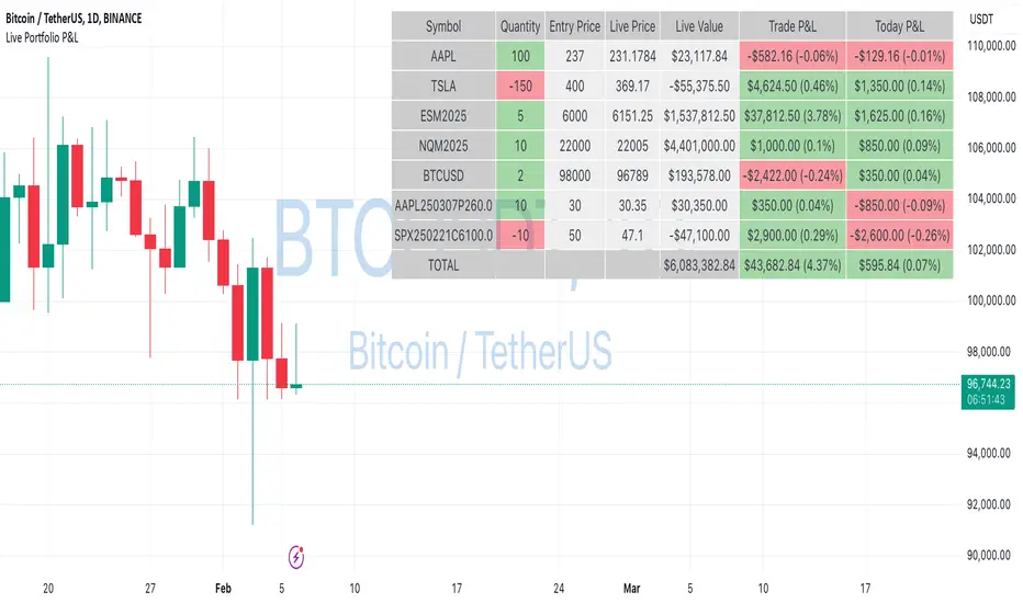
Live Portfolio P<his script calculates live P&L (Profit & Loss) for up to 40 instruments — stocks, ETFs, options, futures, and Forex pairs supported by TradingView. Instead of juggling numerous inputs, you paste your portfolio in CSV format into a single text field, and the script handles the rest. It parses each position and displays a comprehensive table showing the symbol, current price, position value, total P&L, and today’s P&L—all updated in real time.
Key Features
CSV Portfolio Input – Effortlessly import all your positions at once without filling in multiple fields. You can export the position from your broker, save it in the required format, and paste it into this script.
Supports Various Asset Classes – Works with any instrument that TradingView provides data for, including futures, options, and Forex.
Up to 40 Instruments – Track a broad and diverse set of holdings in one place.
Real-Time Updates – Get immediate feedback on live price changes, total value, and current P&L.
Today’s P&L – Monitor your daily performance to gauge short-term trends.
CSV is consumed in the following format:
Symbol (supported TradingView instruments)
Entry Price
Quantity (negative for short position)
Lot Size (for futures/options, it might not be one)
For example:
AAPL,237,100,1
TSLA,400,-150,1
ESM2025,6000,5,50
Planned Enhancements
Multi-Currency Support – Automatically convert and display your positions’ values in different currencies.
Advanced Metrics – Get deeper insights with calculations for drawdown, Sharpe ratio, and more.
Risk Management Tools – Set stop-loss and take-profit levels and receive alerts when thresholds are hit.
Option Greeks & Margin Calculations – Manage complex option strategies and track margin requirements.
Questions for You
What additional features would you like to see?
Are there any specific metrics or analytics you’d find especially valuable?
How might this script fit into your current trading workflow?
Feel free to share your thoughts and suggestions. Your feedback will help shape future updates and make this tool even more helpful for traders like you!
Disclaimer
Please remember that past performance may not be indicative of future results.
Due to various factors, including changing market conditions, the strategy may no longer perform as well as in historical backtesting.
This post and the script don’t provide any financial advice.
Volume Weighted HMA Index | mad_tiger_slayerTitle: 🍉 Volume Weighted HMA Index | mad_tiger_slayer 🐯
Description:
The Volume Weighted HMA Index is a cutting-edge indicator designed to enhance the accuracy and responsiveness of trading signals by combining the power of volume with the Hull Moving Average (HMA). This indicator adjusts the HMA based on volume-weighted price changes, providing faster and more reliable entry and exit signals while reducing the likelihood of false signals.
Intended and Best Uses:
Used for Strategy Creation:
Extremely Quick Entries and Exits
Intended for Higher timeframe however can be used for scalping paired with additional scripts.
Can be paired to create profitable strategies
TREND FOLLOWING NOT MEAN REVERTING!!!!
[Key Features:
Volume Integration: Dynamically adjusts the HMA using volume data to prioritize higher-volume bars, ensuring that market activity plays a crucial role in signal generation.
Enhanced Signal Clarity: The indicator calculates precise long and short signals by detecting volume-weighted HMA crossovers.
Bar Coloring: Visually differentiate bullish and bearish conditions with customizable bar colors, making trends easier to identify.
Custom Signal Plotting: Optional long and short signal markers for a clear visual representation of potential trade opportunities.
Highly Configurable: Adjust parameters such as volume length and calculation source to tailor the indicator to your trading preferences and strategy.
How It Works:
Volume Weighting: The indicator calculates the HMA using a volume-weighted price change, amplifying the influence of high-volume periods on the moving average.
Trend Identification: Crossovers of the volume-weighted HMA with zero determine trend direction, where:
A bullish crossover signals a long condition.
A bearish crossunder signals a short condition.
Visual Feedback: Bar colors and optional signal markers provide real-time insights into trend direction and trading signals.
Use Cases:
Trend Following: Quickly identify emerging trends with volume-accelerated HMA calculations.
Trade Confirmation: Use the indicator to confirm the strength and validity of your trade setups.
Custom Signal Integration: Combine this indicator with your existing strategies to refine entries and exits.
Notes:
Ensure that your trading instrument provides volume data for accurate calculations. If no volume is available, the script will notify you.
This script works best when combined with other indicators or trading frameworks for a comprehensive market view.
Inspired by the community and designed for traders looking to stay ahead of the curve, the Volume Weighted HMA Index is a versatile tool for traders of all levels.
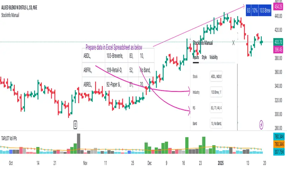
StockInfo ManualScript Description:
The StockInfo Manual is designed to display detailed stock information directly on the chart for the selected symbol. It processes user-provided input data, including
stock symbols
Industries
Relative Strength (RS) values
Band information
Key Features:
1. Symbol-Specific Data Display: Displays information only for the current chart symbol.
2. Customizable Table: Adjust the table's position, text size, colors, and headers to match your preferences.
3. Low RS/Band Conditions: Highlights critical metrics (RS < 50 or Band < 6) with a red background for quick visual cues.
4. Toggle Information: Choose to show or hide RS, Band, and Industry columns based on your needs.
How to Use the Script:
1. Use any platform (ex: chartsmaze) to get Industry,RS and Band information of any Stock. Prepare the data as separate column of excel
2. Configure Inputs:
- Stock Symbols (`Stock`): Enter a comma-separated list of stock symbols (e.g.,
NSE:ABDL,
NSE:ABFRL,
NSE:ABREL,
NSE:ABSLAMC,
NSE:ACC,
NSE:ACE,
- Industries (`Industry`): Provide a comma-separated list of industries for the stocks (e.g., 103-Brewerie,
109-Retail-D,
92-Paper & ,
19-Asset Ma,
62-Cement,
58-Industri,
- Relative Strength (`RS`): Input RS values for each stock (e.g.,
83,
52,
51,
81,
23,
59,
- Band Information (`Band`): Specify Band values for each stock. Use "No Band" if 10,
No Band,
20,
20,
No Band,
20,
3. Customize the Table:
-Display Options: Toggle the visibility of `RS`, `Band`, and `Industry` using the input checkboxes.
-Position and Appearance: Choose the table's position on the chart (e.g., top-right, bottom-center). Customize text size, background colors, header display, and other visual elements.
4. Interpret the Table:
- The table will dynamically display information for the current chart symbol only.
- If the `RS` is below 50 or the Band is below 6, the corresponding row is highlighted with a red background for immediate attention.
One need to enter details at least weekly for a correct result
[blackat] L1 Funding Bottom Wave█ OVERVIEW
The script "Funding Bottom Wave" is an indicator designed to analyze market conditions based on multiple smoothed price calculations and specific thresholds. It calculates several values such as B-value, VAR2-value, and additional signals like SK and SD to identify buy/sell levels and reversals, aiding traders in making informed decisions.
█ LOGICAL FRAMEWORK
The script consists of several main components:
• Input parameters that allow customization of calculation periods and thresholds.
• A custom function funding_wave that computes various financial metrics and conditions.
• Plotting commands to visualize different aspects of those computations.
Data flows from input parameters into the funding_wave function where calculations are performed. These results are then plotted according to specified conditions. The script uses conditional expressions to define when certain plots should appear based on the computed values.
█ CUSTOM FUNCTIONS
funding_wave Function:
This function takes six arguments: close_price, high_price, low_price, open_price, period_b, and period_var2. It performs several calculations including:
• Price range percentage normalized between lowest and highest prices over 60 bars.
• SMA of this value over periods defined by period_b and period_var2.
• Several moving averages (MA), EMAs, and extreme point markers (highest/lowest).
• Multiple condition checks involving these metrics leading to buy/high signal flags.
Returns: An array containing B-value, VAR2-value, SK-value, SD-value, along with various conditional signal indicators.
█ KEY POINTS AND TECHNIQUES
• Utilizes built-in TA functions (ta.highest, ta.lowest, ta.sma, ta.ema) for smoothing and normalization purposes.
• Implements extensive use of ternary operators and boolean logic to determine plot visibility based on specific criteria.
• Employs column-style plotting which highlights significant transitions in calculated metric levels visually.
• No explicit loops; computations utilize vectorized operations inherent to Pine Script's nature.
█ EXTENDED KNOWLEDGE AND APPLICATIONS
Potential modifications/extensions include:
• Adding alerts for key threshold crossovers or meeting certain conditions.
• Customizing more sophisticated alert messages incorporating current time and symbol details.
• Incorporating stop-loss/take-profit strategies dynamically adjusted by indicator outputs.
Similar techniques can be applied in:
• Developing robust trend-following systems combining momentum oscillators.
• Enhancing basic price action rulesets with statistical filters derived from historical data behaviors.
• Exploring intraday breakout strategies predicated upon sudden changes in market sentiment captured via volatility spikes.
Related concepts/features:
• Using arrays to encapsulate complex return structures for reusability across scripts/functions.
• Leveraging na effectively within plotting constructs ensures cleaner chart presentation avoiding clutter from irrelevant points.
█ MARKET MEANING OF DIFFERENT COLORED COLUMNS
Red Columns ("B above Var2"):
• Market Interpretation: When the red columns appear, it indicates that the B-value is higher than the VAR2-value. This suggests a strengthening upward trend or consolidation phase where the market might be experiencing buying pressure relative to recent trends.
• Trading Implication: Traders may consider this as a potentially bullish sign, indicating strength in the underlying asset.
Green Columns ("B below Var2"):
• Market Interpretation: Green columns indicate that the B-value is lower than the VAR2-value. This could suggest downward trend acceleration or weakening buying pressure compared to recent trends.
• Trading Implication: Traders might interpret this as a bearish signal, suggesting a possible decline in the market.
Aqua Columns ("SK below SD"):
• Market Interpretation: Aqua columns show instances where the SK-value is below the SD-value. This typically signifies that the short-term stochastic oscillator (or similar measure) is signaling oversold conditions but not yet reaching extremes.
• Trading Implication: While not necessarily a strong sell signal, aqua columns might prompt traders to look for further confirmation before entering long positions.
Fuchsia Columns ("SK above SD"):
• Market Interpretation: Fuchsia columns represent situations where the SK-value exceeds the SD-value. This usually indicates overbought conditions in the near term.
• Trading Implication: Traders often view fuchsia columns as cautionary signs, possibly prompting them to exit existing long positions or refrain from adding new ones without further analysis.
Yellow Columns ("High Condition" and "High Condition Both"):
• Market Interpretation: Yellow columns occur when either the SK-value or B-value crosses above predefined high thresholds (e.g., 90). If both cross simultaneously, they form "High Condition Both."
• Trading Implication: Strongly bullish signals indicating overheated markets prone to corrections. Traders may see this as a good opportunity to take profits or prepare for a pullback/corrective move.
Blue Columns ("Low Condition" and "Low Condition Both"):
• Market Interpretation: Blue columns emerge when either the SK-value or B-value drops below predefined low thresholds (e.g., 10). Simultaneous crossing forms "Low Condition Both."
• Trading Implication: Potentially bullish reversal setups once the market starts showing signs of bottoming out after being significantly oversold. Traders might use blue columns as entry points for establishing long positions or hedging against anticipated rebounds.
Light Purple Columns ("Low Condition with Reversal" and "Low Condition Both with Reversal"):
• Market Interpretation: Light purple columns signify moments when the SK-value or B-value falls below their respective thresholds but has started reversing upwards immediately afterward. If both fall and reverse together, it's denoted as "Low Condition Both with Reversal."
• Trading Implication: Suggests a possible early-stage rebound from an extended downtrend or sideways movement. This could be seen as a highly reliable bulls' flag formation setup.
White Columns ("High Condition with Reversal" and "High Condition Both with Reversal"):
• Market Interpretation: White columns denote scenarios where the SK-value or B-value breaches high thresholds (e.g., 90) but begins descending shortly thereafter. Both simultaneously crossing leads to "High Condition Both with Reversal."
• Trading Implication: Indicative of peak overbought conditions followed quickly by exhaustion in buying interest. This warns traders about potential imminent retracements or pullbacks, prompting exits or short positions.
█ SUMMARY TABLE OF COLUMN COLORS AND THEIR MEANINGS
Color Type Market Interpretation Trading Implication
Red B above Var2 Strengthening upward trend/consolidation Bullish sign
Green B below Var2 Downward trend acceleration/weakening buying pressure Bearish sign
Aqua SK below SD Oversold conditions but not extreme Cautionary signal
Fuchsia SK above SD Overbought conditions Take profit/precaution
Yellow High Condition / High Condition Both Overheated market, likely correction coming Good time to exit/additional selling
Blue Low Condition / Low Condition Both Possible bull/rebound setup Entry point/hedging
Light Purple Low Condition with Reversal / Low Condition Both with Reversal Early-stage rebound from downtrend Reliable bulls' flag formation
White High Condition with Reversal / High Condition Both with Reversal Peak overbought with imminent retracement Exit positions/warning
Understanding these color-coded signals can help traders make more informed decisions, whether for entry, exit, or risk management in trading strategies. Each set of colors provides distinct insights into market dynamics and trends, aiding in effective execution of trade plans.

Strategie Bollinger Bands buy & sellMiddle Band (Basis): Calculated using a Simple Moving Average (SMA) over a user-defined period.
Upper Band: The middle band plus the standard deviation of the price multiplied by a user-defined multiplier.
Lower Band: The middle band minus the standard deviation of the price multiplied by the same multiplier.
User Inputs:
Length: The number of periods used for the SMA and standard deviation (default: 20).
Deviation: The multiplier for the standard deviation to calculate the upper and lower bands (default: 2.0).
Buy and Sell Signals:
Buy Signal: Generated when the price crosses above the lower band, indicating a potential oversold condition.
Sell Signal: Generated when the price crosses below the upper band, indicating a potential overbought condition.
Visual Markers:
Buy Signals: Displayed below the price bars as green labels with the text "BUY."
Sell Signals: Displayed above the price bars as red labels with the text "SELL."
The Bollinger Bands (upper, middle, and lower) are plotted directly on the price chart for easy visualization.
How to Use the Script:
Customize Parameters:
Modify the length and deviation inputs to adapt to different market conditions or timeframes.
Interpret Signals:
A BUY signal indicates a possible reversal or upward movement from the lower band.
A SELL signal suggests a potential price decline from the upper band.
Combine with Other Indicators:
While effective in certain conditions, this strategy performs better when combined with other technical tools, such as RSI or MACD, to confirm trends and avoid false signals.
Limitations:
This script assumes that price will revert to the mean, which may not hold during strong trends or highly volatile conditions.
It is not a standalone trading system and should be backtested and optimized before applying to real trading.

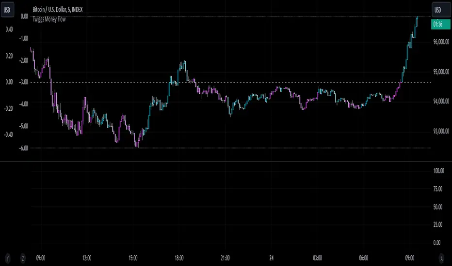
Twiggs Money FlowTwiggs Money Flow (TMF)
This indicator is an implementation of the Twiggs Money Flow (TMF), a volume-based tool designed to measure buying and selling pressure over a specified period. TMF is an enhancement of Chaikin Money Flow (CMF), utilizing more sophisticated smoothing techniques for improved accuracy and reduced noise. This version is highly customizable and includes advanced features for both new and experienced traders.
What is Twiggs Money Flow?
Twiggs Money Flow was developed by Colin Twiggs to provide a clearer picture of market momentum and the balance between buyers and sellers. It uses a combination of price action, trading volume, and range calculations to assess whether a market is under buying or selling pressure.
Unlike traditional volume indicators, TMF incorporates Weighted Moving Averages (WMA) by default but allows for other moving average types (SMA, EMA, VWMA) for added flexibility. This makes it adaptable to various trading styles and market conditions.
Features of This Script:
Customizable Moving Average Types:
Select from SMA , EMA , WMA , or VWMA to smooth volume and price-based calculations.
Tailor the indicator to align with your trading strategy or the asset's behavior.
Optional HMA Smoothing:
Apply Hull Moving Average (HMA) smoothing for a cleaner, faster-reacting TMF line.
Perfect for traders who want to reduce lag and capture trends earlier.
Dynamic Thresholds for Signal Filtering:
Set user-defined thresholds for Long (LT) and Short (ST) signals to highlight significant momentum.
Focus on actionable trends by ignoring noise around neutral levels.
Bar Coloring for Visual Clarity:
Automatically colors your chart bars based on TMF values:
Aqua for strong bullish signals (above the long threshold).
Fuchsia for strong bearish signals (below the short threshold).
Gray for neutral or undecided market conditions.
Ensures that trend direction and strength are visually intuitive.
Configurable Lookback Period:
Adjust the sensitivity of TMF by customizing the length of the lookback period to suit different timeframes and market conditions.
How It Works:
True Range Calculation: The script determines the high, low, and close range to calculate buying and selling pressure.
Adjusted Volume: Incorporates the relationship between price and volume to gauge whether trading activity is favoring buyers or sellers.
Weighted Moving Averages (WMAs): Smooths both volume and adjusted volume values to eliminate erratic fluctuations.
TMF Line: Computes the ratio of adjusted volume to total volume, representing the net buying/selling pressure as a percentage.
HMA Option (if enabled): Smooths the TMF line further to reduce lag and enhance trend identification.
Bar Coloring Logic:
Bars are colored dynamically based on TMF values, thresholds, and smoothing preferences.
Provides an at-a-glance understanding of market conditions.
Input Parameters:
Lookback Period: Defines the number of bars used to calculate TMF (default: 21).
Use HMA Smoothing: Toggle Hull Moving Average smoothing (default: true).
HMA Smoothing Length: Length of the HMA smoothing period (default: 14).
Moving Average Type: Select SMA, EMA, WMA, or VWMA (default: WMA).
Long Threshold (LT): Threshold value above which a long signal is considered (default: 0).
Short Threshold (ST): Threshold value below which a short signal is considered (default: 0).
How to Use It:
Confirm Trends: TMF can validate trends by identifying periods of sustained buying or selling pressure.
Divergence Signals: Watch for divergences between price and TMF to anticipate potential reversals.
Filter Trades: Use the thresholds to ignore weak signals and focus on strong trends.
Combine with Other Indicators: Pair TMF with trend-following or momentum indicators (e.g., RSI, Bollinger Bands) for a comprehensive trading strategy.
Example Use Cases:
Spotting breakouts when TMF crosses above the long threshold.
Identifying sell-offs when TMF dips below the short threshold.
Avoiding sideways markets by ignoring neutral (gray) bars.
Notes:
This indicator is highly customizable, making it versatile across different assets (e.g., stocks, crypto, forex).
While the default settings are robust, tweaking the lookback period, moving average type, and thresholds is recommended for different trading instruments or strategies.
Always backtest thoroughly before applying the indicator to live trading.
This version of Twiggs Money Flow goes beyond standard implementations by offering advanced smoothing, custom thresholds, and enhanced visual feedback to give traders a competitive edge.
Add it to your charts and experience the power of volume-driven analysis!
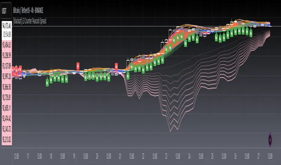
[blackcat] L3 Counter Peacock Spread█ OVERVIEW
The script titled " L3 Counter Peacock Spread" is an indicator designed for use in TradingView. It calculates and plots various moving averages, K lines derived from these moving averages, additional simple moving averages (SMAs), weighted moving averages (WMAs), and other technical indicators like slope calculations. The primary function of the script is to provide a comprehensive set of visual tools that traders can use to identify trends, potential support/resistance levels, and crossover signals.
█ LOGICAL FRAMEWORK
Input Parameters:
There are no explicit input parameters defined; all variables are hardcoded or calculated within the script.
Calculations:
• Moving Averages: Calculates Simple Moving Averages (SMA) using ta.sma.
• Slope Calculation: Computes the slope of a given series over a specified period using linear regression (ta.linreg).
• K Lines: Defines multiple exponentially adjusted SMAs based on a 30-period MA and a 1-period MA.
• Weighted Moving Average (WMA): Custom function to compute WMAs by iterating through price data points.
• Other Indicators: Includes Exponential Moving Average (EMA) for momentum calculation.
Plotting:
Various elements such as MAs, K lines, conditional bands, additional SMAs, and WMAs are plotted on the chart overlaying the main price action.
No loops control the behavior beyond those used in custom functions for calculating WMAs. Conditional statements determine the coloring of certain plot lines based on specific criteria.
█ CUSTOM FUNCTIONS
calculate_slope(src, length) :
• Purpose: To calculate the slope of a time-series data point over a specified number of periods.
• Functionality: Uses linear regression to find the current and previous slopes and computes their difference scaled by the timeframe multiplier.
• Parameters:
– src: Source of the input data (e.g., closing prices).
– length: Periodicity of the linreg calculation.
• Return Value: Computed slope value.
calculate_ma(source, length) :
• Purpose: To calculate the Simple Moving Average (SMA) of a given source over a specified period.
• Functionality: Utilizes TradingView’s built-in ta.sma function.
• Parameters:
– source: Input data series (e.g., closing prices).
– length: Number of bars considered for the SMA calculation.
• Return Value: Calculated SMA value.
calculate_k_lines(ma30, ma1) :
• Purpose: Generates multiple exponentially adjusted versions of a 30-period MA relative to a 1-period MA.
• Functionality: Multiplies the 30-period MA by coefficients ranging from 1.1 to 3 and subtracts multiples of the 1-period MA accordingly.
• Parameters:
– ma30: 30-period Simple Moving Average.
– ma1: 1-period Simple Moving Average.
• Return Value: Returns an array containing ten different \u2003\u2022 "K line" values.
calculate_wma(source, length) :
• Purpose: Computes the Weighted Moving Average (WMA) of a provided series over a defined period.
• Functionality: Iterates backward through the last 'n' bars, weights each bar according to its position, sums them up, and divides by the total weight.
• Parameters:
– source: Price series to average.
– length: Length of the lookback window.
• Return Value: Calculated WMA value.
█ KEY POINTS AND TECHNIQUES
• Advanced Pine Script Features: Utilization of custom functions for encapsulating complex logic, leveraging TradingView’s library functions (ta.sma, ta.linreg, ta.ema) for efficient computations.
• Optimization Techniques: Efficient computation of K lines via pre-calculated components (multiples of MA30 and MA1). Use of arrays to store intermediate results which simplifies plotting.
• Best Practices: Clear separation between calculation and visualization sections enhances readability and maintainability. Usage of color.new() allows dynamic adjustments without hardcoding colors directly into plot commands.
• Unique Approaches: Introduction of K lines provides an alternative representation of trend strength compared to traditional MAs. Implementation of conditional band coloring adds real-time context to existing visual cues.
█ EXTENDED KNOWLEDGE AND APPLICATIONS
Potential Modifications/Extensions:
• Adding more user-defined inputs for lengths of MAs, K lines, etc., would make the script more flexible.
• Incorporating alert conditions based on crossovers between key lines could enhance automated trading strategies.
Application Scenarios:
• Useful for both intraday and swing trading due to the combination of short-term and long-term MAs along with trend analysis via slopes and K lines.
• Can be integrated into larger systems combining this indicator with others like oscillators or volume-based metrics.
Related Concepts:
• Understanding how linear regression works internally aids in grasping the slope calculation.
• Familiarity with WMA versus SMA helps appreciate why different types of averaging might be necessary depending on market dynamics.
• Knowledge of candlestick patterns can complement insights gained from this indicator.
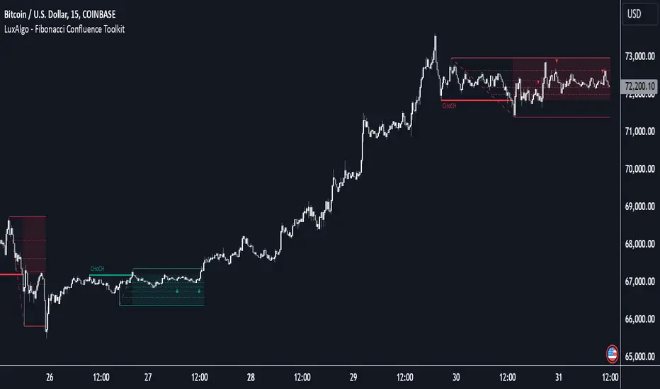
Fibonacci Confluence Toolkit [LuxAlgo]The Fibonacci Confluence Toolkit is a technical analysis tool designed to help traders identify potential price reversal zones by combining key market signals and patterns. It highlights areas of interest where significant price action or reactions are anticipated, automatically applies Fibonacci retracement levels to outline potential pullback zones, and detects engulfing candle patterns.
Its unique strength lies in its reliance solely on price patterns, eliminating the need for user-defined inputs, ensuring a robust and objective analysis of market dynamics.
🔶 USAGE
The script begins by detecting CHoCH (Change of Character) points—key indicators of shifts in market direction. This script integrates the principles of pure price action as applied in Pure-Price-Action-Structures , where further details on the detection process can be found.
The detected CHoCH points serve as the foundation for defining an Area of Interest (AOI), a zone where significant price action or reactions are anticipated.
As new swing highs or lows emerge within the AOI, the tool automatically applies Fibonacci retracement levels to outline potential retracement zones. This setup enables traders to identify areas where price pullbacks may occur, offering actionable insights into potential entries or reversals.
Additionally, the toolkit highlights engulfing candle patterns within these zones, further refining entry points and enhancing confluence for better-informed trading decisions based on real-time trend dynamics and price behavior.
🔶 SETTINGS
🔹 Market Patterns
Bullish Structures: Enable or disable all bullish components of the indicator.
Bearish Structures: Enable or disable all bearish components of the indicator.
Highlight Area of Interest: Toggle the option to highlight the Areas of Interest (enabled or disabled).
CHoCH Line: Choose the line style for the CHoCH (Solid, Dashed, or Dotted).
Width: Adjust the width of the CHoCH line.
🔹 Retracement Levels
Choose which Fibonacci retracement levels to display (e.g., 0, 0.236, 0.382, etc.).
🔹 Swing Levels & Engulfing Patterns
Swing Levels: Select how swing levels are marked (symbols like ◉, △▽, or H/L).
Engulfing Candle Patterns: Choose which engulfing candle patterns to detect (All, Structure-Based, or Disabled).
🔶 RELATED SCRIPTS
Pure-Price-Action-Structures.
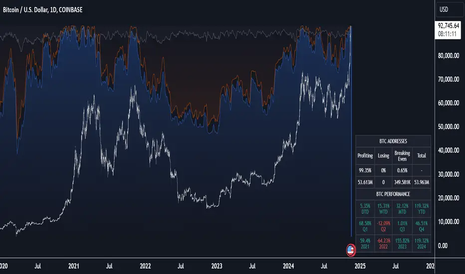
Crypto Wallets Profitability & Performance [LuxAlgo]The Crypto Wallets Profitability & Performance indicator provides a comprehensive view of the financial status of cryptocurrency wallets by leveraging on-chain data from IntoTheBlock. It measures the percentage of wallets profiting, losing, or breaking even based on current market prices.
Additionally, it offers performance metrics across different timeframes, enabling traders to better assess market conditions.
This information can be crucial for understanding market sentiment and making informed trading decisions.
🔶 USAGE
🔹 Wallets Profitability
This indicator is designed to help traders and analysts evaluate the profitability of cryptocurrency wallets in real-time. It aggregates data gathered from the blockchain on the number of wallets that are in profit, loss, or breaking even and presents it visually on the chart.
Breaking even line demonstrates how realized gains and losses have changed, while the profit and the loss monitor unrealized gains and losses.
The signal line helps traders by providing a smoothed average and highlighting areas relative to profiting and losing levels. This makes it easier to identify and confirm trading momentum, assess strength, and filter out market noise.
🔹 Profitability Meter
The Profitability Meter is an alternative display that visually represents the percentage of wallets that are profiting, losing, or breaking even.
🔹 Performance
The script provides a view of the financial health of cryptocurrency wallets, showing the percentage of wallets in profit, loss, or breaking even. By combining these metrics with performance data across various timeframes, traders can gain valuable insights into overall wallet performance, assess trend strength, and identify potential market reversals.
🔹 Dashboard
The dashboard presents a consolidated view of key statistics. It allows traders to quickly assess the overall financial health of wallets, monitor trend strength, and gauge market conditions.
🔶 DETAILS
🔹 The Chart Occupation Option
The chart occupation option adjusts the occupation percentage of the chart to balance the visibility of the indicator.
🔹 The Height in Performance Options
Crypto markets often experience significant volatility, leading to rapid and substantial gains or losses. Hence, plotting performance graphs on top of the chart alongside other indicators can result in a cluttered display. The height option allows you to adjust the plotting for balanced visibility, ensuring a clearer and more organized chart.
🔶 SETTINGS
The script offers a range of customizable settings to tailor the analysis to your trading needs.
Chart Occupation %: Adjust the occupation percentage of the chart to balance the visibility of the indicator.
🔹 Profiting Wallets
Profiting Percentage: Toggle to display the percentage of wallets in profit.
Smoothing: Adjust the smoothing period for the profiting percentage line.
Signal Line: Choose a signal line type (SMA, EMA, RMA, or None) to overlay on the profiting percentage.
🔹 Losing Wallets
Losing Percentage: Toggle to display the percentage of wallets in loss.
Smoothing: Adjust the smoothing period for the losing percentage line.
Signal Line: Choose a signal line type (SMA, EMA, RMA, or None) to overlay on the losing percentage.
🔹 Breaking Even Wallets
Breaking-Even Percentage: Toggle to display the percentage of wallets breaking even.
Smoothing: Adjust the smoothing period for the breaking-even percentage line.
🔹 Profitability Meter
Profitability Meter: Enable or disable the meter display, set its width, and adjust the offset.
🔹 Performance
Performance Metrics: Choose the timeframe for performance metrics (Day to Date, Week to Date, etc.).
Height: Adjust the height of the chart visuals to balance the visibility of the indicator.
🔹 Dashboard
Block Profitability Stats: Toggle the display of profitability stats.
Performance Stats: Toggle the display of performance stats.
Dashboard Size and Position: Customize the size and position of the performance dashboard on the chart.
🔶 RELATED SCRIPTS
Market-Sentiment-Technicals
Multi-Chart-Widget
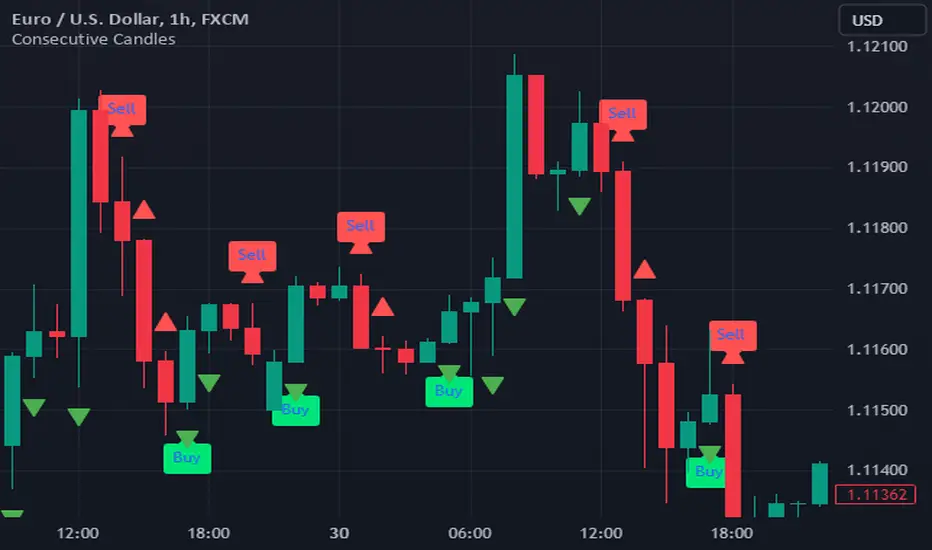
Consecutive CandlesTrading as Easy as One, Two, and Three
Unlock the power of simplicity in trading with this innovative script inspired by KepalaBesi. Designed for traders of all levels, this script provides a user-friendly approach to market analysis, enabling you to make informed trading decisions effortlessly.
Key Features:
Simplified Signals: Receive clear buy and sell signals based on robust technical indicators. The script streamlines your trading process, allowing you to focus on execution rather than analysis.
Customizable Settings: Tailor the script to fit your trading style. Adjust parameters to suit your risk tolerance and market preferences, ensuring a personalized trading experience.
Visual Clarity: Benefit from intuitive visual cues on your chart, making it easy to identify optimal entry and exit points. The clean interface helps you make quick decisions without confusion.
Whether you’re a seasoned trader or just starting, "Trading as Easy as One, Two, and Three" simplifies your trading journey, turning complex strategies into straightforward actions. Embrace a more efficient way to trade and elevate your performance in the markets!
Get Started Today!
Join the community of traders who have discovered the ease of trading with KepalaBesi's inspired script. Elevate your trading experience and achieve your financial goals with confidence!
Prometheus Black-Scholes Option PricesThe Black-Scholes Model is an option pricing model developed my Fischer Black and Myron Scholes in 1973 at MIT. This is regarded as the most accurate pricing model and is still used today all over the world. This script is a simulated Black-Scholes model pricing model, I will get into why I say simulated.
What is an option?
An option is the right, but not the obligation, to buy or sell 100 shares of a certain stock, for calls or puts respective, at a certain price, on a certain date (assuming European style options, American options can be exercised early). The reason these agreements, these contracts exist is to provide traders with leverage. Buying 1 contract to represent 100 shares of the underlying, more often than not, at a cheaper price. That is why the price of the option, the premium , is a small number. If an option costs $1.00 we pay $100.00 for it because 100 shares * 1 dollar per share = 100 dollars for all the shares. When a trader purchases a call on stock XYZ with a strike of $105 while XYZ stock is trading at $100, if XYZ stock moves up to $110 dollars before expiration the option has $5 of intrinsic value. You have the right to buy something at $105 when it is trading at $110. That agreement is way more valuable now, as a result the options premium would increase. That is a quick overview about how options are traded, let's get into calculating them.
Inputs for the Black-Scholes model
To calculate the price of an option we need to know 5 things:
Current Price of the asset
Strike Price of the option
Time Till Expiration
Risk-Free Interest rate
Volatility
The price of a European call option 𝐶 is given by:
𝐶 = 𝑆0 * Φ(𝑑1) − 𝐾 * 𝑒^(−𝑟 * 𝑇) * Φ(𝑑2)
where:
𝑆0 is the current price of the underlying asset.
𝐾 is the strike price of the option.
𝑟 is the risk-free interest rate.
𝑇 is the time to expiration.
Φ is the cumulative distribution function of the standard normal distribution.
𝑑1 and 𝑑2 are calculated as:
𝑑1 = (ln(𝑆0 / 𝐾) + (𝑟 + (𝜎^2 / 2)) * 𝑇) / (𝜎 * sqrt(𝑇))
𝑑2= 𝑑1 - (𝜎 * sqrt(𝑇))
𝜎 is the volatility of the underlying asset.
The price of a European put option 𝑃 is given by:
𝑃 = 𝐾 * 𝑒^(−𝑟 * 𝑇) * Φ(−𝑑2) − 𝑆0 * Φ(−𝑑1)
where 𝑑1 and 𝑑2 are as defined above.
Key Assumptions of the Black-Scholes Model
The price of the underlying asset follows a lognormal distribution.
There are no transaction costs or taxes.
The risk-free interest rate and volatility of the underlying asset are constant.
The underlying asset does not pay dividends during the life of the option.
The markets are efficient, meaning that all known information is already reflected in the prices.
Options can only be exercised at expiration (European-style options).
Understanding the Script
Here I have arrows pointing to specific spots on the table. They point to Historical Volatility and Inputted DTE . Inputted DTE is a value the user may input to calculate premium for options that expire in that many days. Historical Volatility , is the value calculated by this code.
length = 252 // One year of trading days
hv = ta.stdev(math.log(close / close ), length) * math.sqrt(365)
And then made daily like the Black-Scholes model needs from this step in the code.
hv_daily = request.security(syminfo.tickerid, "1D", hv)
The user has the option to input their own volatility to the Script. I will get into why that may be advantageous in a moment. If the user chooses to do so the Script will change which value it is using as so.
hv_in_use = which_sig == false ? hv_daily : sig
There is a lot going on in this image but bare with me, it will all make sense by the end. The column to the far left of both the green and maroon colored columns represent the strike price of the contract, if the numbers are white that means the contract is out of the money, gray means in the money. If you remember from the calculation this represents the price to buy or sell shares at, for calls or puts respective. The column second from the left shows a value for Simulated Market Price . This is a necessary part of this script so we can show changes in implied volatility. See, when we go to our brokerages and look at options prices, sure the price was calculated by a pricing model, but that is rarely the true price of the model. Market participant sentiment affects this value as their estimates for future volatility, Implied Volatility changes.
For example, if a call option is supposed to be worth $1.00 from the pricing model, however everyone is bullish on the stock and wants to buy calls, the premium may go to $1.20 from $1.00 because participants juice up the Implied Volatility . Higher Implied Volatility generally means higher premium, given enough time to expiration. Buying an option at $0.80 when it should be worth $1.00 due to changes in sentiment is a big part of the Quant Trading industry.
Of course I don't have access to an actual exchange so get prices, so I modeled participant decisions by adding or subtracting a small random value on the "perfect premium" from the Black-Scholes model, and solving for implied volatility using the Newton-Raphson method.
It is like when we have speed = distance / time if we know speed and time , we can solve for distance .
This is what models the changing Implied Volatility in the table. The other column in the table, 3rd from the left, is the Black-Scholes model price without the changes of a random number. Finally, the 4th column from the left is that Implied Volatility value we calculated with the modified option price.
More on Implied Volatility
Implied Volatility represents the future expected volatility of an asset. As it is the value in the future it is not know like Historical Volatility, only projected. We provide the user with the option to enter their own Implied Volatility to start with for better modeling of options close to expiration. If you want to model options 1 day from expiration you will probably have to enter a higher Implied Volatility so that way the prices will be higher. Since the underlying is so close to expiration they are traded so much and traders manipulate their Implied Volatility , increasing their value. Be safe while trading these!
Thank you all for clicking on my indicator and reading this description! Happy coding, Happy trading, Be safe!
Good reference: www.investopedia.com
