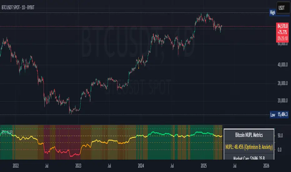
TrendBand CycleSimple breakout signal with POTENTIAL target price and stop loss / trailing stop.
Cycle begin with green bar signal and will end if price break above target or break below stop loss.
Volume test and pullback signal only appear within cycle period.
Few example :
Pesquisar nos scripts por "Cycle"
AAEN With Auto Length Adjust to CycleAverage Absolute Error Normalization With Auto Length Adjust to Cycle Length
Indicator by alexgrover, I just added the auto cycle length
Saturn–Pluto Cycle
Indicator colors background of the chart in the following way:
Saturn - Pluto Cycle in conjunction: Blue
Saturn - Pluto Cycle in opposition: Yellow
While opposition periods are indicated according to the actual date ranges an opposition occurs, conjunctions last only for one day.
Conjunctions indicated with this indicator mark a period around the actual conjunction date.
The actual date a conjunction occurs is indicated in the script.
Following the dates which were considered for this indicator:
Dates of Saturn–Pluto Conjunctions
October 5, 1914 at 2° Cancer (recurrence on May 20, 1915)
August 11, 1947 at 13° Leo
November 8, 1982 at 27° Libra
January 12, 2020 at 22° Capricorn
Dates of Saturn–Pluto Oppositions
February 17, 1931 – December 13, 1931 at 19°–21° Capricorn–Cancer (conjunct their respective North and South Nodes)
April 23, 1965 – February 20, 1966 at 14°–17° Pisces–Virgo
August 5, 2001 – May 26, 2002 at 12°–16° Gemini–Sagittarius (conjunct the lunar nodes)
BTC Cycle High IndicatorWith high probability show BTC price cycle highs. When price touches the white line, and when yellow and red moving averages cross, we will most likely have our next BTC cycle price high.
Based on Philip Swift's analysis (@positivecrypto)
Dominant Cycle Tuned Rsi BackgroundBackground version of the Dominant Cycle Tuned Rsi Background published here
Robust Cycle Measurement [Ehlers]The last of Ehlers Instantaneous Frequency Measurement methods.
This is a more robust version of this script.
I wrote it as a function, so you can simply copy and paste it into any script to add an adaptive period setting capability.
Cheers,
DasanC
Pi Cycle Top & Bottom OscillatorThis TradingView script implements the Pi Cycle Top & Bottom Oscillator, a technical indicator designed to identify potential market tops and bottoms using moving average relationships. Here's a detailed breakdown:
Indicator Overview
Purpose: The indicator calculates an oscillator based on the ratio of a 111-day simple moving average (SMA) to double the 350-day SMA. It identifies potential overbought (market tops) and oversold (market bottoms) conditions.
Visualization: The oscillator is displayed in a standalone pane with dynamic color coding to represent different market conditions.
Inputs
111-Day Moving Average Length (length_111): Adjustable parameter for the short-term moving average. Default is 111 days.
350-Day Moving Average Length (length_350): Adjustable parameter for the long-term moving average. Default is 350 days.
Overheat Threshold (upper_threshold): Percentage level above which the market is considered overheated. Default is 100%.
Cooling Down Threshold (lower_threshold): Percentage level below which the market is cooling down. Default is 75%.
Calculation
Moving Averages:
111-day SMA of the closing price.
350-day SMA of the closing price.
Double the 350-day SMA (
𝑚
𝑎
_
2
_
350
=
𝑚
𝑎
_
350
×
2
ma_2_350=ma_350×2).
Oscillator:
Ratio of the 111-day SMA to double the 350-day SMA, expressed as a percentage:
oscillator
=
𝑚
𝑎
_
111
𝑚
𝑎
_
2
_
350
×
100
oscillator=
ma_2_350
ma_111
×100
Market Conditions
Overheated Market (Potential Top): Oscillator >= Overheat Threshold (100% by default). Highlighted in red.
Cooling Down Market (Potential Bottom): Oscillator <= Cooling Down Threshold (75% by default). Highlighted in green.
Normal Market Condition: Oscillator is between these thresholds. Highlighted in blue.
Visual Features
Dynamic Oscillator Plot:
Color-coded to indicate market conditions:
Red: Overheated.
Green: Cooling down.
Blue: Normal condition.
Threshold Lines:
Red Dashed Line: Overheat Threshold.
Green Dashed Line: Cooling Down Threshold.
White Dashed Line: Additional high-value marker at 30 for reference.
Alerts
Overheat Alert: Triggers when the oscillator crosses the overheat threshold, signaling a potential market top.
Cooling Down Alert: Triggers when the oscillator crosses the cooling down threshold, signaling a potential market bottom.
Use Case
This script is particularly useful for traders seeking early signals of market reversals. The thresholds and dynamic color coding provide visual cues and alerts to aid decision-making in identifying overbought or oversold conditions.
Cosmic Cycle Trader -AYNETThe "Cosmic Cycle Trader 🌌"
Here's a summarized breakdown of the code:
Inputs
Orbital Periods (Moving Averages):
User specifies moving average (MA) periods as a comma-separated string (e.g., "10,20,50,100").
Predefined colors for each MA are used.
Fibonacci Sphere Levels:
User specifies Fibonacci retracement levels as a string (e.g., "0.236,0.382,0.618,1.0").
Color customization for Fibonacci levels is included.
Gravitational Pull (Signal Thresholds):
Configurable thresholds (buy_pull and sell_pull) to define signal triggers.
Alerts can be toggled on or off.
Core Features
Helper Functions:
parse_floats: Converts a comma-separated string into an array of floating-point numbers.
parse_ints: Converts a comma-separated string into an array of integers.
Orbital Periods (Moving Averages):
Moving averages are calculated for the given periods using the ta.sma function.
Each MA is stored in an array and plotted on the chart with a unique color.
Fibonacci Spheres:
Fibonacci levels are calculated based on the high and low of the current bar.
These levels are plotted as circles, visually indicating key price zones.
Signals:
Buy Signal: Triggered when:
The price closes above the highest MA.
The price is between specific Fibonacci levels.
Sell Signal: Triggered when:
The price closes below the lowest MA.
The price is below specific Fibonacci levels.
Alerts:
Alerts are created for buy and sell signals.
Signals are also annotated on the chart with labels and shapes.
Visual Elements
Plots:
Moving averages are plotted with distinct colors and line widths.
Fibonacci spheres are plotted as circles with customizable transparency.
Shapes:
Triangles indicate buy (green) and sell (red) signals on the chart.
Labels:
Buy signals display a "🌕 Buy" label.
Sell signals display a "🌑 Sell" label.
Purpose
This indicator helps traders identify potential buy and sell zones based on:
Moving average trends (orbital periods).
Key Fibonacci retracement levels.
Configurable thresholds (gravitational pull).
This combination of technical analysis tools makes it a visually appealing and functional indicator for traders.
Dynamic Cycle Oscillator [Quantigenics]This script is designed to navigate through the ebbs and flows of financial markets. At its core, this script is a sophisticated yet user-friendly tool that helps you identify potential market turning points and trend continuations.
How It Works:
The script operates by plotting two distinct lines and a central histogram that collectively form a band structure: a center line and two outer boundaries, indicating overbought and oversold conditions. The lines are calculated based on a blend of exponential moving averages, which are then refined by a root mean square (RMS) over a specified number of bars to establish the cyclic envelope.
The input parameters:
Fast and Slow Periods:
These determine the sensitivity of the script. Shorter periods react quicker to price changes, while longer periods offer a smoother view.
RMS Length:
This parameter controls the range of the cyclic envelope, influencing the trigger levels for trading signals.
Using the Script:
On your chart, you’ll notice how the Dynamic Cycle Oscillator’s lines and histogram weave through the price action. Here’s how to interpret the movements.
Breakouts and Continuations:
Buy Signal: Consider a long position when the histogram crosses above the upper boundary. This suggests a possible strong bullish run.
Sell Signal: Consider a short position when the histogram crosses below the lower boundary. This suggests a possible strong bearish run.
Reversals:
Buy Signal: Consider a long position when the histogram crosses above the lower boundary. This suggests an oversold market turning bullish.
Sell Signal: Consider a short position when the histogram crosses below the upper boundary. This implies an overbought market turning bearish.
The script’s real-time analysis can serve as a robust addition to your trading strategy, offering clarity in choppy markets and an edge in trend-following systems.
Thanks! Hope you enjoy!
ZN Market CycleDescription
The purpose of this indicator is to create symbols that try to show the most accurate positions possible for trading. The formation of BUY/SELL symbols is based on the intersection of RSI, MACD and 6 bar moving average. Additionally, BOLLINGER bands were used to determine the lower and upper points. For example, while the price is falling, it will create an BOTTOM symbol when the price crosses the lower BOLLINGER band upwards. If this transition is accompanied by the RSI breaking its average upwards, it will produce the STRONG BOTTOM symbol. If the RSI average crosses the RSIMA direction upwards, it will produce the DEEP symbol. Of course, the scenario described above is also valid in the opposite direction. The purpose of the icons on the screen is indicated by the text above them. However, a detailed explanation of what these symbols do is given below.
Symbols
The symbols are explained one by one below.
BOTTOM: Indicates that the fall has slowed down or may have been completed.
STRONG BOTTOM: Indicates that the fall has stopped or may have been completed.
TOP: Indicates that the ascent has slowed down or may have been completed.
STRONG TOP: Indicates that the ascent has stopped or may have been completed.
BUY: Indicates the convenient location to make a buying. Buying pressure may increase after this symbol.
STRONG BUY: Indicates the most suitable location for buying. It should be considered that a strong buying wave may come after the appearance of this symbol.
SELL: Indicates the appropriate location to selling Selling pressure may increase after this symbol.
STRONG SELL: Indicates the most suitable position to selling. It should be considered that a strong selling wave may come after the appearance of this symbol.
PEAK: It indicates that the uptrend has come to an end.
DEEP: It indicates that the downtrend has come to an end.
ARROWS: Arrows show the trend direction. Since it varies a lot, it should be used to follow the trend rather than buy/sell. However, the appearance of a downward arrow shortly after a buy signal should suggest that the buy signal is fake. In this case, the buying position can be closed. This also applies to the selling process.
Best Use
This indicator should be used for SPOT trades. Regardless, since it is not possible to know exactly the direction of the market, it should be considered to buy gradually at buy signals and sell gradually at sell signals.
It should be followed for at least a 4-hour period. We do not recommend its use as the margin of error will increase in shorter time periods.
After a buy signal comes, a short decline may occur and the rise may begin. An immediate rise should not be expected after the signal arrives. Since the signals are not guaranteed to work 100%, we do not recommend you to trade with all your money.
No Repainting
Repainting is definitely not done. After the symbols appear, the closing should be expected. Once the closing occurs, the symbol will now be permanent.
Disclaimer
This indicator is for informational purposes only and should be used for educational purposes only. You may lose money if you rely on this to trade without additional information. Use at your own risk.
Version
v1.0
[_ParkF]cRSIHi, it's been a while since I posted a script.
This script basically puts the principle of convergence and divergence first.
(The Bollinger Band on the main chart is for reference)
The cRSI will move within the range of 0-100 just like the normal RSI
Along with that, there is a Donchian channel that will be the main activity area of the cRSI
If you know the characteristics of the Bollinger Band, it might be easy to understand
Basically, it will have the Expansion - Bulge - Squeeze Cycle
I wanted to express the movement of the wave visually.
Donchian Channel can be viewed to check Expansion - Bulge - Squeeze.
The centerline of the Donchian Channel is important because it plays a key role in identifying trends, such as 50 of the cRSI.
Also, Bear and Bull Divergence has 3 different colors
The reason is that the Divergence measurement period values are different.
Bear Divergence will be marked with Yellow, Orange, Red Label, and Bull Divergence will be marked with Green, Blue and Purple Label Purple. There will be a longer period of diversity in the order listed order.
I hope it helps your trading.
--------------------------------------------------------------------------------------------------------------------------------------------------------------------------------------------------------------------------------------------------------------------
안녕하세요, 오랜만에 새로운 지표를 올립니다.
이 지표는 기본적으로 수렴과 발산을 가장 중요하게 생각한 것입니다.
(메인 차트에 있는 볼린저 밴드는 참고를 위한 것입니다.)
cRSI는 일반적 RSI와 마찬가지로 0-100의 범위 안에서 움직이겠지만
그와 함께 cRSI의 주 활도 범위가 될 돈치안 채널이 함께 존재해서
볼린저 밴드의 특성을 알고 있다면 이해하기 쉬울 수 있을 것 같은데
기본적으로 Expansion - Bulge - Squeeze의 사이클을 가질 것이고
그 파동에 따른 RSI의 움직을 시각적으로 표현해보고 싶어서 만들었습니다.
돈치안 채널은 Expansion - Bulge - Squeeze 를 확인하기 위해 존재한다고 보면 될 것이고
돈치안 채널의 중심선은 cRSI의 50의 위치와 같이 추세를 확인하는데 있어
중점적인 역할을 하기 때문에 유의깊게 보면 좋습니다.
또, 하락과 상승 다이버전스는 각각 3가지 종류이고 색이 다릅니다.
이뉴는 각각의 다이버전스의 측정 기간값을 다르게 했기 때문이며,
하락 다이버전스는 노랑, 주황, 빨강 라벨로 표시 될 것이고
상승 다이버전스는 초록, 파랑, 보라 라벨로 표시 되며,
나열한 순서대로 더 긴 기간값의 다이버전스가 라벨로 플롯됩니다.
트레이딩에 도움이 됐으면 좋겠습니다.
BBC M2 Pi Ratio Indicator v2Pi Cycle indicator expressed as a ratio such that when the indicator triggers (350DMA *2 = 111DMA) the ratio will be 1. This allows you to place an alert on the ratio line for crossing certain thresholds such as 1.1.
Pi Cycle Top Ribbon [Mamo]This is a modification on the original Pi Cycle Top Indicator by Philip Swift.
It consists of 2 moving averages with one of them being multiplied by a chosen number. When the lower moving average crosses the higher (with multiple) moving average, the bull market top is indicated.
The original indicator showed bull market tops within a 3 day accuracy. This version shows the exact tops on the exact day for 2013 and 2017.
There are 7 different perfect solution shown as a band in this modified indicator. Each solution is a color pair and can be viewed separately by turning each combination off or on in the settings.
2T sine wave + correlation ranks v1This indicator produces up to 6 sinusoids very useful in the cyclical analysis, moreover a correlation index has been inserted to understand which cycle is more correlated to the price trend.
The degree of correlation is represented by the small dots at the end of the waves.
//The highest is the most correlated; all the others to follow
TradiKator 07 Turnover Cycle MATradiKator 07 Turnover Cycle MA (TCM (HSX) 07 by TK) is a visual indicator that underlying stock's character since its participants' collected forces cause the price movement.
Here, we use turnover rate estimation to identify a possible trading level of a given underlying stock.
I hope this indicator can help traders to estimate a true market average price in the essential trading behavior.
Here is an input option to enter shares float manually in the case that a user who has quite a limited time frame financial data.
Known issue:
The share split will cause "Total float shares" inaccurate and therefore the result will be unreliable.
We are trying to find a solution.
TradiKator is Traders' indicator.
Please visit TraiKator for more free scripts.
We also support the Chinese.
Happy new year!
Wishing you a great and successful journey in the Chinese Zodiac Bull Year.
Ark Crypto HeatlineThis is the 'on chart' indicator. See also "Ark Crypto Heatband" indicator for a side-by-side BTC view, without a re-scaled line.
The crypto landscape is largely dominated by BTC and characterised by cyclical stages with varying degrees of mean reversion.
To understand what stage of the cycle we are currently experiencing, it is useful to examine to what degree the current price has extended beyond the long term average that BTC has established. This is true even when analysing other crypto assets as BTC is the dominant force in the crypto asset class.
This indicator uses the 1400 period daily SMA , which is broadly the 200 period weekly SMA. This can be configured, but historically has represented a baseline to which BTC commonly returns.
The graph plots current price in terms of multiples of this long term average. Traditionally, at multiples beyond 10, BTC is considered overextended with a higher likelihood of trending towards the mean thereafter. Colors indicate the extent of price extension.
Where the indicator is applied to non BTCUSD pairs, a smoothed conversion is applied, seeking to superimpose the BTC long period SMA onto the current chart.
The indicator specifically references BTC by default on all charts, as it is designed to use BTC as general purpose indication of where crypto as a whole currently sits. Accordingly the indicator is only to be used on crypto charts.
For best results on BTC, using BNC:BLX will give the longest historical view.
Ark Crypto HeatbandThe crypto landscape is largely dominated by BTC and characterised by cyclical stages with varying degrees of mean reversion.
To understand what stage of the cycle we are currently experiencing, it is useful to examine to what degree the current BTC price has extended beyond a long term average. This is true even when analysing other crypto assets and helpful to view side by side.
This indicator uses the 1400 period daily SMA, which is broadly the 200 period weekly SMA. This can be configured, but historically has represented a baseline to which BTC commonly returns.
The graph plots current price in terms of multiples of this long term average. Traditionally, at multiples beyond 10, BTC is considered overextended with a higher likelihood of trending towards the mean thereafter. Colors indicate the extend of price extension.
The indicator specifically references BTC by default on all charts as it is designed to use BTC as general purpose indication of where crypto as a whole currently sits. Accordingly the indicator is only to be used on crypto charts.
Planet orbit cyclePlanet orbit cycle Line
惑星の公転周期
Bulu Line : MERCUR
青:水星
Yellow Line : VENUS
黄色:金星
Green Line : EARTH
緑:地球
Orange Line : MSRS
オレンジ:火星
A line that divides one lap into four
1周を4分割したライン
Reflex Oscillator - Dr. John EhlersHot off the press, I present this NEW "Reflex Oscillator" employing PSv4.0, originally formulated by Dr. John Ehlers for TASC - February 2020 Traders Tips. John Ehlers might describe it's novel characteristics as being a reversal sensitive near zero-lag averaging indicator retaining the CYCLE component. Also, I would add that irregardless of the sampling interval, this indicator has a bound range between +/-2.0 on "1 second" candles all the way up to "1 month" candle durations. This indicator also has a companion indicator entitled "TrendFlex Oscillator". I have published it in tandem with this one in my scripts profile.
One notable difference between this and the original formulation is that I have added an independent control for the Super Smoother. This "tweak" is enabled by applying the override and adjusting it's period. There is a "Post Smooth" input() that "tweaks" the internal Reflex EMA too. Keep in mind that my intention of adding tweaks is solely for experimentation with the original formulation.
I also added adjustable levels for those of you that may wish to employ alertcondition()s to this indicator somehow. Providing a more utilitarian approach, I created this with an easy to use reusable function named reflex(). As always, I have included advanced Pine programming techniques that conform to proper "Pine Etiquette". Being this is one of John Ehlers' first two simultaneously released indicators for 2020, I felt a few more bells and whistles were appropriate as a proper contribution to the Tradingview community.
Features List Includes:
Dark Background - Easily disabled in indicator Settings->Style for "Light" charts or with Pine commenting
AND much, much more... You have the source!
The comments section below is solely just for commenting and other remarks, ideas, compliments, etc... regarding only this indicator, not others. When available time provides itself, I will consider your inquiries, thoughts, and concepts presented below in the comments section, should you have any questions or comments regarding this indicator. When my indicators achieve more prevalent use by TV members, I may implement more ideas when they present themselves as worthy additions. As always, "Like" it if you simply just like it with a proper thumbs up, and also return to my scripts list occasionally for additional postings. Have a profitable future everyone!
Zero-Lag Smoothed CycleOld indicator ! But its a simple trick to have a zero-lag smoothing effect, i think i did it because the smoothing was kinda asymmetrical with the detrended line. So even if the result appear quite good take into account that the detrended line isn't always correlated with the price.
Wyckoff Trend Tracking Future CycleWyckoff Trend Tracking Future Cycle 未来趋势和价格目标策略。该策略建基于傅立叶和吉姆赫斯特周期理论,通过遗传基因非线性测序算法检测市场历史价格循环中全周期因子,拟合周期因子并投射到未来的时间框架,以获得趋势的方向和未来的价格目标。该策略能很好的辅助交易者跟踪趋势、交易未来并获得可预见性收益。