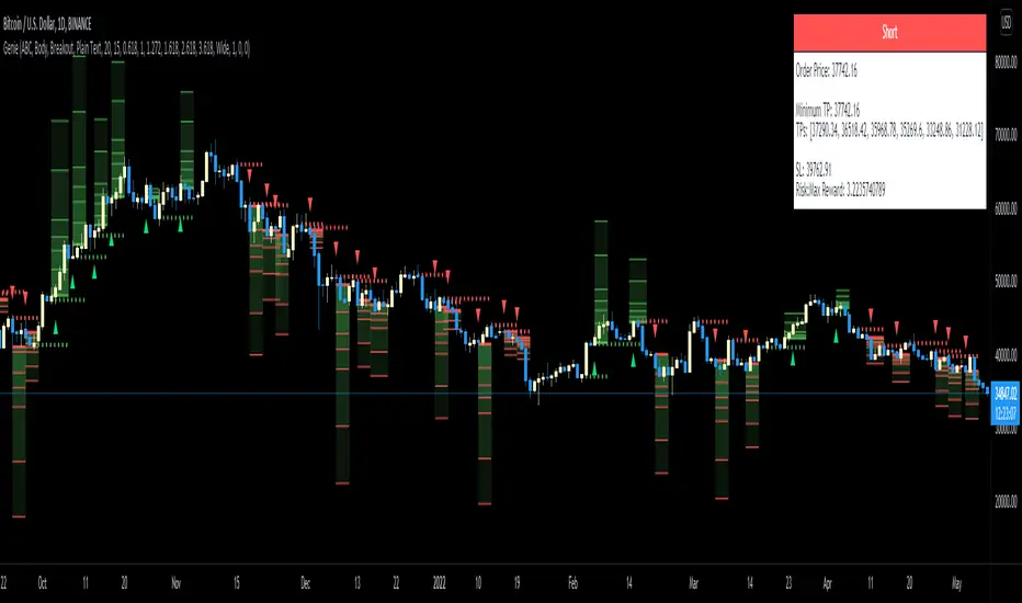
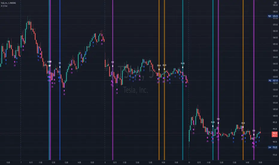
Genie (AB=CD Fibonacci Extensions and Peaks & Valleys)Our proprietary algorithm supports two types of Signals to choose from (and uses Matrices to keep track of the various waves): 'Fibonacci Extensions' where it spots extended waves (XABC) to predict AB=CD moves and puts the Take Profit levels accordingly to commonly used Fibonacci ratios; OR 'P&V' which stands for Peaks & Valleys (M and W) capturing full Peaks and Valleys formations to signal.
Signal Trigger for two types of positions: Breakout or Confirmation when price retraces back to them (so you wait for a candle to close away from price first to Trigger). The idea is whenever a proper Peak or Valley matching those conditions is printed, price usually reacts at those levels by doing a Reversal, so they represent potential entries .
For Confirmation signals, you want price to close away from the level first to then return to it, and that candle close is either a Close (only the close should be outside the level), Hard Close (OPEN and CLOSE outside the level) or Full Close (HIGH, OPEN, CLOSE, LOW all outside the level).
Note that the Signal is to be taken as soon as a Green or Red arrow appears (not before), based on your desired settings.
The Level of Entry is decided by the user; 'Extreme' means you want the algorithm to process based on the Wicks/Pins (Highs and Lows of candles) so while 'Body' means the Borders (Open and Close of candles). Based on this choice the Signal will change accordingly.
The indicator also provides recommended Take Profit levels as well as a Stop Loss levels. The Take Profits are measured based on the wave structure formation.
All features are configurable from the indicator's settings including setting Minimum Take Profit and Reward:Risk (RR) to filter Signals.
This indicator has Alerts for LONG and SHORT signals. You can create a new Alert, select the indicator from the "Condition" list and create it. You can create an Alert for each different timeframe if you want the indicator to monitor various timeframes and give you Alerts accordingly.
Análise de Candles
Candle Number AnalysisAuthor: Marek Zatwarnicki
Inspired by: -
Category: Technical Analysis
Type: Indicator
Timeframe: 4H - 1MONTH
Index: ALL
About:
The indicator allows to examine the number of historical occurrences of candles in a given color, evaluate the risk and analyze returns of the next candle.
How to use:
Check with plotline how many candles of a given color have occurred so far and use the table to evaluate the risk.
Formula:
- Returns - ((close / open) - 1) * 100
- Returns Culminative - close / open
Overfitting: Overfitting free. Research only.
Disclaimer: Past good results do not guarantee future trading success. Please use the algorithm with caution and support it with your knowledge. Published algorithm decisions are not financial advice.

Diamond FU of TMD This indicator is helpful in finding price manipulation using just price action. The FU candle is a price action pattern that helps illustrate either bullish or bearish bias. Using this in conjunction with your TA is helpful and provides you additional levels to look for price manipulation for reversals and retests of the reversal pivots.
A bullish FU candle is where the price wicks down, thus stopping out all the retail longs and then continues to move up in the market makers desired direction.
It should be noted that simply buying after an FU candle is not always wise, but should wait for the retest or confirmation of bias with price action revisiting the area of interest.
If you are looking for any FU candles, use the settings and make the default wick 10%. If you're wanting major FUs, change the wick value to 50%. When you change the value there it is telling the indicator, "The FU wick is at lease 50% or more of the entire candle."
I've also included a 50% mark on the wicks of the candles as this is a primal spot for retest and entry. This feature can be toggled on or off, and the length of extension of that line can be changed as well.

Supply and Demand - Order Block - Energy CandlesSupply and Demand - Order Block - Energy Candles
Description
An experimental script, designed as a visual aid, to highlight the last up or down candle before a fractal break. We can assume these candles where the point of origin that generated enough strength to break recent structure. By using them as reference points, traders are expected to follow their own set of rules and mark higher probability supply and demand zones in the area.
How to use:
Expect a potential retest in these areas, and if they fail, a potential retest in the opposite direction. The greater the number of times a zone is tested, the more likely it is to break. A fresh zone that has not yet been tested will have a higher probability of a bounce.
Fractal period and candle break type can be personalised in settings. Can be used on all timeframes (higher the better).
Indicator in use:
Extras:
An option to flip candle colours if current price is above or below them has been added.
Rally Candle (End Game ) 26/04/2022 Few Months ago I started wanted to code a candle which alerts me when a Rally may be over in Bearish Conditions and today I have created a candle which is 1. subjective but more importantly appears in areas where buying pressure is at either a climax or in the process of a decline and this is where the Rally Candle signals. This shows momentum may be shifting and these can provide some good entries.
They will only working when price is below the 200ema and in overextended markets - VERY IMPORTANT!!!
Works on all timeframe with HTF providing more price percentage than LTF
They aren’t a specific candle size however they will repaint when we see 4 higher close candles followed by a candle which has closed lower than the previous 4th.
//Candle Conditions
This candle has to be in a swing high area to be valid and on 1H and 6H but the 1H will repaint a lot of candles so when we have a point system of +20 we can assume this setup is a good setup.
//Candle Operators
You can change the color of the bar to your liking
There is a ema filter so if you want to candle to not show candles of the 50ema this operator will do the command.
Please post requests and any potential implementations I could port to pine script.
Hope you Enjoy :)
Bounce Manager TrendlinesThe trendline script is made for manual input of trendlines using point clicks on the chart. The script will then see if price respects these lines by the parameters you input in settings panel. On a respectable bounce it will print buy/sell arrows. The script also has functionality to send alerts, this is helpful if you want to automate trendlines . I created this script and many others under the bounce manager toolkit to expand on the signalling capabilities of popular drawing tools as I find using just a crossover to be lacking especialy for full automation.
components:
- Line respect: When price moves past this the script will no longer look for entry until a new trend has been established. The line can also be used as a stop loss.
- Confirmation: When price touches the line during a trend it
will wait to cross over this line to confirm a reaction from the line.
- Consolidation filter: A trend filtering system, this is a distance from
the line price has to break to confirm trend direction.
- Stop loss: This can be set to a percentage distance from the low after
bounce. Or it can be set to the line respect line
- Take profit: This can be a fixed take profit target or a risk to reward
based take profit. With risk to reward it will multiply the stop loss
distance by the input and use that to create target (green cross)
- ATR based or % based: there are 2 versions of the script, one for strict
percentage based logic and another one based on ATR values
If you are having problems figuring out which settings to use I recommend you check the Bounce Manager ATR script for reference as this script plots the components:
Zignaly automation settings:
zignaly integration, you can use the settings panel to decide your risk management. Option to use a fixed take profit % or an automatic risk to reward calculation based on the stop loss. Stop loss can get calculated using the max violation setting as a stop loss (this will put stop loss below line respect level) or when not checked it will use 0.01% below the low of the signal candle as stop loss. Just add your zignaly private key in the settings and use any alert function call as alert. Make sure to use zignaly.com as your webhook url.
If 5 trendlines are not enough use the 20 line input version, this script is for the clean strong trendline trader.
Part of the Honest Algo indicator suite

Morningstar Equity Style Box HeatmapStyle boxes are a classification scheme created by Morningstar. They visually provide a graphical representation of investing categories for equity investments. A style box is a valuable tool for investors to use when determining asset allocation.
There are 9 categories:
Large Value, Large Blend, Large Growth
Medium Value, Medium Blend, Medium Growth
Small Value, Small Blend, Small Growth
The strength of the 9 categories are found by using 9 Vanguard ETF's that follow the respective CRSP index of their category.

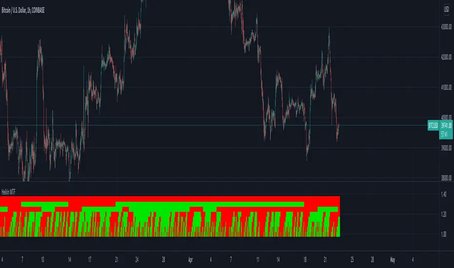
Heikin Multi Time Frame// How it Works \\
This script calculates the open and close prices of Heikin Ashi candles across multiple timeframes,
If the candle formed on that timeframe is green it will display in the table a green square, If the candle is red, the square will display red.
// Settings \\
You can change the colours of the plots
You can also Change any of the timeframes which the Heikin Ashi candles are being calculated on
// Use Case \\
Heikin Ashi candles are often used to give a smoother trend direction and help cancel out some of the noice/consolidation.
It can also be use as trend detection for multiple timeframes at once
/ / Suggestions \\
Happy for anyone to make any suggestions on changes which could improve the script,
// Terms \\
Feel free to use the script, If you do use the scrip please just tag me as I am interested to see how people are using it. Good Luck!
Bollinger Band with Moving Average & Pin BarsThis indicator was specifically built to be used for trading the Scalpius Trading System promoted by @scottphillipstrading. Additionally I've added Daily and Weekly Highs, Lows and Central Pivot lines
The central indicators used in the Scalpius trading system which are included here are: The Bollinger Band, chart plotting of Pin Bars (Hammers & Shooting Stars) and an Exponential Moving Average.
In the settings the user has the option select EMA, SMA or WMA along with desired length, the default settings are 8EMA as per the Scalpius system rules. Also the Bollinger Band settings can be amended by the user and the Pin Bar chart plots and daily + weekly high and low plots can be removed by the user.

Titans Engulfing Retracement ZonesThe Titan Engulfing Retracement Zones indicator detects Engulfing Candlesticks on a higher user defined timeframe, and uses that event to plot retracement and extension levels on the chart for ease of users' chart reading and trade execution. The four retracement levels, two of which delimit the target entry zone, and another two delimiting the target exit zone, are also user defined.
The user of this indicator is advised that the default levels provided are unoptimized. The user of this indicator is advised to use this indicator at his or her own risk.
To further filter out the results of Engulfing Candlestick detection, a long wick condition has been included into the detection mechanics.

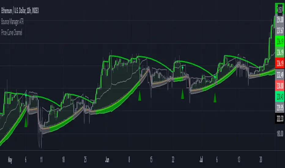
Bounce Manager ATRThis is a tool to turn any line or indicator into a signaller from bounces from the source line.
The ATR version is build to specify what would be considered a worthy entry from the line using ATR multiplier values as inputs.
COMPONENTS:
- Max violation: When price moves past this the script will no longer look for entry until a new trend has been established. The line can also be used as a stop loss.
- Confirmation line: When price touches the line during a trend it
will wait to cross over this line to confirm a reaction from the line.
- Min past distance: A trend filtering system, this is a distance from
the line price has to break to confirm trend direction.
- Stop loss: This can be set to a percentage distance from the low after
bounce. Or it can be set to the max violation line
- Take profit: This can be a fixed take profit target or a risk to reward
based take profit. With risk to reward it will multiply the stop loss
distance by the input and use that to create target (green cross)
- ATR based or % based: there are 2 versions of the script, one for strict
percentage based logic and another one based on ATR values
In bounce manager v1 these stop loss and take profit targets are there only for plotting and visual backtesting purposes. Right now it can only send long and short signals.
Part of the Honest Algo service.
Dynamic Volume CandlesThese candlesticks fill with opacity based on the significance of the volume compared to the volume's EMA.

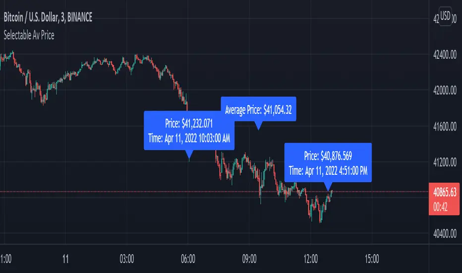
Average Price between Two PointsScript calculates & displays the average price of two selected points. Request from @Bosstradamus3 on Twitter.
This is a quick & dirty script that should be updated in the future.
If you use it and/or modify it, I'd love to hear about it.
Once the indicator is selected, click & drag the label base to reset starting & ending points.
To display label on top of bars, right click on it & select "Visual Order" → "Move to Front."
Wick Pressure by SiddWolfMultiple Wicks forming at OverSold & OverBought levels create Buying and Selling Pressure. This Script tries to capture the essence of the buy and sell pressure created by those wicks. Wick pressure shows that the trend is Exhausted.
How it works:
This Wick Pressure Indicator checks for three candles forming the wicks in overbought and oversold zones. The zones are set by RSI and can be changed in settings. Those three candles should form a bit long wick and length of the wick is determined by ATR. The ATR multiple can be changed from settings. And then the script draws a box in the area formed by three candle wicks.
Confluence:
This indicator should not be used on its own. You should include it in your existing trading strategy. Any indicator should be rigorously tested before making any real trades.
Settings is the Key:
Settings are key to all of my indicators. Play around with it a bit. Change the ATR multiplier. Read the tooltips to understand what each settings mean. Tooltips are the (i) button in-front of each settings.
FAQs:
Q. Does the indicator Repaint ?
--- No. None of my indicators repaints. What you see now is what's drawn in real time.
Q. Indicator doesn't show anything ?
--- Maybe you've messed up the settings so reset it. or try different coin/stock.
Q. Does this indicator give financial advice?
--- No. Nope. Nein. Não. नहीं.
Conclusion:
This indicator is very basic but if used correctly it can be very powerful. Hit me up if you'd like to see the screener/scanner for this or any of my indicators. If you have any questions or suggestions feel free to comment below. I'd love to connect with you. Thank you.
~ SiddWolf

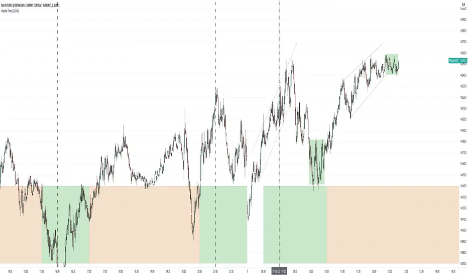
FDAX Impulse TimesThis little scrip is used to automatically draw the most important time periods of the DAX Futures into your chart. You can use the configuration gear to adjust the position of the rectangles based on the current price level.
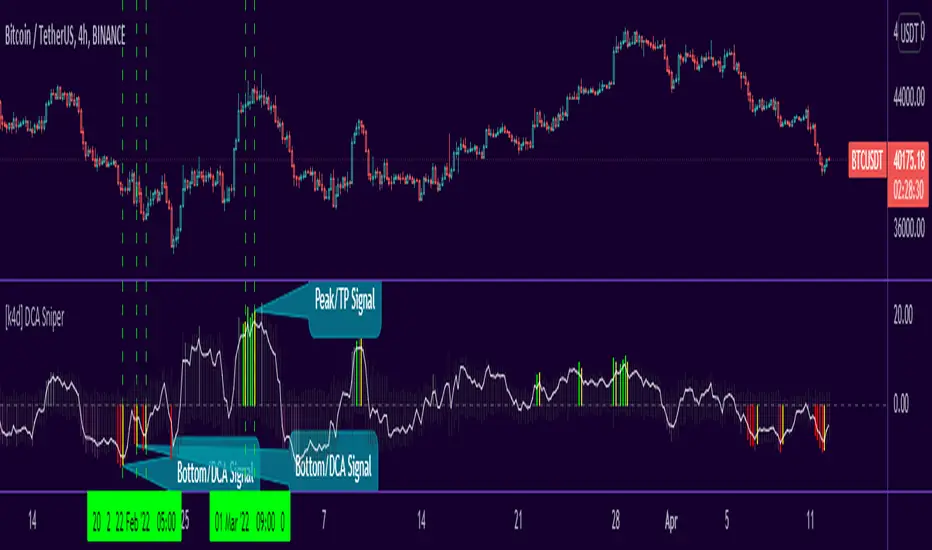
[k4d] DCA SniperFrench text below / Texte en Français plus bas
TL;DR
DCA Sniper is an indicator that tells you the perfect time to do DCA, the bottoms areas are indicated by red bars, the buy signal is given when a yellow bar appears.
"DCA Sniper" aims to help you make DCA (Dollar Cost Average) smarter.
Instead of buying your cryptos at a regular rate, this script will send you an alert at an opportune moment when the prices are touching, or are close to, a bottom.
The script works on several time intervals, the smaller the interval the more signals you will get...
so you can try with several time slots and choose the one that gives you the best signals for your strategy.
How to use this indicator
The indicator scans the price evolution in real time and displays grey bars
When it detects a potential bottom, the bars become darker
When the bottom is near, the bars turn red
Finally, when a potential bottom is detected, a yellow bar is displayed => it's time to buy
Warning:
Since the indicator works in real time, a bar can change color as long as the current candle is not closed. A yellow bar may very well turn red and thus cancel the signal. So wait for the close before making a decision.
Settings
This version of the indicator has only two settings:
Use Candlesticks filter: If this box is checked, the script will try to eliminate false signals based on candlestick patterns.
Use LinReg filter: If this box is checked, the script uses the "LinReg length" value to apply a linear regression and filters out all bottoms that fall within a standard deviation of the linear regression.
Before using DCA Sniper
This indicator was not developed for trading, although it can give good potential entries.
If you use it for trading, please manage your risk well and share your feedback :)
====================================================================
Résumé
DCA Sniper est un indicateur qui vous indique le moment parfait pour faire du DCA, les zones de bottoms sont indiquée par des barres rouges, le signal d'achat est donné lorsqu'une barre jaune apparait.
"DCA Sniper" a pour objectif de vous aider à faire du DCA (Dollar Cost Average) plus intelligement
Au lieu d'acheter vos crypto à un rythme régulier, ce script va vous envoyer une alerte à un moment opportun ou les prix touchent, ou sont proches, d'un bottom.
Le script fonctionne sur plusieurs intervals horaires, plus l'interval est petit plus vous aurez des signaux ...
vous pouvez donc essayer avec plusieurs tranches horaires et choisir celle qui vous donnent les meilleurs signaux pour votre stratégie.
Comment utiliser cet indicateur
L'indicateur scan l'évolution des prix en temps réel et affiche des barres grises
Lorsqu'il détecte une zone de bottom potentiel, les barres deviennent plus foncées
Lorsque le bottom est proche les barres deviennent rouges
Enfin, lorsqu'un bottom potentiel est détecté, une barre jaune s'affiche => c'est le moment d'acheter
Attention
Puisque l'indicateur fonctionne en temps réel, une barre peut changer de couleur tant que la bougie actuelle n'est pas cloturée. Une barre jaune peut très bien devenir rouge et annule donc le signal. Il faut donc attendre la cloture avant de prendre une décision.
Réglages
Cette version de l'indicateur propose seulement deux réglages :
Use Candlesticks filter : Si cette case est cochée, le script va essayer d'éliminer des faux signaux en se basant sur des patterns de bougies.
Use LinReg filter : Si cette case est cochée, le script utilise la valeur "LinReg length" pour appliquer une regression linéaire et filtre tous les bottoms qui se retrouvent au sein d'une déviation standard de la régression linéaire.
Avant d'utiliser DCA Sniper
Cet indicateur n'a pas été développé pour faire du trading, bien qu'il puisse donner de bonnes entrées potentielles.
Si vous l'utilisez pour du trading, gérer bien votre risque et partagez vos retours :)
4C Inside/Outside BarThis indicator colors the candle body based on whether it closed as an Inside Bar (IB) or an Outside Bar (OB).
Inside and outside bars can be powerful triggers to enter or exit trades from, when price breaks above or below the candle.
The coloring of only the body and not the border of the candle makes it possible to still know whether the candle was bullish/bearish.
This indicator has the unique ability to add/hide labels for each IB and OB.
Small labels are printed on the chart directly below the candle. (See below)
It also has the unique ability to paint the chart background when an IB forms directly after an OB.
This is a special combination of the two, and can also be a powerful signal.
This feature can be turned on/off. (See below)
Thanks to Craig Stine, as some parts of this indicator were adapted from Custom Candle color Inside/Outside candles, Highwave, Star Patt. by Craig_Stine
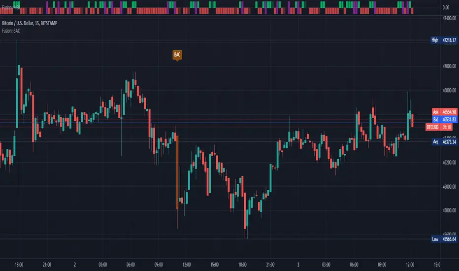
Fusion: Big Arty CandlesAnyone who follows Arty knows about his "Big A** Candle" strategies.
I didn't like the BAC indicators that had code available so I wrote this one that has some decent flexibility and display options.
You can use this to enter a trade immediately after a BAC, probably in the opposite direction and ride the pullback that usually occurs or just use it to avoid trading until things settle down. I use it to avoid trading for a few bars on the 15 minute timeframe on bitcoin.
The settings are certainly not optimized so set them to whatever suits your needs as the defaults will probably be wrong for you.
The code is structured to easily drop into a bigger system so use it as a lone indicator or add the code to some bigger project you are creating. If you do integrate it into something else then send me a note as it would be nice to know it's being well used.
Finally, if you find value please do make a comment, give a thumbs up etc.
Enjoy and good luck!
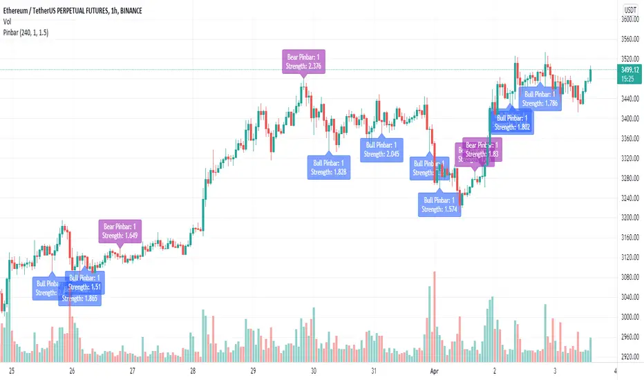
Pinbar IndicatorHello everyone, this is a simple script for determining a qualified Pinbar
(1) Indicator introduction
This indicator can combine multiple K-lines and determine whether the combined K-line is a qualified Pinbar
Supports the calculation of Pinbar strength and filters out undesirable Pinbars by a minimum threshold
(2) Parameter introduction
- Pinbar Pattern
Draw Pinbar Pattern Alert?: Display the Pinbar label or not
Pinbar Statistic Period: The statistic bars for calculating average values
Max Merged Bars: Maximum number of merged bars, default is 2
Min Pinbar Strength: Minimum Pinbar strength, default is 1.5
Happy trading and enjoy your life!
————————————————————————————————————————
各位朋友大家好,这是一个用于判断 Pinbar 的简单脚本
(1) 指标说明
该指标可以合并多跟 K线,然后判断合并后的 K 线是否是一个合格的 Pinbar
支持 Pinbar 强度的计算,并通过一个最低阈值过滤掉不理想的 Pinbar
(2) 参数说明
- Pinbar Pattern
Draw Pinbar Pattern Alert?: 是否需要显示 Pinbar 标签
Pinbar Statistic Period: 用于统计 Pinbar 的平均量的 bar 数量
Max Merged Bars: 最大合并 bar 的数量,默认为 2
Min Pinbar Strength: 最小的 Pinbar 强度,默认为 1.5
祝大家交易愉快
Tweak Strat Candle ColorThis script allows traders to customize candlestick colors based on The Strat trading system developed by Rob Smith.
The script determines if the current candle is an inside bar (1), outside bar (3), directional up (2u) , or directional down (2d).
An inside bar is a candle that trades fully within the previous candle.
An outside bar breaks both the high and the low of the previous candle.
A directional up bar breaks the high of the previous candle but NOT the low of the previous candle.
A directional down bar breaks the low of the previous candle but NOT the high of the previous candle.
The trader can modify the colors they wish to use in the settings menu.
NOTE: You must select "Visual order - Bring to front"
If you do not, the custom colors will disappear when you click the chart window.

TheStrat AlertsFinally, an indicator that will monitor and send notification for any potential 'TheStrat' candle combination setups.
Explanation of 'TheStrat' trading technique
‘ TheStrat ’ technique works off the basis of labelling whether the focus candle did or did not break any of the previous candles high or low values. There are three possible label definitions; either a 1 candle, 2 candle or a 3 candle.
1 bar (inside) - If price movement on the new candle remains within the high and low of previous candle.
3 bar (outside) – If price movement went above both the high and the low of the previous candle.
2 bar (directional) – If price movement only broke with the high (called a 2-up) or if price movement only broke the low of the previous candle (called a 2-down).
Once labelled the technique then looks for certain combination of these labelled candles (called actionable setups) such as: 2-1-2, 1-2-2, 3-1-2.
How does the indicator work?
This indicator will monitor and alert you when a possible ‘ TheStrat ’ actionable combination is identified on any ticker and timeframe you add the indicator to and then register an alert. The key decisions are which TICKER and which TIMEFRAME to register the alert and lastly what actionable ‘ TheStrat ’ combination to enable in the indicator settings.
When a registered alert is running it will continually monitor for the enabled ' TheStrat ' conditions and upon the bar close of a defined condition, it generates the alert notification using the existing built-in TradingView alert feature. This indicator is not market or timeframe specific, in fact this alerting indicator can be used to register alerts on multiple tickers and timeframes simultaneously.
Example of how to use the indicator
Assume you are interested in being alerted for any ‘2-1-2’ combination on AAPL on the 30min timeframe. You would simply go to that chart (APPL on 30 min), add ' TheStrat Alerts ' indicator to the chart. Ensure the 2-1-x condition is enabled in the indicator setting. Then using the built-in TradingView - 'Create Alert' feature to register the alert that will listening to 'TheStrat Alerts' indicator monitored events. In this example the alert will specifically trigger if it finds a 2-1 bar setup and send the alert of a possible 2-1-2 setup allowing you to jump to the chart to review.
Description of the script
The script work by monitoring the development of new candles and when it finds a potential developing combination it will generate an alert prior to the completion of the actionable signal.
The following 'TheStrat' combinations have been coded.
2-1-? candle setup (expect 2-1-2)
3-1-? candle setup (expect 3-1-2)
1-2-? candle setup (expect 1-2-2 rev)
3-2-? candle setup (expect 3-2-2 rev)
2d-2d-? or 2u-2u-? (expect 2-2 rev)
"Randy Jackson" 2u-2u-2d-? or 2d-2d-2u-? candle setup
5 consecutive 2u or 5 consecutive 2d "Pivot Machine Gun" candle setup
50% retracement after a 2u
50% retracement after a 2d
Failed 2u - candle that closed red, instead of green
Failed 2d - candle that closed green, instead of red.
1-3 "Nirvana" candle setup
1 candle and 3 candle formation
How is this useful to a trader?
This unequivocally original and useful indicator relieves the need to sit and monitor all the tickers and timeframes you can simply place the alert indicator, enable the conditions under which you wish to be alerted and let it monitor for you.
The clear value of the indicator is the increased ability to find potential setups to trade when certain conditions have been identified.
TO ENABLE, please follow these steps:
1) Add indicator to your TICKER choice and TIMEFRAME of your choice.
2) Open the indicator options/settings (cog wheel of indicator) and select the checkboxes to enable which conditions you want to be alerted on. Start off with a few specific setups to get the hang of the indicator. Then OK the indicator setting window to close it.
3) Next find along the of the screen the 'Create Alert' icon (watch icon with + symbol). Click it will open the ' Create Alert ' settings.
4) For CONDITION , drop down and select ' TheStrat Alerts ' so that the alert will listen for the alerts you selected in the indicator settings.
5) Expand 'More options' to select notification preference like pop-up, sound or email
6) Finally click on ' CREATE ' to register the alerts
The indicator will now generate alerts for the options you enabled in the indicator. Please delete and re-register the alert if you changed any settings in the indicator, for example a different condition.
This indicator is not merging multiple indicators as it uses only the default TradingView alert functionality, and the source code is based on my other highly successful free indicator. The indicator does not infer future performance but does notify of the potential actionable ' TheStrat ' setup prior to the completion of the ' TheStrat ' combination. It is also an independent and standalone indicator and does not rely on any of my other published indicators.
This is a paid private invite-only indicator, if you want a trial, please contact me by sending a private message through TradingView.
Good Luck with trading and I hope this indicator helps to increase the profitability of your portfolio. Happy Trading.

Candle ClassifierThis indicator uses allows its users to locate classifications of candles based on user defined input.
Using a % of candle range the user can specify,
High Wick %
Candle Body %
Low Wick %
The user can also search for candles within a (user defined) variance range.
A nifty feature of this indicator is the display of your criteria, so that you can be reminded while you're looking through your chart!

ICT Fair Value Gap [LM]Hello traders,
I would like to present you ICT Fair Value Gap script. The idea is the same as in my other script to look form imbalances. I have improved the previous script from teaching of ICT and created this script to train the eye to see those gaps. Shrinking option also shows if the gap has been already filled and also in case gap is filled you can get alert in case you will set it up .
The script has two settings:
general settings - definition of volatility condition for middle candle
box settings - setting for boxes, box colors, shrinking
I hope you enjoy it,
Lukas
